andy, wanna gimme some critique?
not really the one with text,
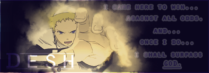
i just liked the quote and wanted to put it in, but i dont think it turned out. =/
i think theres a bit too much dead space in it, but i dont mind it that much :S
edit:
srry, have to self critique it >.<
idk,
im not a big fan of smudging sigs in general, but i like how most of it came out, i dont like the smudges around the right hands cuff, i feel like i smudged to much of the inners but didnt spread it enough.
idk the little bit of the bottom of the right hand bothers me.
might go back to fix that,
i liked the text,
i could have done a bit more with the border, it was just a 2 pxl white fill overlay, but its what i've been doing since i made this thing :
( i lurve this sig like i lurve my mother. one of my best sigs i think i made back from when i was more into photoshop DX )
but yeah. done. lol
edit edit: was looking through my photobucket lol
i always liked this one,
would prolly have used it if swfs sig limits werent lame =[ i liked the text i had done on it DX

 , ive had my grandparents spell it wrong too >_>