turtlecake
Smash Journeyman
yeah well our smash scene has the most hardcore black guy since 2pac

Welcome to Smashboards, the world's largest Super Smash Brothers community! Over 250,000 Smash Bros. fans from around the world have come to discuss these great games in over 19 million posts!
You are currently viewing our boards as a visitor. Click here to sign up right now and start on your path in the Smash community!

 XD
XD
also if any of it seemed rude or anything it wasnt intentional lol,ohai
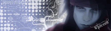
i don't like the background because of the reasons chris said. seems like filters and gradients which are really good tools to use in a lot of cases, but you can be sooooooooo much more creative with backgrounds. Use more brushes, make your own random shapes, and do whatever. I use filters and gradients and loads of layers and effects to tune it up. It really depends on what you're going for and what suits the render.
Chris says the background has to flow.. yeah, in a way i guess. The background has to flow with the render. They should correspond with each other and blend. Not really as in you gotta mask around the render, that works in some cases, but you just want the render to not stick out of place, or the background to stick out of place too much. You can actually use the render and do some crazy filters on it and make random shapes to put together and make the background. Your background is like blue while your render is all shiny and whhotnot. color co-ordination works really well for blending stuff in.
Text is the most frustrating part of the sig in my experience...... There's one easy thing to know about it, though. When you work with renders and backgrounds, you can focus on either of them and do whatever you want with the blending of it. For text, most of the time you just need to make it really, really simple and just blend. It never has to really stand out. A lot of people will tell you that keeping text simple is the best thing you can do then using crazy big font.
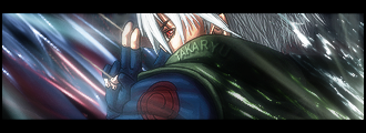
i made this sig like 2 years ago near the end of when I was really into photoshop
i like it because i was getting better at using C4D renders which is probably really overused by now, but people are always finding ways to be creative and sexy with them. I also looooooovvvvveeeeeeee how I made the text. but my monitor sucks and i have really low contrast levels so it's probably cut off for most people.
I kind of half-***** on the border, but whatever. Speaking of which, borders are also best simple. I usually have my border match with my text, which both should work for the entire sig. Nothing too fancy. The border should just close off the sig, i mostly just use a 1px black border. You can use a white border+text if you want so it stands out more on forums with darker backgrounds, just as long as the rest of the sig works with that.
<3lol oh man this game is ****ing great XD
Yes they do. We'll get people from out of town/province/country occasionally.lol just a question, do most people who post in this thread live in toronto?
We're gonna be Team Dharma and Karma.^ remember, Dharma give you good Karma.
lmfaaaao.
yeah, but we also mostly play melee. just a heads up =Plol just a question, do most people who post in this thread live in toronto?
my karma ran over your dogmaWe're gonna be Team Dharma and Karma.
So long as I'm Dharma.
")
^ remember, Dharma give you good Karma.
lmfaaaao.
Yeah poor guy. But honestly, if I didn't take it, someone else would'veit looks more subtle now but still isn't smooth enough. and i can still sort of tell where it restarts, but it's much less obvious. so...same problems as before, but less so =P
lol @ finding a ds. poor person who lost it.
wednesday night is christmas eve.is anyone free to smash on wednesday?

fixed for accuracylife = smash
its sad we still have to say that despite the fact that the words melee only are int he thread title XDyeah, but we also mostly play melee. just a heads up =P