MaTA
Smash Ace
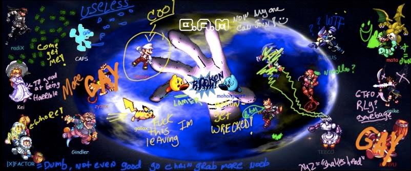
yeah, the other background was better...this one looks cool but just way to chaotic. Some of the names are hard to read too and really no point for random asteroids cause there are all the characters.
to get rid of that wing with clone stamp at the top when you select the tool. you'll see a layers tab i believe. You want to click "Current and Below" and that should get rid of it when you use the background to color over it.
You probably don't need 2 bams in there. Fonts like the one at the top are generally hard to read so i wouldn't recommend using it. I'd get rid of the bam in the middle just because its so small. no real point to it. For the top bam just find one with similar colors so it'll fit in nicely. you dont want it sticking out so much cause it'll take away from the rest of the picture. might even throw in a "Team Bam" instead of just Bam.
")