ManEg
Smash Journeyman
Like with everything, you need to learn the timing for ledge jump waveland. You take the same risk as with ledge hop> jump> waveland if you dont time it right.

Welcome to Smashboards, the world's largest Super Smash Brothers community! Over 250,000 Smash Bros. fans from around the world have come to discuss these great games in over 19 million posts!
You are currently viewing our boards as a visitor. Click here to sign up right now and start on your path in the Smash community!
") So sweet being able to add more songs it looks like.
So sweet being able to add more songs it looks like.Well I thought with all the effort put into the menus and the front screen and other superficial things things to make it aesthetically like Melee would also be a priority.Those are just .brsar edits and a texture. You can do that with your own Project M Demo if you'd like, but as far as I know, we will not edit Sonic's voice or add in a snake texture. Only textures that might be added are just team color edits.
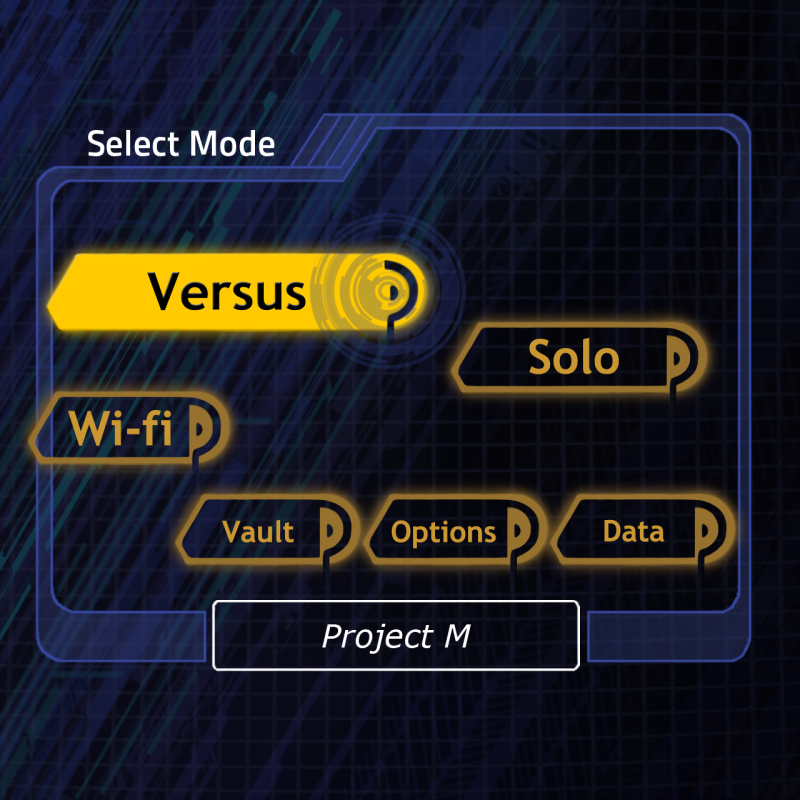
The menus aren't all that aesthetically similar to Melee. I think there's your answer.Well I thought with all the effort put into the menus and the front screen and other superficial things things to make it aesthetically like Melee would also be a priority.
Eh... I don't see it being much different than DK's punch honestly. He gets 3 different ways to use it, but most of his smashes are a little laggy too and he can't hold his charge partway.I like the game. Downloaded it on Sunday and I have been testing it ever since.
My only concern right now is that Lucas has the potential to be... to good. He can kill way to early with his charged B. I love that you made his PK Fire PK Freeze, but I am still concerned about about his standard B. I think you should change it back to a normal EarthBound B. Maybe make it PK Fire (use the very large Dins explosion as the attack).
Just my two sense.
I thought the color scheme was kinda similar and it seems that the installer even went as far as to give me a background for Gecko. But whatever, I'll drop it. Good work fellas!The menus aren't all that aesthetically similar to Melee. I think there's your answer.
Not really. The only repercussion from screwing it up is, well, screwing it up, IE putting yourself in an unwanted position. But I can't see a way to SD.so, you kill yourself if you mess up?
As Crispy said, it's not too similar to Melee. I think that was mostly just done to make this more recognizable as a different game than vBrawl. And if you want, there are both a PS styled and high-res MGS1 Snake on BrawlVault.Well I thought with all the effort put into the menus and the front screen and other superficial things things to make it aesthetically like Melee would also be a priority.
leelue hit the highlights, but something I'd like to add: CP WarioWare. I swear that stage is almost made for Sonic.Any tips for using Sonic?
Thank you!Not really. The only repercussion from screwing it up is, well, screwing it up, IE putting yourself in an unwanted position. But I can't see a way to SD.
As Crispy said, it's not too similar to Melee. I think that was mostly just done to make this more recognizable as a different game than vBrawl. And if you want, there are both a PS styled and high-res MGS1 Snake on BrawlVault.
leelue hit the highlights, but something I'd like to add: CP WarioWare. I swear that stage is almost made for Sonic.
I also suggest you look into some vBrawl techniques, such as stutter step, fair momentum, grinding (just looks cool), and all the intricacies of Side/Down-B.
Lastly, as far as I can tell, a normal Side-B is usually better for recovery than a Spinshot. However, Spinshot is otherwise fancy.
Menu was mostly done by me, and is definitely going to be improved at some point.As far as all the talk about asthetics and the menus, I just have a random question. Why can't the shape and layout of the buttons be changed? Also, are the menus finalized, or is there still room for improvement?
thats all thanks to Nintendo's brilliant marketing... yay :/They look alright, but I'm hoping for something completely redone. The brawl menus just dont seem sharp at all to me. It seems rounded and childish.
Maybe you didn't notice but the Smash series is about taking your Jigglypuff up against your friend's Peach and seeing who can kill each other with Pokeballs and anime hammers the most in 2 minutes.They look alright, but I'm hoping for something completely redone. The brawl menus just dont seem sharp at all to me. It seems rounded and childish.
yeah, i always find its painful for my eyes after a whileActually, psychology research shows the dark fonts on light backgrounds are the worst kinds of layout for you eyes. At least when doing powerpoints, they tell us that at some point, the strain on the eyes might make some just stop looking. Some it's best to have dark backgrounds for this purpose. E.G., for Powerpoints, using dark blue backgrounds and light golden font works great to retain attention. So for extended viewing, darker fonts put less strain on your eyes. I prefer the PM background.
You don't /have/ to use the menu changes. Just don't use the menu file.Maybe you didn't notice but the Smash series is about taking your Jigglypuff up against your friend's Peach and seeing who can kill each other with Pokeballs and anime hammers the most in 2 minutes.
The Brawl menus are extremely polished and professional and every time a fan messes with the menus it looks terriawful. Please just leave them alone.
Haven't you realized how Melee's and even 64's menu looks more mature with their schemes and darker colors? Less like a cartoon and more like a game that can be taken seriously by people that want to.Maybe you didn't notice but the Smash series is about taking your Jigglypuff up against your friend's Peach and seeing who can kill each other with Pokeballs and anime hammers the most in 2 minutes.
The Brawl menus are extremely polished and professional and every time a fan messes with the menus it looks terriawful. Please just leave them alone.