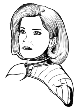
I manually choose each color myself, but sometimes when I want gradients I just press really lightly with my tablet and gradually press harder as I go along. I have a very heavy-handed rendering style though, so oftentimes when you see streaks those are actually seperate brush strokes, radiating out from one point. I'm all about them color fields
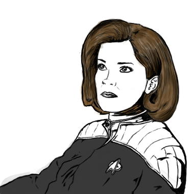
More about picking colors:
It's really important to choose your colors for mid, light and dark tones rather than being like "here's my skin color, and now shadows will be skin color + black, and highlights will be skin color + white," which is a mistake that everyone ever has done. Depending on the lighting condition, as the surface of an object moves from light to dark there can be a huge range of colors for something that is seemingly one hue. For skin it's even trickier, because you take into consideration blushing, different surface smoothness, and of course, skin's natural translucency.
As a general rule of thumb, as you go darker with skin, make your hue more red. So on the gradient box thing in Photoshop for example, not only would you move the color down-right towards black, you would also shift the overall color more towards red. Of course, different environments can change this drastically — if someone is outside their shadows would be more blue or green, for example.
Really, if you guys have any questions or anything feel free to ask away, I feel weird for randomly dumping my art in here and flying away again
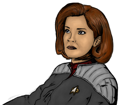
")