• Welcome to Smashboards, the world's largest Super Smash Brothers community! Over 250,000 Smash Bros. fans from around the world have come to discuss these great games in over 19 million posts!

    You are currently viewing our boards as a visitor. Click here to sign up right now and start on your path in the Smash community!

Official Critique Topic

A_man13

Smash Master
Joined
Apr 6, 2008
Messages
3,535
Location
Auburn, Al
Brutality is apparently the new form of CnC. Even if a critique is brutal, it should at least point out what was wrong with a signature, what was good, and specific ways to improve. It's not a good road for anyone to be going down.

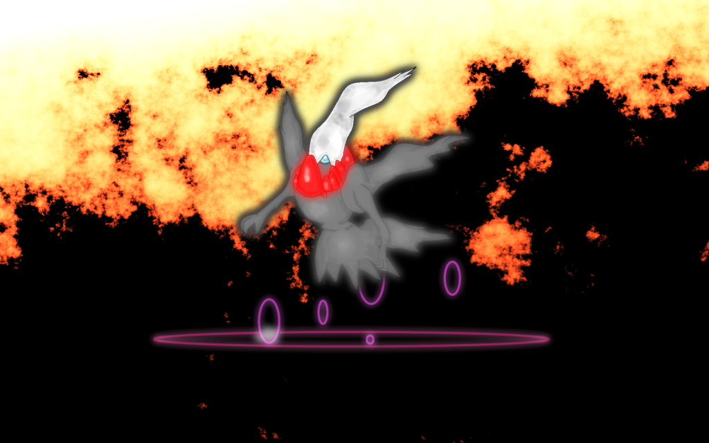
@WB40: You seem to have a good start with the abstract art, but as of now it is rather insipid. I don't think there is much you can do this time, so if you decide to do another piece, try and add some more shapes and patterns. Don't make it overly busy, but add a variety of shapes and you can easily get your work top stand out.

@BW: Sure, post away. I'm actually kind of psyched to see what you have in store.
 

Marthmaster92

Smash Champion
Joined
Jun 29, 2006
Messages
2,564
Location
Stuck between a parallel dimension of code and you
Brutality is apparently the new form of CnC. Even if a critique is brutal, it should at least point out what was wrong with a signature, what was good, and specific ways to improve.

I hardly think that "try putting some effort into it next time" is pointing out what's wrong with it.


Maybe here on SB brutality is the way to give CnC, but most GFX forums I've been on don't handle it like that. SB has always been brutal for the CnC, looks like it still hasn't changed. lol.
 

A_man13

Smash Master
Joined
Apr 6, 2008
Messages
3,535
Location
Auburn, Al
I hardly think that "try putting some effort into it next time" is pointing out what's wrong with it.


Maybe here on SB brutality is the way to give CnC, but most GFX forums I've been on don't handle it like that. SB has always been brutal for the CnC, looks like it still hasn't changed. lol.
I know. It's the huge reason I don't post anything I have for CnC anymore; critique shouldn't be sugar coated, sure, but it should at least be telling me what I'm doing wrong.

CnC wasn't always this brutal. When I was first starting out on SWF, even all of the experts were nice to my early attempts at sig making at the critique topic and it helped me improve. I guess it was all downhill from there.
 

Neon Ness

Designated Procrastinator
Joined
Jul 10, 2008
Messages
3,631
SB has always been brutal for the CnC, looks like it still hasn't changed. lol.
Actually it has. It's gotten way better since like, the days of '08 when every other post was "U suck read a tut". :laugh: People actually are more helpful in recent times even in the sig CnC thread. I agree though that CnC used to be pretty bad here.

I wouldn't really call this place brutal anymore though. This is just one instance (which wasn't even that brutal in my humble opinion).
 

Black Waltz

Smash Champion
Joined
Jan 27, 2007
Messages
2,243
Yo man, that's pretty harsh. I understand that critiquing can be harsh/hard sometimes, but that's a bit too brutal. Telling somebody they put no effort into it is pretty cold.


How about saying something like "It looks rushed, maybe slow down and take your time on the next one?" Instead of saying "You didn't even try or put effort into it, it's half-*****."


Just sayin' man. Not trying to start a war here, but just a little bit of tactfulness would be appreciated, i'm sure.


Peace. :)
Being harsh is sometimes necessary. If someone makes their first piece and they acknowledge that it looks like **** and politely ask for help, I'll be more than happy to give them tips, etc. But the guy that I critiqued has posted his work many times under the assumption that it looks good, and even had the audacity to make his own shop. That warrants some radical redirecting.
 

Zephron

Smash Ace
Joined
Jul 26, 2008
Messages
697
Location
Among the trees in Minnesota
@Black Waltz

I haven't posted here in forever, but please let me post my little two cents.
I appreciate this topic and I want to make sure no actual wars start.

Being harsh is necessary for critiquing, but perhaps you can just work on the delivery better. You probably meant that it looks terrible to you and that there are a lot of errors or flaws.

The way you put it just sort of sounded like an ultimatum. It is half done or something. *shrugs*

@WB40

I like the colors, but there is a bit too much simplicity. Even with abstract art there needs to be some sort of flow or change within the piece.

The canvas shape and size I don't really understand either. One idea I have for you would be the shape of your canvas. You can make it a silhouette of something or perhaps have a contrasting wavy flowing background and have the squares overlapping something.

@All

Like I've said before, I haven't posted anything in a long time, or have even made anything in that matter. But since summer is here I picked this stuff back up.

CnC this please.


(Click on it for full size)

It's my new desktop wallpaper. It's meant to be very simplistic looking so obviously there isn't too much to critique but anything constructive is appreciated a lot.
 

Neon Ness

Designated Procrastinator
Joined
Jul 10, 2008
Messages
3,631
AE is so inactive :(
Hey, inactivity isn't always a bad thing!

A lot of empty space again. I would say on your next try of something like this just go with a smaller canvas, so you don't feel compelled to just fill it with random stuff/have that gaping emptiness.

Why the fire? If you were tryna make something like Hell then it could have been tied with Darkrai somehow. The fire itself looks pretty good, it's just separated from the actual scene. I might try to add some lower opacity fire beneath the main layer to create some gradation, and add more flames in the foreground to create a sense of presence. And Darkrai is just floating there not really doing anything. Find some way to make it interesting or dynamic. It could have its arms folded, or lunging forward as if chasing someone, etc. I do think it was drawn well-enough to be recognizable right away, and the way some parts are trailing off/blowing in the wind is a pretty good start.

This review is probably pointless since that was posted over a week ago, but I enjoy writing these long-winded things, so, shrug.
 

global-wolf

Smash Champion
Joined
Jan 17, 2010
Messages
2,215
Location
Northern Virginia
Hey, inactivity isn't always a bad thing!
But this thread has been around for more than a year, and it's got... 15 pages? Or look at the social thread, only 400 posts in half a year's time. Compare that, for example, to the Pika social thread that has 1,800 pages. (Though it is one of the more active socials.)

IMO it's great that this thread isn't spammy, but there's a lot of people who post their work for critique and no one replies. I'm not exactly helping that though. After I get some sleep I shall critique and try my best to critique any future requests!

Let's see if I can commit myself.
 

Neon Ness

Designated Procrastinator
Joined
Jul 10, 2008
Messages
3,631
Yeah, I was just messing around, I know what you meant.

The AE has been more active in the past, but it's never been the most active subforum on this site. I saw posts a while back mentioning that people had no idea this place existed :laugh: I dunno if it's because it's at the bottom of the page or what. Activity just comes and goes in waves.
 

global-wolf

Smash Champion
Joined
Jan 17, 2010
Messages
2,215
Location
Northern Virginia
Yeah, that's what I thought, but I wanted to post something anyways. Thread promotion! I was really surprised a couple days ago when the social jumped like 3 pages. The community project is a great idea.

Critique please


The first thing I noticed was that the lines are very light, giving Darkrai a blurry look. I understand what you were trying to do, but if the lines were a darker shade it would look much better. The red collar around the neck should be more jagged, and the big front "spike" looks like it's attached to Darkrai's head. The part of the white "hood" around the eye is not symmetrical, like you have it here. The left hand is much smaller than the right hand, though that isn't very obvious at a quick glance.

I think this would look much better if you made the shading darker. The colors seem very flat. The background doesn't help this, it's very bright. A dark blue or purple hue would probably be better. I do like the texture though. I also like the purple rings below Darkrai. It looks very mystical :)

Good job!
 

Neon Ness

Designated Procrastinator
Joined
Jul 10, 2008
Messages
3,631
G'head.

Normally you are supposed to CnC someone else first, but this thread's a little inactive right now so there's not much to be done. I guess you can still comment on an older work though.

ALSO. If it's just a "I was bored" drawing you can post it in the social thread if you want. People normally post stuff like that there, and stuff they want to work on more seriously in here.
 

Charmander

Smash Champion
Joined
Jan 4, 2010
Messages
2,015
Location
The Middle Pokeball
NNID
JoeThorpedo
G'head.

Noramlly you are supposed to CnC someone else first, but this thread's a little inactive right now so there's not much to be done. I guess you can still comment on an older work.

ALSO. If it's just a "I was bored" drawing you can post it in the social thread if you want. People normally post stuff like that there, and stuff they want to work on more seriously in here.
well, Dispite the drawing being done out of boredom, I actually want it critiqued, as its one of my better drawings

anyway, from the boredom of some 13 year old kid spawns.....


Neon Ness

Designated Procrastinator
Joined
Jul 10, 2008
Messages
3,631
Really like this one. I think the best parts are the little details and line quality.

The scale representation on the wings and neck look really good. They're not meticulous, but there's a sort of sketchiness to them that I think looks good. Only thing is I would distribute them more evenly, the scales on the left wing for instance are really close together in some areas and sparse in others. The neck scales are pretty awesome as well. It looks like you created a sense of movement/direction throughout with the direction of the pencil marks, well done. There's even some lighting/shading on the front of his head.

Only other thing is try to make it more symmetrical I guess? The right wing and antenna are higher up than the left for some reason. And the right mustache... thing is lower than the left when it seems like it should be going straight horizontal.

Gj. Now, color?

Also, can you turn off your signature in this thread? Thanks.
 

Charmander

Smash Champion
Joined
Jan 4, 2010
Messages
2,015
Location
The Middle Pokeball
NNID
JoeThorpedo
Really like this one. I think the best parts are the little details and line quality.

The scale representation on the wings and neck look really good. They're not meticulous, but there's a sort of sketchiness to them that I think looks good. Only thing is I would distribute them more evenly, the scales on the left wing for instance are really close together in some areas and sparse in others. The neck scales are pretty awesome as well. It looks like you created a sense of movement/direction throughout with the direction of the pencil marks, well done. There's even some lighting/shading on the front of his head.
Well, I own a bearded dragon. And from experience the scales arent evenly distributed in most reptiles, so I tried to make them a little uneven. May just be my lizard though :/


Only other thing is try to make it more symmetrical I guess? The right wing and antenna are higher up than the left for some reason. And the right mustache... thing is lower than the left when it seems like it should be going straight horizontal.
I think the fire would kinda put a little force in the air, making his antenae/mustache thingy go up a bit. I do see a little bit of this that could be worked on however, so good call.

Gj. Now, color?
*ponders on how to do this*

Also, can you turn off your signature in this thread? Thanks.
Oh crap I forgot >.<
 

Serris

ლ(ಠ益ಠლ)
Joined
Nov 11, 2007
Messages
2,946
Location
Plymouth, Massachusetts
NNID
Herple-Derples
3DS FC
5043-4507-3351


A little something I whipped up in about half an hour. I want to get a few opinions on it, if that's alright with you guys.
 

Neon Ness

Designated Procrastinator
Joined
Jul 10, 2008
Messages
3,631
Serris, remember to try and CnC someone else when asking for advice :laugh:

That's really good for having been done in half an hour. I know things like textures are time consuming but a lot of it is pretty polished. About the setting I would do something to make the sky more resolved. It's just a bright white sheet right now that looks unnatural. Even if there aren't any clouds, a slight color gradation could add some believability to it. The ship and ground are also really dark in comparison. Adding highlights in the ship and bottom half of the scene will make it less lopsided in terms of contrast. Blurring the far distance could add depth.

@ global wolf: The composition is a little strange as is. The wolves look okay, but the whole revolving sun and moon thing looks forced.

I just got a crazy idea though. What if the whole picture was a yin yang symbol? One side could be dark with a white/light colored wolf with the sun as the circle, and the other half could be light with a dark moon/wolf. Something that ties everything together.

The wolves are really well drawn though. Can't wait to see everything colored in.
 

ZIO

( ͡° ͜ʖ ͡°)
Joined
Sep 14, 2006
Messages
10,884
Location
FREEDOM
Serris. I think it's too dark on the bottom half. Lighten up that so more detail can be shown. Also, make it more vibrant, unless you're trying to make the world look bland and uninhabitable. Then you're successful. But as for the sky, drop the bright tone, and try to get some of the background to show in the distance. It gives that hopelessness more meaning if you see further, and there's still nothing in sight. Give the sky some color. Any color is good. try to get the gradients to match the whole picture. Right now, it's a bit top heavy.

Hope that helps.
 

Zephron

Smash Ace
Joined
Jul 26, 2008
Messages
697
Location
Among the trees in Minnesota
@Global-wolf

The first wolf (on the left) looks a little strange... perhaps because I think you cant see any of the wolf's legs or arms because of the wings and tail. Perhaps have a leg showing or something.

You also made the sun/moon in front a decent size bigger than the one behind it. If so that shows there's some more distance between the two wolves and you might want to alter their sizes to fit it better.

Not much else to say though, it's a great sketch.

@All

The AESA helped me get back into art a little bit more and I'd like to know what you guys thought of this art style. It was really weird but fun to do.

The scanner picked up every eraser mark so there were a ton of white dots in random places. You cant tell zoomed out but it's easy to see zoomed in.

The perspective is a little weird on the top frame but that's all I got.

CnC please.


Master Ppv

Smash Journeyman
Joined
Dec 2, 2007
Messages
271
Location
Springfield, Illinois
That's a really good comic! The only thing I have to suggest is to make the detector look a bit more like advanced tech... And that's a small criticism. Great job! :)

This is a really old picture that I took with my point-and-shoot. Not the best but I liked it at the time so here it is :p


The next one is a t-shirt design I did for a friend of mine; also really old. I figured it would be best to start with the old stuff first so you guys can see how I've been advancing. There's also an alternate of the design below.


global-wolf

Smash Champion
Joined
Jan 17, 2010
Messages
2,215
Location
Northern Virginia
I really like the first photo, Ppv! The colors are really nice and the flower looks really soft. I don't know much about design, but they're pretty cool :D
 

smash superstar

Smash Ace
Joined
Jul 23, 2005
Messages
654
Location
Taylorville, IL
I have a lot of photography that I would love people to take a look at.....Its all on my facebook but obviously not everyone can see that so Iv been slowly adding it to a deviantart account
http://t-rav88.deviantart.com/

Choose any that you want to talk about, granted some of this stuff wasnt really meant to be "artsy fartsy"
 

Neon Ness

Designated Procrastinator
Joined
Jul 10, 2008
Messages
3,631

And try to give other people some helpful comments before demanding feedback. If you genuinely can't think of something to say, fine. Don't stretch yourself. But at least try.
Come on, people. First page, giant red letters.

smash superstar, I'm not trying to single you out at all (I noticed Serris also did this), I just want to make sure this rule is enforced before this gets out of hand. I'm not usually super Nazi strict on guidelines or w/e but this is one of the more important ones. If you want critique on your work, it's only fair that you crit others. I would like if this thread had people posting art for review as well as people contributing in kind. Give and take. It's not hard, I promise.

It's been going alright for the most part, but I just want to remind people not to just dump a bunch of images and say "crit plz" without anything else to add.

That said...

@ Ppv: First photo we've had in a long time. The depth looks really nice. It would be better I think if the flower was fully in focus though, left side's kind of blurry. Nice capture, I like the colors there.

To be frank I dunno how well those would work as T shirts. Your design bleeds off outside of the border, and it looks like the main points of focus are not in the center. Seems like a better T-shirt design would have the 2 characters near the center with the words across the chest. The smudging is pretty random looking, I think if they were smudged outwards from the center in a radial fashion it'd look more dynamic. Version 1 has better colors to me. I think you should get rid of the purple box around Insomniac games, let the words sit on their own. And I'm guessing bhatt0507 wouldn't be on the shirt but is more like a watermark/proof of ownership kind of thing? Dude on the right is low quality so I'd scrap him or find a better image. But if this is old stuff then I guess you've improved since, eh. :p

@ smash superstar: I like the grayscale photo. High contrast looks cooool. Your(?) head is cut off at the top though, as well as the left shoulder. I think it'd be better if there was a little more space for those and less space near the right shoulder. Not sure what that dude in the corner's doing there lol. I'm not a photo pro, but overall a really nice shot.
 

Zephron

Smash Ace
Joined
Jul 26, 2008
Messages
697
Location
Among the trees in Minnesota
@Master Ppv

The shirts are cool, but I feel like there's too many things competing for my eyes' attention. I want to look at Resistance, but then I look at the... zombie man in front. The text also kind of pops out, and then Insomniac is there too. So essentially everything pops out XD

You should either make some of these elements more subtle, or remove them entirely. If you may allow some jargon, there isnt much flow or composition to the piece, even though the elements themselves are good.

@All

I made a banner for a new Smash clan's forum. CnC please.


smash superstar

Smash Ace
Joined
Jul 23, 2005
Messages
654
Location
Taylorville, IL
Come on, people. First page, giant red letters.

smash superstar, I'm not trying to single you out at all (I noticed Serris also did this), I just want to make sure this rule is enforced before this gets out of hand. I'm not usually super Nazi strict on guidelines or w/e but this is one of the more important ones. If you want critique on your work, it's only fair that you crit others. I would like if this thread had people posting art for review as well as people contributing in kind. Give and take. It's not hard, I promise.

It's been going alright for the most part, but I just want to remind people not to just dump a bunch of images and say "crit plz" without anything else to add.

That said...

@ Ppv: First photo we've had in a long time. The depth looks really nice. It would be better I think if the flower was fully in focus though, left side's kind of blurry. Nice capture, I like the colors there.

To be frank I dunno how well those would work as T shirts. Your design bleeds off outside of the border, and it looks like the main points of focus are not in the center. Seems like a better T-shirt design would have the 2 characters near the center with the words across the chest. The smudging is pretty random looking, I think if they were smudged outwards from the center in a radial fashion it'd look more dynamic. Version 1 has better colors to me. I think you should get rid of the purple box around Insomniac games, let the words sit on their own. And I'm guessing bhatt0507 wouldn't be on the shirt but is more like a watermark/proof of ownership kind of thing? Dude on the right is low quality so I'd scrap him or find a better image. But if this is old stuff then I guess you've improved since, eh. :p

@ smash superstar: I like the grayscale photo. High contrast looks cooool. Your(?) head is cut off at the top though, as well as the left shoulder. I think it'd be better if there was a little more space for those and less space near the right shoulder. Not sure what that dude in the corner's doing there lol. I'm not a photo pro, but overall a really nice shot.


oh dont worry of course im willing to critique some things...I just wanted to make sure I at least got some credit first. XD
 

smash superstar

Smash Ace
Joined
Jul 23, 2005
Messages
654
Location
Taylorville, IL
Master PPv-

Nice shot....if you were able to re shoot that again I would deff recommend trying to get a macro style lens or maybe something with a stronger depth of field.

Though you said you took it a long time ago so that probably cant happen....lol
 

ZIO

( ͡° ͜ʖ ͡°)
Joined
Sep 14, 2006
Messages
10,884
Location
FREEDOM
Oh look. A photographer!

:D

Do you know anything about the Nikon D3000? I been hearing bad things about it lately, and I'm a little down. I spent $550 on a new one at Best buy. I sorta got hasty. I saw good reviews for it, but several people are bashing it. I want to feel better about myself.
 

Neon Ness

Designated Procrastinator
Joined
Jul 10, 2008
Messages
3,631
Zephron, the arrow design intertwining to make the Smash symbol is really cool, that took some thought. The characters facing off on either side is nice too. Their outlines are jagged and uneven though. Did you use the pen tool in Illustrator/Photoshop for those? That would make them smoother looking. The background is a little bit plain. I'd move the text inside the Smash symbol, and make the words smaller/less fancy. Good start.
 

smash superstar

Smash Ace
Joined
Jul 23, 2005
Messages
654
Location
Taylorville, IL
Oh look. A photographer!

:D

Do you know anything about the Nikon D3000? I been hearing bad things about it lately, and I'm a little down. I spent $550 on a new one at Best buy. I sorta got hasty. I saw good reviews for it, but several people are bashing it. I want to feel better about myself.
Nikon normally puts out some good things....Im only really familiar with the d70 and d 80 though since thats what my school carries


I do know the d3 is a beast though but its a lot more pricey then what you picked up but it also films legit hd which is a nice bonus XD
 

Joeadok

Smash Journeyman
Joined
Aug 27, 2009
Messages
222
Location
Cape Town
A lot of help required.

Hey, guys. I'm trying to capture the likeness of Sakurai in low poly 3d, but I'm having a bit of trouble since he never looks the same in a picture.


What do you think? any suggestions?

Edit: suggestions besides his eyelids and the complete clearness of his skin, currently fixing that. Also, it's meant to be slightly stylized.
 

ZIO

( ͡° ͜ʖ ͡°)
Joined
Sep 14, 2006
Messages
10,884
Location
FREEDOM
Joe. Nice to see all these models you show us, but are you gonna do more with them?

I want to see more.
 

Joeadok

Smash Journeyman
Joined
Aug 27, 2009
Messages
222
Location
Cape Town
Most of my 3d stuffs are going towards


which I'm intending to animate, but there other things like


which I did for Shadic and the Geno brawl hack guys.

And yeah, some are just for fun like


really I just like making the stuff, I've even considered doing those there fakemon.
 

Purple

Hi guys!
Joined
Mar 26, 2009
Messages
10,383
Location
Duluth, Georgia
These are very well done Joeadok. I'm not entirely sure how to discuss these considering I'm not strong in the 3d area. However I will say that Peach has some parts of her body that resemble a man more than they do a female (perhaps because you're using the same model of sorts?). It's probably because of how the definition of her chest looks like pectorals more than they do glands of breasts (they look identical except smaller to falcos). Like I asid 3d isn't my strong art, and i'm not sure how far you can go with this..

I also see from Falco that he seems to not have a neck from the angle he is being shown; is it just the angle itself or is there no neck?

All in all, these are once again very well done! I really like Geno this far (i wish his poses had a bit more dynamic power in them though ^.^)

What program did you use to make these? How long did these take? How long have you been making these? etc.

------------------

This is a commission for a friend of mind. She wanted me to draw Twinrova from LoZ : OoT; except to give her a cute, young, sassy demeanor in contrast to her original witch look. I did the lineart in around a day (probably less, like an hour and a half), however it took me a lot of motivation and annoyance that it wasn't complete in order to produce the shading and such. I wish that my tablet pen allowed me to do pen pressure lineart; for whatever reason it won't apply the pressure in Photoshop (I THINK it would in flash, however I can't be sure). It probably has something to do with me using a bamboo pen for a wacom graphire 3 tablet; however if it responds, you would think it would do pen pressure as well :ohwell:
[collapse=TwinRova Final]
[/collapse]
 

Joeadok

Smash Journeyman
Joined
Aug 27, 2009
Messages
222
Location
Cape Town
The peck with Peach, it's cause I gave her suit Falco's suit's texture, hence the result. And yes the angle obscures Falco's neck.

With your Artwork, the lineart is kind of wobbly in certain area, and though not really noticeable the eyes are slightly skwonk. But the piece as a whole looks very nice.
 
Top Bottom