• Welcome to Smashboards, the world's largest Super Smash Brothers community! Over 250,000 Smash Bros. fans from around the world have come to discuss these great games in over 19 million posts!

    You are currently viewing our boards as a visitor. Click here to sign up right now and start on your path in the Smash community!

Official Critique Topic

Livvers

Used to have a porpoise
BRoomer
Joined
Jan 10, 2007
Messages
7,103
Location
North of South Carol
This should mainly be for works in progress. If you have a finished piece you want critiques for, it can have it's own thread and you can write out whether you want critiques or not. If you want to post a finished piece in here, you still can, of course.

Basic rules: Don't get upset if someone doesn't like your art, don't bash, be mature, it's a good idea to give both pros and cons even if it's pretty terrible, etc etc.

DEACTIVATE YOUR SIGNATURE IN THIS TOPIC

It is acceptable (but not preferable) if you activate your sig banner for the purpose of example or public rating. But for posting simple comments, the sigs serve no purpose other than clogging up the already graphic-intensive critiques topic.

Three warnings, that's it.

And try to give other people some helpful comments before demanding feedback. If you genuinely can't think of something to say, fine. Don't stretch yourself. But at least try.
 

PMKNG

Smash Ace
Joined
Jul 16, 2008
Messages
534
Location
Miami, Florida
NNID
GalickGon
Alright time to get started. Change all of that text to Futura, or Helvetica Neue. All justified, and increase the size of "deactivate....topic" to about 24 and bold it.

^^^ Graphic Design critique jokes...Harr Harr Harr....
 

Lythium

underachiever
BRoomer
Joined
Mar 6, 2009
Messages
17,012
Location
Halifax, Nova Scotia
Come on, guys. I'm definitely not the most active AE member, but this thread needs some action! Let your creative juices flow!
And keep your mind out of the gutter.
 

Moon of the Strawberries

Smash Journeyman
Joined
Jan 26, 2009
Messages
279
Location
Connecticut
Ok, here's a few finished pieces i've done so far.


This one was drawn with conte and charcoal pencil. It's rather large, so I had to take a picture of it. Used a reference. Took me about 3o hours.


This one was for a contest at school for a winter concert program (I got third). Drawn in photoshop elements. Decided to make it almost like a painting, no lineart at all. Used the artwork from Trans-Siberian Orchestra for inspiration.


This one was really for fun, started off as a rough pencil sketch then put it into photoshop and colored it.
 

PMKNG

Smash Ace
Joined
Jul 16, 2008
Messages
534
Location
Miami, Florida
NNID
GalickGon
I like the wolf, i'm going to assume the picture had him standing on some floor that was uneven, since the back leg seems like its floating. Only thing is to me, it looks like its cross-eyed? And idk, could have pushed the texture of the fur more

and interesting lilo and stitch character
 

IDK

Smash Lord
Joined
Mar 28, 2008
Messages
1,708
Location
Yo Couch
hi guys, i'm pretty sure this is crap. i haven't done gfx since about january, so cut me some slack. basically it's summer again and i have time away from sports so i did some art work. pretty basic stuff, didn't remember much. tell me what you think.


oh btw, is anyone here from when i used to hang out here a lot? i'm not bothering to check.

edit: uh woah. wheres the old critique topic lulz. where should i post this? i'm not ready to go back to GI yet...
 

Thundermistress

BRoomer
BRoomer
Joined
Jan 17, 2002
Messages
3,893
Location
Normandy
IDK, if you look when you come into the AE, there's now a 'Sig Shoppe' sub forum, there's a new critique topic in there for all sig/banner related postings.
 

Lythium

underachiever
BRoomer
Joined
Mar 6, 2009
Messages
17,012
Location
Halifax, Nova Scotia
A critique for Moon of the Strawberries!

First: I really like your blending and shading on the fur. It's really well done. However, it seems like he's floating. Could you put some shadow under him? Also, I agree with PMKNG, it could use some more texture on the fur, especially around the shoulder/chest area.

Second: I love the tree in this picture and the use of motion as wind. I think the cloak/coat could use some work on the shadows on the underside. It's a bit difficult to tell the difference between the inner part and the outer part. Also, you can see the gradual shading in your sky, so perhaps you could blend it a bit more. And the star seems a bit too... big, for lack of a better word. Maybe if you make it and its surrounding glow a little smaller.

Third: I really like this one. So cute, and an interesting way of recreating a character. (Experiment 627?) However, it seems unfinished. I think this picture seems a bit bland from the lack of detail. Could you put some more shading in? Add depth to the water?

:)
 

Moon of the Strawberries

Smash Journeyman
Joined
Jan 26, 2009
Messages
279
Location
Connecticut


This is the infamous C.C picture alot of people know i'm working on. This is still a rough draft and WIP. Theirs a few things I know to work on; I am defiantly going to make the hair longer and i'm having a bit of trouble with the feet. I'm also going to make the arm/sleeve look slimmer towards her shoulder, but for now I want to work on getting the entire thing outlined. So I put this up to see if anyone had some criticism on it, I really want this picture to come out good.
 

Lythium

underachiever
BRoomer
Joined
Mar 6, 2009
Messages
17,012
Location
Halifax, Nova Scotia
I already gave you some critiques in VMs, Moon. I look forward to seeing your changes.

When I'm out of school and hardly working, I get restless. I need busy work. Here's one of the things I've been doing:


Painted on my friend's back with Mehron water-based body paint and MAC Fluidline. It's a recreation of a Degas. Critique please!
 

zrky

Smash Lol'd
Joined
Jun 1, 2008
Messages
3,265
Location
Nashville
Lythium, that is REALLY good, I really don't know what to say. Except the right leg looks distorted, not sure how you could fix that, but yeah:ohwell:

Strawberries, your designs are a little flat, I mean this as in they have little color dimension.

Strawberries, your designs are a little flat in color dimension.
 

Zero Beat

Cognitive Scientist
Joined
Apr 12, 2006
Messages
3,924
Location
MIT Observatory
NNID
BLUE
3DS FC
4141-3279-8878
Lythium, that is REALLY good, I really don't know what to say. Except the right leg looks distorted, not sure how you could fix that, but yeah:ohwell:

Strawberries, your designs are a little flat, I mean this as in they have little color dimension.

Strawberries, your designs are a little flat in color dimension.
I'm kind of confused since you repeated it. Do you have any insight on HOW she could better her existing drawings?(Refer to Lythium's post) Perhaps post an example as to how something with a substantial amount of color dimension differs from what she has?

I don't know, I just thought it was kind of mean to say it's flat without being specific(color dimensions have high and low levels) as to how it could look better. :-p But I'm not an artist so what do I know? lol

And great work Kate, :) you should be a tattooist!
 

zrky

Smash Lol'd
Joined
Jun 1, 2008
Messages
3,265
Location
Nashville
Crap, the edit button wasn't working right, I didn't mean to put the same thing twice >_<
I'll give examples when I get home later:)
 

PMKNG

Smash Ace
Joined
Jul 16, 2008
Messages
534
Location
Miami, Florida
NNID
GalickGon
Strawberries: for the relative size of the character, i think the chest is rather big, if you want to keep that that's up to you. Also, the elbow joint, that is, the cloth in the area where the forearm meets the bicep doesn't look very cloth like. You put marks over on the elbow, but that is not how cloth "ripples" and bends.

Lythium: i see what you were going for with the leg, but it does look as if the leg realistically would be bending the wrong way there, obviously not much you can do now since it was a painting on someone, lol. I love the choice in color and shading
 

PMKNG

Smash Ace
Joined
Jul 16, 2008
Messages
534
Location
Miami, Florida
NNID
GalickGon
well it depends on if that's meant to be a sig or not, since the size is a bit bigger. :S don't know whether to crit it or not O-o
 

Samochan

Smash Master
Joined
Jun 2, 2006
Messages
3,450
Location
I'm in your house, dsmashing your tv
Lythium: I really love that art, you're very talented. The tiny little black blobs, soft brownish colors and the image line around it really make this picture I think. Her pose seems a bit awkward from her right knee, but it might be just by how your friend's body bends or something. Anyways, I don't find much here to critique lol, the colors are right and create a certain mood, which is enhanced by the way you drew her. Perspective is nailed I think. But what I think might work for this picture would be bigger shadow underneath her, perhaps a scenery with some grass which fades out fairly quickly, not too much focus and detail into here. In overall, I really like this piece of art, shame your friend can only see a mangled image of it from a mirror or this picture on comp screen and not the real thing as people might fawn over this (if you show off, that is). :p


Below is my own fan art that I've finished or very near so, least what comes to the pencil version. I'm quite happy with my first mewtwo to date. The shadowball is kinda funky, but pencil electricity is not my forte lol. I kinda itch to make this a colored one too, but my cg'ing skills don't really match my pencil skills so I'd be unhappy with the result, most likely. <.< Sorry bout the smudge too, had to change poses many times and erase and I tend to smudge quite a bit lol.


I refuse to redraw mew even more bend than she/he/it aready is lol. Same with redrawing mewtwo's lower body whole as to possibly fix that slight, dunno, angle problem (I blame the original pose).
 

Kandoken

Smash Cadet
Joined
Mar 29, 2009
Messages
35
Lythium: I really love that art, you're very talented. The tiny little black blobs, soft brownish colors and the image line around it really make this picture I think. Her pose seems a bit awkward from her right knee, but it might be just by how your friend's body bends or something. Anyways, I don't find much here to critique lol, the colors are right and create a certain mood, which is enhanced by the way you drew her. Perspective is nailed I think. But what I think might work for this picture would be bigger shadow underneath her, perhaps a scenery with some grass which fades out fairly quickly, not too much focus and detail into here. In overall, I really like this piece of art, shame your friend can only see a mangled image of it from a mirror or this picture on comp screen and not the real thing as people might fawn over this (if you show off, that is). :p


Below is my own fan art that I've finished or very near so, least what comes to the pencil version. I'm quite happy with my first mewtwo to date. The shadowball is kinda funky, but pencil electricity is not my forte lol. I kinda itch to make this a colored one too, but my cg'ing skills don't really match my pencil skills so I'd be unhappy with the result, most likely. <.< Sorry bout the smudge too, had to change poses many times and erase and I tend to smudge quite a bit lol.


I refuse to redraw mew even more bend than she/he/it aready is lol. Same with redrawing mewtwo's lower body whole as to possibly fix that slight, dunno, angle problem (I blame the original pose).
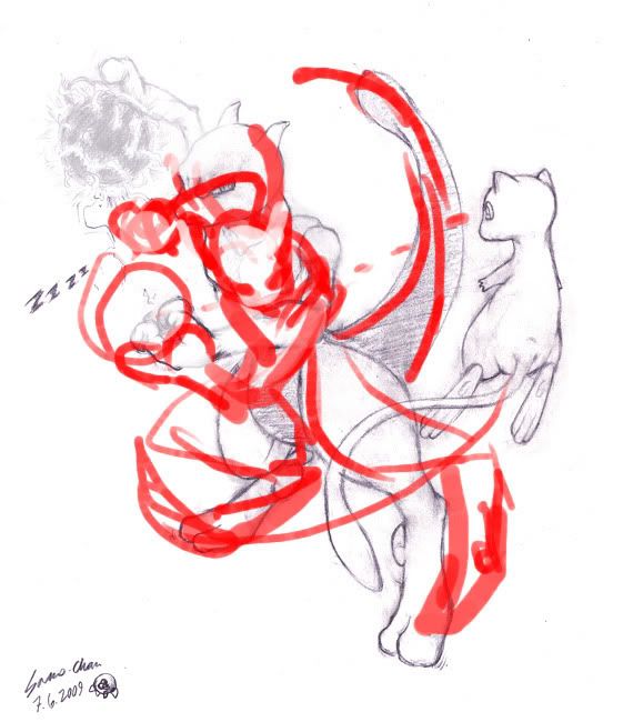
Hey man! This's a REALLY cool drawing. The lines came out great. No major mistakes, really. My only crits would be toward the 'feeling' or focus of the drawing.

I drew over it just a tad.

Like, for a more climactic feel, and more interaction, I noticed mew's eye was looking toward mewtwo's left hand, so i thought, instead of that make him look toward the beam, like oh **** he's gonna blast me. It's mostly mewtwo's upper body, it looks more like a pinup rather than him trying to get mew. So i aimed him downward, to give him a more evil-hadou appearance. Your legs are fine, but in the case of his upper body the only real changed i'd recommend would be to adjust his right leg more, his left could be either way now that i see it. Mew's tail is a minor nitpick. Just having the overall composition resemble a circular shape. Other than that nice work.
 

Samochan

Smash Master
Joined
Jun 2, 2006
Messages
3,450
Location
I'm in your house, dsmashing your tv
I drew over it just a tad. *insert image here*
Like, for a more climactic feel, and more interaction, I noticed mew's eye was looking toward mewtwo's left hand, so i thought, instead of that make him look toward the beam, like oh **** he's gonna blast me. It's mostly mewtwo's upper body, it looks more like a pinup rather than him trying to get mew. So i aimed him downward, to give him a more evil-hadou appearance. Your legs are fine, but in the case of his upper body the only real changed i'd recommend would be to adjust his right leg more, his left could be either way now that i see it. Mew's tail is a minor nitpick. Just having the overall composition resemble a circular shape. Other than that nice work.
I do agree wholeheartedly with you, but I must confess I didn't aim for this pose nor the one you showed, it was more airborne match as both can levitate and mewtwo's lower body pose was totally different plus I couldn't fanthom where to put his left arm. The perspective of his right leg and all was off and couldn't really draw it, so I changed it to the better, but the upper body stayed as it was cause I was happy with it. So I didn't really want to change the whole image.

I don't wanna portray mewtwo as evil, because he really isn't but more like mislead character that doesn't know any better (if we stick to anime that is). He's atm more about "you annoying little twerp, gtfo" and mew's like "okay, make me *giggle*" rather than killkillkill, so mew's not too worried. =). I also place the blame of the pose of his head and upper body onto a reference image, which coincidentally has him just about to throw a shadowball on mew's face. :p
 

Sinz

The only true DR vet.
Premium
Joined
Aug 31, 2005
Messages
8,189
It reminds me of Okami. Very cool.

What do you think of these? Not too bad, but not my best, really...


The size is just too much for me. I recommend a smaller size, such as 350 by like 125. You have good text in the second one. While, the first one just doesn't feel right. Also, I think that coloring on the second one is better, but you should have lightened the C4d use a little bit.
 

Urb

Smash Journeyman
Joined
Nov 29, 2007
Messages
211
Location
Right...behind you...
I know, but the fist post seems to allow this. And why not? A small thread means quick feedback. That logic works somehow...trust me.
 

Lythium

underachiever
BRoomer
Joined
Mar 6, 2009
Messages
17,012
Location
Halifax, Nova Scotia
Samochan, thanks for the critique. :)

I love your Mewtwo. It has great lines. And I love the ball of energy. Beautiful. My only critique is that the upper arm looks a little skewed, though that may just be my ignorance of Mewtwo's physiology.

I look forward to seeing more of your work.
 

Samochan

Smash Master
Joined
Jun 2, 2006
Messages
3,450
Location
I'm in your house, dsmashing your tv
Samochan, thanks for the critique. :)

I love your Mewtwo. It has great lines. And I love the ball of energy. Beautiful. My only critique is that the upper arm looks a little skewed, though that may just be my ignorance of Mewtwo's physiology.

I look forward to seeing more of your work.
Thanks. :3 The perspective is kinda tough and all so I wouldn't wonder if his arm is a bit skewed, but mewtwo does have skinny arms and funky 3 digit hands, albeit the resemblance to human anatomy makes him easier to draw, so I dunno lol. :p

I might post one of my finished colored art here. :3
 

SKy Angel

Smash Apprentice
Joined
May 1, 2009
Messages
165
Location
Somewhere in Paradise. XD
Since I'm a marth fan this is based with marth, both pictures are, and my character is always being stick wit marth, or tutored by him. XD Cause I main marth. O_o

Note: This is from my Deviant art place, I might show my art here if people like it.


GeishaPRO

Smash Rookie
Joined
Jun 6, 2009
Messages
16
Location
in my own happy place
All of the artwork that has been posted here is really good. I have a few things, but they're photography, and they're not very good.

SKy Angel- I'm learning about design and I wanted to ask, were is the focal point of your first picture?
 

SKy Angel

Smash Apprentice
Joined
May 1, 2009
Messages
165
Location
Somewhere in Paradise. XD
Well, I like to let people figure that out, most of the time when it comes with anime drawings I like to express the way I see my art style sort of like Picasso does with his work, I don't look for professional work.

I just draw cause I love to see other artist's work, wither it's great, or not good.


But yeah, sorry I just don't like answering every answer that other artist like to ask me cause I see things different then other people when I draw.
 

PMKNG

Smash Ace
Joined
Jul 16, 2008
Messages
534
Location
Miami, Florida
NNID
GalickGon
Zook: I like the concept, and what you actually did. As for the photography, Well the third picture is out of focus, and like most designs of any kind, its best to stay away from centering. And with this type of work, it'd be best to get a BIT closer, cause the texture of the bark plays a big role in the photography of it.

Sky: For the first drawing, I know what you wanted to do with the lens flare, but try not to use them at all. If you want something to shine like that, draw it yourself. Cause for me, the lens flares are distracting, and make me go in a triangle formation from the crown to the pendants.

Also for the second drawing, this is a design thing; don't overplay with text. You have a thick stroke, bevel, texture, and more texture. It also is a bit distracting. Text in general should be left alone, and mess with the kerning and leading (space between letters and each line) Let it stand strong on its own merit.
 

Lythium

underachiever
BRoomer
Joined
Mar 6, 2009
Messages
17,012
Location
Halifax, Nova Scotia
Zook, I love your piece. The only issue I have is with your photography. Work on steadying your hands. You have great natural lighting, and position. Just practice some more.

Sky, I love the emotion in your first piece. It's great. However, I hate hate hate lens flares. And they detract from your piece overall. They just seem unnecessary. I love the colour in your second piece. It's really fun. Your use of purple and green is great. But the text detracts from your piece. It just doesn't seem to fit in. Your background seems a little too busy, but I still like it. Talk about mixed messages, huh? :urg:

Good work from both of you. I look forward to seeing more of your work.
 

SKy Angel

Smash Apprentice
Joined
May 1, 2009
Messages
165
Location
Somewhere in Paradise. XD
Awesome, and thanks a lot.

That inspires me a lot, thank you Lythium, and yeah I can understand why most people dislike Lens flare, and somewhat not.

Don't worry though I tend to probably keep my style the same way, I don't tend to change to much, but as a artist I like to be wild, and explore things, but the text was just a random animation that I wanted to try like in an anime screen shot, but thank you for your words I'll keep in mind what I still do best! That's being yourself when you draw. (That's how I see it. ^_^ )
 
Top Bottom