• Welcome to Smashboards, the world's largest Super Smash Brothers community! Over 250,000 Smash Bros. fans from around the world have come to discuss these great games in over 19 million posts!

    You are currently viewing our boards as a visitor. Click here to sign up right now and start on your path in the Smash community!

Official Critique Topic

A_man13

Smash Master
Joined
Apr 6, 2008
Messages
3,535
Location
Auburn, Al
No problem. If you want, I could always share some of the stuff I know. Be it signatures or LPs, I'm always willing to help anyone get better. If one is willing to learn more, than there will always be something there to help them along the way.

EDIT: @ Neon Ness: I hoped it wouldn't come out that way. I just meant that you likely have had a lot more of the official nomenclature and classification than I do.

That is the ONLY thing I don't like about the multiple critique topics; there are a TON of boarderline stuff that could go either way. I've seen photomanips that would be more in line with an AWYP contest, but at the same time photomanips that I'd clearly call GFX. It forces a division in a comunity that, while a fundamental difference exists, has a lot more in common than I'd think.

I meant Art as in "stuff that does not belong in the GFX thread." Technically you could throw in music and writting in there and art would still be as cohesive. As you said, it's all about the aspect of creaton.
 

Neon Ness

Designated Procrastinator
Joined
Jul 10, 2008
Messages
3,631
That's an interesting point about the multiple Critique Topics, but...

A lot of people felt it was necessary because before sigs just plain dominated the CnC Thread. And the page was covered in Sig Shops, while people who made threads of their non-sig work just sorta fizzled out and died. The AE looked like the Signature Emporium. :| And it was like "if you can't make sigs you don't belong here", which probably scared some people away. So I think this setup also has its purpose. And there's people like myself and others who make sigs and other art, so it's maybe not a complete divide, but I see what you were saying.

What is your definiton of GFX? I always thought it just referred to digital graphic designs but I'm interested in hearing why GFX wouldn't belong in an AWYP.

Also this is the most scintillating discussion this thread's had in a while. :laugh:
 

A_man13

Smash Master
Joined
Apr 6, 2008
Messages
3,535
Location
Auburn, Al
That's an interesting point about the multiple Critique Topics, but...

A lot of people felt it was necessary because before sigs just plain dominated the CnC Thread. And the page was covered in Sig Shops, while people who made threads of their non-sig work just sorta fizzled out and died. The AE looked like the Signature Emporium. :| And it was like "if you can't make sigs you don't belong here", which probably scared some people away. So I think this setup also has its purpose. And there's people like myself and others who make sigs and other art, so it's maybe not a complete divide, but I see what you were saying.

What is your definiton of GFX? I always thought it just referred to digital graphic designs but I'm interested in hearing why GFX wouldn't belong in an AWYP.

Also this is the most scintillating discussion this thread's had in a while. :laugh:
I know, I like intellegent debate as long as no rants are involved.

I know that. Sigs took up all the space the AE had to offer and that deterred people from joining the community. While there is that gray area, the difference between a signature that abuses C4Ds and stock images like no Tomorrow (read as "My signatures") and something hand drawn and everything is made from scratch is black and white. Maybe LPs like Daft Punk's should just be allowed to post where they wish. Besides, who posts on the sig CnC topic anymore?

It's hard to get a good definition of GFX. My definition has usually been "Any image that was created using various resources such as C4Ds, renders, stocks, etc.," in the actual image, but then you get signatures that are completely made from scratch that would not fall under that category. It's hard to exactly get a good definition (see what I mean by gray area yet :D) because there is no clear cut definition at least in my mind. The scratching piece has already been touched on, but there are plenty of other divisions that have about 5,000 exceptions (GFX is computer based, Non-GFX is all drawing, painting, and sculpting, etc.). Alright, sure there might be Signatures and paintings that are clearly one from another, but when you get a 3D digitally rendered lightsaber with all custom made textures and completely made from scratch, would that fall under the GFX category, the non-gfx category, or some third category all together?
 

Neon Ness

Designated Procrastinator
Joined
Jul 10, 2008
Messages
3,631
I still try to post in the sig CnC thread when I can, but I haven't posted anything of my own in a while. Hrrmmmmm. But yeah, there are (were?) a few regulars.

That's a good definition of GFX. Because even though the medium would probably be classified as digital, GFX is like a subcategory, like its own practice within that medium, which involves taking other renders and adding abstract effects to create a composition. It's definitely a style that a lot of people incorporate in some way.

So I would say something like the lightsaber wouldn't match that GFX definiton since you made it yourself from scratch. It's kind of funny to think about, how it involves using other premade images most of the time. I wonder how that began/why it became popular.
 

A_man13

Smash Master
Joined
Apr 6, 2008
Messages
3,535
Location
Auburn, Al
I still try to post in the sig CnC thread when I can, but I haven't posted anything of my own in a while. Hrrmmmmm. But yeah, there are (were?) a few regulars.

That's a good definition of GFX. Because even though the medium would probably be classified as digital, GFX is like a subcategory, like its own practice within that medium, which involves taking other renders and adding abstract effects to create a composition. It's definitely a style that a lot of people incorporate in some way.

So I would say something like the lightsaber wouldn't match that GFX definiton since you made it yourself from scratch. It's kind of funny to think about, how it involves using other premade images most of the time. I wonder how that began/why it became popular.
I posted my last sig ages ago back when it was merged. There is only one sig I considered posting there since my last and that would be...


But, then again, I posted a tutorial on it. Ultimately I've kind of gotten to the point where I can see most of the flaws the second I hit adjustment layers but I have no idea how in the world I can fix em. I know CnC is helpful and all, but more often than not I don't like getting positive or negative feedback. I can dole it pretty well, though.

That's what I think, but abstract signatures (the king of GFX) still would fall under art, then. That's the main flaw I can think of. But that's the closest as I can come up with; most signatures work that way. We find an image, we find some effect images, and we combine them along with PS brushes (another resource), filters (another resource), and then fonts (another resource). Even that signature up there uses a stock image as the base. OK, sure I distorted it, but still.

Y'know, that lightsaber really exists. It was a Guild Inn DSOTW a while back. My lightsaber a few posts up was an entry and, well, it lost to that big time. Guild Inn is our signature makers on drugs and winning anything there is hard. I have placed 2nd before, but it was on a "make a pattern" topic...
 

MLEsis

Smash Journeyman
Joined
Feb 10, 2010
Messages
241
Location
NC; get at me.
i made this for a tournament i hosted called Jungle Beatdown.
made from a cardboard box, i just painted some smash characters and cut out face holes.
first time making something like this; im planning on doing a new one for every tournament.


if youre wondering what Zero_Gamer is holding--he's munching on some pizza.
 

global-wolf

Smash Champion
Joined
Jan 17, 2010
Messages
2,215
Location
Northern Virginia
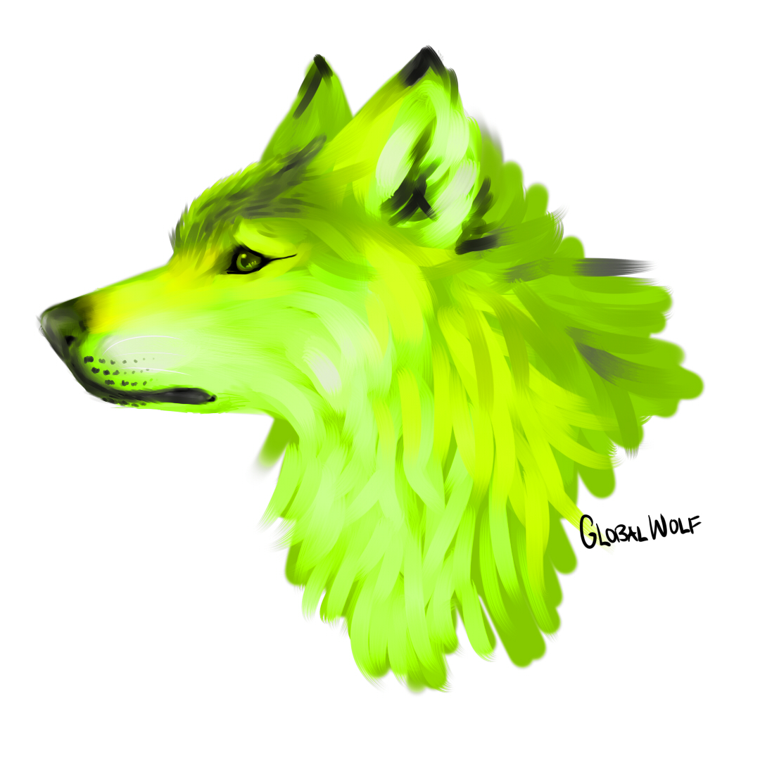
My avatar :D

I painted it a couple months ago in a test prep class where we don't learn anything, took 2 hours, no reference photo.
It was going to be a wolf, but the muzzle turned out too blocky so it's a wolfdog now.


Critique please?
 

Neon Ness

Designated Procrastinator
Joined
Jul 10, 2008
Messages
3,631
Lol that's awesome. I'm a fan of the painterly style and radioactive colors.

How long did it take? I'm guessing it was more of a speedpainting sort of thing if you had time to make it in class. I wish I could speedpaint, but I usually get caught up in small details for weeks or months at a time...
 

Pikaville

Pikaville returns 10 years later.
Joined
Feb 16, 2006
Messages
10,897
Location
Kinsale, Ireland
Hey guys!

This is my 1st time posting any work I've done but here it goes!


I created it using Paint.net and used trial and tribulation to get the look I wanted.(I used a basic creating planet tutorial and did the rest myself)

I love the look of the smaller planet,but there is something about the large one that's not perfect yet.

Any and all suggestions are welcome.

Also Global Wolf I LOVE the way you used the strokes in that painting.That is truly immense.
 

Neon Ness

Designated Procrastinator
Joined
Jul 10, 2008
Messages
3,631
That motion blur on the smaller planet is niiiice.

There's a few things about the big planet. I'm not completely convinced by the surface texture, it looks low resolution or fuzzy or something. It's not sharp enough. It'd be cool if you had really dramatic lighting from the impact. Right now the lighting isn't much more than a red circle, and half the planet is dark/light. I think the big planet should be mostly dark, and then brighter orange/yellowish light radiating close from the impact radius. Add some cracks and flying debris/rocks and it'll look really cool. It's pretty close to being complete, there's just some minor stuff that could be done.

If the background was darker it would emphasize the brightness of the impact more, so that could also be something to try out.

What exactly is Paint.net? A 3D modeling program?
 

Pikaville

Pikaville returns 10 years later.
Joined
Feb 16, 2006
Messages
10,897
Location
Kinsale, Ireland
Thanks for the input Neon Ness!

Paint.net is essentially Adobe Illustrator with loads of user created plugins you can download.#

Its really good.

I might spend another few hours working on that to get it PERFECT!

There are a few techniques I'm still getting to grips with.
 

Neon Ness

Designated Procrastinator
Joined
Jul 10, 2008
Messages
3,631
Lol wow. That's insanely good for being a 2D image based program. My hat's off to you.
 

PsychoIncarnate

The Eternal Will of the Swarm
Joined
Jul 4, 2007
Messages
50,641
Location
Char
NNID
PsychoIncarnate
3DS FC
4554-0155-5885
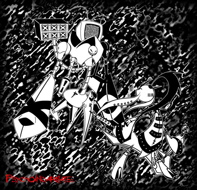
Just a little thing I threw together,

A character "Mel" fighting one of the many "Robots"


Daft_Punk

Smash Rookie
Joined
Mar 16, 2010
Messages
10
Location
Aurora CO
I just want a critique, and please refrain from one line comments, they don't help me much thank you :3


I made this for a person, and My signature is Hevil93, a name I commonly use everywhere: Youtube/Yahoo. If you don't believe me, then w/e
 

em0cand3h

Smash Rookie
Joined
Feb 6, 2010
Messages
5
Location
South Flo.
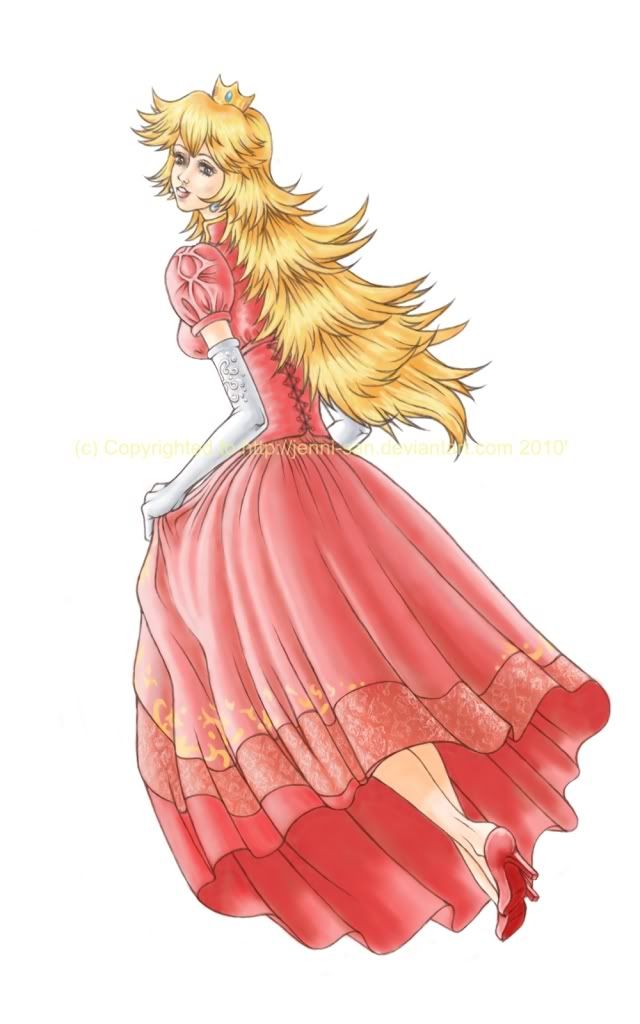
Hi, this is the first time I'll post an artwork I've recently finished of my favorite melee character. ^^; Critiques would be nice; I have no idea what to put for a background or if I should leave it that way. I was wondering if I should put some weights inside the bottom of her dress, but I think I'll add that for another piece. lol I hope people get that joke. e.e;; It's a pretty big picture, btw. Sorry for the copyright. Gotta have that on. >> I also don't know how to disable signatures even though I don't think I have one. >.<;


Neon Ness

Designated Procrastinator
Joined
Jul 10, 2008
Messages
3,631
The biggest thing for me is the details.

I don't think I've ever seen anyone draw out all the little details in her dress and glove so... completely. That turned out really well. I can't imagine how long it took to do those and include all of the folds. Incidentally I'm trying to get better at that myself, adding folds/dimension to fabric. Great linework and overall stylization. I guess you could do a background but it's already great without one. Was this hand drawn?

Really good work.
 

em0cand3h

Smash Rookie
Joined
Feb 6, 2010
Messages
5
Location
South Flo.
Thank you! :) It was all drawn on the computer, actually. It's too complicated for me to draw traditional and move it to digital. x-x;
 

hazelnice

Smash Rookie
Joined
May 13, 2010
Messages
4
I already gave you some critiques in VMs, Moon. I look forward to seeing your changes.

When I'm out of school and hardly working, I get restless. I need busy work. Here's one of the things I've been doing:


Painted on my friend's back with Mehron water-based body paint and MAC Fluidline. It's a recreation of a Degas. Critique please!

Well, I like this..I like everything...
 

Tacel

Smash Lord
Joined
May 10, 2009
Messages
1,616
Location
PA

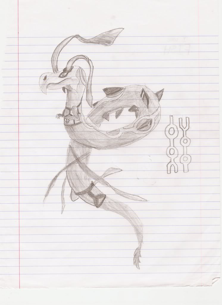
I drew a picture of the legendary bird, Lugia, sleeping while protecting his/her precious egg.
This was done with pencil and colored pencils.

Could you critique this, please.
Thanks in advance. :)
 

Neon Ness

Designated Procrastinator
Joined
Jul 10, 2008
Messages
3,631
Well, I think you chose an interesting subject matter. Taking the 'parent protecting the young' scenario and using Pokemon is kind of funny/interesting.

The coloring is decent but it's really basic. The pencil marks are all over the place. It would look neater if there was some direction there. Like if all of the pencil marks for the nest were going clockwise, then it would create a visual direction. And it's really difficult to create smooth visuals with colored pencils, so think about whether or not you really want to use those/the brand or quality of pencils.

Did you have a picture of Lugia to draw from? The anatomy doesn't make sense in some places. Like I don't get how the legs are supposed to be situated; I'm also pretty sure Lugia's arms are waaay longer than that. It would help a lot if you knew what pose you wanted to draw, and then found a picture of an animal in a similar pose and used that to work from. I also think it'd look more peaceful if Lugia's eyes were closed like it was asleep.

It's a good concept but it'll take some technical prowess for it to be fully realized. Keep working and reposting, I'd be happy to help you work on this. :O

Also don't forget to comment on someone else's work before asking advice.
 

Charmander

Smash Champion
Joined
Jan 4, 2010
Messages
2,015
Location
The Middle Pokeball
NNID
JoeThorpedo
I really like the pic TAL.
However, It would look a little better if lugia were in a different pose, one that looks a bit more like its Guarding the egg rather than cuddling it.
also, Lugias eye is missing a pupil ;)

The egg however is really good, A really good design for a lugia egg :)

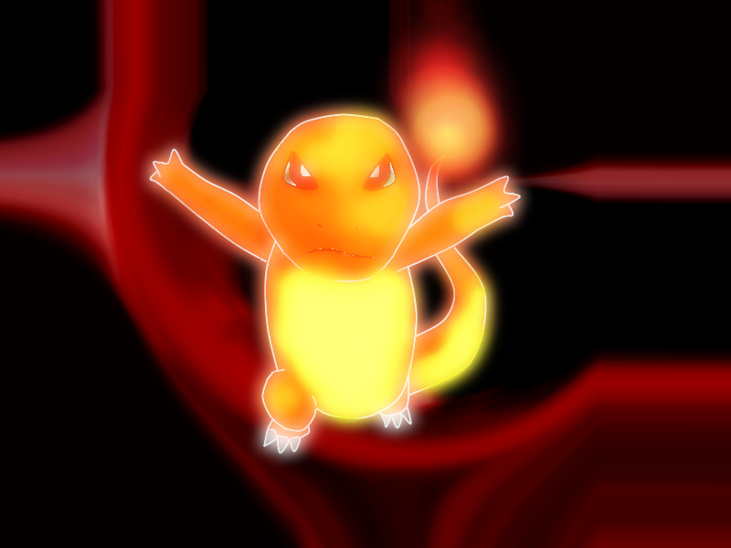
anyway, I want some critique of my own

made ENTIRELY from scratch on paint.net
 

Purple

Hi guys!
Joined
Mar 26, 2009
Messages
10,383
Location
Duluth, Georgia
First I would like to compliment you for finishing your product entirely. You did a very good job :). Not many people actually finish their work when they begin working on it, because they don't like how it works. So the fact you finished is a very good thing. Plus, it makes it easier for people to critique your work.

Now this is just my opinion, so you can take it with a grain of salt.

  • First, i'm not sure what the charmander is doing, i'm assuming due to how it's arms are, that he's trying to lunge, or dash towards the viewer.
  • If that is the case, then his head should be pushed lower, so that it looks like he's overlapping the body.
  • He could also be bending one knee, which is logical as well.
  • If that is the case, I don't feel that his right knee is proportional to his body, and should be a bit larger.
  • The light sources seem to be jumbled, if you look at his head, you would think the light source came from the right, while looking at his left knee, you would think the light source came from the left.

I hope this helps you :)


Also, I have a picture of my own I would like to show you all, I drew it because I felt bad using someone else's picture as my avvie, so I decided to use my own as a signature. :D

[collapse=Princess Peach!]


Honestly, i'm not sure where those random white blobs in the outline come from, because they aren't in the .psd file[/collapse]


I'm also showcasing a simple signature I made for a friend from Alabama. It's way too simple to me, and I wish I knew more about Photoshop to make cooler signatures for my friends. Help? :(


Neon Ness

Designated Procrastinator
Joined
Jul 10, 2008
Messages
3,631
@ charmander1065: There's some pretty decent stuff here. You got a nice pose, some nice color interaction with red/orange/yellows on Charmander, and some preliminary lighting going on. I can tell you put effort into it.

There's a lot of empty space and the background doesn't do much. Try to plan out what the picture will look like beforehand to avoid these giant empty areas. If you wanted it to look like it's rushing forward you could motion blur the background a little, but as is it looks like it's just randomly floating. I agree with Roxy's notes on anatomy/lighting, but that'll take some time to get right. Keep working at it.

@ Roxy: Well, Peach's eyes look really nice there. The soft blur or whatever technique you used turned out well. But those huge thick black lines look out of place next to everything else in the picture. If it's supposed to be eyeliner I think it can be toned down a little.

Her left ear looks too far away from her left eye, like that part of her face was streeeetched back. I dunno, it seems... off. The earring's nice, I think you captured a glossy looking material well. What are those red marks on her face? If I had to guess it looks like low opacity circle brush > motion blur... If you wanted to create a look of blushing, I think there's a more effective way. Maybe something like low opacity (8-15%?) soft circle brush to create barely visible reddish areas over her face. Try to use a reference image of someone blushing, even, so it looks accurate. But the diagonal streaks look odd.

I think the anatomy is overall well done here, and the light colors look nice. I just would like more consistent shading/lighting, some places you started to add some like the hair while other places are flat, like her ear. Looks pretty good, though. :D

Also, if you're going to try to get into sigs, definitely look at this thread: http://www.smashboards.com/showthread.php?t=175790 Some really good stuff here, should help you get some ideas running.

The Pikachu tag is sort of plain. Using a low opacity double of your main image is normally not a great technique. :( It doesn't add much. The border is sort of thick and distracting. Think about why you'd want to add a border and if it's necessary. The "cam" font is good, I think the text could be arranged differently, though. Typography is a complicated aspect in and of itself. The colors are really good, though, probably my favorite thing about this.
 

Purple

Hi guys!
Joined
Mar 26, 2009
Messages
10,383
Location
Duluth, Georgia
Aah, so much critique for something so little (the signature I mean).

I highly agree about the blush, It realy doesnn't look realistic at all, in fact, i'll probably go back and re-edit it (i won't repost it to not waste space, but I'l at least be able to look back at it better).

Also you're entirely right about the shading. I got way too lazy and overlooked it :(
 

Neon Ness

Designated Procrastinator
Joined
Jul 10, 2008
Messages
3,631
I don't think a repost would be a waste of space, really. That's what this thread's here for after all, step by step improvement.

And maaan you reminded me of this Peach painting I really need to finish. I've been working on it for like a year and a half. Not that you could tell by looking at it rofl, it still needs a lot of work.
 

ZIO

( ͡° ͜ʖ ͡°)
Joined
Sep 14, 2006
Messages
10,884
Location
FREEDOM
I would critique a piece, but, like, I'm bad at it, and there's just so much nitpicking I do to someone who may or may not have had the training I have had. I judge everything based off myself, and that doesn't really help you, nor me. so i just sit back and watch.

Unfortunately. :laugh:
 

Purple

Hi guys!
Joined
Mar 26, 2009
Messages
10,383
Location
Duluth, Georgia
oh come on zio, help us :D

it's a slow proceed to say the least, I edited the ear and her blush.
[collapse=Peach 2]
[/collapse]
 

Neon Ness

Designated Procrastinator
Joined
Jul 10, 2008
Messages
3,631
Yep, that definitely was a step forward. Only thing I can suggest now is shade shade shade until it's finished. :D If you wanted to keep working on it.

Also one other thing, it might be useful to find a picture reference of a woman's nose/ear to look at while shading and lighting. Sounds weird... but could be helpful.
 

uhmuzing

human-alien-cig
Writing Team
Joined
May 6, 2009
Messages
2,106
Location
Austin, TX
I'm extremely new to using Photoshop, but yeah, I've had a few beginner's lessons, and I watched a couple of tutorials, and after some time, this is what I came up with. =D


Thanks for any critique or advice.
 

Neon Ness

Designated Procrastinator
Joined
Jul 10, 2008
Messages
3,631
@ dragonblooded: Well since you're first starting out the main thing I'd recommend is to just try out as many different tools in Photoshop as possible. At least, that's what I did. :p People learn differently I guess, some use tutorials, some are better experimenting on their own.

I think Yoshi's been cut out pretty well, there's still some white stuff around the edges though. I see some depth here and there, certain areas of the sparkles have been blurred more than others. The background is sort of plain, I had the same problem when I was first starting out too. Mainly you just grow out of it with experience. I'm also wondering why that purple color as opposed to something closer to green (or red if you want the complement).

It's fine as a quick experimental sort of thing. :D If it's something you're serious about, I think planning out what you want the end result to look like helps tremendously. Is it a sig? Or something else entirely? What sort of colors do you want to use? What do you want the audience to focus on? What sort of feel do you want it to have--retro, sophisticated, urban, etc.? Having a checklist or something like this helps in making exactly what you want. It's also fine to just start making stuff without planning, but it becomes easier once you know all the stuff Photoshop is capable of doing (which in my opinion is pretty much anything).

@ stabby: o.o Well, that's pretty darn close. I mean really close. There's nitpicky stuff like the width of the cords in the upper left, and the hand holding the gun isn't at the exact same angle as in the original, but for what you're going for that's insanely good. Once you add colors it's going to be a pretty good replica I'd imagine.
 

WB40

Smash Apprentice
Joined
May 28, 2010
Messages
78
Location
A world of my own
First I would like to compliment you for finishing your product entirely. You did a very good job :). Not many people actually finish their work when they begin working on it, because they don't like how it works. So the fact you finished is a very good thing. Plus, it makes it easier for people to critique your work.

Now this is just my opinion, so you can take it with a grain of salt.

  • First, i'm not sure what the charmander is doing, i'm assuming due to how it's arms are, that he's trying to lunge, or dash towards the viewer.
  • If that is the case, then his head should be pushed lower, so that it looks like he's overlapping the body.
  • He could also be bending one knee, which is logical as well.
  • If that is the case, I don't feel that his right knee is proportional to his body, and should be a bit larger.
  • The light sources seem to be jumbled, if you look at his head, you would think the light source came from the right, while looking at his left knee, you would think the light source came from the left.

I hope this helps you :)


Also, I have a picture of my own I would like to show you all, I drew it because I felt bad using someone else's picture as my avvie, so I decided to use my own as a signature. :D

[collapse=Princess Peach!]


Honestly, i'm not sure where those random white blobs in the outline come from, because they aren't in the .psd file[/collapse]


I'm also showcasing a simple signature I made for a friend from Alabama. It's way too simple to me, and I wish I knew more about Photoshop to make cooler signatures for my friends. Help? :(

That is very good. A bit on the big side, though, I would say. But that's me mainly doing abstract art. The Pikachu one was much better, and I say the right size for a siggy.

Here, I have two of my own art.

When Opposites Attack


Ville Valo


Cnc please.
 

Black Waltz

Smash Champion
Joined
Jan 27, 2007
Messages
2,243
Question: are we allowed to post videography here? I'm playing with After Effects and would like critique later on.

And for guy above me: your canvas size is tiny and you tried to shove as much crap as you could in there. It looks really bad. There's no real structure or composition, just random rectangles with fill. Try putting effort into something next time.
 

Neon Ness

Designated Procrastinator
Joined
Jul 10, 2008
Messages
3,631
Question: are we allowed to post videography here? I'm playing with After Effects and would like critique later on.
I don't see why not. Come to think of it, not many people post animation/video work in here.

I really wish the Adobe CS4 package I bought included AfterEffects instead of Soundbooth. =/
 

Marthmaster92

Smash Champion
Joined
Jun 29, 2006
Messages
2,564
Location
Stuck between a parallel dimension of code and you
Try putting effort into something next time.
Yo man, that's pretty harsh. I understand that critiquing can be harsh/hard sometimes, but that's a bit too brutal. Telling somebody they put no effort into it is pretty cold.


How about saying something like "It looks rushed, maybe slow down and take your time on the next one?" Instead of saying "You didn't even try or put effort into it, it's half-*****."


Just sayin' man. Not trying to start a war here, but just a little bit of tactfulness would be appreciated, i'm sure.


Peace. :)
 
Top Bottom