• Welcome to Smashboards, the world's largest Super Smash Brothers community! Over 250,000 Smash Bros. fans from around the world have come to discuss these great games in over 19 million posts!

    You are currently viewing our boards as a visitor. Click here to sign up right now and start on your path in the Smash community!

Official Critique Topic

Neon Ness

Designated Procrastinator
Joined
Jul 10, 2008
Messages
3,631
Anything Geno related automatically gets my seal of approval.

@ Roxy DPC: That looks pretty cool man. Your shading/lighting has def improved from last time. The diamond on the forehead and hair are well done. The background is pretty nice too, it's better where it's more subtle. I think the border is unnecessary... or at least make it smaller.

Everyone has their own style preferences, but I would just work on making lighting/shading stand out a lot more. A fire, especially one that close, is a really bright light source, which means the shadows on her left side should be darker and create a higher contrast--brighter highlights, deeper shadows basically. Her left arm should be pretty dark since it's behind her torso (which should cast a shadow on it). That's the only big thing I would say consider for next time, overall the highlights/shadows are pretty understated. Overall though it's a nice composition, and I like the colors and everything.
 

Master Ppv

Smash Journeyman
Joined
Dec 2, 2007
Messages
271
Location
Springfield, Illinois
I really like the first photo, Ppv! The colors are really nice and the flower looks really soft. I don't know much about design, but they're pretty cool :D
Thank you very much! :) It's old stuff so I'm glad you like it!

I have a lot of photography that I would love people to take a look at.....Its all on my facebook but obviously not everyone can see that so Iv been slowly adding it to a deviantart account
http://t-rav88.deviantart.com/

Choose any that you want to talk about, granted some of this stuff wasnt really meant to be "artsy fartsy"
The older shots from the concert, etc. aren't that great to be honest, but one or two of them are all right. The newer stuff is much better, although some of the "fashion" portraits look a little more like emotive or expressive portraits. Still good, just miscategorized in my opinion. The black-and-white one is one of the best, and that one actually seems more like a fashion portrait. Very good job there. Keep it up and keep practicing! ;)


That said...

@ Ppv: First photo we've had in a long time. The depth looks really nice. It would be better I think if the flower was fully in focus though, left side's kind of blurry. Nice capture, I like the colors there.

To be frank I dunno how well those would work as T shirts. Your design bleeds off outside of the border, and it looks like the main points of focus are not in the center. Seems like a better T-shirt design would have the 2 characters near the center with the words across the chest. The smudging is pretty random looking, I think if they were smudged outwards from the center in a radial fashion it'd look more dynamic. Version 1 has better colors to me. I think you should get rid of the purple box around Insomniac games, let the words sit on their own. And I'm guessing bhatt0507 wouldn't be on the shirt but is more like a watermark/proof of ownership kind of thing? Dude on the right is low quality so I'd scrap him or find a better image. But if this is old stuff then I guess you've improved since, eh. :p
Thank you! I was just getting into photography then so I wasn't exactly great, and only using a point-and-shoot I had to leave focusing to the camera. What I really tried to capture with that shot was the lighting, which I thought looked nice when I was taking it... :p

The designs are some of my oldest stuff... the 'bhatt0507' bit is his profile name / username so that's why it was on there. My monitor was (and still is) a little too dark, so I didn't actually notice the purple around the Insomniac logo until I highlighted it in my web browser. Without that, all my monitor shows is black around the words, so I thought I was OK :ohwell:

I can understand most of the other stuff now, as again this was one of the earliest things I did. My friend liked it, so at least the customer satisfaction was good :p The enemy on the right was a last-minute addition, and I definitely didn't put in as much effort there as I should have. Thank you for the critique and advice! :)

@Master Ppv

The shirts are cool, but I feel like there's too many things competing for my eyes' attention. I want to look at Resistance, but then I look at the... zombie man in front. The text also kind of pops out, and then Insomniac is there too. So essentially everything pops out XD

You should either make some of these elements more subtle, or remove them entirely. If you may allow some jargon, there isnt much flow or composition to the piece, even though the elements themselves are good.

@All

I made a banner for a new Smash clan's forum. CnC please.

Thanks for the advice! I'm a little better now, so I've realized not to make some of these mistakes. Thanks for the help; hope I can keep improving! :)

Master PPv-

Nice shot....if you were able to re shoot that again I would deff recommend trying to get a macro style lens or maybe something with a stronger depth of field.

Though you said you took it a long time ago so that probably cant happen....lol
Haha, I had a point-and-shoot on macro mode for this; aside from composition there wasn't much I could do. Focusing, depth of field, etc. were all out of my control. Now that I have a DSLR and have more control I've been experimenting and getting better. I've put a slightly newer shot below; so you can judge for yourself.

Oh look. A photographer!

:D

Do you know anything about the Nikon D3000? I been hearing bad things about it lately, and I'm a little down. I spent $550 on a new one at Best buy. I sorta got hasty. I saw good reviews for it, but several people are bashing it. I want to feel better about myself.
Don't worry about them... The D3000 is what I have now and I love it! It's not the tool that takes the pictures - it's the photographer. As long as you've got a good eye and know what you're doing, you can take amazing pictures with just about any camera. My point-and-shoot was doing all the focusing for me before; now that I know what I'm doing with the focus when using the D3000, I can produce (in my opinion) better pictures than I did before. As for how the D3000 can perform in practice, I've posted some of my stuff from it below, so see for yourself what it can do ;)

Most of my 3d stuffs are going towards
I'm jealous... These are great! I can't wait to see how that image looks once it's been fully animated! The Sakurai and Geno models are brilliant, even if the Sakurai one isn't finished yet. You're doing really well; keep it up! :)

ALL RIGHT...

Now here's some of my newer stuff!

This one was on my point-and-shoot, like the other one I posted. Not much else to say about this that it doesn't say for itself.


AND NOW... THE D3000!!!

This one was from the first time I went outside with my then-new Nikon D3000. I'd been experimenting inside a bit and learning how to use it, and decided to go out and try it out. Aside from very small brightness and saturation adjustments, this is pretty much out-of-the-camera. Please do keep in mind this is still pretty old, as it was taken in November or December 2009 ;)


Around this time, I started providing my school's website with pictures from sports games, school events, etc. This one is from the first basketball game I shot with the D3000 - around the middle of January 2010.


ZIO

( ͡° ͜ʖ ͡°)
Joined
Sep 14, 2006
Messages
10,884
Location
FREEDOM
I suppose I'll post a few photos.


This one was patched up a little with CS5 and editing the RAW (NEF) files.


ZIO

( ͡° ͜ʖ ͡°)
Joined
Sep 14, 2006
Messages
10,884
Location
FREEDOM
It's funny how you say "I (hopefully) will . . ." and then I see your signature.

Is that a sign?
 

Neon Ness

Designated Procrastinator
Joined
Jul 10, 2008
Messages
3,631
Whoa whoa whoa, I know SWF is acting up but try not to quintuple post.

Use the edit button if you wanted to change your post.
 

Master Ppv

Smash Journeyman
Joined
Dec 2, 2007
Messages
271
Location
Springfield, Illinois
Whoa whoa whoa, I know SWF is acting up but try not to quintuple post.

Use the edit button if you wanted to change your post.


He's right... Quintuple-posting usually isn't much appreciated :p The green screen stuff was all right, but you do need some kind of flow to that video... It just skips from one thing to the next, and the guy playing the guitar at night takes up a disproportionate amount of time. Keep improving; you'll get there... ;)


Oh and if anyone could critique the shots at the bottom of my previous post, that would be nice... :)
http://www.smashboards.com/showpost.php?p=10672733&postcount=242


I suppose I'll post a few photos.


This one was patched up a little with CS5 and editing the RAW (NEF) files.


This coming from the person who wanted to know whether getting a D3000 was a good choice? Hmmmmmm...... :p
 
Joined
Aug 6, 2008
Messages
19,345


So yeah... A few hours ago I started messing around with a few circles adding in little faces with some quotes with it. Eventually, I moved up into using ovals for bodies, then I moved up to the image on the right by adding in a few props like an arm, sword and little sparkly thingies.

After feeling a bit more confident I tried actually making a whole body. Suffice to say, I am not quiet happy with how the they both turned out. However, considering I have never done anything like this before in my life (I'm not very creative you see...), I feel it's at least an accomplishment and a start to getting better.

Anyway, the things I am not really satisfied with on the image on the right for the most part is the shadow. It ended up facing the wrong way >_< And perhaps the detail should have gotten more detail.

The image on the left I am not really happy with the body porportions. Particularly in the face. I added in the little blush marks things because once I had already started half way through I noticed the distance from the eyes to the mouth was weird no matter how I looked at it. I think by adding that, it makes it less awkward looking. So, to top it off I guess I added in some tears and wings to try to add an innoence kind of look to it.

And all of this was accomplished using Microsofts default paint program on windows 7. So, sorry for it not being as polished as some other artwork I have seen in this thread thus far. Good work people.
 

Neon Ness

Designated Procrastinator
Joined
Jul 10, 2008
Messages
3,631
Well yeah, that's not bad I guess for just messing around in Paint. How did the shadow end up facing the wrong way? Lol.

It looks like you're getting the hang of basic shapes/proportions and stuff. Next time try lighting/shading for finer detail, and sometimes it helps to plan things out beforehand.
 
Joined
Aug 6, 2008
Messages
19,345
"Well yeah, that's not bad I guess"
Translation: This is bad :laugh:

"How did the shadow end up facing the wrong way? Lol."
I was trying to imagine how lighting would work from that angle and sort of imagined it wrong.

It looks like you're getting the hang of basic shapes/proportions and stuff. Next time try lighting/shading for finer detail, and sometimes it helps to plan things out beforehand.
Yeah, I am working my way there. I wonder if I should actually stop working on graphics for the time being and mess around with a paper and pencil to get a better feel for things like shading, proportions, shapes, etc.
 

Neon Ness

Designated Procrastinator
Joined
Jul 10, 2008
Messages
3,631
Translation: This is bad :laugh:
Nooo that's not what I meant at all. :laugh: I really don't think it's bad.

Pencil and paper practice definitely helps though. I've always said that if you can draw with a pencil, you can draw on a computer. Practice one and it's almost like practicing the other. I would just alternate as you improve and get comfortable with graphics/pencil drawing.
 

smash superstar

Smash Ace
Joined
Jul 23, 2005
Messages
654
Location
Taylorville, IL
He's right... Quintuple-posting usually isn't much appreciated :p The green screen stuff was all right, but you do need some kind of flow to that video... It just skips from one thing to the next, and the guy playing the guitar at night takes up a disproportionate amount of time. Keep improving; you'll get there... ;)


Thanks for the opinions....I wasnt really going for "style" or "artsy" i was more going for technical with the video just to get opinion on if it seems believable. XD
 

ZIO

( ͡° ͜ʖ ͡°)
Joined
Sep 14, 2006
Messages
10,884
Location
FREEDOM
Oh and if anyone could critique the shots at the bottom of my previous post, that would be nice... :)
http://www.smashboards.com/showpost.php?p=10672733&postcount=242
I wish I could give some input, but I'm new to the photography. I'm not sure what's right or wrong. The picture of the fruit seems right, but not vibrant enough. Like, it feels like it's over run by yellow, if you can see it, even with the blue sky. And as for the sports pic, what more can be said? Increase the aperture speed, open the lens as wide as you can, and go for a 800 or 1600 for light sensitivity. For a photo like that, it's not noise or grain that matters, it's getting the action as clear as possible.

IMO
 

Master Ppv

Smash Journeyman
Joined
Dec 2, 2007
Messages
271
Location
Springfield, Illinois
I wish I could give some input, but I'm new to the photography. I'm not sure what's right or wrong. The picture of the fruit seems right, but not vibrant enough. Like, it feels like it's over run by yellow, if you can see it, even with the blue sky. And as for the sports pic, what more can be said? Increase the aperture speed, open the lens as wide as you can, and go for a 800 or 1600 for light sensitivity. For a photo like that, it's not noise or grain that matters, it's getting the action as clear as possible.

IMO
Thank you for the input! :) I can't exactly see the 'overrun by yellow' bit, but I was worried that maybe it was a bit too bright... Was this what you meant? As for sports, I do have plenty of shots where I've completely frozen the action, so this was a little switch-up - using motion blur to indicate some fast action. If you want, I can show you some action shots like you described. :)
 

ZIO

( ͡° ͜ʖ ͡°)
Joined
Sep 14, 2006
Messages
10,884
Location
FREEDOM
Well, I was going by my mind's eye. I think not enough of that photo is in focus. More berries, lolz.

And yes, please. provide us with some of those still frame photos. :)
 

Master Ppv

Smash Journeyman
Joined
Dec 2, 2007
Messages
271
Location
Springfield, Illinois
Well, I was going by my mind's eye. I think not enough of that photo is in focus. More berries, lolz.

And yes, please. provide us with some of those still frame photos. :)
Oh, you wanted to see the berries that are in the back there, I see. :laugh:

And here you are. They're track, I know, so if you want to see just basketball, let me know and I'll give you that :p


Neon Ness

Designated Procrastinator
Joined
Jul 10, 2008
Messages
3,631
I don't know a whole lot about photography but these look really professional.

You should think of making a career out of it.
 

Master Ppv

Smash Journeyman
Joined
Dec 2, 2007
Messages
271
Location
Springfield, Illinois
I don't know a whole lot about photography but these look really professional.

You should think of making a career out of it.
You flatter me... I just do stuff for my school's website whenever they need shots of a game or meet or whatever... Only recently did I do an actual shoot with a friend and his girlfriend. Thank you very much though! I'm glad you like the shots! :)

As far as a career goes... I've been thinking I could do something with it for a summer job, but my true ambition is to go into video game design :laugh: Most of my 'clients' are good friends of mine anyway, so I'd do most of my work for free anyway. I know it sounds like I'm passing up money, but I can't bring myself to actually charge my friends for something like that. Even all through sophomore year I tutored two of them through Pre-Calculus. If I had charged them even a few dollars an hour they would have owed me in the thousands. I couldn't do that :ohwell:

Anyway, sorry about getting off on that tangent there! Once again, thank you very much for your kind words! I'll try not to disappoint with my future works! :)
 

ZIO

( ͡° ͜ʖ ͡°)
Joined
Sep 14, 2006
Messages
10,884
Location
FREEDOM
Seeing those makes me want to shoot some photos like that.

It's unfortunate I'm around an environment where I could get shots like that.

I'll tell you one of my photography loves - night shots. Everythign looks better at night.

Admittedly, I'm new at this, and I don't want to be thought of as one of those hipsters. But, I was tired of the digital cameras that were a hundred dollars here, hundred dollars there, and they didn't fit the bill for every situation. So I bit my lip and bought the D3000. I'm learning composition is more important than clarity, so i try not to worry about the image clarity when it's at 100% (no one is realistically gonna see it but you at 10 megapixels) or grain because that doesn't become a nuisance until I view the image at 100%.
 

Master Ppv

Smash Journeyman
Joined
Dec 2, 2007
Messages
271
Location
Springfield, Illinois
Seeing those makes me want to shoot some photos like that.

It's unfortunate I'm around an environment where I could get shots like that.

I'll tell you one of my photography loves - night shots. Everythign looks better at night.

Admittedly, I'm new at this, and I don't want to be thought of as one of those hipsters. But, I was tired of the digital cameras that were a hundred dollars here, hundred dollars there, and they didn't fit the bill for every situation. So I bit my lip and bought the D3000. I'm learning composition is more important than clarity, so i try not to worry about the image clarity when it's at 100% (no one is realistically gonna see it but you at 10 megapixels) or grain because that doesn't become a nuisance until I view the image at 100%.
Let me be the first (or at least on here) to offer you my congratulations on learning one hell of an important lesson :p

Don't worry about not having opportunities like that where you live; I sometimes think that too but I always seem to find something to shoot. Open your eyes further and you'll see that instead of going for shots like mine or anyone else's you'll make your own mark by using the surroundings of your home, street, local area, city, etc. that are unique to you. You'll find stuff to shoot if you just look for things that look interesting, rather than trying to find something that you've seen in someone else's picture. Good luck at creating your own comfort zone and finding the things you've been missing before ;)
 

smash superstar

Smash Ace
Joined
Jul 23, 2005
Messages
654
Location
Taylorville, IL
Master ppv Good stuff....you really captured the movement well in those track shots =)


I would deff try to composite a "prettier" background into the pole vault picture if you our good enough in photoshop to do such things. =)
 

Neon Ness

Designated Procrastinator
Joined
Jul 10, 2008
Messages
3,631
Controller is easily the best part. It's drawn so well. And having worked with charcoal before I have to say the whole thing is REALLY clean, so kudos for that.

I don't really think the Zelda emblem was necessary since everything else is Mario-themed, but that's nitpicking. The contrast and aesthetic of the whole thing looks really nice.
 

Joeadok

Smash Journeyman
Joined
Aug 27, 2009
Messages
222
Location
Cape Town
Charcoal? Really? That's awesome.

Here's a animated pixel I'm blocking out to get back into spriting featuring wolf's catchphrase.


I'm unsure whether to have him just shaking his head or wagging his finger at the same time.
 

global-wolf

Smash Champion
Joined
Jan 17, 2010
Messages
2,215
Location
Northern Virginia
Wolf looks so cool :O I think it would look nice with him wagging his finger too.

Here's a picture I painted yesterday. It was a request from someone who wanted Pikachu to be doing an electric version of Ike's final smash. Took about 3 hours. It's very messy, and I don't like it too much.


Master Ppv

Smash Journeyman
Joined
Dec 2, 2007
Messages
271
Location
Springfield, Illinois
Wow, that is a great painting! Definitely showing a sense of style and artist identity, and the shading works really well. At the top, it seems like you kind of just went a little crazy, but apart from that everything else is really well done. Great work :)
 

Evil-Guy

Smash Journeyman
Joined
Mar 2, 2009
Messages
416
Location
Cats Eye Nebula Constellation: Draco
Wolf looks so cool :O I think it would look nice with him wagging his finger too.

Here's a picture I painted yesterday. It was a request from someone who wanted Pikachu to be doing an electric version of Ike's final smash. Took about 3 hours. It's very messy, and I don't like it too much.


Hi yati! :3 hehehehe

I personally think that the background doesnt work well, and the over contrast of the piece causes the whole piece to be low quality. The whole effects, are just scribbles :lick: You can do better, and the pikachu kinda just looks like its just standing there as if its posing. You might wanna try to add more action to the piece, more motion blur, less scratchy scratchy in the bg, and stuff :3.
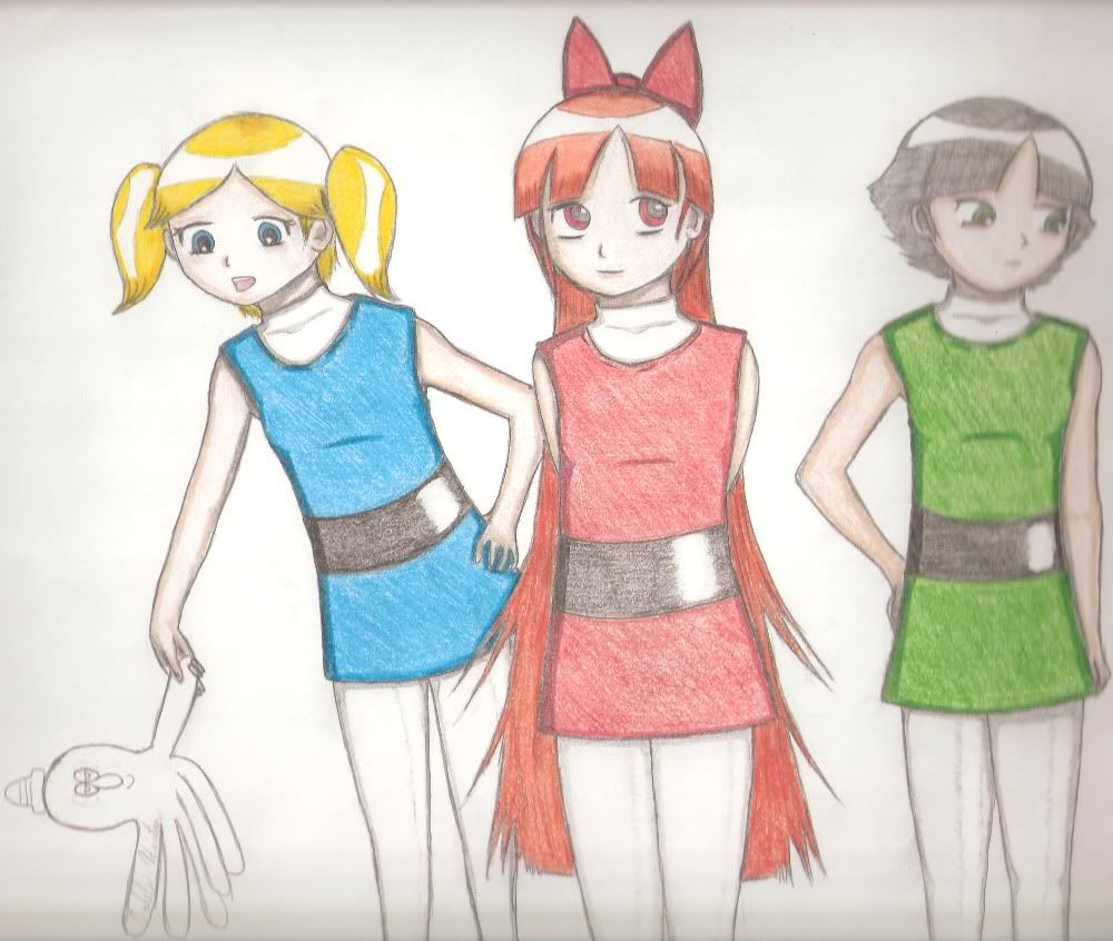
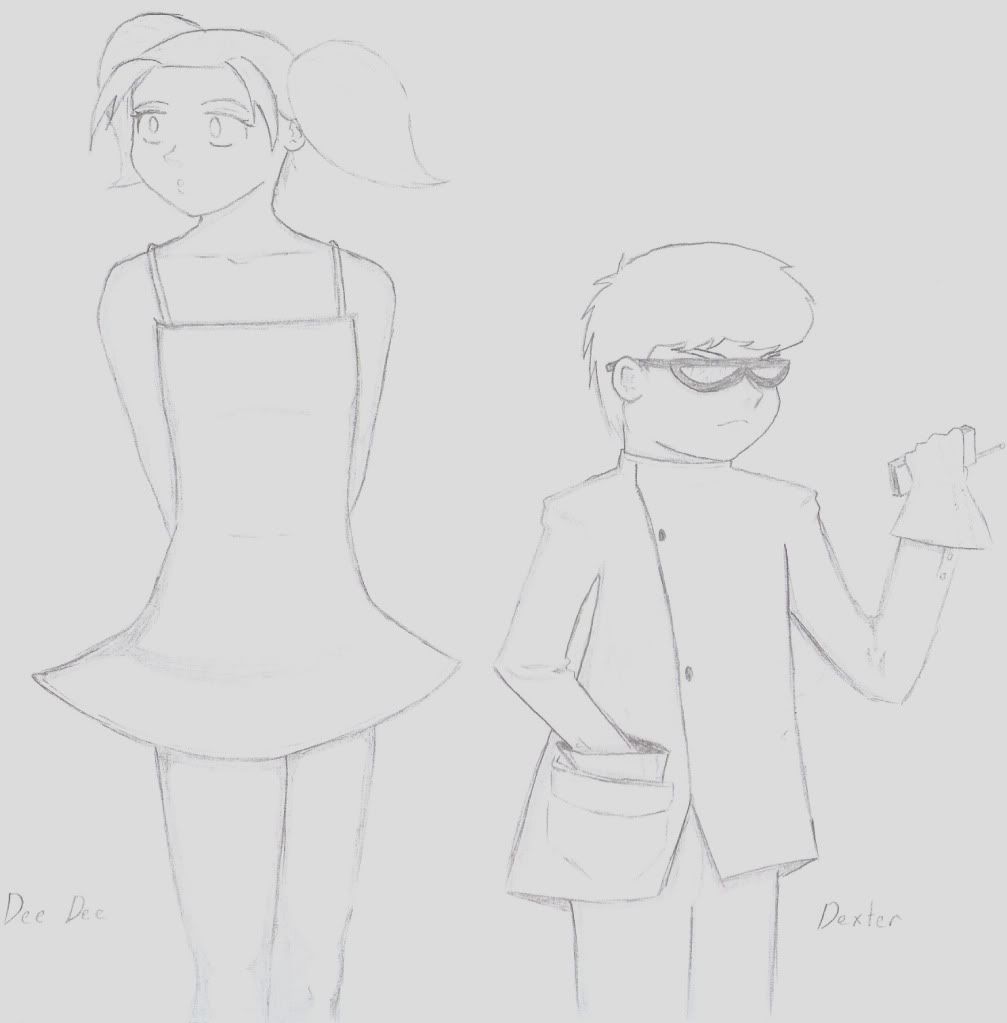
i like it good job :3
 

ZIO

( ͡° ͜ʖ ͡°)
Joined
Sep 14, 2006
Messages
10,884
Location
FREEDOM
I want to say learn some anatomy. It may seem like a staggering process, but it's easy. Learn the skeletal system, then the muscles that lay on top of them. It helps a great deal in drawing figures. That, or take a class that simply has you stare at a nude for an hour or two and you draw what you see.

Not trying to knock you're works, but that is what I see needs work.
 

global-wolf

Smash Champion
Joined
Jan 17, 2010
Messages
2,215
Location
Northern Virginia
@Zio: There is evidence of basic anatomy knowledge in the picture, and that level is enough for simple anime things. I would say to work on lighting. More shadows and highlights make pictures look much better.
 

ZIO

( ͡° ͜ʖ ͡°)
Joined
Sep 14, 2006
Messages
10,884
Location
FREEDOM
The characters feel stiff. Meaning that not enough is known. I was just trying to help.
 

saberhof

Smash Master
Joined
Jun 6, 2006
Messages
3,405
Location
Mexico-Tijuana
you need more FORM and perspective work like, certain positions and movements your character is making and size too...i know cartoons can be distorted and crazy, but they all have a line or guides you need to measure... like height, fat, skinny, nationality...you might say you have to draw within a process :p


and wow, i havent been on for a while lol hahah
 
Top Bottom