Dan_X
Smash Lord
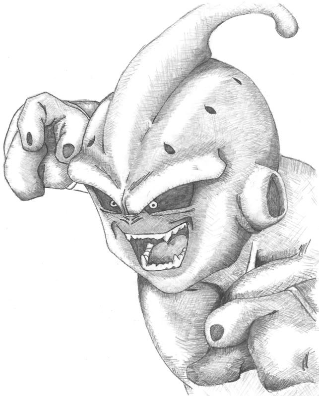
:d:d:d
A few comments:
1. I really like it! The colors are unique, but stylish. Keep it up-- also nice lines.. which is important for a vector.
2. Is this vector based on a photo (a photo edit-- not that that's a bad thing)?
3. What program are you using? I want to get into Vectors this November / December, once I return from a LONG vacation. I've done some vector work, but on the commercial side, and haven't actually drawn and photo edited what I truly want to. Nevertheless, I use Ullustrator CS5, and PS CS5.
Okay, well... I have some WIPs of my own... Feel free to critique or comment. :D
^^ I appologize for the watermarks, I really do hate adding them, no matter how slight they are, but I hate when people steal my work even more.
Both were digitally painted with use of a Wacom Intuos 3 Tablet, in Photoshop CS4 and later CS5.
Thanks.
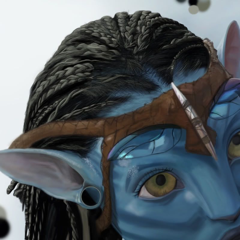
1A vector that's been in progress for awhile...
***IMG***
A few comments:
1. I really like it! The colors are unique, but stylish. Keep it up-- also nice lines.. which is important for a vector.
2. Is this vector based on a photo (a photo edit-- not that that's a bad thing)?
3. What program are you using? I want to get into Vectors this November / December, once I return from a LONG vacation. I've done some vector work, but on the commercial side, and haven't actually drawn and photo edited what I truly want to. Nevertheless, I use Ullustrator CS5, and PS CS5.
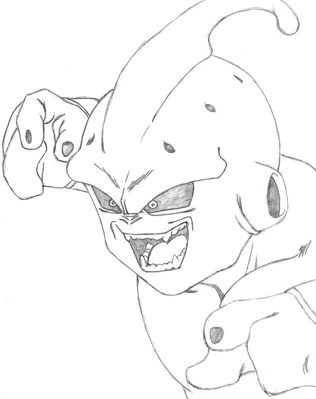
Really neat, I don't know what Flashman normally looks like, but there's not much to nitpick here. Nice tones, anatomy seems good, stance seems good, I like. I'm sure my friend would love this, he LOVES megaman.on the charmander... i think the neck is too elongated, it reminds me of charmeleon with out a horn.
i want critiques too!!
i changed megaman 2's flashman completely.
****IMG****
critique plz.
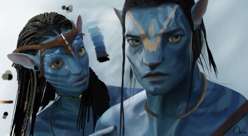
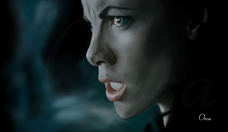
Okay, well... I have some WIPs of my own... Feel free to critique or comment. :D
^^ I appologize for the watermarks, I really do hate adding them, no matter how slight they are, but I hate when people steal my work even more.
Both were digitally painted with use of a Wacom Intuos 3 Tablet, in Photoshop CS4 and later CS5.
Thanks.


")