Purple
Hi guys!
Yes, we've been practically interviewing orca u_u

Welcome to Smashboards, the world's largest Super Smash Brothers community! Over 250,000 Smash Bros. fans from around the world have come to discuss these great games in over 19 million posts!
You are currently viewing our boards as a visitor. Click here to sign up right now and start on your path in the Smash community!
I think what it is for me is the satisfaction of seeing how the picture improves each time I work on it. This is especially noticeable with digital paitning if you save a jpeg at the end of each 'session.' When I'm done drawing I like to look at the progress I've made that day, or within the past few hours. It's amazing. I love it! My true problem is that I often lose motivation. For example, I started the Avatar piece in January... here we are 9 months later. I haven't touched it in the past 2-3 months easy. I have a bunch of unfinished pieces. The Avatar one is definitely one that I intend on revisiting soon.I have a cheap plastic Helix electrical eraser, and it works just fine. I have used professional grade ones before, but honestly, like most things, it only makes a difference if you go all the way, like $50+.
I don't know how you can stand to spend that amount of time on a single piece D:
I get so lethargic.
All I've wanted to do, for the past few months, is have ample time to draw what I want to draw. I've been in midst of commissions of various sorts, and working my promotions job. It's my die hard goal to be the best I can be at drawing (especially people). Some people pop out a nice pic every day, or every week. Ever since January 1st 2010, I've made it my goal to draw as much as I can. So far, so good-- but I've still been slacking wayy too much. When I DO have time to sit down and draw, I don't. Oftentimes hanging out with friends/family, going to work, etc, gets in the way of what's truly important to me. I'm not kidding when I say drawing is the most important thing I have in my life save for my loved ones. -- with that said--- I NEED to draw more.Right now I'm concentrating more on my soon-to-be university studies doing video game art, so I've been spending less time on portraits than I'd like to, but I'd always like to squeeze in more drawing time reguardless.
Again... this is an awesome night! I've been introduce to so many artists, from the ones in this thread to these amazing inspirations that you've unveiled to me! It's great to see whats out there. I seldom look. However, studying other peoples art is a GREAT way to improve your own. Needless to say, I'm shocked by the artists in the above quote. Another height I must reach! I have no doubts in my mind that you and I WILL be that good. None. At all. Practice makes perfect-- there's no way these guys were that good INSTANTLY either, they too looked up to other artists.Right now Stephan Martinier and Mike Butkus are my real push, they're hands down, THE best of the best.
")
Yes, yes it has. :DWoah. Active topic got unusually active.
Pretty much :DYes, we've been practically interviewing orca u_u
I try :DHe brought new life into our usually drudgingly boring discussions.


exactly what I'm thinking. On;y thing holding me back is myself.Needless to say, I'm shocked by the artists in the above quote. Another height I must reach! I have no doubts in my mind that you and I WILL be that good. None. At all. Practice makes perfect-- there's no way these guys were that good INSTANTLY either, they too looked up to other artists.
Yohttp://www.drewstruzan.com/illustrated/portfolio/
Look at the link.. wait, that's right, he's the guy behind the poster art for such titles as "Star Wars," "Indiana Jones," "Harry Potter," "Back to the Future," and the list keeps going. He has a VERY distinct style too.
I think I remember seeing some of these.Oh... Well here it goes. My scanner is currently dead... so I wont be posting any new sketches for a while. I posted these a while back.. but hopefully you can help :D
From what I can tell, you're definitely on the right track. They look good, it's too bad the quality is so bad. Were those scanned or were they photographed? I can't tell if they were originally darker or what, but as blowtoes pointed out, contrast is nice.Oh... Well here it goes. My scanner is currently dead... so I wont be posting any new sketches for a while. I posted these a while back.. but hopefully you can help :D
***PICS***
Still, the form looks pretty solid on most of them, definitely keep this up! I should do something like this, it'd be great practice.Yeah, it's funny... I noticed that to when I started going over Mike's stuff. It looks as though they are from similar time periods, as far as drawing is concerned-- Drew is likely older, not sure. However, it looks as though they were competing artists, both the top of their game. Both have similar styles too, as you've pointed out, which is even more interesting. Both are very inspirational! Drew Struzun is one of the most sought after artist in hollywood, that is, for poster art anyway--- and it doesn't appear as though Mike is too far behind either. Both are spectacular. Drew landed so many MAJOR films it's crazy-- no wonder he's worth so ****ed much! My god!As a matter of fact, I have seen his stuff on youtube before, it was another megan fox piece haha.
Yeah, they're both prestigeous award winning artists, pretty much of the highest calibur possible for the areas they work with, and definitely the Apex of achievement.
Yo
Yo I just **** bricks
I mean
I already knew about him as an artist of course, but:
http://www.drewstruzan.com/illustra...8&mp&gallerystart=26&pagestart=1&type=mp&gs=2 - Drew Struzan
http://www.mikebutkus.net/butkispics/1_07e.jpg - Mike Butkus
I'm confused, because I was under the impression that Mike Butkus was involved in a lot of those EXACT SAME movies you just listed.
And to match that, their styles are very similar.
again:
http://www.drewstruzan.com/illustra...0&mp&gallerystart=51&pagestart=1&type=mp&gs=3 Drew S
http://www.mikebutkus.net/butkispics/1_08a.jpg - Mike B
very very similar
That's cool.
They obviously work together on a regular basis.


You posted your pic in the 'Las Pictoras' thread not too long ago, and it looked to me like it was begging to be drawn.Those were photographs xD. It was on a cellphone.. so the quality is baddd.
Ugh... I'll fetch them >>
Drew is definitely amazing, hands down one of the top.Yeah, it's funny... I noticed that to when I started going over Mike's stuff. It looks as though they are from similar time periods, as far as drawing is concerned-- Drew is likely older, not sure. However, it looks as though they were competing artists, both the top of their game. Both have similar styles too, as you've pointed out, which is even more interesting. Both are very inspirational! Drew Struzun is one of the most sought after artist in hollywood, that is, for poster art anyway--- and it doesn't appear as though Mike is too far behind either. Both are spectacular. Drew landed so many MAJOR films it's crazy-- no wonder he's worth so ****ed much! My god!
Wow!!! That's awesome! Great value!! I love the dew drops!! Help is okay, it's all part of learning! :DThis is my pride and glory. XD. I was really motivated to make this one... for some reason
**flowers**.
Hmm, interesting. Talk about success stories, geez. Imagine how much the original StarWars posters sold for??!?!? I haven't a clue.. but it must be disgustingly expensive. lol.Drew is definitely amazing, hands down one of the top.
Of course, how can you not be amazing when you've not only drawn posters to some of the most successful movies of all time, but the majority of people don't even know they were hand drawn in the first place. Seriously it takes a real man to pull that off.
Mike focuses more on movie compositions professionally, but he worked on the original character designs for all the Starwars movies, Harry Potter, Indiana Jones, Robocop, and I, Robot, if I'm not mistaken. It's definitely a close resume, but I think Drew takes the cake.
WHAT!? Lame. Do they still need an icon, I'll make it.. hmm..I had an HP. LMAO. This is the 3rd one to have died...
Oh and that was the original idea orca... the admins got lazy
Admins are supposedly working on a paintbrush icon, but the feather is attached to the user group. I dont mind, I might buy premium somtime soon anyways and pimp my own title.An another note, so let me get this straight... The orange names represent artists, right? Is the quill some how attached to the color, that is, it comes along with it? The quill clearly says "Writer" but... wouldn't it be better if it said.. oh, I don't know. artist?
If I make a graphic icon to be displayed for artists, can an admin up it?
lmao....theyre such crap garbageI had an HP. LMAO. This is the 3rd one to have died...
Oh and that was the original idea orca... the admins got lazy
 What color!? OMG the options!
Well not exactly. There're a bunch of postbit images to be uploaded, but there's a problem uploading them and getting them to work correctly. There's already a paintbrush icon that's been made, it's just the matter of actually getting them to show up. A new group'll probably be made once that's ironed out with the title "Smash Artist" or something of the like.Oh and that was the original idea orca... the admins got lazy
Hmm. Yeah, hopefully they figure it out.Well not exactly. There're a bunch of postbit images to be uploaded, but there's a problem uploading them and getting them to work correctly. There's already a paintbrush icon that's been made, it's just the matter of actually getting them to show up. A new group'll probably be made once that's ironed out with the title "Smash Artist" or something of the like.
There's already enough user groups... ):< But I think Artists should have silver names yeeeaaahhh.
Lol @ this place becoming the new social thread.


Nice job so far. :D
Hell yes-- that's what I'm going for. Also... the model has very large/perky assets. So. lol.\Wow! I can't wait to see the finished product. Her assets look a bit perky though... unless that's what you're going for xD.
I'm working on my self-portrait!
I'm working off of this:
This is me so far:
Excellent critique! Thank you blowtoes! I'll be sure to check out those areas when I continue work! You're absolutely right though, the face could use some slight tweaks here and there. I thought the same-- it's nice to hear that some1 agrees with my thoughts.I lost
oh my god looool
Nice job so far. :D
For the sake of whatever, I think I'll critique your piece the same way I'd critique one of my own.
So far her face is well done, it has good structure albeit very very subtly warped. Of course I haven't seen the picture you're working off of (assuming you are working off a reference), so I couldn't be sure, but her nose looks a tad uncentered, or at least it draws itself to the right nearer the tip. (possibly her lips are shifted a bit to the left, or her left (your right?... -> this one) eye is slightly high. It's small enough that I can't tell right off the bat. Either way, something's up. It's more apparent when reversed.
I would also suggest slightly darkening under the eyebrow on the right nearing her ear, and you'll likely smooth out her forehead later, etc...
Perspective and shading on her left arm is great, and you've done a good job with her hair so far, it has a good flow to it, looks natural. Body proportions are done well, one could argue that her hips are a biiiiit low, but I've seen lower irl so I'll just shutup now
Of course, I know you haven't finished yet, but those are just some suggestions I'm throwing out haphazardly.
Orca you're amazing. O_oHmm. Yeah, hopefully they figure it out.
Silver could be cool :D
Critiquing + socializing = win.
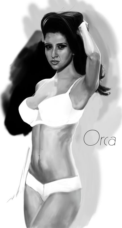
Anway, here's a piece I started a while back (over a year ago now). I worked about 20 or so hours on it. So far, I like it quite a bit, however, I got bored and moved on (as always). I'm going to revisit this within the week, what do you guys think thus far?
Orca you're amazing. O_o
I would like to point out that her head seems somehow stiff considering the way she's leaning back. Her hand sorta seems like it's forcing her head up. Also, either her nose is slightly bent to the right (starting at the left, bending towards the middle) or her right eye and eyebrow are too low. Or it could be because us humans aren't really symmetrical. xD
I think this was mentioned earlier but her breasts really do jut out. Real ones have a much gentler curve or slope at the top.
Lighting and stuff is gorgeous though. I can't wait until everything gets smoothed out <3
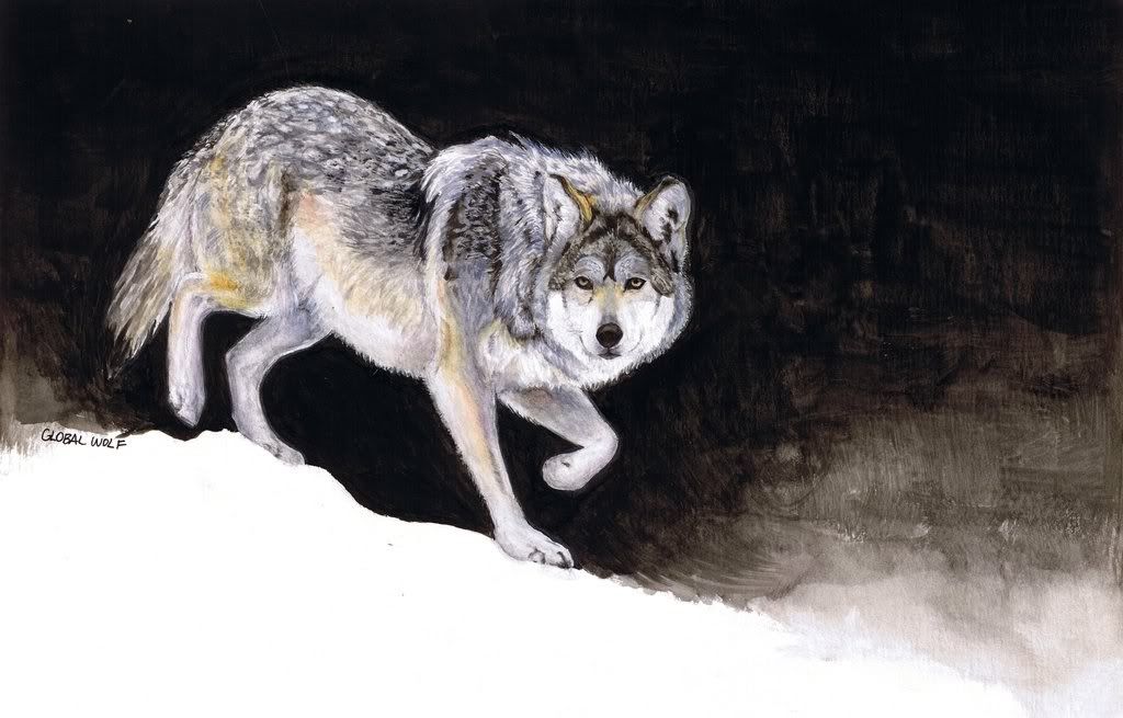
Awesome! I love how the snow is suggested, just a flat line that the wolf is atop of! Really cool! Like blowtoes, I also like the black meeting the white, obviously that's a high contrast spot. As for the wolf, I love the texture, the detail is excellent! Nice job! What medium is this? Oil?Since this topic is suddenly alive, I would like to post my painting that I did back in November for critique:
I haven't really done any realism since then xD
Yeah, I didn't even know watercolor could be that good. lol.Oh crap thats watercolor?
Respect +1000

Thanks! :DBeast...
Can't think of much to say since it's mostly attempting to replicate someone else's style, which you did almost perfectly. Nice background haha. Whoever your employers are I hope they pay you well.
Permission to call you Dan from now on?
Thanks very much!! With regards to payment, I get payed well, it's just the rate at which I'm payed which is silly. I got this promotions job of mine recently, 3 weeks or so ago. I've done huge things for this new company already-- like landing them a job with the Deadliest Catch guys. The guy who signed it off is Jeff Cohen, an actor from The Goonies, he played the part of "chunk" back in the day. I guess Jeff is their manager, or PR guy-- and he really liked my stuff! :D Needless to say, exciting opportunities are ahead. I have no doubts about that.If they don't pay you well enough...we have our ways to fix that....
Orca, you are seriously skilled. And thats an understatement.
Yeah I think I agree. I'll be changing my SWF name soon anyways, because blowtoes is ****ing stupid.Yes, actually, I've been meaning to say that you guys can call me Dan. Orca isn't exactly personal. By this point, considering we're all sharing with each other, it makes sense to me that you guys call me by my name.
If you guys would like me to refer to you by your ACTUAL names, feel free to post them. :D
Thanks!Good job on Donald haha
Yeah I think I agree. I'll be changing my SWF name soon anyways, because blowtoes is ****ing stupid.
So if everyone would call me by Bren, that would be ideal.
Also, late payments make me furious. >:[

LoL "speaking of Orcas." That's pretty awesome, Bren! I love colored pencils, though I will NOT lie and say I use them a ton-- once I went digital years and years ago I never looked back. hehe.That sounds frustrating. I had a portrait done for a man a while back when I was still in high school. It took me almost a month to get my $80.
And speaking of Orcas:
I drew this a while back.
Anyone wanna critique? I love doing wildlife sketches, but I'm not the best with colored pencil :/
Thanks DanAs for my critique, I generally feel bad giving them. I don't want to step on peoples' feet, but then again I understand that constructive criticism is important to improving. In addition, when it comes to critiquing, many of the points will be opinion based. I mean, unless it's a glaring issue like anatomy, other points may or may not be necessary change. None the less, I guess feedback is always good.
Oh yeah, Bren, what kind of tablet are you looking to get? I saw a few pages back you mentioned you wanted one. I have lot's to say about them.. so... yeah. I'd like to point you to a certain one.
Thanks,
Dan