• Welcome to Smashboards, the world's largest Super Smash Brothers community! Over 250,000 Smash Bros. fans from around the world have come to discuss these great games in over 19 million posts!

    You are currently viewing our boards as a visitor. Click here to sign up right now and start on your path in the Smash community!

Official Critique Topic

Exceladon City

Smash Hero
Joined
Dec 2, 2008
Messages
6,037
Location
The Lonesome Crowded Midwest
Thank you Neon. I'll definitely keep that in mind. I still have the .xcf file so I could edit it as I see fit. Should I darken some parts in the center then?

I was kinda conflicted on where to place the circle because I wanted most of Laharl's scarf in the picture.

Also, aspect ratio. Was that the original dimensions of the art piece for Laharl? Because he feels kind of distorted, stretched, skewed, and what have you. Looks unnatural to me . . .
I had to rescale him to fit the sig. Yink pointed out that I should bring out his face more, but it would've messed up the the layout if I rescaled him or messed with the perspective.
 

BlackKnight23

Smash Apprentice
Joined
Jun 24, 2006
Messages
160
Location
Somewhere in texas
It was a good attempt though Dio. Like Zio said though its a bit stretched out. I would also bring more focus to his face and make it horizontal...but thats just me. In return.

Its been a while since I made a sig but I think it turned out pretty good.


global-wolf

Smash Champion
Joined
Jan 17, 2010
Messages
2,215
Location
Northern Virginia
The area around the lines seem to be white, did you take the picture from a manga? I would suggest instead of dropping the colors directly onto the layer with the picture, set the picture layer to multiply and put the colors in a layer underneath. No white stuff that way :)

The placement and size of your text makes it a little unnoticeable. The character's eyes and the bright fire thing lead the viewer into the bottom right corner, and I would suggest putting the text more in that area.

I like the overall concept and flow of the sig though, it has a rather panicked feel to me.


I drew my first colored pencil wolf in almost 2 years. I think it's improved somewhat :D These are what I drew all the time when I was active on deviantart.


Critique away I guess xD The wolf is someone else's character.
 

BlackKnight23

Smash Apprentice
Joined
Jun 24, 2006
Messages
160
Location
Somewhere in texas
The area around the lines seem to be white, did you take the picture from a manga? I would suggest instead of dropping the colors directly onto the layer with the picture, set the picture layer to multiply and put the colors in a layer underneath. No white stuff that way :)

The placement and size of your text makes it a little unnoticeable. The character's eyes and the bright fire thing lead the viewer into the bottom right corner, and I would suggest putting the text more in that area.

I like the overall concept and flow of the sig though, it has a rather panicked feel to me.

Well the lines are the borders which I think I set to burn or dodge to give it that white. But yea I do agree with the text placement. I was torn between the fire or the top left. It wasn't panicked though I actually put alot of time into it but like i said it has been a while since I been in the sig making business . but thanks I will work on it some more. Also no its from the anime actually.
 

global-wolf

Smash Champion
Joined
Jan 17, 2010
Messages
2,215
Location
Northern Virginia
Well the lines are the borders which I think I set to burn or dodge to give it that white. But yea I do agree with the text placement. I was torn between the fire or the top left. It wasn't panicked though I actually put alot of time into it but like i said it has been a while since I been in the sig making business . but thanks I will work on it some more. Also no its from the anime actually.
I don't mean the border of the sig, I meant the jagged white pixels that appear around the character's hair, glasses, etc. Unless that's what you mean by borders. And I meant panicked as in the mood of the sig.
 

Geist

Smash Master
Joined
Sep 26, 2007
Messages
4,893
Location
Menswear section


Critique away I guess xD The wolf is someone else's character.
Aw that's adorable :3

I think you're ready to take a big step forward with your techniques. Getting a good result with colored pencils takes much less time than getting a great result, but the end result justifies the work imo.

For colored pencils definitely work your layerings. I like starting with the darkest parts first, and then very very lightly putting in values. Like 10-20 layers should be your ideal target. Colored pencils are soft, so this way your pencils stay sharp and you can get awesome definitions and not worry about having to one-shot your colors. I'm mostly pointing this out since you were rendering fur, but you were missing those valuable highlights and thin strokes that fur has.

You did a good job though. Definitely do more things :D

Oh that reminds me, I trust you're over that art block you had? :[
 

global-wolf

Smash Champion
Joined
Jan 17, 2010
Messages
2,215
Location
Northern Virginia
Thanks Bren! I admittedly did rush this a little... only 3 layers. I have trouble sharpening my Prismacolor pencils though, they always always always break unless I leave a big blunt end. I'm also not very good at determining how big drawings should be so the actual wolf only took up about half the paper. D: I will definitely try to include more details in the fur and use more layers though. I might try to buy a new pencil sharpener too.

I'm not sure if I'm over the art block... but winter break is soon and I'm required to do a project for school and for some reason I chose to do a picture book. ._.; So I'm gonna be drawing anyway! xD
 

Geist

Smash Master
Joined
Sep 26, 2007
Messages
4,893
Location
Menswear section
Thanks Bren! I admittedly did rush this a little... only 3 layers. I have trouble sharpening my Prismacolor pencils though, they always always always break unless I leave a big blunt end. I'm also not very good at determining how big drawings should be so the actual wolf only took up about half the paper. D: I will definitely try to include more details in the fur and use more layers though. I might try to buy a new pencil sharpener too.

I'm not sure if I'm over the art block... but winter break is soon and I'm required to do a project for school and for some reason I chose to do a picture book. ._.; So I'm gonna be drawing anyway! xD
Electric sharpeners tend not to break colored pencils I find.

Also using rough shapes to block in your drawing before-hand is one of the best ways to manage space.

and yay drawing :D
 

ZIO

( ͡° ͜ʖ ͡°)
Joined
Sep 14, 2006
Messages
10,884
Location
FREEDOM
I've had this set of Drewent 72 colored pencils that I really havent made use of. So much so I've forgotten where I've placed them . . . HMM
 

Neon Ness

Designated Procrastinator
Joined
Jul 10, 2008
Messages
3,631
BlackKnight, you posted that in the other thread already though, right? Sigs should stay in the Sig Critique thread.
 

global-wolf

Smash Champion
Joined
Jan 17, 2010
Messages
2,215
Location
Northern Virginia
Electric sharpeners tend not to break colored pencils I find.

Also using rough shapes to block in your drawing before-hand is one of the best ways to manage space.

and yay drawing :D
I will remember that :D And I remember painters talking about blocking in all the time, never though to use it in a normal drawing. o.o Thanks!


Needs colored pencil drawings by Zio. :3
 

Charmander

Smash Champion
Joined
Jan 4, 2010
Messages
2,015
Location
The Middle Pokeball
NNID
JoeThorpedo
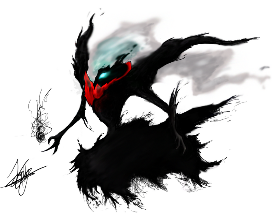
Guys, I finally managed to get my hands on a tablet. Before I decided to get any advice on it, I made my first drawing on it because I was so freaking excited x)
[COLLAPSE=My first time using a tablet]

Done on Photoshop CS3 in 2 and a half hours.[/COLLAPSE]

Any critiques, suggestions, techniques, anything to tell someone just starting digital, please tell me :DD
 

Neon Ness

Designated Procrastinator
Joined
Jul 10, 2008
Messages
3,631
Nice :D Lol I'm pretty sure everyone does a just-go-crazy drawing when they first get a tablet.

I guess something to keep in mind with digital drawing as opposed to pen(cil) and paper is the kind of brush you use. I suggest using solid brushes at 100% opacity in the beginning to mark out the major forms. Then later use brushes that are more transparent for blending/softer value transitions. A lot of Darkrai's edges are fuzzy/jagged looking and he just kind of floats off of the page (or maybe that's what you were going for?). If he had harder edges around his body it might give him a bit more 'weight' in the picture. The whole thing feels a bit too airy, like he doesn't have any real dimension/form.

I suggest using hotkeys for things like the Eraser and Eyedropper Tools in Photoshop to make things a bit faster.

Other than that, there are a lot of things to keep in mind that you'd want to know for traditional drawing/painting anyway, so drawing digitally with a tablet is pretty similar in that sense.
 

Charmander

Smash Champion
Joined
Jan 4, 2010
Messages
2,015
Location
The Middle Pokeball
NNID
JoeThorpedo
Well the reason Darkrai's edges are fuzzy is because Ive always remembered darkrai as a more gaseous being, being mostly made of black smoke, or at least being surrounded by it. Otherwise, I would have had to agree with more weight on the pokemon.
Anywho, those are some nice tips that I will certainly use, thanks so much :D
My next drawing is going to be something more..solid, you could say, I guess I could get a better critique that way, its hard to critique something made of smoke I guess XD
 

BioDG

Smash Ace
Joined
Jan 20, 2009
Messages
609
The anatomy is very cool, Charmander, as is the gritty linework.

I agree with the fuzziness input. However, I think the concern was with the execution and not your style choice. It looks like you went for sharper contours on the more solid parts of the figure, but they remain on the hazy side anyway as a result of your brush or tool usage. I like the effect, though I think making sure you push that sharpness in areas like that could add some dimension to your style.

Regardless, I think it's marvelous (especially for a first tablet job). No matter what I said, your style is refreshing to see.

My first one was SOOO bad. Oh my gosh...
 

Exceladon City

Smash Hero
Joined
Dec 2, 2008
Messages
6,037
Location
The Lonesome Crowded Midwest
Who would I talk to around here to request a sig? All the "Request A Sig" threads are super dead and The Art Shoppe itself is pretty desolate in general. I'd normally make one myself but I've been lacking in the creativity department.
 

Neon Ness

Designated Procrastinator
Joined
Jul 10, 2008
Messages
3,631
Yeah, unfortunately there is a bit of a sig shop drought... You could try asking in the Social thread since it's a special case.

Questions like this should go in the Q+A Thread by the way.
 

Master Ppv

Smash Journeyman
Joined
Dec 2, 2007
Messages
271
Location
Springfield, Illinois
Been a while since I put something up... Let's see what you guys make of this :)


Taken at a football game... I wanted to get a shot of the crowd without, you know, just shooting the crowd... XD
 

Geist

Smash Master
Joined
Sep 26, 2007
Messages
4,893
Location
Menswear section
lol nice
it's definitely a cool idea, but I think it could be improved compositionally. The rule of thirds, if you don't know, is putting your main focus on one of 4 spots on the photo composition, each spot corresponding to an intersection of imaginary lines that divide the photo into 3 pieces. The rule isn't an absolute must, but it's much too important to ignore.
If there was more space to the right of the horn - about another full length's worth than you have now, it would have a big impact and I think that this would have turned out really, really good.
 

Master Ppv

Smash Journeyman
Joined
Dec 2, 2007
Messages
271
Location
Springfield, Illinois
lol nice
it's definitely a cool idea, but I think it could be improved compositionally. The rule of thirds, if you don't know, is putting your main focus on one of 4 spots on the photo composition, each spot corresponding to an intersection of imaginary lines that divide the photo into 3 pieces. The rule isn't an absolute must, but it's much too important to ignore.
If there was more space to the right of the horn - about another full length's worth than you have now, it would have a big impact and I think that this would have turned out really, really good.
Thanks for the critique! :)

I agree that this could have been improved with a change in the composition. I am aware of the concept of the rule of thirds. My original intention was almost exactly what you described, but I was behind a section of the stands that was reserved for the band, and between me and the band there was a line of spots reserved for handicapped people. When I tried to move to change my composition, one of the guards ran over and gave me a warning to get back :glare:
 

Sarix

Smash Ace
Joined
Jan 18, 2012
Messages
796
Location
Grand Rapids, MI
This something I'm working on for a basic portfolio for GDC. I still have 2 years so this likely won't be in the final portfolio then. But please give me honest critiques.


Edit: Messed up on collapsing the image, hopefully this one works.
 

Neon Ness

Designated Procrastinator
Joined
Jul 10, 2008
Messages
3,631
@ Jim Morrison: Hard to say without knowing what the prompt was but I assume it's something more lol than serious. Maybe better to post stuff like that in the social though.

@ Sarix: This coming from someone with almost no modeling experience, but it looks good from a technical standpoint. I'm just... not really sure what it is.

I guess it depends on what/who your portfolio is catered to, but it might be helpful to get several snapshots from various angles so we get a better idea of the overall form. If you're showing it to a studio/art director, it should preferably be something that they could feasibly use in a production pipeline. I guess think about what 'purpose' the model serves and really make sure that gets across in your portfolio.
 

Sarix

Smash Ace
Joined
Jan 18, 2012
Messages
796
Location
Grand Rapids, MI
Thank you for the critique Neon Ness. It was actually supposed to be Samus's arm cannon but considering how I felt like I was working on a high tech thermos while building it and that I only had one render I can see why you might not recognized what it was. I have been taking on that kind of mentality of having a purpose for the model as I practice for my major portfolio for when after I graduate in about 2 years.

This piece is only for my junior portfolio for internships to show "Hey I can model pretty well" and my professors have told me to focus on being more of a jack of all trades to learn a lot for the first 2 years then use what I've learned to specialize. I already know what I want to go into but I'm still learning about how to apply the methods involved before I build something like a river for example without understanding how erosion would affect the terrain and how the water would move.
 

Geist

Smash Master
Joined
Sep 26, 2007
Messages
4,893
Location
Menswear section
This something I'm working on for a basic portfolio for GDC. I still have 2 years so this likely won't be in the final portfolio then. But please give me honest critiques.


Edit: Messed up on collapsing the image, hopefully this one works.
I could tell what this was right away lmao. I'm majoring in 3d modeling so thankfully I can give you a few pointers on bad habits, small pointers, small tricks, etc.

So first off, it has nice and neat polys and it's pretty accurate. There's a few things that are wrong/you might want to avoid though. First of all, you have what's called interpenetrating geometry (bear with me, that's actually what it's called). If you don't already know what this is, it just means your shapes are colliding with one another. In itself this isn't a tragedy, but you have to have to consider later processes while you're doing it. In this case, texturing your arm cannon will become more difficult to do properly because you're missing a vital connection between your shapes. Of course for this example you might want to have this animated to rotate or something. In this case I would disconnect the cylindrical part from the long piece that is extruded from it, and then create a gap between the main gun piece and the cylindrical part. It doesn't have to be floating of course, just create in intruding edge and connect it at the bottom. Just get something in there that says definitively that 'this piece is separate'.

Secondly, you have edges that just stop about halfway down the base gun, and I'm not even sure why they exist. It's creating polygons that have more than 4 sides, and basically you never want polygons that have over 4 sides. 4 sides is optimal, 3 sides is fine (for hard surface modeling like this - avoid it for organic modeling) This is probably the worst offender here, and the only real problem with this model. It's fortunately easily fixable. Just tie off all of your 5 sided polygons into squares by adding edges. Erase edges that you don't need, and it'll neaten up your whole model. The reason you don't want polygons with 5 sides or more is that the renderer has trouble calculating the surface and it doesn't look good as a final product, and when the surface bends if it's animated, you get disgusting bends and warps that are hard to control.

Lastly, this is just modeling ediquette, at the part of the model that has all the edges converging into the center, you can neaten that up by cutting the edges to all run vertically up and down. This isn't much of a big deal and doesn't even have to be done, but it can help fix small problems you might run into later. Plus it looks nicer.
 

Sarix

Smash Ace
Joined
Jan 18, 2012
Messages
796
Location
Grand Rapids, MI
Thanks for the critique Geist, I really appreciate it. I read over the part on readjusting the geometry so it doesn't collide but I just can't seem to get a visual idea of what you mean. Maybe it's because my brain's a bit discombobulated from all the work on the side I've been doing for different things but do you think you could reexplain it?
I understood the part about the quads and edges and realized that I had also forgotten to even check that before I posted it, so that's not a problem.
 

Sarix

Smash Ace
Joined
Jan 18, 2012
Messages
796
Location
Grand Rapids, MI
Yeah it's hard to explain in words, so I'll make you a visual lol

Lol thanks, normally I would get it but I have an advanced screen writing class that I have to write two full scripts for so my brain is already in overdrive with brainstorming my pacing, character arcs, themes, etc.
 

Charmander

Smash Champion
Joined
Jan 4, 2010
Messages
2,015
Location
The Middle Pokeball
NNID
JoeThorpedo
Heres a WIP, Its my first time experimenting with "Lineless art"

obviously, its more finished near the head than anywhere outwards.
Any suggestions in color choice or anything before I continue? :3
Thanks so much ^^
Edit: ACK quiality got ruined. I still have the original PSD thank god..
 

Geist

Smash Master
Joined
Sep 26, 2007
Messages
4,893
Location
Menswear section
Remember that no color exists exclusively by itself. It seems like your sticking with one value and simply making it darker or lighter, and it's making it look a bit flat. What I like to do is eestablish a background color that works harmoniously with whatever color you want to paint your main element. Maybe choose something that works practically in another way, like the color of the environment, or an atmospheric haze, or maybe just choose a color that just looks nice next to that brown/orange you have. Maybe like an organic desaturated purpleish brown like this

anyways what this'll allow you to do is paint on darks and lights with layers that have opacity, and your tones will automatically blend with your background and make nice accurate color shifts that match your bg. It's even possible to get rid of that bg color when you're done.

I used a similar technique to get the colors on the robe of this painting: http://fc07.deviantart.net/fs71/f/2011/343/9/8/the_crimson_king_by_uninfinitum-d4imji3.jpg
I had a light brown/beige color that blended really well with the red of the robe, which you can see I actually kept for the skull. Then, I just got rid of it when I was done and filled the bg with a white instead. C:

For what you've done so far though it's looking pretty cool. I can see a lot of improvements from your earlier stuff. Keep it uuuuuup
 

CAB77

Smash Rookie
Joined
Dec 5, 2011
Messages
20
Location
Savannah, Georgia
"Homeworld"

HOMEWORLD

Hello everyone! This is an original "composition" that I put together using the music program "Reason" by Propellerhead. It was inspired by Grant Kirkhope's early work during Nintendo and RARE's powerhouse partnership on the Nintendo 64. Banjo-Kazooie, Tooie, Conker's Bad Fur Day, and DK64 are what come to mind.

I didn't really have a level that I based this off of, but I sort of imagined an autumn-themed level where leaves are constantly falling from the beautifully colored trees. The leaves are collecting so densely on the forest floor that if you slip off the tree stumps scattered about, you'll sink into the leaves, never to be heard of again. ;)

(Basically, the leaves/floor=quicksand!)


Anyway, I'm super into music but don't have much experience with it yet so it is far from perfect. I am actually going to start taking music classes soon so hopefully I will have the opportunity to improve :) .
 

Charmander

Smash Champion
Joined
Jan 4, 2010
Messages
2,015
Location
The Middle Pokeball
NNID
JoeThorpedo
Thank you so much Giest, It does look a bit...monochromatic doesn't it ^^'
And that purple should really work with the warm color scheme im going to be using :3
Only problem is, Im doing this as a one-layer-painting. Meaning that I'd want to add the background either first or last, as its gonna be on the same layer and would be a bit of a hassle to get rid of ._.
I will try to imagine the background color and color the Behemoth accordingly, thanks again for your advice :DD
 

Jim Morrison

Smash Authority
Joined
Aug 28, 2008
Messages
15,287
Location
The Netherlands
Thank you so much Giest, It does look a bit...monochromatic doesn't it ^^'
And that purple should really work with the warm color scheme im going to be using :3
Only problem is, Im doing this as a one-layer-painting. Meaning that I'd want to add the background either first or last, as its gonna be on the same layer and would be a bit of a hassle to get rid of ._.
I will try to imagine the background color and color the Behemoth accordingly, thanks again for your advice :DD
I know your pain of working with few layers, I really suck with using more than 5 layers, however, I heavily advise you to keep background and foreground seperate layers. It'll be much, much easier to adjust the background to the foreground or vice versa.

Also, thanks Geist, I also have the problem of working monochromatic, but I have a really hard time finding other colours that work well. Also, drawing off screenshots I've taken, I try to stay a bit true to the colours and it's somewhat harder to experiment.
 

Geist

Smash Master
Joined
Sep 26, 2007
Messages
4,893
Location
Menswear section
HOMEWORLD

Hello everyone! This is an original "composition" that I put together using the music program "Reason" by Propellerhead. It was inspired by Grant Kirkhope's early work during Nintendo and RARE's powerhouse partnership on the Nintendo 64. Banjo-Kazooie, Tooie, Conker's Bad Fur Day, and DK64 are what come to mind.

I didn't really have a level that I based this off of, but I sort of imagined an autumn-themed level where leaves are constantly falling from the beautifully colored trees. The leaves are collecting so densely on the forest floor that if you slip off the tree stumps scattered about, you'll sink into the leaves, never to be heard of again. ;)

(Basically, the leaves/floor=quicksand!)


Anyway, I'm super into music but don't have much experience with it yet so it is far from perfect. I am actually going to start taking music classes soon so hopefully I will have the opportunity to improve :) .
It's funny because I was immediately reminded of banjo-kazooie, and then re-read your post and saw that's what you were actually going for lol
I assume you've done some music theory, I only have a little bit of experience composing music myself, and it's been a while, but I'll try to remember what's what.

So as it is, it's a decently catchy song and wouldn't be out of place in a game, but there's always things you can do to make your stuff better. The first thing that seems out of place, to me at least, is the G chord that comes every measure. There's a very prominent D playing that I think would be better suited to an octave lower. It would help fill the absence of lower notes that you have, and you could probably do well with having a bass line that isn't so low (I couldn't actually hear it until I put my headphones on lol) that helps keep the key of the song out of a constant G throughout, similar to what you have the sax type sound doing with the G's to D#. (btw I think the sax should go to a D instead since it fits the scale of G major)
Speaking of which, the tune of the sax atm sounds to me like G D# to C E. I think a little extra buildup would make it sound nice, like going from D G to D# G to E G and then to E C, or something like that. It's kinda hard to explain, but the idea is to have less repetition overall.
Around 1:31 you have some good harmonizing going on, but the sounds are blending together. I don't know what would be most appropriate to fix this, maybe you could mix a channel to be more quiet or something. It could help to have that flute sounding section an octave higher, but mixed a bit quieter so it doesn't overpower the rest of it.

Anyways, it sounds like it's coming along to me, I find it really helps to revisit music with a cleared head, when you're writing it for hours on end it might as well be a different song that you and someone else is hearing, and when you take a break and come back you can fix a lot of mistakes.


Only problem is, Im doing this as a one-layer-painting.
wait wut are you punishing yourself for something? D:
every time I hear someone only using one layer, I get a nervous twitch
 

Charmander

Smash Champion
Joined
Jan 4, 2010
Messages
2,015
Location
The Middle Pokeball
NNID
JoeThorpedo
wait wut are you punishing yourself for something? D:
every time I hear someone only using one layer, I get a nervous twitch
Actually, I'm going to start actually painting things soon, Im using this piece as more or less of a practice to painting with only one layer
(and because I was lazy and forgot to make the white background a separate layer before painting)
 

CAB77

Smash Rookie
Joined
Dec 5, 2011
Messages
20
Location
Savannah, Georgia
So as it is, it's a decently catchy song and wouldn't be out of place in a game, but there's always things you can do to make your stuff better. The first thing that seems out of place, to me at least, is the G chord that comes every measure. There's a very prominent D playing that I think would be better suited to an octave lower. It would help fill the absence of lower notes that you have, and you could probably do well with having a bass line that isn't so low (I couldn't actually hear it until I put my headphones on lol) that helps keep the key of the song out of a constant G throughout, similar to what you have the sax type sound doing with the G's to D#. (btw I think the sax should go to a D instead since it fits the scale of G major)
Speaking of which, the tune of the sax atm sounds to me like G D# to C E. I think a little extra buildup would make it sound nice, like going from D G to D# G to E G and then to E C, or something like that. It's kinda hard to explain, but the idea is to have less repetition overall.
Around 1:31 you have some good harmonizing going on, but the sounds are blending together. I don't know what would be most appropriate to fix this, maybe you could mix a channel to be more quiet or something. It could help to have that flute sounding section an octave higher, but mixed a bit quieter so it doesn't overpower the rest of it.

Anyways, it sounds like it's coming along to me, I find it really helps to revisit music with a cleared head, when you're writing it for hours on end it might as well be a different song that you and someone else is hearing, and when you take a break and come back you can fix a lot of mistakes.
This was a very helpful post! Thank you for taking the time to listen and think about my track.

The only music theory I know is what I've learned from a small book called, "Music Theory for Computer Musicians". It's just something I've read on my own to prepare me for classes starting next semester :bee: So I guess I know the note names and thirds and fifths are good harmonies, but other than that I don't know a whole lot.

I tried moving the repetitive D down an octave, and maybe it's just because I've heard the higher version played so often, but the lower D sounds a little weird or out of place to me.

Same with the saxophone, the G to D and then G to D# sounds great, but the G to E and E to C sound out of place. For now I have it as G to D, G to D#, repeat, until I can work out a nicer melody, because I agree with you, the less repetitive, the better!

Thanks for the advice! I've been glued to this project for the passed few days and I think it would be a good idea to take a short break.

CAVES
Here is another (earlier) work I have done. This is my first attempt at video game music. If you have the time, I'd love it if you took a look (listen) to this one as well!
 
Top Bottom