• Welcome to Smashboards, the world's largest Super Smash Brothers community! Over 250,000 Smash Bros. fans from around the world have come to discuss these great games in over 19 million posts!

    You are currently viewing our boards as a visitor. Click here to sign up right now and start on your path in the Smash community!

Official Critique Topic

Kuares

Pizza
Joined
Aug 15, 2010
Messages
732
Location
"G-Ames?" Iowa
@ Kuares: Looks pretty good to me so far. The only issue with it is it's sort of confusing how Fox and the Arwing are mashed against each other. It might help the Arwing fade into the background a little more if you used lighter, duller colors on it so it looks like it's far away. Fox's shoulder seems to be coming from his ear, so some planning of the basic body position could help before getting into details. I dunno, it's probably hard to draw on something as cramped as a 3DS screen though. You could create a more defined light source with where your highlights and shadows are placed. There's a bright area behind him on the left so you could make all of the surfaces that are turned toward the opposite direction much darker for a more dynamic look.
A 3ds ap eh? not bad at all. Proportions are a tad wonkey but it's nothing crippling. He's got a cool line of action working for him so it makes up for a lot. The colors are nice and clean, and I like how you outlined sections with a darker color of their container, but overall the color selection feels a bit flat. I don't know how limited the 3ds ap is so I can't strike you down too hard in case they only provide like 32 colors or something.
The arwing is porbably the weakest part, mostly because it looks to me like the perspective is a tad off, and the lines could be straighter to make it look more hard surface.

Also, consider your silhouettes when making an action pose. Limbs in the wrong place can be distracting or look weird, even if they're in a place that is technically accurate. Fox's gun is hard to see because it's a similar color to his jacket, and the detail of both objects tangents a bit, making the gun hard to pick out, even if I know it's there. As a rule of thumb, make the pose completely recognizable even in a pure silhouetted form. If you filled your pose with black, does it still make sense? If it does, it's a really good pose.
The 3ds app isn't that bad considering it's been my method of digitaldrawing for quite a while. It's got a color wheel, so that's not a limitation(atleast in the final product).

Thanks for the critique, I'll work on it this weekend and bring it back later.
 

Neon Ness

Designated Procrastinator
Joined
Jul 10, 2008
Messages
3,631
I can't see any images in your post, not sure if it was just accidentally left out or if there was some kind of formatting mistake.

This thread is really for posting your own work, though...
 

Geist

Smash Master
Joined
Sep 26, 2007
Messages
4,893
Location
Menswear section
I think I've got just the thing for you purple, it's a face topology study I did a little while ago. If I can find it, I'll write up some notes to go along with it and post it for you when I have the time.
 

Geist

Smash Master
Joined
Sep 26, 2007
Messages
4,893
Location
Menswear section
[collapse=for the sake of proportioning, is this correct (big image, minimal content)]

[/collapse]
Alrighty, here's the face study, along with the notes I typed up for you explaining what's what, really generally. There's small differences between male and female faces, but the measurements are still there on both genders, so it's probably better anyways that I'd have rotations of the same person's head rather than rotations of two different people, etc, whatever.
As a minor disclaimer, keep in mind that A) this is really vague, like nutshell of a nutshell explanation, I could probably write a hundred more of these and not run out of things to say. B) this was a quick study from life, so her facial proportions, while surprisingly symmetrical, still deviate slightly from those stonefaced demo sketches with perfect measurements that you see in all those how-to-draw books. Actually it's probably kind of better that way. because
blahblahblahblah something something
/paragraph


Click for bigger size
I guess credit should also go to aly/alley cat for supplying her face for me/you. woooo


Kso because posting this study technically isn't giving a critique, let me now attack your drawing directly. I'm just gonna point everything out that's wrong as objectively as possible with maybe a few funny analogies because analogies are fun and easy to remember.
First of all, I'll just outright say that his face is too big for his head right now. Dem measurements. You can see right away that they don't conform to the magic proportions as defined above. It's not unsaveable though, so don't fret. You can easily move or work off of a single piece of the face and structure your drawing from there. At the stage of completion your drawing is at right now, I used to base the rest of my head out of the position of my eyes. I've since started using the nose as reference, because there's only one of them and you get more of a sense of direction and a three dimensional space from it. Whatever floats your boat though, as long as it gets you proper proportion, you can use whatever.
The nose is also too long here, but your forehead is also too small. An easy fix would be to lower the eyes down so that it follows the same measurements as I explained in the tutorial. If you're too lazy to go back and read it, the eyeline should be the same distance from the nose tip as the nose tip is from the very bottom of the head.
His cranium is missing a lot of uh, cranium. The back of the head comes out much further, and the base of the nose lies on the same horizontal line as the base of the skull.

There is no defining edge of your dude's head, so his skull is looking like a jujube stuck onto the top of a pipe. Remember that beautiful, beautiful line in that guide that ran the whole length of the skull? The one that defined the structure of everything in a 3-dimensional space? Yes that is probably the most important of all these lines. I can't stress enough how useful it is for absolutely everything. Anyways it just so happens to follow the defining edge of the face. You're probably not quite sure about what the defining edge really is and want me to stop using that term, so I'll tell you what's up. The defining edge is basically an edge that serves in creating a few key things. It creates an outline of an object, more or less creating the silhouette of the drawing. But instead of just being a simple 'outline' of the drawing, it serves a purpose of acting also as an anatomical structure that helps create an instantly recognizable shape. This is lacking on your drawing. The skull right around the eye should dip in and, depending on the angle, even recede past the eye, so that the eyelid can be seen on the silhouette. I really hope I'm not making things too complicated because this is pretty hard to explain in words. I'll keep it there for simplicity's sake since I'm pretty sure I haven't put as much thought into explaining this as I should.
tl;dr make sure the outline of your face follows that awesome ridge.

Just for sanity's sake, I like to see the sternomastoid muscle on the neck. It's that big muscle that sticks out when you turn your head from side to side. It comes from right behind your ear to the center of your collarbone, and just having it there helps with structure and all that nice stuff.

Yup so that's all I can say at this stage. I dunno if you'll be completing this further or if this was just a practice, but maybe post updates if you're taking it further.

You've got my skype too, I'll do crits and stuff if you pm me things. I sometimes even do quick draw-overs to help with the explanations and stuff if you can catch me at the right time too.

Also if you haven't already, catch Aly and I's tutorial that we posted on swf a while back about how to properly draw and attach necks. It's got some more specified stuff that a lot of people miss, and it also touches on those previously mentioned differences between male and female faces. You'll find it in the tutorial thread that's stickied.

Still the best?

Still the best. Much appreciated.
I do what I can *salute*
 

Soloist

Smash Ace
Joined
Nov 15, 2010
Messages
712
Location
Rochester Hills, MI
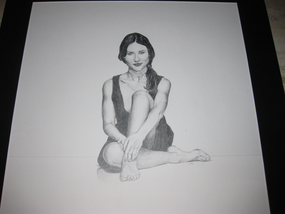
I did this last year, never shared it here. Figured I may as well. Excuse the weird photo angle, as the "regular" overhead view made the drawing look dull with the lighting I had. :shades:

[collapse=Some broad from the internet]
[/collapse]
 

Geist

Smash Master
Joined
Sep 26, 2007
Messages
4,893
Location
Menswear section
To offer a bit of quick advice here, it looks like your problem here is drawing your facial features on your face like you would draw them on a balloon. The surface of the face isn't flat, and your noses really reflect this. There's no third dimension to it, like it doesn't stick out. Maybe this is because you're paying too much attention to that center line of yours. Your nose bridge is on it and the center of your nose is on it, so there's absolutely no volume happening.
The biggest problem is though, that when you start moving your nose to its proper place, all the other features will make it look like it's not right, because they've all been constrained to this two dimensional surface on the previously mentioned hypothetical face balloon. But that's why digital is so nice, because you can just move stuff around like whatever.

Also make sure you're mirroring your image, because it'll make your mistakes glaringly obvious.
 

global-wolf

Smash Champion
Joined
Jan 17, 2010
Messages
2,215
Location
Northern Virginia
I think the turned face looks fine actually- the roundness of the face is apparent both sideways and up and down. Sideways it doesn't stick out much but that's normal, I know people with flatter facial features than that. I think the turned face actually looks better than the more frontal ones. I did notice problems with the back part of his head though. The back part of someone's head doesn't go all the way down to the same height of someone's chin, it generally slopes in at around the bottom of someone's ear. In your picture that'd be it sloping in where your circle guideline is. Another thing is that the ear is very small, but that's easily fixed.

^At least if I'm talking about the same face y'all are talking about, I didn't see an actual side face so I assumed you guys meant the 3/4 one. o.o

The first face that you posted does look like it has the problem Bren mentioned though.


@Soloist: It looks pretty good! Have you tried leaning it against a wall and taking a picture like that?


Also Bren, your images are ridiculously helpful and it's so nice of you to make them/post them, thank you thank you <3333
 

Geist

Smash Master
Joined
Sep 26, 2007
Messages
4,893
Location
Menswear section
No problem Global :3

I did this last year, never shared it here. Figured I may as well. Excuse the weird photo angle, as the "regular" overhead view made the drawing look dull with the lighting I had. :shades:

[collapse=Some broad from the internet]
[/collapse]
Missed this
It looks decently accurate from the angle you took it, but it also looks like you're missing some definition in your blackest areas. Might be the glare. You've utilized the range of darks to lights, but strangely enough what you're missing is midtones, which is the opposite of what most people miss.
If I had to nitpick about your proportions, most of what I'd have to say would involve her face. That's not exactly uncommon, since the face is the most complex part of the body, and since it has the most demand for accuracy, etc. even though you're sketching, it's still important to set up guidelines and measurements to get more accuracy out of your drawings. Sketching should be more akin to studying than simply copying. Make sure you start out with the larger shapes and forms first, eg, don't start drawing eyes on a face until the head is structured, and don't start fingernails until the hand is drawn, etc.

Good work though, I'd like to see more.
 

hichez50

Smash Lord
Joined
Oct 27, 2008
Messages
1,464
Location
Georgia
NNID
Player-00
3DS FC
2122-6108-1245
I did this last year, never shared it here. Figured I may as well. Excuse the weird photo angle, as the "regular" overhead view made the drawing look dull with the lighting I had. :shades:

[collapse=Some broad from the internet]
[/collapse]
This is very nice. Generally the anatomy is excellent. The only thing that looks a bit off it the feet. They seem too large to be women's feet. I also like the shading a great deal. Over all great piece of work. May want to work on a better way to get thing digital though.
 

Soloist

Smash Ace
Joined
Nov 15, 2010
Messages
712
Location
Rochester Hills, MI
Geist: You actually have seen more lol. I posted some heads/portraits awhile back, but didn't get too many replies when I made the thread. I guess I'll post them again for anyone who didn't see them before.

[collapse=1]

[/collapse]

[collapse=2]

[/collapse]

I don't draw/do anything art related anymore though, simply lost motivation and interest (I was previously in art school focusing on CG and game design). Just wanted to see what people here thought of my old drawings.
 

Geist

Smash Master
Joined
Sep 26, 2007
Messages
4,893
Location
Menswear section
Geist: You actually have seen more lol. I posted some heads/portraits awhile back, but didn't get too many replies when I made the thread. I guess I'll post them again for anyone who didn't see them before.
Ah, yeah I only really check the threads I'm subscribed to so that makes sense. I think I have seen these though now that I think about it. Regardless, I would still like to see more, you're good.
You might find motivation a bit easier to come by if you don't invest a lot of time per each drawing. I don't physically have time for long paintings so I've began to hone my technique in speedpainting. If you can get an idea down in a tenth of the time, you might find yourself drawing a lot more.
Not trying to force you to do something of course, but it's just an idea that's helped people in the past.
 

BioDG

Smash Ace
Joined
Jan 20, 2009
Messages
609
Great work, Soloist. Great senses to dark and light values and anatomy. Aside from a few proportions sticking out, I'd say keep working on your gradation and strokes. They seem to lose their consistency at times. Keep up the great work.

And thanks for your input, Geist. I found a studio to join in the Fall for life drawing. I hope to find one this summer, though.

I never posted anything here, though. Here's some old sketches:

[collapse=1]
[/collapse]
[collapse=2]
[/collapse]
[collapse=3]

[/collapse]
[collapse=4]
[/collapse]
[collapse=5]
[/collapse]
[collapse=6]
[/collapse]


Just some of the better ones between '09-'11. The two portraits were direct observations while watching TV and the digipaint was over a month or so off and on...but I never bothered to finish it (LifeVirus is an old pen name I dropped for BiO). I really want to improve the speed of my output on rendering a figure while keeping quality, so I tend to view the quality of my sketches as an indication of where I am on that. I've been busy with work so I haven't really found time to move back to the sketching as much as I would like. But I hope that will change soon.
 

Geist

Smash Master
Joined
Sep 26, 2007
Messages
4,893
Location
Menswear section
It's not bad stuff. I guess I'll kinda critique them in order

Life drawings first. They're not bad, but it should be obvious to you that there's some big problems going on with your proportions. This can actually be remedied (not completely of course) pretty fast, I find, if you follow a specific hierarchy of drawing processes. The larger 'ideas' should come first, eg. the motion and force and direction on a figure. Everything else that has to do with the figure's physical volume or muscilature or details of any sort takes a back seat for the first little while.
The largest idea will always be your line of action, aka the simplest line depicting how your pose is moving. Ideally, this line should be a single curve that goes from the feet to the head. If the pose's legs are separated, this line will still follow a single curve, most likely existing on the leg that is holding the most weight. The line of action is the most simple and quickest part, which is a common pattern with figure drawing. The larger ideas are usually much more simple and quicker to draw. This is why really good artists can draw 30 second figures that look better than most drawings after 5 minutes.

After drawing the line of action you can choose to use it as the reference of your figure's midpoint or the edge of one side of your pose, eg the line that would follow the leg up the hip, and so on. I prefer the latter, though there's no definite answer. Some poses require one way while other poses require the other. From here, you'll now have a way to find important landmarks. The hips should be at the center of this line, if you drew the line of action from the feet to the head, and you can then quickly mark out the torso, and the legs, and so on. Without these important first few steps, figures will lose their action and feel stiff and unanimated, which I think your drawings are falling victim to. Depending on what your purpose is, having your drawings look forceful can be more important than having them proportionally accurate.
Another thing I notice, don't be afraid to draw through your figure. If a leg is obscured by your poses hips, draw through it and attach that hidden leg to its socket. This will ensure accuracy with your limb positioning.
One last bit of advice for your figures, establish a perspective plane for your drawings, imaginary or by actually drawing in a plane that 'recedes' back into space. Right now all of your poses look like they're balancing on a wire since the legs and feet all lie on the same horizonal line. If you establish a bit of perspective, your drawings will feel much more lifelike and accurate, even if you take creative liberties like moving an arm or a leg somewhere the model didn't have it.

for your sketches, they look pretty good, nicely proportioned and the features are properly placed for the most part (first one's ear seems a smidgen or two high). Your usage of darks is a bit minimal though. Contrast gives a comparison of values, which are the real key to making a realistic drawing. The more you rely on values, the less you rely on lines, and as you're well aware, lines don't exist in real life.
I do like your hatching technique that you use to add in darks though. the first one looks almost entirely crosshatched, which is nice. Usually I recommend shading in strokes that follow the topology of the face, but in this case I'd say you should stick with what you're doing, because you seem naturally good at it.

As for your digital paintings, I'm not sure how to critique the first one. Some of the figures in it have problems that others don't so the only thing that comes to mind is consistency. I notice however, that a persistent problem you seem to have is attaching body parts together. Sometimes your drawings have heads that seem to float or torsos that aren't quite attached in the right position. It's not an uncommon problem, and you don't really have it that bad, but I think the first step to solving these problems is to really become aware of them. A common reason for this is perspective issues - for instance most people will still measure a torso a certain length even when it's being foreshortened, which can cause what is referred to as 'stacking'. Basically that results in extending your proportions and getting some really funky looking results. The best way to get rid of this is just constant awareness. If you always draw with it in mind and get an eye for pointing it out, sooner or later you won't even have to pay attention to it and it'll become second nature.

Your final painting is good. Decent color use overall, and good use on the sleeves and hair. It might just be me, but I find the lighting on her skirt to be slightly inconsistent, but if you told me to shut up because it was from a reference then I'd believe you.

Good stuff overall, you'll probably see a huuuge leap in improvements once you start life drawing.
 

Soloist

Smash Ace
Joined
Nov 15, 2010
Messages
712
Location
Rochester Hills, MI
Ah, yeah I only really check the threads I'm subscribed to so that makes sense. I think I have seen these though now that I think about it. Regardless, I would still like to see more, you're good.
You might find motivation a bit easier to come by if you don't invest a lot of time per each drawing. I don't physically have time for long paintings so I've began to hone my technique in speedpainting. If you can get an idea down in a tenth of the time, you might find yourself drawing a lot more.
Not trying to force you to do something of course, but it's just an idea that's helped people in the past.
Thanks, and I'll try to find a few more things to put up here.
 
D

Deleted member

Guest
So this is my first ever signature banner, it's for an upcoming fanfiction I'm writing (I'll be posting it on here as soon as my beta reader gets finish proofreading the first chapter).


I'd like to see what people think of this.
 

hichez50

Smash Lord
Joined
Oct 27, 2008
Messages
1,464
Location
Georgia
NNID
Player-00
3DS FC
2122-6108-1245
@ Super Smash Bros. Fan

As a a banner it almost does it's job. The text needs to be centered more. Also the renders you use are are distracting. My eye always drift toward Tom and Jerry. Then I realize that the render isn't even that great. Also the Mouse seems to be a bit blurred. Your color scheme is nice though. Also it is hard to judge the banner without seeing it within context.

http://senthrax.deviantart.com/art/Full-Signature-Tutorial-55042010

Take a look at the link above. It is pirmarliy for signatures and not banners, but a lot of the ideas can be transferred into other works of art.
 

True Blue

Smash Lord
Joined
Jan 18, 2011
Messages
1,310
Location
Stardust Speedway, FL
Hey want a critique idea type thing... Don't know how else to say it but will explain. So I want to make a bunch of buttons. And the first set of buttons I am making were going to be MLP (My Little Pony) based. Though I looked around and the TYPICAL thing I find is buttons for there Symbols and the a plain image of everyone from the show that looks like it was taken from the episode itself, lol cheap money I guess. But I wanted to do something different so I thought to do some different Meme faces for each Pony. Though I wanted critique to see if the picture even looked good and if it would be a good idea to make and if anyone thinks that people would actually like this.

http://kiro13.deviantart.com/art/AppleJack-Troll-Face-309897860
 

Neon Ness

Designated Procrastinator
Joined
Jul 10, 2008
Messages
3,631
I think there's an audience for pretty much anything you can think of, so yeah, I'm sure there'd be quite a few people interested in it. Besides which, if it's something you really want to work on, you should do it regardless.

Although, that doesn't really look like the troll face, try exaggerating the grin more. My only crit at this point is to make it really obvious that your buttons are derived from meme faces, so people can tell right off the bat.
 

Kuares

Pizza
Joined
Aug 15, 2010
Messages
732
Location
"G-Ames?" Iowa
[collapse=Carnage Wolf]
[/collapse]

Random doodle that I decided to detail and stuff, it's the first thing that I decided to work fully on on the computer so I don't know what other things I should be working on.
 

Geist

Smash Master
Joined
Sep 26, 2007
Messages
4,893
Location
Menswear section
not bad kuares, especially for a doodle. Decent organic look of rubble.
your painting has an okay grasp on light direction, with a few mistakes, and your colors don't seem as flat as they were looking before in some of your drawings. You've done well enough that your color/lighting mistakes don't become glaring, or distracting rather. If you want to take it a step further, next time I recommend adding some atmospheric depth to it, making objects in the bg more desaturated than the fg. It'll give your paintings more sense of scale, and you can use it to focus attention to your foreground objects. Adding a bit here might actually help with a lot of the problems you've got with objects seeming too large/ too small for where they're placed.

Nitpicking, I think your sky might be a tad bit purple, but that might be okay since it fits your entire color scheme. A quick hue/sat tweak might make it look like more of an outdoorsy scene.
I can also tell your plane of perspective is off, but again, it doesn't stand out as much because you have a very organically scattered scene.
Also your stop sign says "STO" without any indication that it's really bent much but that's w/e
 

Kuares

Pizza
Joined
Aug 15, 2010
Messages
732
Location
"G-Ames?" Iowa
I guess there's still more for me to work on with lighting/shading. I learned about the desaturation of color as thing go further in the distance from class and actually tried it in those building in the middle, but I messed up so no other attempt was made. I'll try that trick on my next drawing. Also I'm studying
bent stop signs
right now.

Honestly, I have a big problem with perspective. I was wondering what would be the best way to practice. More building sketches or do a 2-point drawing with imaginary blocky squares and a ruler or something else even?
 

Chronodiver Lokii

Chaotic Stupid
BRoomer
Joined
Aug 11, 2009
Messages
5,846
Location
NEOH
I just found this thing on tumblr to make perspective easy!!!!

Use the ruler line thing to mark your horizon line
Then, outside the page, use the shape tool to make 2 99 sided stars at 99% at the horizon line.
Bam. Perspective grid
I'll link to the post later
It's so helpful

:phone:
 

Geist

Smash Master
Joined
Sep 26, 2007
Messages
4,893
Location
Menswear section
Since I mostly do characters, using the polygon lasso tool isn't as massively important for me, but if you're doing buildings and rubble it's pretty much indispensable.
Random factoid

:phone:
 

Neon Ness

Designated Procrastinator
Joined
Jul 10, 2008
Messages
3,631
Agreed, establishing a horizon line/grid right at the beginning will be a huge help. Maybe try doing still lives/landscapes? No better practice than straight from life. I would be careful about studying perspective from photos since the way a camera captures things is not always how we perceive them with our own eyes.

Also try to do studies that focus on solving a specific problem-- maybe you have issues with proportions in perspective, so you might want to try drawing similar sized objects at various distances from yourself to calculate how they appear to change in size. If you can get your hands on Ernest Norling's Perspective Made Easy it teaches a lot of good fundamental ways for using guidelines and such. If you can learn to set up cubes/boxes in perspective, you can fit organic shapes within the confines of those boxes, so you might try to set up scenes that way.

A lot of your shadows fade into the same inky black, but think about how light bounces around in real life. Even with things cast in shadow we can often see colors reflected from nearby objects. If you're going for like a comic book look then black for shadows is fine but I guess make it more obvious that's what you're aiming for. I do like the composition, the wreckage on either side form a nice border for the scene. Just keep at it. :D
 

global-wolf

Smash Champion
Joined
Jan 17, 2010
Messages
2,215
Location
Northern Virginia
Wow, it's been a while since the last post!

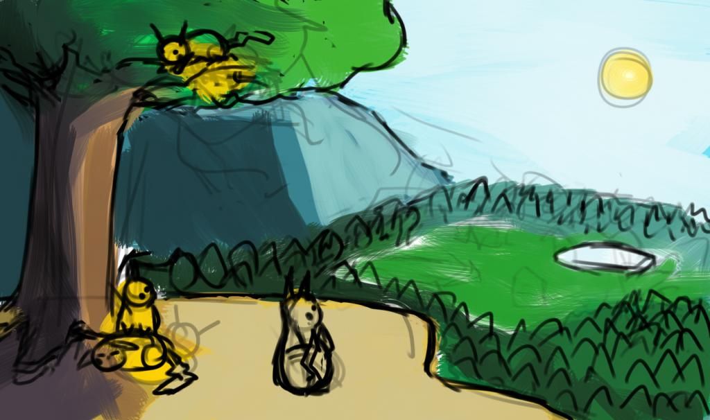
I'd like suggestions on my Pikachu painting, mostly regarding digital techniques. I'm fairly happy with how everything looks at the moment, but I don't know to refine it and make it look nice- in SAI my paintings are smudgy and in PS they're really gross and airbrushed. Do you guys do any special things when rendering things?


Jimnymebob

Smash Champion
Joined
Sep 26, 2008
Messages
2,020
NNID
Jimnymebob
The composition, colours, and lighting are looking good so far.
Only thing that seems kinda off is the brush that you're using. It looks really harsh and scratched on, a contrast to the peaceful scene. I guess the smudge tool could help you there, or just adding a broader range of shades.
Are you using one of the default Photoshop wet paint brushes?
 

Chronodiver Lokii

Chaotic Stupid
BRoomer
Joined
Aug 11, 2009
Messages
5,846
Location
NEOH
Global, looks cute x3

Oooooh! im working on a few paintings right now. I could livestream and demo how i paint in PS : o
Im not nearly as good as Bren and Aly, but I am confident enough in PS to demo I guess xD
 

Neon Ness

Designated Procrastinator
Joined
Jul 10, 2008
Messages
3,631
I'd like suggestions on my Pikachu painting, mostly regarding digital techniques. I'm fairly happy with how everything looks at the moment, but I don't know to refine it and make it look nice- in SAI my paintings are smudgy and in PS they're really gross and airbrushed. Do you guys do any special things when rendering things?
I guess it depends on what you mean by "look nice"--are you going for something more realistic, or trying to match Ken Sugimori's style of drawing, etc. I guess the next step might be to start refining shapes though.

The tree in the foreground for instance, the shape of the trunk just goes straight up and down without any irregularities and the leaves look like a bundle of green cotton. You could find some reference in real life/photos of the sort of tree you have in mind, and see how the leaves actually sit on the branches, how light passes through the foliage, all the curves and bumps in the bark, etc. Even if you're not going for full-blown realistic, this can help give you an idea of how things should basically look and you can stylize where you want.

As for the smudgy/airbrushed look, from personal experience I realized my stuff looked the same way because I didn't really understand how light/color worked lol. Try to read up on light/color theory a bit for the basics, I found it to be a pretty big help so far. For a painting like this it might also help to study outdoors midday lighting environments, to see how things like leaves appear to change color/brightness when facing sunlight and when facing away from it. Also look for a shift in values/colors for things in the distance--adding a little atmospheric perspective can help push that forest/mountain farther back from the 'camera'.

Also agree with Jimnymebob about the brush. For blocking in basic colors I'd try something more straightforward (default hard round brush in PS would probably be fine, set the Spacing to 1% though) for making big splotches of color fast and covering the white of the canvas below. A scratchy brush like that seems more like it'd be used to indicate a specific texture in greater detail.

My long winded 2 cents. Hope that helped though. :D
 

Jimnymebob

Smash Champion
Joined
Sep 26, 2008
Messages
2,020
NNID
Jimnymebob
To elaborate on what Neon Ness said, the image will benefit if you incorporate more realism into the painting, then loosen it up/make it more cartoony or stylised from there. Aside from going from reference, a good source to look at would be Bob Ross' work. A lot of his work seems to be similar to what you're trying to achieve, and even though they are edging to the more photorealistic end of the spectrum, they could still help you with your scene.

This is a great site to do with Colour Theory/Johannes Itten's Farbkreis. I'm probably approaching this from more of a graphic design aspect, but your colour palette is very analogous; you've covered half of the colour wheel, which is OK, but the lack of complementary colours stops any particular thing from standing out. However its hard to suggest what you could do about that, because I could say make the sky a more reddish hue, to complement the trees and leaves, but then you'd need to change the colour of the whole scene pretty much due to the change in lighting.

Just try dropping in some texture and fine details with a 1pt brush and see where you end up from there lol. Also maybe try making the sun more radiant, it's currently just a yellow ball sitting in the middle of an almost frosty looking sky.
 

Neon!

Smash Lord
Joined
Nov 7, 2010
Messages
1,285
Location
Dallas, Texas
I'm always name searching here so I thought I might as well ask, are there only certain art mediums that you critique here? Seems like most of it is digital art in which case I'd love to show some of my work.
 

Geist

Smash Master
Joined
Sep 26, 2007
Messages
4,893
Location
Menswear section
All mediums are critiqued, but many of us specialize in digital. Probably because there's generally more people who are regulars here that are going to art school for technical or production art rather than fine arts.
But yeah totally post your stuff, I always like giving a whopping wall of text critique when I have the time.
 

Neon!

Smash Lord
Joined
Nov 7, 2010
Messages
1,285
Location
Dallas, Texas
All mediums are critiqued, but many of us specialize in digital. Probably because there's generally more people who are regulars here that are going to art school for technical or production art rather than fine arts.
But yeah totally post your stuff, I always like giving a whopping wall of text critique when I have the time.


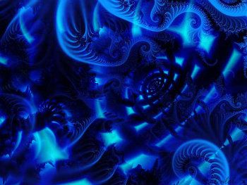
I've enjoyed making fractal art in the past and this was one of my personal favorites.
 

global-wolf

Smash Champion
Joined
Jan 17, 2010
Messages
2,215
Location
Northern Virginia
Thanks for the responses guys. Jimny, the reason it looks messy is because it's just my rough outline of where I want the objects and the color to be, it took about 20 minutes. I used SAI's default pen and brush tools for this. For reference, here are some finished digital paintings I've done: http://global-wolf.deviantart.com/gallery/#/d4933w8 http://global-wolf.deviantart.com/art/Light-Absorb-200011170

You can see in the Pidgeot picture that I did attempt to create texture in the nest, but everything still looks smudgy. Overall it's really difficult for me to give things a sharp edge and still make it look natural. At the moment, it's not really the colors that I'm worried about, I'm happy enough with it that I can start to really paint it. But on this step, I can't seem to find a way on SAI to not make it smudgy or on PS to not make it plastic looking. I guess my original question wasn't really clear, I apologize. I wanted to know if anyone did anything special when rendering details.

Here are some crisp paintings to contrast with my smudge http://daniellieske.deviantart.com/gallery/?sort=popularity&catpath=/&q=#/d2dwrlq http://purplekecleon.deviantart.com/gallery/?sort=popularity&catpath=/&q=#/d46utg8


Neon, I don't know enough about fractals to critique but it looks good to me :)
 

Geist

Smash Master
Joined
Sep 26, 2007
Messages
4,893
Location
Menswear section


I've enjoyed making fractal art in the past and this was one of my personal favorites.
ah coool, I think this is the first piece of fractal art I've seen in here yet.
It's not bad, correct me if I'm wrong but it looks like it's from a 2d fractal generator rather than a 3d one? I'm not so sure how those work but since fractals are procedural and have no true resolution, I'd like to see a really enlarged version where you can really see the crispness of the patterns and repeating shapes. There's not a lot of contrast, since it's monochrome blue (in fact blue is the naturally darkest looking color - if all colors of the same brightness value were lined up, blue would 'appear' most dark.) So unfortunately the small size of what you posted doesn't really showcase well what you've done.

Fractal art is more or less the digital medium's equivalent to abstract, and a lot of the basics and important rules pass over. Composition and color become much more important than structure and form, and stuff like perspective is thrown out the window. Composition, by far, should be the thing you should study into if you really want your fractal stuff to vastly improve. I'll go by some basics of that, and then see where I can go from there.

So you've probably heard of it, but there's 2 really important things in composition called "the golden ratio" and "the fibonacci sequence". I say you probably know them because fractals are based on these exact equations and more or less capture their own natural composition perfectly in an unlimited repeating scale. It's then up to you as the artist to capture this on a limited scale.
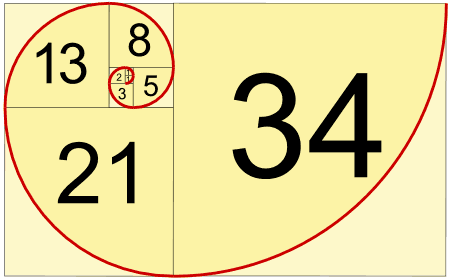
So the Fibonacci sequence goes 0, 1, 1, 2, 3, 5, 8, 13, 21, 34... etc etc. That's the most important part to remember. You don't have to memorize the numbers but you need to remember what they represent.

Here's the fibonacci sequence in a more practical form.


This ties directly into the second rule, "the golden ratio"
The golden ratio is "A+B divided by A = A divided by B" this equation comes out to 1.618
This ratio produces a rectangle that you're probably familiar with. Credit/ debit cards, TVs, your monitor, photographs, and even packs of gum are among a huge amount of actual objects that use this ratio, simply because it's an appealing shape. This is also the cheapest and easiest way to determine canvas shape and size as well as composition. I'll get to actual composition setup in a sec.

Now you'll notice something


look familiar? The fibonacci sequence continues in that into infinity. Not only are these two equations absolutely abundant in nature (seriously google 'fibonacci sequence in nature', it's really awesome stuff) but it's very similar math that leads into mandlebrot equations and fractal generations.


Now you can apply this to actual compositional techniques by using focus and vanish points, horizon lines and perspective techniqies. I know I said perspective is more or less thrown out the window, but stay with me here.
There's a 3rd rule that you should be aware of. It's not as universe-explaining as the last 2 but it serves its purpose well. It's referred to as the rule of thirds, and the idea goes, if you divided your canvas up by thirds both horizontally and vertically, the intersecting points are the areas where focus points become most interesting and most appealing.

Visual:


Easy. This isn't a rigid rule, and there's lots of ways to make interesting compositions without it, but generally it's a great rule to keep in mind.

Now, because this hopefully hasn't been an info overload at this point in time I'm going to go further and touch on leading techniques. People's eyes are naturally drawn to certain elements, colors, shapes and lines. These aren't rigid rules either, and you don't have to use all, if any, of these while determining composition, but they're useful tools in manipulating your audience into looking and focusing on certain areas rather than others.
To list a few:
- Cool colors tend to recede back into space and warm colors tend to appear in the foreground.
- people tend to subconsciously continue down straight lines, which makes a 'pointing effect' you draw a line, and their eyes go that way.
- the eye is lazy, and is drawn to blank areas more-so than busy complex areas. This can also help push their eyes around the canvas.
- contrast creates boundaries and helps divide the canvas. Darks with lights, oranges with blues, simple with complex, textured with smooth, etc. It's much more visually stimulating to have drastic differences than one long smooth gradual change
- framing results in surrounding your intended focus or subject in with shapes or some other boundary form. The above mentioned contrast, for example, could work in framing.
- similar shapes can help tie in different subjects and create a relation between parts of your art piece
- shapes can also work to lead the eye. You subconsciously break everything down into large recognizable shapes, no matter how complex they are. This can help create that pointing effect as mentioned earlier

So hopefully this helped, it turned into more or a lesson than and actual critique but hey
whatever I guess


Thanks for the responses guys. Jimny, the reason it looks messy is because it's just my rough outline of where I want the objects and the color to be, it took about 20 minutes. I used SAI's default pen and brush tools for this. For reference, here are some finished digital paintings I've done: http://global-wolf.deviantart.com/gallery/#/d4933w8 http://global-wolf.deviantart.com/art/Light-Absorb-200011170

You can see in the Pidgeot picture that I did attempt to create texture in the nest, but everything still looks smudgy. Overall it's really difficult for me to give things a sharp edge and still make it look natural. At the moment, it's not really the colors that I'm worried about, I'm happy enough with it that I can start to really paint it. But on this step, I can't seem to find a way on SAI to not make it smudgy or on PS to not make it plastic looking. I guess my original question wasn't really clear, I apologize. I wanted to know if anyone did anything special when rendering details.

I'm thinking you may have one of the same problems I have global
I focus too much on very specific areas when I paint and lose the ability to judge what parts are able to be automatically filled in by someone else. If you notice, especially in the first painting of that other persons's profile you linked, a lot of that sharp detail was composed of solid strokes of color. Your mind fills in what's missing and judges the entire piece as a whole. However, when you're working on a painting, you are focusing on specific areas at a time. It may look much better than you think it does, at least to someone else.
That being said, it's very important to practice texture and material painting. I'd suggest that to you personally. Try painting a really rugged tree stump, then try painting a porcelain fruit bowl. You'll notice that the colors contrast with eachother in much different ways and you'll get sharper shadows and broader highlights. Some materials will require smudging while others wont.
Try to limit yourself for a few paintings by only allowing yourself use of a solid colored hard brush, and see what you can do.
 

Neon!

Smash Lord
Joined
Nov 7, 2010
Messages
1,285
Location
Dallas, Texas
ah coool, I think this is the first piece of fractal art I've seen in here yet.
It's not bad, correct me if I'm wrong but it looks like it's from a 2d fractal generator rather than a 3d one? I'm not so sure how those work but since fractals are procedural and have no true resolution, I'd like to see a really enlarged version where you can really see the crispness of the patterns and repeating shapes. There's not a lot of contrast, since it's monochrome blue (in fact blue is the naturally darkest looking color - if all colors of the same brightness value were lined up, blue would 'appear' most dark.) So unfortunately the small size of what you posted doesn't really showcase well what you've done.

Fractal art is more or less the digital medium's equivalent to abstract, and a lot of the basics and important rules pass over. Composition and color become much more important than structure and form, and stuff like perspective is thrown out the window. Composition, by far, should be the thing you should study into if you really want your fractal stuff to vastly improve. I'll go by some basics of that, and then see where I can go from there.

So you've probably heard of it, but there's 2 really important things in composition called "the golden ratio" and "the fibonacci sequence". I say you probably know them because fractals are based on these exact equations and more or less capture their own natural composition perfectly in an unlimited repeating scale. It's then up to you as the artist to capture this on a limited scale.
So the Fibonacci sequence goes 0, 1, 1, 2, 3, 5, 8, 13, 21, 34... etc etc. That's the most important part to remember. You don't have to memorize the numbers but you need to remember what they represent.

Here's the fibonacci sequence in a more practical form.

This ties directly into the second rule, "the golden ratio"
The golden ratio is "A+B divided by A = A divided by B" this equation comes out to 1.618
This ratio produces a rectangle that you're probably familiar with. Credit/ debit cards, TVs, your monitor, photographs, and even packs of gum are among a huge amount of actual objects that use this ratio, simply because it's an appealing shape. This is also the cheapest and easiest way to determine canvas shape and size as well as composition. I'll get to actual composition setup in a sec.

Now you'll notice something


look familiar? The fibonacci sequence continues in that into infinity. Not only are these two equations absolutely abundant in nature (seriously google 'fibonacci sequence in nature', it's really awesome stuff) but it's very similar math that leads into mandlebrot equations and fractal generations.


Now you can apply this to actual compositional techniques by using focus and vanish points, horizon lines and perspective techniqies. I know I said perspective is more or less thrown out the window, but stay with me here.
There's a 3rd rule that you should be aware of. It's not as universe-explaining as the last 2 but it serves its purpose well. It's referred to as the rule of thirds, and the idea goes, if you divided your canvas up by thirds both horizontally and vertically, the intersecting points are the areas where focus points become most interesting and most appealing.


Easy. This isn't a rigid rule, and there's lots of ways to make interesting compositions without it, but generally it's a great rule to keep in mind.

Now, because this hopefully hasn't been an info overload at this point in time I'm going to go further and touch on leading techniques. People's eyes are naturally drawn to certain elements, colors, shapes and lines. These aren't rigid rules either, and you don't have to use all, if any, of these while determining composition, but they're useful tools in manipulating your audience into looking and focusing on certain areas rather than others.
To list a few:
- Cool colors tend to recede back into space and warm colors tend to appear in the foreground.
- people tend to subconsciously continue down straight lines, which makes a 'pointing effect' you draw a line, and their eyes go that way.
- the eye is lazy, and is drawn to blank areas more-so than busy complex areas. This can also help push their eyes around the canvas.
- contrast creates boundaries and helps divide the canvas. Darks with lights, oranges with blues, simple with complex, textured with smooth, etc. It's much more visually stimulating to have drastic differences than one long smooth gradual change
- framing results in surrounding your intended focus or subject in with shapes or some other boundary form. The above mentioned contrast, for example, could work in framing.
- similar shapes can help tie in different subjects and create a relation between parts of your art piece
- shapes can also work to lead the eye. You subconsciously break everything down into large recognizable shapes, no matter how complex they are. This can help create that pointing effect as mentioned earlier

So hopefully this helped, it turned into more or a lesson than and actual critique but hey
whatever I guess

.
This piece was made using Ultra Fractal v5.04. I decided to only upload a smaller, watermarked version of this piece which I named "Realms" because I don't particularly want it to be used by anyone else. I doubt that I would actually have to worry about that here but I just want to play it safe.

I'm familiar with all of the design principles you mentioned but I'm sure they were more of a help to others who were possibly not familiar with fractal art. Fractals can be either fairly easy to make or sometimes very difficult. I've spent between 10 minutes and 2 hours making a single one, its easy to get lost in the color scheme trying to find the perfect combination. With "Realms" I wanted to create an entrance to another dimension, it's overlaid with vines to give it a mysterious and aged feel.
 
Top Bottom