• Welcome to Smashboards, the world's largest Super Smash Brothers community! Over 250,000 Smash Bros. fans from around the world have come to discuss these great games in over 19 million posts!

    You are currently viewing our boards as a visitor. Click here to sign up right now and start on your path in the Smash community!

Official Critique Topic

Geist

Smash Master
Joined
Sep 26, 2007
Messages
4,893
Location
Menswear section
Yeah by all means, my critique is just for suggestion and ideas for you lol. It's always good to have a second ear for music but it obviously comes do your choice.

And you're welcome :p

btw I'll see if I have enough time later to critique that second song
 

Jim Morrison

Smash Authority
Joined
Aug 28, 2008
Messages
15,287
Location
The Netherlands


Something I drew up! But it's not finished (doubt I'll ever finish it to my satisfaction), so I'd love to hear some critique, what seems off, what seems on etc.

P.S. I am not good at all at drawing, a simple thing like this took me 4 hours.
 

Charmander

Smash Champion
Joined
Jan 4, 2010
Messages
2,015
Location
The Middle Pokeball
NNID
JoeThorpedo


Something I drew up! But it's not finished (doubt I'll ever finish it to my satisfaction), so I'd love to hear some critique, what seems off, what seems on etc.

P.S. I am not good at all at drawing, a simple thing like this took me 4 hours.
Is this supposed to be in the same style as Okami? At least the outlining reminds me of it, and I cant really get enough of that game x)

Anyway *ahem*
The first thing you want to do is make everything in the drawing all in one style.
Like, Theres the large okami-esque borders and the tree's shading goes well with it.
Then theres the grass, in a totally different style, more focused on the blades of grass themselves, and have no borders at all.
Then you have the persons face which...to be honest creeps me out being in that picture, Its much too surreal for the pictures type of atmosphere.

I suggest you make the field, instead of detailing the grass blades themselves, do a more distanced approach..bah I cant really explain it, so heres some pictures to show what I mean
http://images.wikia.com/zelda/images/8/8b/Hyrule_Field_(Ocarina_of_Time).png
http://26.media.tumblr.com/tumblr_lftxc7gYt91qgvvtno1_500.jpg
(yeah, one of the images is from okami, but it fits XD)

As for the face..just focus less on sheer detail for now. I suggest a more cartoony look, something that just sorta flows with the style your using.

Forgive me, Im not that great at critiquing, but I tried. Its a really nice piece overall though ^^
Im sure Giest or Global Wolf or someone will give you a much more useful critique XD
So keep an eye out for theirs if they make one.
 

Jim Morrison

Smash Authority
Joined
Aug 28, 2008
Messages
15,287
Location
The Netherlands
Thank you, I really had no idea where I was going with this piece, so I just did whatever I felt like drawing at that time, so I'm going to agree with you, the composition of style is terrible.
The thing that reminded you of Okami is most likely the fact that I used the caligraph brush, one of my favourite ones :p. Thanks for the criqitue.
 

ZIO

( ͡° ͜ʖ ͡°)
Joined
Sep 14, 2006
Messages
10,884
Location
FREEDOM
I'll say a few things, I suppose.

What was your goal of the piece, first and foremost? Message? Having think that out, you can direct the piece better. To me, it feels like you didn't think of the composition and just threw things on a canvas.

The lines, in general, are actually mad distracting to the piece, as a whole. The horizon like is glaring and splits the image in an uninteresting way. Line quality needs work, since all the lines are of the same length, it's hard to get a sense of depth. Just by changing the weight, you can effectively change the whole picture; What has thicker, darker lines, comes out at the viewer, meanwhile thin, light valued lines tend to descend into the background.

So what I'm saying is, make the horizon line non-existent. Hell, if you know how to work out Atmospheric perspective, you could make the earth meld with the sky for added depth.

I also see you spent more time on the color/painting part. I think the emphasis on the blades of grass wasn't needed and actually hurt the composition of the work. Being that the strokes are the same length at the horizon line and at the base of the tree, you effectively made the piece flat with no sense of space.

I hope that helps, if you do plan on doing more work on it.
 

Jim Morrison

Smash Authority
Joined
Aug 28, 2008
Messages
15,287
Location
The Netherlands
I actually don't think I'll plan on doing more work on it, this is much more a piece to get critique on, than to look good. Thanks a bunch ZIO. There was no goal with the piece, I just wanted to draw and put things on the canvas. First it was lines, but then I decided "nope colour too" and decided I didn't want to do lines around every blade of grass or the clouds etc., so yeah composition was thought out HORRIBLY.

On the lines part, thanks, I actually had no idea it worked like that. What do you mean by weight and "all the lines are of the same length"?

Yeah, I'm very unhappy with the grass and would've deleted it, but I was a ****** and did it on the same layer as most of the lines. Any advice on the colouring part of the drawing, it's what I'm most interested in, since colouring is what I spend most time on, usually.
 

ZIO

( ͡° ͜ʖ ͡°)
Joined
Sep 14, 2006
Messages
10,884
Location
FREEDOM
Weighted lines refer to their thickness, really. When I referred to length, I was referring to the width of the lines, and I really should have said width. Bad choice of words.

You'd be surprised at how heavy lines effect composition. Hell, there are lines you can't see, even.

I hope I didn't come off as mean or anything. I don't mean to insult anyone. Try taking what i suggested and implement in the next work you do. :)
 

Neon Ness

Designated Procrastinator
Joined
Jul 10, 2008
Messages
3,631
I actually thought the voice acting was pretty good heh. I liked the overall pacing and comedic timing.

The animation wasn't bad--it wasn't distracting or anything but it does have that basic MS Paint kind of look. Since the comedy/writing seems to be the main point of the show you could probably get away with it if you wanted to, but whoever on your team is doing the art might want to invest in getting a digital tablet. It should help those wobbly lines be less... wobbly.

As far as animation it could be a bit more fluid in some areas. For instance, in the opening scene where the gorilla is walking across the 'stage' he's just sort of gliding along. A simple up-and-down movement can better suggest walking even if we don't see his feet. Whenever you're animating a gesture or movement, act it out in real life and take note of all of the subtle nuances to make it really convincing. Of course there's a lot more to the craft of animating, so if you want to get serious about it there are a lot of good books on the subject. Richard Williams' The Animator's Survival Kit is a pretty good one from my experience.

I'm not a sound expert so I can't recommend a microphone or anything, but at certain points it sounded like you were talking out of a box. Great stuff though, keep it up!
 

DoctorRheet

Smash Rookie
Joined
Mar 4, 2012
Messages
1
Here is the first cartoon my chap and I produced. How's the animation, writing, and voice acting?
Not bad for a first, but needs lots of work. The artwork looked pretty sloppy. Sloppy lines can work well in animation, but it really needed some depth. First, you need a background. Something besides a solid colour like you have. I think you should put some shading into the background, and while you could also shade the characters, they'll look fine without it and have more emphasis. That alone will make it look way better.

I second what neon said about the animation, but you can always do something simple and appealing without having to put too much effort in the animation itself.

Get decent mic, or at least add some background noise (people murmuring and rustling in the background). I liked the outro music though. Made me feel good inside.

Voice acting was alright for what it was. Overacted a bit imo, but I see that was the point.

I didn't find the writing particularly funny nor interesting.

Sounds like I'm just hating on you, but I'm a critical person. It really is good for a first attempt.
 

Dr. Wario

Smash Cadet
Joined
Oct 29, 2006
Messages
35
Location
Kingston (Canada!)
I actually thought the voice acting was pretty good heh. I liked the overall pacing and comedic timing.

The animation wasn't bad--it wasn't distracting or anything but it does have that basic MS Paint kind of look. Since the comedy/writing seems to be the main point of the show you could probably get away with it if you wanted to, but whoever on your team is doing the art might want to invest in getting a digital tablet. It should help those wobbly lines be less... wobbly.

As far as animation it could be a bit more fluid in some areas. For instance, in the opening scene where the gorilla is walking across the 'stage' he's just sort of gliding along. A simple up-and-down movement can better suggest walking even if we don't see his feet. Whenever you're animating a gesture or movement, act it out in real life and take note of all of the subtle nuances to make it really convincing. Of course there's a lot more to the craft of animating, so if you want to get serious about it there are a lot of good books on the subject. Richard Williams' The Animator's Survival Kit is a pretty good one from my experience.

I'm not a sound expert so I can't recommend a microphone or anything, but at certain points it sounded like you were talking out of a box. Great stuff though, keep it up!
Thanks! We do have a tablet but this is our main method of exercising skills with it so it's good to know what to improve on for next time. I just might pick up that book you recommended - hopefully it'll help.

The microphone we use is pretty professional but the room we recorded it in has terrible acoustics. By the way, I hope the background noise didn't sound like a mic problem - everything recorded was crystal clear. We were going to record a washing machine but were clinched for time on the project and had to use a freeware loop. Probably not the best quality one so that's why the background sounded like ****.

As for the good Doctor above, all your points have been noted as well! Thanks for all the critique and don't worry about coming off as callous - it can only help us improve.
 

PsychoIncarnate

The Eternal Will of the Swarm
Joined
Jul 4, 2007
Messages
50,642
Location
Char
NNID
PsychoIncarnate
3DS FC
4554-0155-5885
I've been drawing up a storm for the same comic I've been working on for a while (Since I first drew it when I was 6)

I posted a picture here once of one of the characters from it, I believe. A robot thing.

My style has changed a bit from then.
 

Neon Ness

Designated Procrastinator
Joined
Jul 10, 2008
Messages
3,631
Sooo... I imagine there was supposed to be an image in that post but it was accidentally left out?

Remember this thread is for critiquing artwork, general discussion goes in the social.
 

PsychoIncarnate

The Eternal Will of the Swarm
Joined
Jul 4, 2007
Messages
50,642
Location
Char
NNID
PsychoIncarnate
3DS FC
4554-0155-5885
Sooo... I imagine there was supposed to be an image in that post but it was accidentally left out?

Remember this thread is for critiquing artwork, general discussion goes in the social.
Yeah, I have it now.

It got messed up at first


DiSQO_BuNNY

Smash Lord
Joined
Mar 11, 2011
Messages
1,133
Location
Altadena, CA
NNID
DisqoBunny
^ that's legit.
Man I wish I had known about this place before. anyway.
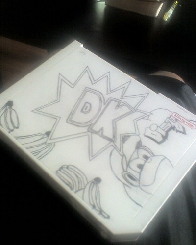
I'm disqo, a self proclaimed sharpie expert. I usually draw on people shoes or this and that. Recently decided to draw on my wii. No color yet, so enjoy black and white


:phone:
 

Geist

Smash Master
Joined
Sep 26, 2007
Messages
4,893
Location
Menswear section
For freehand, it doesn't look bad, but it's hard for me not to nitpick people to create guidelines for themselves first. I come from an engineering/drafting past, so having very rigid guidelines and extremely clean linework is important to me. My advice for you is to work hard in planning ahead and working out problems beforehand.
I sound like a negative nancy above just to emphasize that advice. It does look pretty sweet, but it also needs color, I think. Mostly because there isn't eye grabbing amounts of detail (not necessarily a bad thing on its own), it would probably function better if color helped emphasize the images you have on there. It would make it much more attention grabbing than simple linework.

You have good even spacing with your lines though, you did a good work on the DK section, but your bananas are looking a tad squiggly. So my advice remains with 'guidelines are your friends' especially when working with permanent mediums.
 

DiSQO_BuNNY

Smash Lord
Joined
Mar 11, 2011
Messages
1,133
Location
Altadena, CA
NNID
DisqoBunny
For freehand, it doesn't look bad, but it's hard for me not to nitpick people to create guidelines for themselves first. I come from an engineering/drafting past, so having very rigid guidelines and extremely clean linework is important to me. My advice for you is to work hard in planning ahead and working out problems beforehand.
I sound like a negative nancy above just to emphasize that advice. It does look pretty sweet, but it also needs color, I think. Mostly because there isn't eye grabbing amounts of detail (not necessarily a bad thing on its own), it would probably function better if color helped emphasize the images you have on there. It would make it much more attention grabbing than simple linework.

You have good even spacing with your lines though, you did a good work on the DK section, but your bananas are looking a tad squiggly. So my advice remains with 'guidelines are your friends' especially when working with permanent mediums.
Thank you!!! Your advice is well taken.
About the guidelines: I've never quite used them for anything I've done. I do however, when do anything with sharpie, draft out my drawing in light pencil sketches. It was different on the wii because the surface is so slippery, and my bad habit of resting my hand on something would rub the pencil off, so it was like free handing twice.
Color is coming, along with the fixing of the squiggly bananas xD

:phone:
 

Geist

Smash Master
Joined
Sep 26, 2007
Messages
4,893
Location
Menswear section
No problem, I'm looking forward to seeing it finished.

Yeah, I have it now.

It got messed up at first

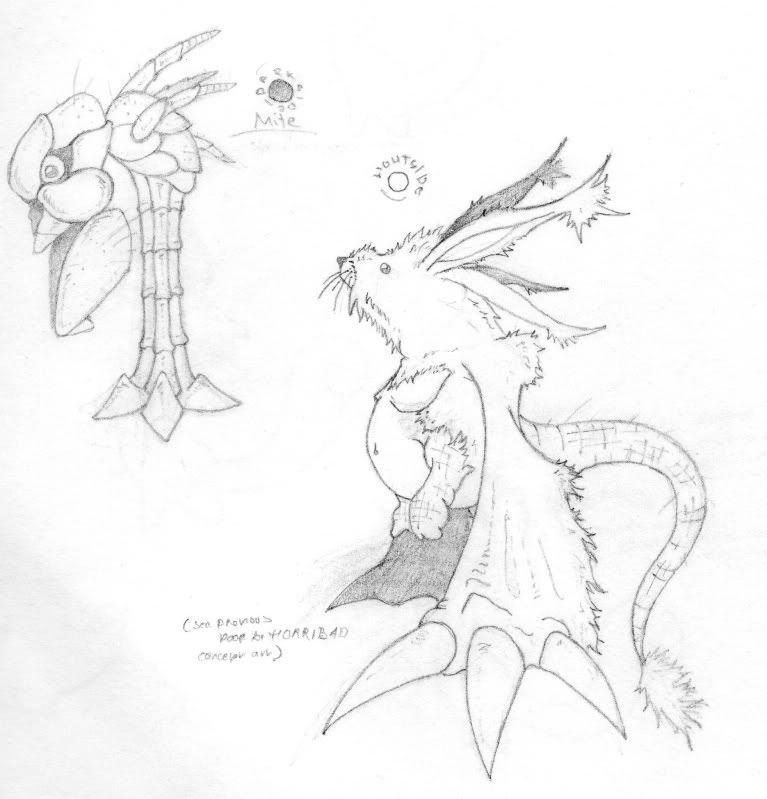
This never got a critique, so I'll do something now for good measure.

When doing concept sheets for creatures and the like, it's good practice to draw rotations and sections in greater detail, or else definition and dimensions are lost, and it can be a detriment to even function as reference. It's 'good practice' in both senses that it's a good professional habit to have, and it's good for literally practicing drawing that character, and getting a consistency down in general.
Not just rotations either, but closeups of faces, hands, feet, eyes, and anything you feel the character/thing should have more focus on.
Physically, those drawings have pretty neat lines, and they're interesting concepts. They give me a total digimon vibe.
 

PsychoIncarnate

The Eternal Will of the Swarm
Joined
Jul 4, 2007
Messages
50,642
Location
Char
NNID
PsychoIncarnate
3DS FC
4554-0155-5885
No problem, I'm looking forward to seeing it finished.


This never got a critique, so I'll do something now for good measure.

When doing concept sheets for creatures and the like, it's good practice to draw rotations and sections in greater detail, or else definition and dimensions are lost, and it can be a detriment to even function as reference. It's 'good practice' in both senses that it's a good professional habit to have, and it's good for literally practicing drawing that character, and getting a consistency down in general.
Not just rotations either, but closeups of faces, hands, feet, eyes, and anything you feel the character/thing should have more focus on.
Physically, those drawings have pretty neat lines, and they're interesting concepts. They give me a total digimon vibe.
Actually when I have an idea for these characters and first try and draw them I do draw them from multiple angles, and also joints and various body parts by themselves.

I also draw hundreds of failed concepts for the same character...This is just from a sketch book where I put designs I like into a short of gallery of the characters with information written about them
 

BioDG

Smash Ace
Joined
Jan 20, 2009
Messages
609
@Geist:
What was your process in learning figure drawing? I remembered your sketches and I feel like you have well-established skills with the human form. I'm mainly going through instruction books (Burne Hogarth) while occasionally drawing from photos. Life Drawing classes seem best, and I have taken a few, but now that I'm done with school, I currently don't have access to that (although I am searching) so I'm looking for what would be considered a sound process when that isn't available.
 

Chronodiver Lokii

Chaotic Stupid
BRoomer
Joined
Aug 11, 2009
Messages
5,846
Location
NEOH
Read loomis Bio
All his books are public domain and inn .pdf on the interwebs
Figure drawing god right there

:phone:
 

Neon Ness

Designated Procrastinator
Joined
Jul 10, 2008
Messages
3,631
Yeah, Andrew Loomis is good--Figure Drawing For All It's Worth might be a good one to start with. I've heard George Bridgman is another useful resource as well.

Even if you're not in a class, I think sketching people around you whenever you can is still good practice. Just go to a public place and find a good spot out of the way to draw, even if it's just rough gestures.

We also have a Q+A thread for general questions. http://www.smashboards.com/showthread.php?t=290735
 

Geist

Smash Master
Joined
Sep 26, 2007
Messages
4,893
Location
Menswear section
@Geist:
What was your process in learning figure drawing? I remembered your sketches and I feel like you have well-established skills with the human form. I'm mainly going through instruction books (Burne Hogarth) while occasionally drawing from photos. Life Drawing classes seem best, and I have taken a few, but now that I'm done with school, I currently don't have access to that (although I am searching) so I'm looking for what would be considered a sound process when that isn't available.
I got the majority of my raw experience through life drawing classes, and I was fortunate enough to be tutored from an instructor who has done work with marvel and the like. I suppose that's coming on to 2 years of that soon.
Books are a good way to read really concise ideas and concepts straight from the experts that can help you, but you don't have that hands-on experience you get from drawing a model from life. Reading a book most likely won't result in you doing hundreds and hundreds of drawings, and as much knowledge as you may have, practical application only comes through experience.
If you look hard enough, you should find life drawing studios that have membership fees and all day life drawing.

I highly reccommend 'force' by Mike Mattesi (who instructs at Pixar) and the 'Vilppu drawing manual' by glenn vilppu, as well as works by andrew loomis that the other guys have reccommended.
 

Jen =3

Smash Cadet
Joined
Apr 7, 2010
Messages
41
Location
Wonderland
Hey there, long time no see :3

@PsychoIncarnate: The picture is well drawn for an anime style artwork, or a "cartooonish" monster. I'd love to see it more finished, shaded, with color, but for imagination I would give it a strong 7. I've never seen anything like it, but the artwork reminds me of Digimon (: Otherwise, as an artwork in whole it doesn't seem finished, I'm sure since it is just concept art there is much more you will be doing, and I'd like to see it.

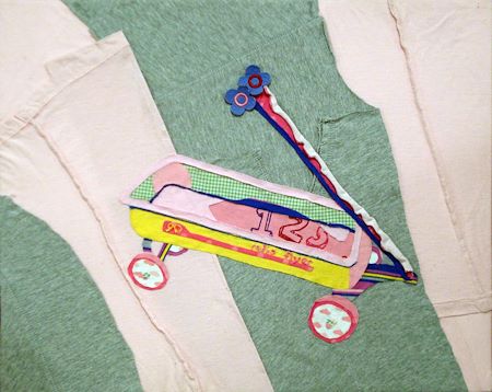
I made this out of baby clothes, as an incarnation of my childhood, critique?


PsychoIncarnate

The Eternal Will of the Swarm
Joined
Jul 4, 2007
Messages
50,642
Location
Char
NNID
PsychoIncarnate
3DS FC
4554-0155-5885
I really wasn't even looking at Digimon for inspiration...I kind of just took animals, made them cartoony and twisted them into forms I thought would look grotesque, but cute at the same time
 

Neon Ness

Designated Procrastinator
Joined
Jul 10, 2008
Messages
3,631
That's nice Jen, how long did that take?

The only thing that stands out is that some of the edges are wobbly. I'm not sure what you used to cut this but I think it would look cleaner with straighter edges and more uniformly round wheels. Personal preference though. The pastel colors definitely give off that childhood look you were aiming for.
 

Kuares

Pizza
Joined
Aug 15, 2010
Messages
732
Location
"G-Ames?" Iowa


Hey guys, so I drew this on the 3ds, using that colors program that got released recently and I wanted a critique.

I know that the right hand is pretty iffy and the text I should've spent more time on. Other than that I'm not quite sure what I should work on with technique? Dunno if I'm relying too much on the outlines, and/or I need to make more contrast in the shading.
 

Neon Ness

Designated Procrastinator
Joined
Jul 10, 2008
Messages
3,631
It's actually preferred if you show us a specific work you want advice on in this thread as opposed to "Hey! Look at my whole gallery!" But I will say you've got some incredibly nice portraits in there. I love the wide range of lights and darks you get with your pencils/charcoal. :D I guess I'd recommend taking care of your edges a bit more. Try using using hard edges for focal points and areas of clarity; use softer edges for less important details and things like hair. Uniform edges are less distracting to the eye and look more polished in general.

@ Kuares: Looks pretty good to me so far. The only issue with it is it's sort of confusing how Fox and the Arwing are mashed against each other. It might help the Arwing fade into the background a little more if you used lighter, duller colors on it so it looks like it's far away. Fox's shoulder seems to be coming from his ear, so some planning of the basic body position could help before getting into details. I dunno, it's probably hard to draw on something as cramped as a 3DS screen though. You could create a more defined light source with where your highlights and shadows are placed. There's a bright area behind him on the left so you could make all of the surfaces that are turned toward the opposite direction much darker for a more dynamic look.

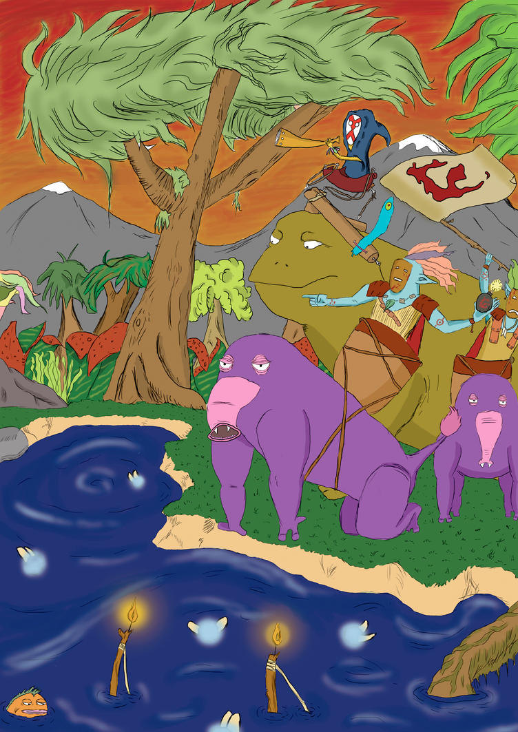
@ Olikus: I'd really like this much more if you just cropped off the bottom area with the water. The soft airbrushy highlights of the lake and fairies just seem so out of place with the upper landscape. I really like the line work in the upper portion, it definitely has a comic feel with the simple flat shading. You might consider really focusing on getting the perspective right in this. Where's the horizon and where are the vanishing points? Marking those out will help put everything on the appropriate plane, as the lake, tree, mountains, and a few other elements look strangely out of sync with each other in terms of where they sit space. It's looking good but it could be looking great with a little more work.

Almost forgot, if the sky is red orange then the water reflecting it should be much closer to that color than the bright blue you've got there.
 

Geist

Smash Master
Joined
Sep 26, 2007
Messages
4,893
Location
Menswear section
Hey welcome to the AE! You have some nice stuff there. One thing I'd recommend is getting more consistent facial construction. Some proportions are slightly off and while this is less apparent in your simpler drawngs, the more you trend towards straight realism, the more these small errors become glaringly obvious. If you don't already do it, use a mirror to flip the image, this is a little trick that can make you much more aware of small things that need fixing, such as an eye being a bit low, or the nose being slightly off center and whatnot.
Really focus on guidelines when shooting for photorealism of any kind. I usually spend more time blocking faces out than I do shading them, just to be extra careful.

But you have nice contrast in your drawings, and they're nice and clean. Keep it up man


A 3ds ap eh? not bad at all. Proportions are a tad wonkey but it's nothing crippling. He's got a cool line of action working for him so it makes up for a lot. The colors are nice and clean, and I like how you outlined sections with a darker color of their container, but overall the color selection feels a bit flat. I don't know how limited the 3ds ap is so I can't strike you down too hard in case they only provide like 32 colors or something.
The arwing is porbably the weakest part, mostly because it looks to me like the perspective is a tad off, and the lines could be straighter to make it look more hard surface.

Also, consider your silhouettes when making an action pose. Limbs in the wrong place can be distracting or look weird, even if they're in a place that is technically accurate. Fox's gun is hard to see because it's a similar color to his jacket, and the detail of both objects tangents a bit, making the gun hard to pick out, even if I know it's there. As a rule of thumb, make the pose completely recognizable even in a pure silhouetted form. If you filled your pose with black, does it still make sense? If it does, it's a really good pose.

Hey, not bad. I think your should redraw the mountains too lol. They're probably the weakest part. Also painting water should be more complex than a simple shade of blue. water isn't actually blue at all, but it reflects its surroundings. So the fact that you have a red sky would most likely turn the water a brown hue.
 

MCOrange

Smash Rookie
Joined
Jan 13, 2012
Messages
5
Location
Lancaster, PA
Ok thanks to both of you! the mirror idea sounds like a good 1 I'll try that out, but lately ive been trying to free hand everything instead of using a grid/pencil for measurements. (Just to improve my observation skills)
Sorry about posting the whole gallery XD my bad.
But I will definitely pay more attention to my edges.
Thanks guys!
 

Olikus

Smash Champion
Joined
Nov 12, 2009
Messages
2,451
Location
Norway
@ Olikus: I'd really like this much more if you just cropped off the bottom area with the water. The soft airbrushy highlights of the lake and fairies just seem so out of place with the upper landscape. I really like the line work in the upper portion, it definitely has a comic feel with the simple flat shading. You might consider really focusing on getting the perspective right in this. Where's the horizon and where are the vanishing points? Marking those out will help put everything on the appropriate plane, as the lake, tree, mountains, and a few other elements look strangely out of sync with each other in terms of where they sit space. It's looking good but it could be looking great with a little more work.

Almost forgot, if the sky is red orange then the water reflecting it should be much closer to that color than the bright blue you've got there.
Hey, not bad. I think your should redraw the mountains too lol. They're probably the weakest part. Also painting water should be more complex than a simple shade of blue. water isn't actually blue at all, but it reflects its surroundings. So the fact that you have a red sky would most likely turn the water a brown hue.
thanks for the feedback guys. Its still a VIP so I will definatley change some stuff. The mountains and the water color as you pointet out, shall be changed. And im wondering on redrawing the small trees too. I got pretty satisfied with the big one though. Looks a bit majestic lol.
 
Top Bottom