• Welcome to Smashboards, the world's largest Super Smash Brothers community! Over 250,000 Smash Bros. fans from around the world have come to discuss these great games in over 19 million posts!

    You are currently viewing our boards as a visitor. Click here to sign up right now and start on your path in the Smash community!

Official Critique Topic

ZIO

( ͡° ͜ʖ ͡°)
Joined
Sep 14, 2006
Messages
10,884
Location
FREEDOM
There's no real tutorial.

I did that for my controllers, and I can tell you it's problematic at times.

I'd suggest getting blue tape to border off what it is you want not to paint and use a small detailing paint brush to get the . . . details.

Spray paint usually works nicely. There different types. As the standard spray paints tend to peel off after being handled, i think there's something to help prevent the peeling. Gloss and other ****

But of course that's layer on layer on layer. And then, things don't seem to screw together as nicely as the use to. This is why i suggest the blue tape - because I ran into that with my GCN controller.

I'd say more, but I never really had much experience outside what I've said here. I hope that helps some.
 

Geist

Smash Master
Joined
Sep 26, 2007
Messages
4,893
Location
Menswear section
For the best quality, you generally want to sand off the pre-existing paint, since it chips off real easy if you just put a coating on top. You don't have to though, plus if you put a clear coat on it afterwards it helps a lot.
 

PsychoIncarnate

The Eternal Will of the Swarm
Joined
Jul 4, 2007
Messages
50,641
Location
Char
NNID
PsychoIncarnate
3DS FC
4554-0155-5885


Basic B&W Vector project I worked on occasions I had nothing else to do
 

Geist

Smash Master
Joined
Sep 26, 2007
Messages
4,893
Location
Menswear section
Nice work.

The silhouette of the robot itself is pretty well done, but the two guns on the side threw me off for a bit. The gun on the right is foreshortened a bit too much to the point where the effect is lost on the viewer. Pulling it out so even a little bit of the side of the gun is visible would help a lot.
On the gun on the left, however, the gun is lost on the viewer because of the two-tone shading. If you put in a white line to accentuate the edge of the gun it'll become much more visible.
Also I think throwing some perspective on that back arm would be sweet. Id shrink it a bit vertically so it gives the whole drawing more sense of volume and dimension.
Overall I like it. It's pretty stylin. The two-tone works really well, and the gesture is pretty dynamic, even though it's a more-or-less static image.
 

BioDG

Smash Ace
Joined
Jan 20, 2009
Messages
609
Here's an animation my little brother made, it took him almost all summer. I personally don't think he gets enough credit for his animations (which he does with a MOUSE, mind you) plus it's a fun watch so I thought I'd just show you guys.

TTGL fans are in for a nice surprise ;)

http://www.youtube.com/watch?v=PS6KADN527E&feature=player_embedded
That is unbelievably epic. Your brother is going to make it someday with that kind of talent. Make sure that kid stays on the right path.
 

PsychoIncarnate

The Eternal Will of the Swarm
Joined
Jul 4, 2007
Messages
50,641
Location
Char
NNID
PsychoIncarnate
3DS FC
4554-0155-5885
with the tv face it reminds me of canti from flcl
It's sorta "Fan Art", but it's not based on canti actually.

By fan art, it only has a couple similarities with the original artists picture. It was incorporated heavily into my story, but the artist is gone now, so I had to change it drastically

Edit 2: I just noticed some things I did BAD with the above version. I'd fix it but I don't have access to Illustrator at the moment

Edit: The artists picture is gone, but I had a drawing I did of it from way back


WIDL

We Are Born
Joined
Jun 14, 2006
Messages
249
Location
Philadelphia

I made this thing. I've been doing this perler bead stuff for three days or something now, and this was the first "product" I made, where I had to make the sprite myself - because I couldn't find a stitchface sprite - what.so.ever. I made this as a necklace to wear at tournaments (because I'm a nerd and I pull an awful lot of stitchfaces).

Thoughts? I'm mainly uncertain about the shading and the leaves. The green colors on the leaves are not as blue-ish as they seem, it's just the lighting in my room, and a mediocre mobile phone photo.
 

neous

Smash Journeyman
Joined
Mar 10, 2009
Messages
374
Location
Rutgers / Apex area
i didnt notice the lack of continuity in the shadows [when comparing the white body, and green leaves] until you pointed it out. You are right, it does look a bit "off" if you pay attention to it.

in its entirety overall, i think your "thing" is quite good. if i saw it for purchase i'd definitely pick it up. [ or in this case pluck ;D ]

keep it up.

edit:

That makes me very happy. :>

I've made like seven other "things" (lol) these last few days, I'll work on some more, then maybe I'll make my own thread. ;O
yes. please make a thread :3
 

WIDL

We Are Born
Joined
Jun 14, 2006
Messages
249
Location
Philadelphia
That makes me very happy. :>

I've made like seven other "things" (lol) these last few days, I'll work on some more, then maybe I'll make my own thread. ;O
 

Neon Ness

Designated Procrastinator
Joined
Jul 10, 2008
Messages
3,631
I've made like seven other "things" (lol) these last few days, I'll work on some more, then maybe I'll make my own thread. ;O
Sounds good, but please keep it up to date if you plan on doing so. I'd like to see more of these when you make them though, this one's really good. :D I like that you made the reference sprite yourself and worked from that... so dedicated lol.
 

global-wolf

Smash Champion
Joined
Jan 17, 2010
Messages
2,215
Location
Northern Virginia
It look good Wiidl, if I was a fan of peach and her turnips I'd buy it. :] The lighting is kinda ambiguous but I don't think anyone would notice unless it was mentioned.
 

abit_rusty

Smash Lord
Joined
Nov 7, 2006
Messages
1,544
Location
East Lansing, MI
NNID
Rontuaru
3DS FC
2895-8974-0662
That is unbelievably epic. Your brother is going to make it someday with that kind of talent. Make sure that kid stays on the right path.
Thanks man, I agree and I'm doing my best to encourage his interest in animation. I think I'll might buy him a tablet for the holidays.
 

PsychoIncarnate

The Eternal Will of the Swarm
Joined
Jul 4, 2007
Messages
50,641
Location
Char
NNID
PsychoIncarnate
3DS FC
4554-0155-5885


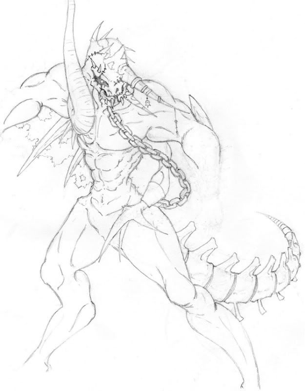
Not fully completed, and very rough. But how is this so far?

For some reason scanning pictures always makes them look weird
 

ZIO

( ͡° ͜ʖ ͡°)
Joined
Sep 14, 2006
Messages
10,884
Location
FREEDOM
Man, you just like making some morbid stuff, huh?

-I'm referring to your MC skins.

I don't see a problem yet, but we'd need to get the hand and foot work in there. See how things are by that point.

I'm not sure what you're trying to go for, but personally I don't like that the character is being drawn off the page. I encourage drawing big, but maybe you'll need to get bigger notebooks. :laugh:

The right leg (his right) the middle part seems a tad lowered. I feel maybe you should shift the weight (biggest part) up closer the the upper leg.

That's all I got.
 

PsychoIncarnate

The Eternal Will of the Swarm
Joined
Jul 4, 2007
Messages
50,641
Location
Char
NNID
PsychoIncarnate
3DS FC
4554-0155-5885
Man, you just like making some morbid stuff, huh?

-I'm referring to your MC skins.

I don't see a problem yet, but we'd need to get the hand and foot work in there. See how things are by that point.

I'm not sure what you're trying to go for, but personally I don't like that the character is being drawn off the page. I encourage drawing big, but maybe you'll need to get bigger notebooks. :laugh:

The right leg (his right) the middle part seems a tad lowered. I feel maybe you should shift the weight (biggest part) up closer the the upper leg.

That's all I got.
It's the printer's fault. There is plenty of room on the actual paper
 

ZIO

( ͡° ͜ʖ ͡°)
Joined
Sep 14, 2006
Messages
10,884
Location
FREEDOM
Oh, word? lol, well, let's see the rest of the sketch when you're done, then.

Don't go inking anything until you're sure.
 

PsychoIncarnate

The Eternal Will of the Swarm
Joined
Jul 4, 2007
Messages
50,641
Location
Char
NNID
PsychoIncarnate
3DS FC
4554-0155-5885
Another old drawing. Not complete

I had to edit it to see, because I drew it so light


I am linking it because scanner made it big, (and cut stuff off)
 

Neon Ness

Designated Procrastinator
Joined
Jul 10, 2008
Messages
3,631
Hope you don't mind :0 I outlined some stuff that looked slightly off.


The perspective on the legs mainly, the leg closest to us seemed too far down, and the number of joints didn't seem to match... Assuming it's symmetrical, it seemed like the lower 'knee' was missing on that close leg, or the shape of it didn't appear to suggest that there was another knee back there. Looking at it now I still don't think I got that area quite right... but something to look into fixing.

The center line of his torso seemed a bit too far twisted, but come to think of it it could just be that he's literally twisting his body lol. Couldn't tell.

Hope that helps, otherwise it's coming along great. Maybe sketch in some quick, light construction lines for the missing arm before jumping into details, just to figure out where it should go. I like the details you have so far, and how a lot of parts aren't actually symmetrical.

Edit: Sorry for messing with your post a bit, try to use
tags if the image is really big... it's better if we don't have to click on links to see people's images.
 

PsychoIncarnate

The Eternal Will of the Swarm
Joined
Jul 4, 2007
Messages
50,641
Location
Char
NNID
PsychoIncarnate
3DS FC
4554-0155-5885
I had a real tough time with that double jointed leg. also having problems with the hands

The body is suppose to be in a slightly awkward position, like he's quickly looking at something that caught the corner of his eye in a slightly menacing fashion.
 

Wretched

Dankness of Heart
Joined
Aug 6, 2010
Messages
4,166
Location
New Mexico
This isn't a sig, but I'm using it as a sig.

I timed myself and it took about 11 minutes, so I know that with a little more time it could look massive. With a few hours I could make it much more complex, which I will be doing in the future.
If anyone wants one, I'd consider making one for you.
 

Strong Badam

Super Elite
Administrator
Premium
BRoomer
Joined
Feb 27, 2008
Messages
26,560
wretched is the worst artist I've ever seen
where'd u get that a Captcha generator???
 

ZIO

( ͡° ͜ʖ ͡°)
Joined
Sep 14, 2006
Messages
10,884
Location
FREEDOM
What is the warped text trying to signify?

The color around the text is extremely distracting, too. It really detracts from the word, if not the whole post.

There's bleeding in some areas thanks to the intensity of the color, and the typeface you decided to go with.

You also might want to take into consideration the Global rule of Sig Violations and try to size your sig based on that. As I've done sigs before and one reason why i don't was because a few years ago I got infracted for a signature violation.

That's my two cents.

Also, I guess i can understand posting in here since it seems more active, but you can also try - http://www.smashboards.com/showthread.php?t=235708. The people there do sigs almost exclusively and I'm fairly certain they'll be more help than I can be.
 

Olikus

Smash Champion
Joined
Nov 12, 2009
Messages
2,451
Location
Norway

I made this thing. I've been doing this perler bead stuff for three days or something now, and this was the first "product" I made, where I had to make the sprite myself - because I couldn't find a stitchface sprite - what.so.ever. I made this as a necklace to wear at tournaments (because I'm a nerd and I pull an awful lot of stitchfaces).

Thoughts? I'm mainly uncertain about the shading and the leaves. The green colors on the leaves are not as blue-ish as they seem, it's just the lighting in my room, and a mediocre mobile phone photo.
Man that was legit. I would like one with DK, luigi or pika :p
 

Exceladon City

Smash Hero
Joined
Dec 2, 2008
Messages
6,037
Location
The Lonesome Crowded Midwest
So this is about to be a bundle of things I worked on like a year ago. Most of which was me being REALLY bored.

[collapse=Megaman]
- I learned how to utilize "Newsprint" (I forget what Calebyte called it.) and kinda used it for everything I made for awhile. This was probably the best one.[/collapse]

[collapse=Bonne Skull]
- As you can see, I love Megaman. The Bonne Family skull is definitely my favorite emblem. I managed to find it on a T-shirt and I plucked it off the shirt. All the coloring and stuff I did, just to clear up any thoughts of me being a pirate. I should render it and use it as an avatar. Anyways, this was a product of being bored late at night and unable to sleep.[/collapse]

[collapse=Sonic]
- Another late night creation thanks to insomnia. I had an old render of Sonic sitting around on my computer and decided to goof around with it.[/collapse]

[collapse=Pumpkinmon]
- I did this last year for Halloween. I had one with Wizardmon and Sorcermon but it turned out kinda cruddy. =/[/collapse]

[collapse=Bugsy]
- A color edit of Bugsy. I wanted to see if I could recolor sprites without them looking ********. This one turned out pretty well.[/collapse]

[collapse=Element Heads]
- I wanted to make something kinda surreal but I'm bad at it. I still can't figure out where I want to take this...at all.[/collapse]

[collapse=Fireball]
- I quite literally came across this by accident. I was just goofing off with smudge and blur effects and I went to the "Alpha to Logo" option in filters and I was just messing around with them and when I got to "Glowing Hot" it turned into a fireball. I was pretty stoked. Especially since "Alpha to Logo" to me, directly translates to "Letters to Logo".[/collapse]
 

Neon Ness

Designated Procrastinator
Joined
Jul 10, 2008
Messages
3,631
I still think boredom produces the best inspiration.

I'm going to make a wide sweeping generalization that makes me sound like a snob: stay away from filters. In all seriousness, a lot of the time the effects they have would look better if they were handcrafted. Like your Megaman tag--halftone is a nice effect in the right places, but when it's spread over his whole body equally it makes him look flat. Something to try out might be only using the effect in areas of shadow or dark color. Speaking of colors, they're really nice in that one. Megaman could use some of those blues/cyans to add to his color range.

Tron Skull is pretty good, but the image you cut out is low resolution (there's some fuzzyness/jaggyness around the circle's edges) and I can see some color bleed outside of the black outline. Just some minor craft errors, but I really like the background design. I might be careful about using a rainbow color scheme like that, it can be tough to get them all to look good together, especially when they're that bright.

I like the technicolor look here a bit more since it's more concentrated. There's a focal point for us to pay attention to--Sonic's shoe. Besides the colors though you may want to start thinking about your value range. In this one it's mostly either white, or a super bright color. There are no real darks to balance out the highlights. I see you were going for some depth with the right shoe as well. A good start, but think about how the space behind that shoe should be blurred as well. The background could be less vibrant to let Sonic stand out more--this can be done by blurring certain areas, dulling the colors, using more dark values, etc. Everything is kind of on the same plane as it is which flattens the image.

Careful about white outlines on your renders. Did you use Magic Wand? Sometimes you might need to go zoom in and get those fine edges with the Eraser. It's not cruddy, just a little... filter-y.

Bugsy recolor looks fine to me. Great colors again.

I like the elemental heads. Other than cleaning up those white edges, my other suggestion is to start sketching things out on paper/with a tablet to brainstorm while you're working. It can be faster than trying to figure out where your idea is headed while working on the final product. I really like those nice clean symbols, especially the plant and sun looking ones. I really think you could benefit from looking at some graphic design stuff, seems right up your alley.

Nice FIYAHBALL, especially since you only 'stumbled' onto it. I guess from here, I can say it's time to start thinking about using reference images. If you look at actual fire, its edges are sharper in some areas and blurred in others. For the sake of your image I would say to be careful about having completely blurred edges. But the brightness and lighting look dead on.

Phew. Hope I didn't miss anything.

Edit: Oh. Turn off your sig in this thread please.
 

Exceladon City

Smash Hero
Joined
Dec 2, 2008
Messages
6,037
Location
The Lonesome Crowded Midwest
I still think boredom produces the best inspiration.

I'm going to make a wide sweeping generalization that makes me sound like a snob: stay away from filters. In all seriousness, a lot of the time the effects they have would look better if they were handcrafted. Like your Megaman tag--halftone is a nice effect in the right places, but when it's spread over his whole body equally it makes him look flat. Something to try out might be only using the effect in areas of shadow or dark color. Speaking of colors, they're really nice in that one. Megaman could use some of those blues/cyans to add to his color range.
I'll keep that in mind. Most of the stuff I posted was from a year ago, so I was really trying to apply as much new stuff to as many things as possible. I don't halftone too much anymore. I wish I still had the .xcf file for this, I'd go over it and touch it up.

Tron Skull is pretty good, but the image you cut out is low resolution (there's some fuzzyness/jaggyness around the circle's edges) and I can see some color bleed outside of the black outline. Just some minor craft errors, but I really like the background design. I might be careful about using a rainbow color scheme like that, it can be tough to get them all to look good together, especially when they're that bright.
Yeah, that's something I notice now. I learned to manually outline the subject now, so if it's being a pain to wand, I'll go through the 3-5 minutes to make it seemingly flawless.


I like the technicolor look here a bit more since it's more concentrated. There's a focal point for us to pay attention to--Sonic's shoe. Besides the colors though you may want to start thinking about your value range. In this one it's mostly either white, or a super bright color. There are no real darks to balance out the highlights. I see you were going for some depth with the right shoe as well. A good start, but think about how the space behind that shoe should be blurred as well. The background could be less vibrant to let Sonic stand out more--this can be done by blurring certain areas, dulling the colors, using more dark values, etc. Everything is kind of on the same plane as it is which flattens the image.
From what you're telling me, I REALLY need to work on my values and highlights/contrasts. I'll look into some tutorials on it.

Careful about white outlines on your renders. Did you use Magic Wand? Sometimes you might need to go zoom in and get those fine edges with the Eraser. It's not cruddy, just a little... filter-y.
I think I did wand it. As I mentioned before, I outline the image manually now. So there's going to be some cleaner edges.


Bugsy recolor looks fine to me. Great colors again.
Thanks.

I like the elemental heads. Other than cleaning up those white edges, my other suggestion is to start sketching things out on paper/with a tablet to brainstorm while you're working. It can be faster than trying to figure out where your idea is headed while working on the final product. I really like those nice clean symbols, especially the plant and sun looking ones. I really think you could benefit from looking at some graphic design stuff, seems right up your alley.
The symbols were paintbrushes that I had downloaded. I should get better at sketching now that you've brought the idea to my attention.

Nice FIYAHBALL, especially since you only 'stumbled' onto it. I guess from here, I can say it's time to start thinking about using reference images. If you look at actual fire, its edges are sharper in some areas and blurred in others. For the sake of your image I would say to be careful about having completely blurred edges. But the brightness and lighting look dead on.
Well, that fireball came from an Alpha to Logo filter like I had mentioned earlier. I've got a whole lot of stuff to learn on lighting and stuff. I have a QCF pic that I had made of out rotating an arrow paintbrush. I guess I could apply that in some way.

Thanks for your insight Neon. I'll take note of this and make sure to look up tutorials for things I need to work on.
 

Neon Ness

Designated Procrastinator
Joined
Jul 10, 2008
Messages
3,631
Forgot to mention this, guys remember to offer feedback on others' work as well when asking for crits.

I'm not a mech/3D model expert, but if I saw that thing in a game I'd want to be the pilot.

I guess something that catches my eye is the design of the feet. They're not bad--I just wonder why they're shaped like that, spreading out in 3 directions. I assume it has something to do with the balance/weight of the entire thing, but I find myself looking at that area more than the torso because they stand out so much. Not really a crit, I'm just curious about your thought process on the design there, like where do you draw inspiration from on designing the individual parts of a mech. I probably don't need to say how good this is on a technical level... but it's really good. How many hours?

@ -Dib-: Np, glad I could help some. C:
 

Geist

Smash Master
Joined
Sep 26, 2007
Messages
4,893
Location
Menswear section
It's probably because they're really big feet, and they're much simpler than the rest of it. I had to upsize the legs a bit in order to make them look less thin - I didn't have enough time to finish the bulk of the connection from the leg to the body frame, so they looked really small.

I went for the design in the first place because I was going for a bulky aesthetic, or something that looked like it could take a beating and not fall over. A tripod sort of shape made it look sturdy and rugged.

Interestingly enough, I love designing mechs, but I can't stand any mech games, or the mech genre in general. Most ideas I come up with aren't from direct reference, but more likely shapes and designs that I subconsciously take from stuff in video games and movies. I also take heavily from nature, this mech specifically was designed with a wombat in mind. :]

Edit: like 20 hours of solid work I guess. I mostly worked on it casually, I never really bunkered down and worked on it for a long period of time.
 

Exceladon City

Smash Hero
Joined
Dec 2, 2008
Messages
6,037
Location
The Lonesome Crowded Midwest


Since the social thread is closed
Critique away
This looks like it was based on Wanzers from Front Mission. Me likey. I feel like the design of the feet give it a more sturdy look - like impact would be pretty well absorbed, whether it came from an outside source or just landing impact. I don't really know what else to say outside of it's really cool.
 

Kuares

Pizza
Joined
Aug 15, 2010
Messages
732
Location
"G-Ames?" Iowa
Geist: This is me just being picky but I found a few things to point out.

-Feet seem too different in design from the main body. While the body's all curved, while the legs are blocky and square.
-Kind of iffy about the arms being held up by a ball joint. Kind of looks like whatever system in there shouldn't be able to be lift the weight of the arm.
-Something I'm wondering is why the joints on the elbow are exposed while there's a plate just above it protecting... the shoulder?

I really do like the way the body is made though. Nothing really seems out of place there and those holes on the bottom make me wonder what they're there for.

Do you have a backside view of that model?


Alright, here's 2 things I'd like some critique on. I know that I still need to work on the grey area of the wheels on the Lucariocyclist, but other than I don't really have a clue.


Top Bottom