• Welcome to Smashboards, the world's largest Super Smash Brothers community! Over 250,000 Smash Bros. fans from around the world have come to discuss these great games in over 19 million posts!

    You are currently viewing our boards as a visitor. Click here to sign up right now and start on your path in the Smash community!

Official Critique Topic

Geist

Smash Master
Joined
Sep 26, 2007
Messages
4,893
Location
Menswear section
Nice global :D
Very admirable butt rendering skills you have there.
I think you should add a bit of a highlight to her face, one thats coloured similarily to the bg colour. It'll help balance the redness you mentioned, as well as giving the bg more of a purpose, instead of just being there.
 

Geist

Smash Master
Joined
Sep 26, 2007
Messages
4,893
Location
Menswear section
Kind of both I guess. Like have the portion of her face thats facing your light source tinted slightly blue green, and define a sharper part with a lighter shade.
 

HondaFoo

BRoomer
BRoomer
Joined
Dec 12, 2001
Messages
2,933
Location
KANSAS
NNID
HondaFoo
global-wolf

For the composition, there's just a bit too much space behind her, especially if there's nothing going on back there. I would crop it to about where the dark-skin-tone-palette-circle is, I think that would help tremendously. Or, if you're feeling daring, even flip the whole image, which would allow for more lead-in to Samus and help with that contemplative feeling that she's expressing.

I know it's still a WIP but make sure you clean up the line art. I suggest adding some thinner lines on her back showing her shoulder blades and spine as well. Also, consider having the lines a slight hue rather than pure black, maybe a dark blue. The colors are nice and soft so the lines should do their best to support them.

What you have colored so far is very nice, though one thing to consider moving forward is where you choose to have hard/soft edges in your shading. Right now there's some hard and soft shading that's likely due to your technique in the coloring program, so I say use that to your advantage and create some nice values. For instance, highlights should be pretty solid and not fade in as much, and more sculpted things like her arms and legs should have harder shading than something round and soft like her butt (haha) And remember that when you have a highlight, the shadow immediately next to it is the darkest value of them all -- you've got the right idea going with her left leg so far.

It might also help to have some sort of indication of a horizon line, even if it's really soft and subtle. You're already defining some sort of ground plane by including her shadow so it's almost required at this point.

Hope this helps!
 

global-wolf

Smash Champion
Joined
Jan 17, 2010
Messages
2,215
Location
Northern Virginia
Thanks Lokii :3

@Hondafoo: By flipping the image, do you mean flipping Samus in the picture so that she's facing right but the light source is still on the left? (dunno if that sentence made sense O_o)

Those are some great tips, thank you! I'll keep them in mind as I continue.
 

HondaFoo

BRoomer
BRoomer
Joined
Dec 12, 2001
Messages
2,933
Location
KANSAS
NNID
HondaFoo
Thanks Lokii :3

@Hondafoo: By flipping the image, do you mean flipping Samus in the picture so that she's facing right but the light source is still on the left? (dunno if that sentence made sense O_o)

Those are some great tips, thank you! I'll keep them in mind as I continue.
I meant flip the entire canvas horizontally, so everything is mirrored. It's worth trying out. If nothing else, flipping the canvas sometimes can help you see weird mistakes in your drawing that you wouldn't see otherwise, so I do it all the time, regardless of whether I intend to keep it flipped or not
 

Joeadok

Smash Journeyman
Joined
Aug 27, 2009
Messages
222
Location
Cape Town
@Evil-guy: That would make a neat wallpaper!

Height comparison for Zoroark, seem about right to me.
 

Neon Ness

Designated Procrastinator
Joined
Jul 10, 2008
Messages
3,631
Awesum

Only thing that bothers me is the way the fur on the 'mohawk'/tail look. Sorta like a solid block with a texture, instead of actual fur. I know fur/hair is a pain to do though :glare:

Actually I meant to ask joeadok, do you do all of your modeling in Maya? There's a program called ZBrush that makes detailed sculpting a lot faster, wondering if you used it.

On a related note, I just got Maya 2011 so I hope to be making some awesome models myself in the near future. :awesome: I might need your help on some stuff lol.
 

Joeadok

Smash Journeyman
Joined
Aug 27, 2009
Messages
222
Location
Cape Town
Yeah the manes kind of messed up, I wanted to keep it in line with Lthe Lucario model.

Neon, so far I've only worked in blender. Zbrush is something I've wanted to try but haven't.
 

Evoke

Smash Apprentice
Joined
Nov 29, 2010
Messages
122
Location
New York
I'm liking the chinese.

What's it supposed to be? Looks vaguely canine/vulpine.
 

Geist

Smash Master
Joined
Sep 26, 2007
Messages
4,893
Location
Menswear section
Definitely a fresh style you have.
Very trippy haha

I don't really have a critique for any of them though. That style is out of my knowledge zone lol
 

global-wolf

Smash Champion
Joined
Jan 17, 2010
Messages
2,215
Location
Northern Virginia
Interesting style! I would vary the line width a little though, not like when inking manga but thinner lines for details inside of objects. Using thick lines for shadow areas also helps things stand out.
 

DuckPimp

Smash Ace
Joined
Feb 7, 2010
Messages
817
Location
In the Land of Amazeia...
Interesting style! I would vary the line width a little though, not like when inking manga but thinner lines for details inside of objects. Using thick lines for shadow areas also helps things stand out.
Up until MALVMMALVM i was working only with a felt tip pen, now i have legitimate drawing utensils. Check malvm and the duckpimp and see if that is what you mean. i think it is, to an extent, but im going to continue to develop it


Zook

Perpetual Lazy Bum
Joined
Jul 30, 2005
Messages
5,178
Location
Stamping your library books.
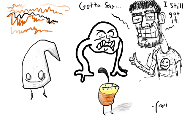
My girlfriend got me a tablet for Valentine's day, but I haven't had the chance to use it until today. Here are the results of my test run:


The first thing I drew was the angry head with arms, then the hook-shaped character, followed by the colored character, and finally a caricature of myself.

I was amazed by how easy the tablet was to use, and how nicely these doodles came out, seeing as how I haven't drawn anything in a good while.

Anyone know of some tablet tips to share?
 

Geist

Smash Master
Joined
Sep 26, 2007
Messages
4,893
Location
Menswear section
Not really a tip, but I find because you're not able to tilt tablets to get those hard angles, it really helps strengthen your ability to draw more precise lines.
So no tips other than use it a lot lol
 

ZIO

( ͡° ͜ʖ ͡°)
Joined
Sep 14, 2006
Messages
10,884
Location
FREEDOM
This is what I've been working on, lately, with my convertible laptop.


It's Akuma. I've spent hours just to get it to look right - anatomy wise. BUT! The hair feels like it's lifted from head a tad too far. I'mma fix that.

I figured I'd post my progress. I'll post another the further I get into it. Most likely will be in color next image I post.
 

Geist

Smash Master
Joined
Sep 26, 2007
Messages
4,893
Location
Menswear section
That's pretty badass yooooo.
I agree, his hair's a bit far back, but that's nothing a little tweaking can't fix.
 

Geist

Smash Master
Joined
Sep 26, 2007
Messages
4,893
Location
Menswear section
That's pretty good for 'just starting to play with'
I like the style. *Thumbs up*

I just noticed you made a thread whooops lmao
I only check the ones I sub to, my bad xD
 

CinatoastB3

Smash Cadet
Joined
Jul 31, 2008
Messages
58
Location
Maricopa,Arizona
thanks man and seriously i just started using photoshop....youtube was what helped me make it come out more clean than a complete noob would do
 

ZIO

( ͡° ͜ʖ ͡°)
Joined
Sep 14, 2006
Messages
10,884
Location
FREEDOM
And this is where I just get disheartened.

I really don't know how to go about digital painting. but, this is so far what I've gotten - this is about 1/4th the size of the actual image.


I've put several more hours into this than I thought i was going to. Now - i want some criticism. Please! I want to know what i should change. More how he looks than the color.

I'll figure out the digital painting **** out myself.
 

Geist

Smash Master
Joined
Sep 26, 2007
Messages
4,893
Location
Menswear section
In terms of line quality, it's good. His face has the right proportions, symmetry, etc, and stuff generally looks how it should. If I was forced at gunpoint to point out something that stands out to me, I'd say his hand is a big strange. His index finger is tiny compared to his tree trunk of a middle finger.

I'd say it's fine though.

I'd actually suggest something a little more complex for you, and that would be to add line weight to your lines. Bold out heavier lines where you want to show movement, an exertion of a force, sagging, and pressure. A good example of areas to darken would be the outer line of his right shoulder, the bridge of his nose, his eyebrows, and the line outlining his chest. This will help give emphasis that previously was absent, and can really help give life to your drawing. You have to remember though, you can't define form without function. If you want to emphasize his chest being thrust out, darken it, if not, find where you want to add darkened lines from the flow or rhythm of his pose. Generally lineweight is also thicker on the outside of the figure compared to the detailing inside.
Etc.
 

ZIO

( ͡° ͜ʖ ͡°)
Joined
Sep 14, 2006
Messages
10,884
Location
FREEDOM
Hmm.

I'll look into the line weight suggestion. The only reason I didn't do something like that is because I kinda am anal about clean lines, especially with havin bad experience with digital drawing. Nothing ever looks how I want it to, and this is the first one to really get across how I want it to look. Now all I have left is to paint it. Which is a learning process itself since I'm no good at it.

Thanks, though.
 

Neon Ness

Designated Procrastinator
Joined
Jul 10, 2008
Messages
3,631
Yeah, proportions look fantastic. Only thing is his nose looks like it's sorta bent to his left a bit much, like we should be able to see more of his left nostril, and maybe his left eye was over-foreshortened. Not sure. The small details look great though, especially the ropes around his hand.
 

ZIO

( ͡° ͜ʖ ͡°)
Joined
Sep 14, 2006
Messages
10,884
Location
FREEDOM
Thanks. I've made adjustments to the aforementioned.

Now on to . . .

digital painting
 

BioDG

Smash Ace
Joined
Jan 20, 2009
Messages
609
Oh, art & design. How I love thee. I'm gonna keep an eye on this thread.

ZIO: Akuma looks good. I recommend you revise the teeth and frontmost forearm. If you aren't doing a background, I also recommend cropping off that thin little empty space on the right side so that he is more centered on the canvas. Looks like I'm way late in posting since you showcased, that, so take it how you will.

What program are you using anyway? And how is your digi-painting learning going?

Anyone know of some tablet tips to share?
I have some. For one, Tablet experience is based on how well you have adapted to your device. Whatever you buy, you will naturally adapt to in the same way as any other tablet. So don't get hung up on a certain type because doing so is more or less irrelevant as long as you get something from a good brand.

Secondly, practice, practice, practice. I will be the most awkward thing in the world using it for the first time, but this is normal.

Thirdly, Practice.
 

ZIO

( ͡° ͜ʖ ͡°)
Joined
Sep 14, 2006
Messages
10,884
Location
FREEDOM
Oh no. Not at all. I appreciate the comments. As a matter of fact, that forearm bugged me alot, because I've had no experience with perspective and foreshortening with the human anatomy. That forearm went through several changes before I decided to make it that.

I'd love to get some help on how I should approach it.

And as for the digital painting - it's going slow. :)
 

BioDG

Smash Ace
Joined
Jan 20, 2009
Messages
609
It shouldn't be too bad as-is, though a general rule of thumb is that it's an uphill climb if a form can't be entirely understood even in its early stages. My advice is to really have an idea of where that elbow is on the arm and getting the rest of forearm's appearance should be straightforward enough to work with. References are a big help, too, though you may already be doing that with all the Akuma illustrations out there.

I tend to get a bit wordy, so don't let that discourage you. It's looking quite good and I can't wait to see the finished product. :)

I may be able to help on the digi-painting side if you (or anybody else) has questions. The avatar/sig I have is based on my own work, so I'm pretty familiar with that kind of process.
 

ZIO

( ͡° ͜ʖ ͡°)
Joined
Sep 14, 2006
Messages
10,884
Location
FREEDOM
Not to worry. I appreciate something is being said instead of nothing but straight compliments.

And you're right. It has been an uphill battle. but I think I've given myself the skillset since I been drawing since I was a little kid.

Still always, always, ALWAYS room for improvement.
 

Dimitris

Smash Ace
Joined
Apr 13, 2010
Messages
571
ZIO, I'm a fan of your street fighter bad ***. Looks real cool.
I would make the arm in front messier. More lines, more fill variation in that arm. It would look cool if that arm got more detailed because of the perspective. <3 messy
 
Top Bottom