
-
Welcome to Smashboards, the world's largest Super Smash Brothers community! Over 250,000 Smash Bros. fans from around the world have come to discuss these great games in over 19 million posts!
You are currently viewing our boards as a visitor. Click here to sign up right now and start on your path in the Smash community!
It appears that you are using ad block :'(
Hey, we get it. However this website is run by and for the community... and it needs ads in order to keep running.
Please disable your adblock on Smashboards, or go premium to hide all advertisements and this notice.
Alternatively, this ad may have just failed to load. Woops!
Please disable your adblock on Smashboards, or go premium to hide all advertisements and this notice.
Alternatively, this ad may have just failed to load. Woops!
Official Critique Topic
- Thread starter Livvers
- Start date

DuckPimp
Smash Ace
http://fav.me/d3e1i4b
im gonna add nostils and a big leaf on the stem later. if i feel like it.
sorry low res
im gonna add nostils and a big leaf on the stem later. if i feel like it.
sorry low res
DuckPimp
Smash Ace
^^ lol thanks
eventually i want to work up to be able to do etching-like pictures with a technical pen-
thats kinda the style i was going for
eventually i want to work up to be able to do etching-like pictures with a technical pen-
thats kinda the style i was going for
 I saw cheap etching starter kits in a shop the other day.
Kuares
Pizza
First Version:

Wip:

I need this critiqued, I know for the Wip the arms are pretty weird. I also don't know whether I'm pixeling correctly or not so yeah.
Wip:
I need this critiqued, I know for the Wip the arms are pretty weird. I also don't know whether I'm pixeling correctly or not so yeah.
DuckPimp
Smash Ace
The thing that i think of when i really look hard is that the comforter shadows are the same in both images. in the first one his arms are tucked in but in the second one theyre not, but it has the same shadow. its an easy fix, but he sorta looks a bit chubby in the second oneI need this critiqued, I know for the Wip the arms are pretty weird. I also don't know whether I'm pixeling correctly or not so yeah.
i really like it though
edit: aha
Geist
Smash Master
^ you can turn sig off after the fact you know lol
@Kuares, is it supposed to say BedtimeS at the bottom, or did you just forget to erase the whole word starfox lol
Also what duckpimp said is accurate
@Kuares, is it supposed to say BedtimeS at the bottom, or did you just forget to erase the whole word starfox lol
Also what duckpimp said is accurate
Neon Ness
Designated Procrastinator
- Joined
- Jul 10, 2008
- Messages
- 3,631
The bottom right corner of the pillow is moving in the 1st one. Not sure if it's supposed to be like that lol.
The only other thing is his left elbow is pretty square in the WIP, sometimes it's best to avoid perfectly square edges when spriting organic forms. Just round that off a little, add some shading and it'll look fine.
The only other thing is his left elbow is pretty square in the WIP, sometimes it's best to avoid perfectly square edges when spriting organic forms. Just round that off a little, add some shading and it'll look fine.
BioDG
Smash Ace
- Joined
- Jan 20, 2009
- Messages
- 609
@DuckPimp:
I love that piece man. It's so technically refined, it looks finished already. You definitely nailed the etching direction you claim to be going for. Very nice!
@Kuares:
Looks great, man. I love the colors. Reminds me of the sprite color style from the KOF games with the pronounced but flat colors of the shadows/highlights. I also like the Zzz animation.
The arms in the WIP create clarity issues. They don't have enough detail to them that allows them to stand out from the grey area surrounding them (bed/pillow, wolf's shirt, wolf's head). I suggest you add some highlights and/or shadow on his forearms if you still want to include them (I personally think they are a good addition). As for other things: the angles of Wolf's left elbow look unusual (but not a big deal) and there seems to be an animation accident on the right side of the animated piece. Overall, though, I like the cute direction you took and I really like the execution.
Kuares
Pizza
Ha, well that animation error I'll fix right away.
Really appreciate the critique. I'll try to get those arms shaded to match his face, correct the fingers a bit, and see what I can do about wolf's weight. Glad people like it though, now back to work.
Progress So far:

Really appreciate the critique. I'll try to get those arms shaded to match his face, correct the fingers a bit, and see what I can do about wolf's weight. Glad people like it though, now back to work.
Progress So far:
[I don't like that highlight blue so I'll mess around with that alot]

Geist
Smash Master
It's missing a punch compositionally. If you divide the canvas into 9 pieces, the points of interest should lie near the 4 points of intersection. As it is now, both players are too close to the border.
The background is also a bit blank, and it's not really functional
The background is also a bit blank, and it's not really functional
*Cam*
Smash Lord
I'm working on a logo, not a signature, for our new series of smash tournaments in Huntsville. My understanding is that a logo doesn't need a bunch of clutter added to it, that the main focus should be the words. That being said, I think I could do better. I can't use anything copyrighted for it either. Here's the two designs I have right now.
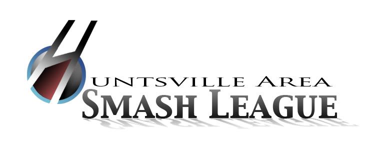
Any suggestions would be awesome. I can't really draw that well, but if someone had a design idea that would require simple shapes, I could do that. I'm willing to start from scratch again if I have to. Also, I'd be open to someone else doing one if they think it would look better than me doing it. There are about 70 people coming to our tournament, so it would be a good way to get your name out there, not to mention this logo would be seen by the companies sponsoring us.
Any suggestions would be awesome. I can't really draw that well, but if someone had a design idea that would require simple shapes, I could do that. I'm willing to start from scratch again if I have to. Also, I'd be open to someone else doing one if they think it would look better than me doing it. There are about 70 people coming to our tournament, so it would be a good way to get your name out there, not to mention this logo would be seen by the companies sponsoring us.
Geist
Smash Master
I like the clean-ness and simplicity of the first one, but it may be a bit long. I'd consider placing the "Smash League" text underneath "Huntsville Area". This'll help break the inconsistencies of the font types as well, so it'll be easier on the eyes.
Have you considered using the smash ball shape in some way? I can imagine it would be quite easy to shop the spaces dividing the ball into an H shape.
Have you considered using the smash ball shape in some way? I can imagine it would be quite easy to shop the spaces dividing the ball into an H shape.
*Cam*
Smash Lord
Yeah, dividing the ball into an H was one of our first ideas actually. It didn't look very good when we tried it. It makes it look like an army insignia or something. I'll try moving the smash league text on the first one below to see how it looks.
Jimnymebob
Smash Champion
- Joined
- Sep 26, 2008
- Messages
- 2,020
- NNID
- Jimnymebob

This is just a rough sketch of Morrigan Aensland I've been working on.
I know it's nothing special, but I'm flummoxed by the wing on the right (the one on her left waist). I don't know if it should be flowing back behind her, or if it should be more rigid, similar to how I have it.
Thanks.
Geist
Smash Master
The way it's drawn right now it looks like her legs have 2 knee joints each. Thought that may not be a problem after cleanup I dunno.
Now, you have an okay way of blocking out proportions using a mannequin style technique (I don't know whether or not you're using one though), but at this point, she feels a bit wooden, and stiff. If you're having trouble with the right wing, I suggest placing it behind her to give the pose more depth. Right now it's suffering from what I commonly refer to as 'hieroglyph syndrome' - where the pose is more or less standing straight up, with the hips straight up and down facing straight on, legs extending down without any depth.
To fix it, try to exaggerate curves, and overlap some pieces with others. Also, start more basic and rough to get the entire drawing on the page.
I recommend starting with two lines representing feet, and a head. Lying directly in the middle is the groin/hips. It's a lot easier when you have a few good landmarks down to help you measure out proportions.
Keep drawing, I'm looking forward to the finished product. :]
Jimnymebob
Smash Champion
- Joined
- Sep 26, 2008
- Messages
- 2,020
- NNID
- Jimnymebob
Yeah, I've been using a wooden mannequin. Never really used one before, I'm used to just breaking it down between head, torso, and feet with lines, then just working within those guidelines. Looking at it now, I can see what's wrong with the hip/upper thigh area- I need to fatten her legs up a bit, and maybe shorten them.
Anyways, thanks for that, I'll try some more stuff.
Anyways, thanks for that, I'll try some more stuff.
Geist
Smash Master
Yeah, no problem. Remember a mannequin is more for rough reference than something to sketch from.
BioDG
Smash Ace
- Joined
- Jan 20, 2009
- Messages
- 609
@Cam:
I like the visual elements of both. Generally, they work well, and are done well enough to get the job done as-is. If you want my critique, though, the second one seems to be a little more convenient since it doesn't read as one long line of text.
And while I do like both visual elements, the first one is more clever and flows better with the text. However, I don't know if wii/nunchuck best represents Smash since most smashers use gamecube controllers. Not really a problem in itself, but just a thought.
@Jimneybob:
For the most part, it's drawn pretty good, but you have some crucial anatomical errors due to taking the Mannequin shape too literally. Just as Geist said, it's more for a rough reference. It's good mainly as a reference to proportions and joint locations, not so much to anatomy.
Neon Ness
Designated Procrastinator
- Joined
- Jul 10, 2008
- Messages
- 3,631
If I might add on to what Geist/BioDG had to say, give her some more room. I feel like there should be more empty space around her in the picture frame so we can see all/most of her. Also, remember to place the eyes nearer the center of the head, her facial features look a little stretched.
Looking good so far, make some edits and post again soon if you can. :D
Looking good so far, make some edits and post again soon if you can. :D
DuckPimp
Smash Ace
you asked specifically about the wings. i for one prefer the one on the right of the picture, it looks more realistic, like it is folded up. i would add fold lines up the wing. as for the one on the left of the picture (her right) the appendage connecting the wing to the body seem out of proportion to the rest of the wing, bring it more to the top of the wing itself.
you can decide for yourself if you want the wings folded or spread. imo wings look best mostly symmetrical, unless one is gesturing
if you dont really get what i said i can try and clarify further (about the rightside wing at least)
you can decide for yourself if you want the wings folded or spread. imo wings look best mostly symmetrical, unless one is gesturing
if you dont really get what i said i can try and clarify further (about the rightside wing at least)
DuckPimp
Smash Ace
sorry for doublepost, but time has passed.
some things i did a couple of weeks ago- lemme know whatcha think
i have 3 other drawings going atm, when i finish with them ill post
http://b00mslangxd.deviantart.com/art/Froyd-210770664?q=gallery:b00mslangxd&qo=0
http://b00mslangxd.deviantart.com/art/Greep-210770267?q=gallery:b00mslangxd&qo=2
the second one was drawn on a worksheet in school (in lieu of doing the worksheet. such is life).
Neon Ness
Designated Procrastinator
- Joined
- Jul 10, 2008
- Messages
- 3,631
Lol, Froyd is nice. So strange and yet so likeable, it's very portrait-like.
I see this is more in the vector realm than being painterly, so I'd recommend trying out ways to add detail like adjusting line weight, using gradients, adding textures, etc. just to see how it looks. The lighting is strange in certain areas; looking at the cap it looks like the source is slightly above and in front of it, so the shadow should be bigger and further behind it instead of directly under. Also judging by the size of the cap more of his head/face should be in shadow. The hatching in the bite mark/shadow is nice, so I wish there was more of that elsewhere. The triangle patterns on the sides of the cap should be more distorted in terms of width so that they appear to be wrapping around the surface.
I like the overall style. Just try out some more color harmonies, I think it would make the overall composition even better.
DuckPimp
Smash Ace
im slapping myself because of the triangles. i agree 1000 percent.
yeah i didnt really think of the source at all in froyd, i was on autopilot.
i dont know much about color harmonies in the theoretical sense, i just pick what was in my head when i drew the thing. ill look more into it
yeah people seem to like the matching and texture things i do, and i enjoy that style. that picture was from before the veggie thing, so i was just getting into it. i plan on incorporating much more, as ive said (wanting to get into the etching style)
Zook
Perpetual Lazy Bum
I've made my attempt at giving a Gameboy a paint job. I used 3 kinds of spray paint (primer, yellow, and black) and a lot of masking tape. Unforunately, a bit of the paint leaked through the tape (I used the tape to keep the yellow parts yellow, then painted the rest black), and I just eyeballed cutting the tape. lol Nonetheless I don't think it looks too shabby.
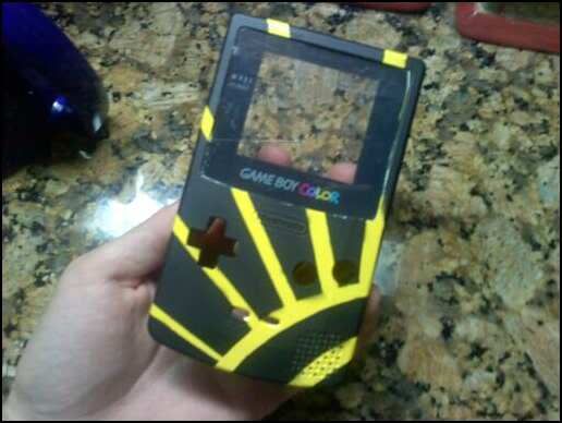
Now to paint the back and I'll take better pictures. lol
Now to paint the back and I'll take better pictures. lol
global-wolf
Smash Champion
That looks really nice Zook :D I'm actually painting my GC controller right now. Did you give yours clearcoat?
Zook
Perpetual Lazy Bum
After googling what that is, I think I will.That looks really nice Zook :D I'm actually painting my GC controller right now. Did you give yours clearcoat?
Geist
Smash Master
Yeah clear coats are a must, or else it starts looking really gross after a while.
It's looking pretty cool so far. I wish I still had my gameboy color.
It's looking pretty cool so far. I wish I still had my gameboy color.
DuckPimp
Smash Ace
bad-***
looks good
looks good
DuckPimp
Smash Ace
dont mean to doublepost but its been a few days
some new thangz

"Sexual Space Voyage"
might add a background sometime if i feel like it. like space. a space background.

"Giant Soap"

"A Misunderstood Swamp-Man"
these are all also on deviantart, under the same titles
some new thangz
"Sexual Space Voyage"
might add a background sometime if i feel like it. like space. a space background.
"Giant Soap"
"A Misunderstood Swamp-Man"
these are all also on deviantart, under the same titles
Neon Ness
Designated Procrastinator
- Joined
- Jul 10, 2008
- Messages
- 3,631
Lol @ "SOPE."
Misunderstood Swamp Man is my favorite. Great detailing and his pose and expression are awesome. I think you've got a knack for giving life and personality to your characters.
If I might nitpick, it might be a good idea to do some anatomical studies and drawings of the human hand. I notice on all 3 that their hands are pretty squishy and lack real form. Not saying they need to be perfectly realistically rendered since these are obviously cartoons, but understanding how hands look will help create them with convincing form. A bg would be nice on all of these as well. Sometimes working on a white bg can mess with how your colors look.
DuckPimp
Smash Ace
lol thanks
yeah i know they all could use backgrounds
on soap the hands are exactly as i wanted them to be, sort of squishy and inconsistant in form. the hands on the spaceman look weird but i think thats because of the way i vectorized them. i messed up lol
and on swampman i wanted them to be kinda small and pudgy
but youre right i dont have much in the way of anatomical studies
theres a class to take in college once i have the spots for it