• Welcome to Smashboards, the world's largest Super Smash Brothers community! Over 250,000 Smash Bros. fans from around the world have come to discuss these great games in over 19 million posts!

    You are currently viewing our boards as a visitor. Click here to sign up right now and start on your path in the Smash community!

Official Critique Topic

Geist

Smash Master
Joined
Sep 26, 2007
Messages
4,893
Location
Menswear section
Cool stuff Zio.
Actually, your hand proportions are better than you think they are. His left hand is good, and his right hand only looks wonky because you left out his wrist. Forshortening is goo though :D
His head to me, looks like it's in the right position, but his neck muscles make it look a tad goofy, I think it makes it look like his head isn't aligned, even though technically it is.
I think it's wierd how obscurities in one section can effect another one, I've always had trouble with drawing things that don't look right until I finish.
 

ZIO

( ͡° ͜ʖ ͡°)
Joined
Sep 14, 2006
Messages
10,884
Location
FREEDOM
Someone who has dealt with the form before extensively, please tell me where I could improve that sketch.

:)

But thanks for the compliment/advice, blowtoes.
 

Geist

Smash Master
Joined
Sep 26, 2007
Messages
4,893
Location
Menswear section
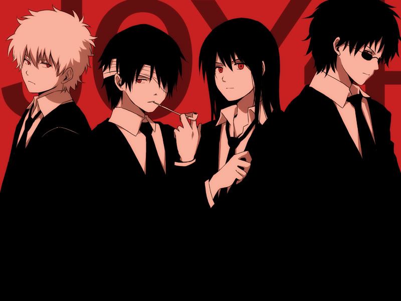
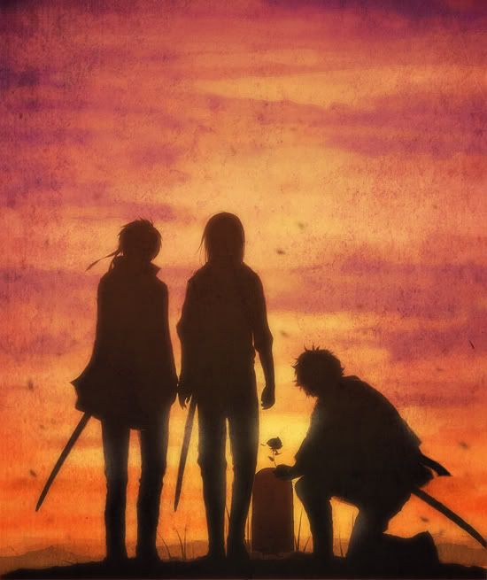
First one is impressive. The composition is well done, and you gave it a good sense of lighting.
The second is good, but it's lacking the completion that the first one has.

Good job.
 

Geist

Smash Master
Joined
Sep 26, 2007
Messages
4,893
Location
Menswear section
Hmm
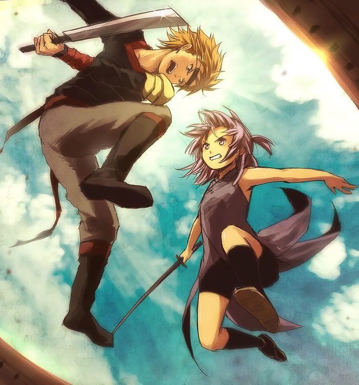
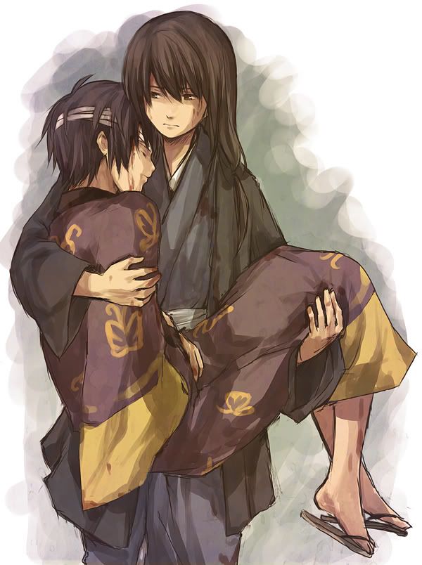
Well I like the style in the 3rd one, but it's missing a bg. Not a big complaint, but the white is a bit distracting since the eye is naturally more attracted to empty space. Your foreshortening is done well, but his stance is missing that 'oompf'.

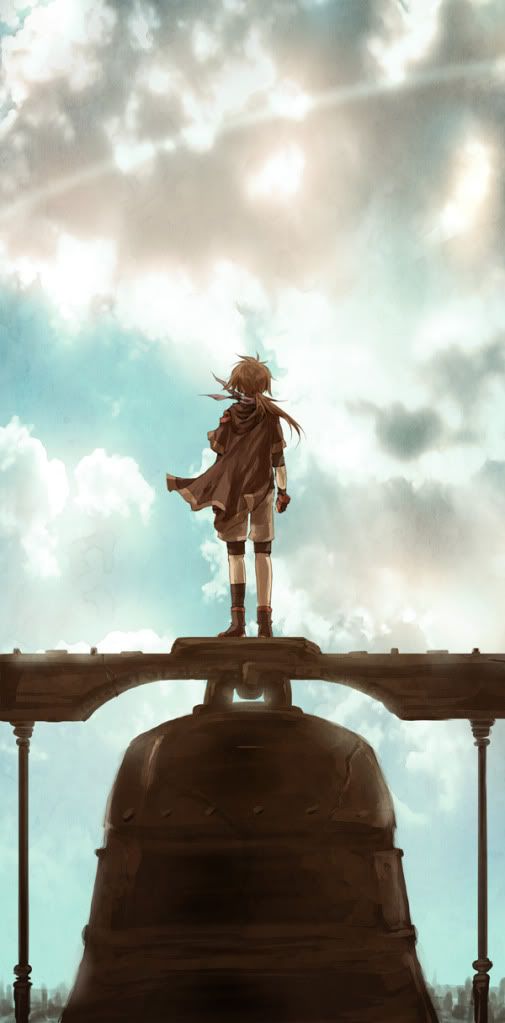
4th piece, again has good lighting but it lacks depth. It's a good attempt however, and the addition of a few elements could make it a standout piece. When designing environments, make sure to focus more on textures and contrast to create a spacial feel. It can be tricky to get the hang of it.
The best way to give a sense of depth is to fade distant objects into color. Look at any picture of a mountain range and you'll see that the further mountains will be less and less detailed, and faded blue (or whatever color the sky is at the time) the further back they go.

I think your stuff is coming along well. Usually I don't judge someone by their age, but I can see you have a lot of potential. I'm not going to lie, your first piece looks professionally done. :]
 

Neon Ness

Designated Procrastinator
Joined
Jul 10, 2008
Messages
3,631
DarkStar, for future reference you're supposed to comment on someone else's work first before asking for advice.

Is the front page invisible or something?
 

ZIO

( ͡° ͜ʖ ͡°)
Joined
Sep 14, 2006
Messages
10,884
Location
FREEDOM
DarkStar, for future reference you're supposed to comment on someone else's work first before asking for advice.

Is the front page invisible or something?
Not to be an arse, but if i were anyone on this site, I'd be hitting the last post link on erry thread. Meaning sometimes people don't see the OP.
 

Neon Ness

Designated Procrastinator
Joined
Jul 10, 2008
Messages
3,631
...That doesn't make it OK.

If everyone did that this thread wouldn't function correctly. Actually a lot of threads wouldn't.
 

global-wolf

Smash Champion
Joined
Jan 17, 2010
Messages
2,215
Location
Northern Virginia
More pics:

[collapse=1]
[/collapse]

[collapse=2]
[/collapse]

[collapse=3]
[/collapse]

[collapse=4]
[/collapse]

[collapse=5]
[/collapse]

[collapse=6]
[/collapse]

[collapse=7]
[/collapse]

This is when i was experimenting with lighting

EDIT:

Oh, sorry, I'll be checking in then for some critique
Do not post pictures that are not yours.

http://nuriko-kun.deviantart.com
 

Geist

Smash Master
Joined
Sep 26, 2007
Messages
4,893
Location
Menswear section
Aw, it's Snivley.
Why did the Sonic team kill off all the decent characters and replace them with this muck we have now?
 

ZIO

( ͡° ͜ʖ ͡°)
Joined
Sep 14, 2006
Messages
10,884
Location
FREEDOM
Those characters were never really part of the canon series.

They were part of the SatAM morning cartoon. They found themselves placed in the still running comic book and can still be found there.

My childhood was a good one thanks to those comics. Playing the games at the same time as reading the comic to have an even deeper story be unfolded to me while I was playing was awesome. My favorite being Mecha Madness.

Speaking of which, I'd go bonkers of Joe did a still frame of mecha knuckles and mache sonic going at it. :3

BTW - always good work, Joe.
 

Chronodiver Lokii

Chaotic Stupid
BRoomer
Joined
Aug 11, 2009
Messages
5,846
Location
NEOH
JOE!
Your works are just amazing.
Seriousllyyyyyyyyy
Def inspiring me to get gud at 3D when I go to college
KEEP UP THE GOOD WORK!!!!!!!!!
 

Master Ppv

Smash Journeyman
Joined
Dec 2, 2007
Messages
271
Location
Springfield, Illinois
:crazy: Those are some seriously awesome models! I love the detail!

Can you put up different angles so we can see the whole models? Great stuff! :)

Here's some photography for you guys! Let me know what you think...


And the Bells Tolled On...


Dilapidated
 

Geist

Smash Master
Joined
Sep 26, 2007
Messages
4,893
Location
Menswear section
What's in the bg in the first one? It looks like a screen door. Kinda distracting, but I like the whole concept. Juxtapose the bells on a sunset-like sky and it's stunning. I like it.

As for the second one, I'm no photography pro or anything (you're better than me by a good mile), so I'll just say what's aesthetically pleasing and what isn't. I'm not crazy about the thin area of focus. It's blurry on both sides and doesn't really draw attention to any part of the photo, considering my eyes keep drawing my to either side of what it's actually focused on.
Try to capture a similar shot, but with lighting playing a factor, like have the sun at a certain angle that gives out sharp lines to give more of an emphasis on the texture of the wall.

Good work though, we need more people to post their stuff here on a whim :D
 

Master Ppv

Smash Journeyman
Joined
Dec 2, 2007
Messages
271
Location
Springfield, Illinois
What's in the bg in the first one? It looks like a screen door. Kinda distracting, but I like the whole concept. Juxtapose the bells on a sunset-like sky and it's stunning. I like it.

As for the second one, I'm no photography pro or anything (you're better than me by a good mile), so I'll just say what's aesthetically pleasing and what isn't. I'm not crazy about the thin area of focus. It's blurry on both sides and doesn't really draw attention to any part of the photo, considering my eyes keep drawing my to either side of what it's actually focused on.
Try to capture a similar shot, but with lighting playing a factor, like have the sun at a certain angle that gives out sharp lines to give more of an emphasis on the texture of the wall.

Good work though, we need more people to post their stuff here on a whim :D
The background of the first is a window, but it does have a screen-door-like attachment on it. Not much I can do about that since it's up on the second floor :p

I know about the focus in the second one; I actually tried to get more of it in focus, but it just wouldn't. If you know any photography lingo at all, I closed the aperture down from f/4 all the way to f/8 and was still the same. I would have loved to have the sun out giving it some shadow to make it interesting, but alas, it was cloudy that day :(

Thanks for the reply! I'm trying to improve so any feedback is helpful! I can put some more stuff up too if you'd like to see more :)
 

ZIO

( ͡° ͜ʖ ͡°)
Joined
Sep 14, 2006
Messages
10,884
Location
FREEDOM
For portraits, taking a picture from a distance effects how the posture looks. Having a 55-200mm lens is awesome and I wish I had one.
 

HondaFoo

BRoomer
BRoomer
Joined
Dec 12, 2001
Messages
2,933
Location
KANSAS
NNID
HondaFoo
http://i.imgur.com/pH2C5.jpg

I made this for my Xbox 360 theme. It's my first one, it took me hours to make, and even though the shading is pretty off, I'm pretty proud of myself ^^
Background is a bit distracting -- if you blended the images together to eliminate all of those straight edges, and maybe applied a uniform color throughout the background to unify it/push it back, it would help tremendously

The logo on the left should be in Multiply or some other layer style that keeps the red but gets rid of the white. Also make sure to sharpen everything up to the same level as the render, it'll look more polished.

I did a quick 'paintover' to show some things that you could do next time:
http://www.tsuaii.com/art/sg/gow3.jpg

One more thing, and this is more of a pet peeve of mine -- I'm not big on putting your name on graphics work, but if you do, be more discreet about it.
Don't make me have to bring out my FFXIII wallpaperz thread again
 

HondaFoo

BRoomer
BRoomer
Joined
Dec 12, 2001
Messages
2,933
Location
KANSAS
NNID
HondaFoo
:ohwell: Sorry, photoshop jargon has permanently been made a part of my vocabulary. I hope my paintover sort of helped, at least?
 

Fuelbi

Banned via Warnings
Joined
Jun 17, 2009
Messages
16,894
Location
Also PIPA and CISPA
Too bad I don't actually know or understand on how to do any of those special effects on Photoshop

Couldn't you simplify what you said or something?
 

global-wolf

Smash Champion
Joined
Jan 17, 2010
Messages
2,215
Location
Northern Virginia


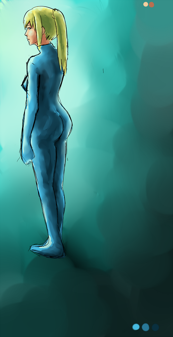
WIP, I posted a earlier version in the social thread. Here I tried to fix her body proportions (super sculpted rear!) and added the basic colors and shadows and stuff. I know her skintone is too red. Also she's supposed to be holding her gun but I forgot to draw that :x gonna add it later. The composition/balance of the picture also bothers me, I have no idea how much empty space there should be to look good.

Later I'll draw the designs of her suit. I'm planning on taking the lines off if all goes well, if not then I'll make cleaner lines.
 
Top Bottom