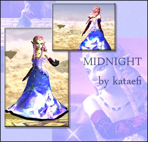
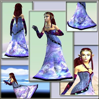
I certainly think she looks better than before now.
I don't know how I feel about her dress. It's realllyyyy busy with the gigantic print--it overpowers her.
If there's one thing I've learned from What Not To Wear, it's that everything needs to be in proportion and moderation. In other words, the size of the print needs to be proportionate to her body.
I do like her gloves, though it would be nice to see some of that seaming detail from the dress on the outer side of her gloves. Just something to lighten up the arms a bit. (The seaming detail is also pretty cool. Adds some good contrast.)
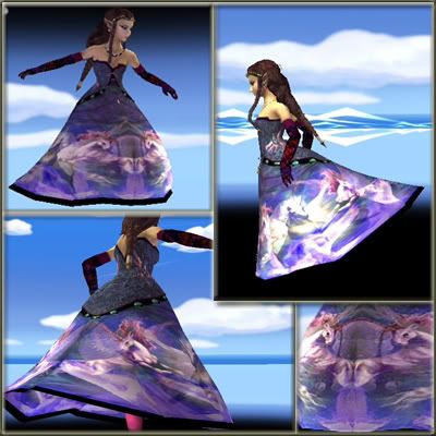
Ultimately I just think the colour of the dress and the print on it are just not working as well as they can be. It could be because of the background, but that kind of muted blue-violet doesn't work for Zelda's skin type. Her skin is more on the cool side of yellow than the orange that would be needed for this colour to work. Reds, red-oranges and violets would work on her. Think of her as an "autumn" type. (For example, why ballroom zelda looks fresher and brighter.)
I don't quite agree with the black lining on the bottom of the dress either. Again it's quite distracting. In a dress like this you want the emphasis to be on 4 things:
Face.
Waist/Breasts.
Height.
To conclude:
The colour/print of the dress distract from her face.
The seaming accomplishes the waist and some of the breast part.
The bottom lining distracts from her height and face.
Nevertheless, this is only your second try and already there is HUUGGEEE improvement from your last try. I only see things getting better from here.


 "Yes?"