Sorry I'm a bit late with posting up the scores, it's been a busy day.
----------
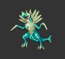
CrimsonFeint - Lickitoed
F8AL: I really enjoyed the simplicity of your sprite. It shows that even simple sprites can be executed well. I also enjoyed the use of the two pokemon you chose for the sprite. Overall, nicely made sprite and I look forward to seeing more in the future!
Firus: A solid, well-done fusion, albeit a little lacking in detail. You did a good job adding Politoed’s cheeks, swirl, and hair to Lickilicky; however, I feel that you could have incorporated more of Politoed in Lickitoed, such as by altering its limbs to be more like Politoed’s. I can immediately see the presence of Politoed in the fusion, but it gives off far more of a Lickilicky vibe than a Politoed one.
Neon Ness: Clean fusion, really no complaints here. These two Pokemon fit together well and I like the design choices--changing the color and stomach pattern, and the head crest as well. It's fairly simple but I think that's just the nature of the 2 sprites you worked with. I wish you had changed the tongue to resemble a frog's tongue, seems like it would have been perfect on this lol.
F8AL: 9/10
Firus: 7/10
Neon Ness: 9/10
FINAL: 8.33/10
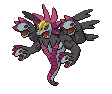
Wretched – Dialga/Garchomp
F8AL: Good work on making your sprite look like an actual pokemon. The only problem I have looking when I look at this sprite is that it doesn't immediately show what the pokemon look together combined. It took me a couple of minutes to realize that the combination was supposed to be Garchomp and Dialga. Besides that, good looking sprite.
Firus: Quite an interesting fusion choice, and certainly a challenging one, I’d imagine. I absolutely love this sprite conceptually; in practice, however, there are some flaws to it. The sprite looks somewhat awkward, which is somewhat to be expected in fusing two Pokémon as different as Dialga and Garchomp; most notably, the removal of the “hammer” piece of the head as well as the fins attached to his arms leaves both pieces looking a little strange, but in the context of fusing him with Dialga it is a sensible alteration. I’d have made Dialga’s chestplate a bit smaller to make it more proportional to Garchomp’s size as well. However, you implemented Dialga’s body stripes into Garchomp’s body extremely well, and altered Garchomp’s limbs and tail to the style of Dialga’s (and I like the choice of Dialga’s shiny palette as opposed to his regular one). You even used Dialga’s back-structure (no idea exactly what to call that) as a mane on Garchomp, although the appearance of that piece is a bit rough in places. As I said, you had some really great concepts in the creation of this sprite, melding pieces of Dialga into Garchomp rather than simply attaching them; if you work on your spriting technique a bit more and smooth out some of the rough pieces, you can have some really great sprites.
Neon Ness: Decent job of taking Garchomp into a more dinosaur-esque direction. First off I want to note that this a good looking color scheme, and the glowing Dialga lines were a nice addition. The peacock crest is crooked looking to be honest, I'm not convinced that those spikes are all the same shape and size. Similarly, the right claw is more curved than the left and the right leg appears longer than the left leg. Unless there's a good reason for it you want your anatomy to appear symmetrical for the most part so make sure everything matches up properly. Also, some bolder outlines would improve the greenish upper neck area to match the rest of the sprite.
Also, your sprites would look so much better with transparent backgrounds. ):<
F8AL: 8/10
Firus: 8/10
Neon Ness: 6/10
FINAL: 7.33/10
Meta-Kirby – Chimorita
F8AL: I really like this sprite. I really do. You did a really good job of creating a colorful and happy version of Gothorita using Chimeco as a guide. Every part of the sprite was melded well and I like the amount of detail and care you put into your sprite.
Firus: Very interesting sprite, with a touch of creepiness. The fusion is pretty smooth and well-blended, but it is a bit difficult to discern what’s going in within it. You can gather the Gothorita part pretty well, but the Chimecho part is a bit ambiguous and aside from the colors, it’s hard to tell that it’s Chimecho at all. Also, the white, yellow, and pink are all used to such an extent that the parts almost look amorphous rather than having some defined shape. Looking at it as a whole, it’s got sort of a creepy doll vibe to it, but aside from that, it’s hard to make out much of what’s happening in the sprite.
Neon Ness: Creepy, it almost has a twisted Alice in Wonderland feel or something. The colors you chose are a good match for your idea, but there are a lot of them going on here, and unfortunately I feel it would have been better to stick with slightly fewer. The hairbows all could have been a single color since the alternating look is distracting. The shading is confusing near the torso, since I can't tell where the body ends and the right arm begins. Also, the area of the torso between the two bows is the same color as the head/arms instead of the dress which is really strange looking. Gothorita overpowers Chimecho a bit in this sprite, it would've been nice to see Chimecho's flag area as the pigtails or something, just so the fusion feels like an even mix.
F8AL: 9.5/10
Firus: 6/10
Neon Ness: 7/10
FINAL: 7.5/10
Wave – Missingtrio.
F8AL: Missingtrio successfully gives the creepy jagged vibe that Missingno did. My only complaint is that you should've made the fire a teeny bit more jagged like and I think the sprite would look better without the tail sticking out the back of it.
Firus: Interesting choice of Pokémon to fuse; Missingno. is always entertaining to see in fusions. You did a good job of integrating Missingno.’s glitchy, blocky look into Dugtrio while still maintaining Dugtrio’s overall appearance. I like the addition of the various pieces which help create the Missingno. atmosphere as well, especially the tail which, I gather, is from the Fossil Aerodactyl sprite found as one form of Missingno.
Neon Ness: I can barely tell what's happening in some parts of this, but I get the feeling that's the point. The glitchy texture overlayed onto Dugtrio's form is great, if eye-straining. Part of me wants to see more blocky-ness. If you hadn't called it Missingtrio I might have thought this was just a crusty looking Dugtrio. The shading on the sand(?), and fire stuff, and... whatever that is sticking out on the side looks really good.
F8AL: 8.5/10
Firus: 8/10
Neon Ness: 8/10
FINAL: 8.17/10
JOE! – Hychampeon
F8AL: I found your sprite to be really funny when I saw it. You did a good job of making the arms look like the heads of the hydra pokemon you were combining. I particularly like how you managed to make the upper body look like machamp's leaning down into a skinny snake like ghost tail which I really thought was good. I also really like the collar petal things sticking out of behind the head of the sprite. Overall, good job at making this sprite.
Firus: Clever way of approaching a fusion, using Hydreigon’s heads as a means of representing Machamp’s arms. I do like the subtle addition of a slight bit of muscularity on the bottom heads, although it is a tad bit too subtle; had it been more obvious, I think it would have better added to it. Overall, the sprite is mostly well-made, but it is a bit difficult to tell exactly what the other Pokémon in the fusion was. Machamp’s crest is the only piece which explicitly implies the other Pokémon used, and that doesn’t make it entirely obvious in and of itself. There’s not a whole lot more you can add from Machamp, but even something like a belt like his might’ve made the combination a bit more obvious.
Neon Ness: I actually liked the idea of turning arms into heads for this, but the overall sprite looks crowded. The wings might have been better off left out since they're mostly obscured from view anyway, and Machamp's head crest doesn't match the look of the other body parts and feels out of place. I really like what you did with the biceps/torso area, I can just barely tell that they're more muscular than normal. It has a few technical errors here and there but it's a solid sprite, and I can tell you put effort into mixing up the different parts.
F8AL: 8.5/10
Firus: 7/10
Neon Ness: 7/10
FINAL: 7.5/10
Ingulit – Shucklegon
F8AL: Like the sprite for the Lickilicky/Politoed entry, I also enjoyed the simplicity of this sprite. It shows off a simple concept executed well. I particularly liked how well you made the head fit in the hole and how much shading the shell has. I would have to tell you that the way the shade actually reflects might be a tad bit off, but overall, I found that this sprite was a good one being simple yet highly detailed.
Firus: Simple sprite, but well-executed nevertheless. I’d have thinned the outline on the left side of the neck a bit, and I’d have stuck with the dark pink you originally used on it instead of changing over to black. Otherwise, the sprite was well-done; however, it would’ve been nice if you’d spiced it up a bit more. There’s not much more to do between the two Pokémon you chose, but perhaps something like using creativity with the shell design to better fit Porygon 2’s concept would’ve benefitted the fusion.
Neon Ness: This is really weird... but it works. Somehow though the head is not 100% convincing to me. The black outline around the edge of the neck makes it look sort of like it's floating above the shell instead of poking out from it, like it's tacked on. Even though all of the parts come together nicely it is a fairly basic fusion; you switched out the head and recolored the limbs. More risk taking in altering the anatomy could have helped in terms of creativity.
F8AL: 8.5/10
Firus: 6/10
Neon Ness: 6/10
FINAL: 6.83/10
vVv ChiboSempai – Clefforus
F8AL: I think your sprite is ok. While your sprite is really well colored, I feel like the Cleffa head sticking out of Landorus to be a bit awkward at the angle you put it in and the way of the amount of Cleffa you put in it. Besides that, good job on your sprite I really liked the colouring.
Firus: I love the comedic value of this sprite; I got a kick out of the hilarity of fusing a legendary Pokémon with a baby. The fusion of Cleffa’s head into Landorus’s was a pretty successful one. I like the overall softer palette; however, I do wish you’d done more to Landorus than simply recoloring and giving him Cleffa’s face; I feel like you could’ve done more to Landorus to get across the mood of Cleffa, even while still maintaining some of the hilarity of the two opposites meeting. The sprite actually made me laugh, though, so props for that.
Neon Ness: Lol I love this. Simply changing the body from orange to pink gives this a drastically different feel, and I do like the color change of the tail in harmony with everything else. The perspective of the face is somewhat confusing as I can't tell if it's leaning its head to the side or what. I think the outline of the head might have been in need of reshaping to make a clearer distinction between the neck and the head. This is a really unique idea, but still I wish some more shapes could have been altered like the 'crown' and tail. The bulk of the work seems to have been recoloring. I can also see something that needs to be erased under the left arm, so be careful about stray pixels. Overall a really cool idea.
F8AL: 8/10
Firus: 7.5/10
Neon Ness: 7.5/10
FINAL: 7.67/10
Tacel – Guls
F8AL: I think this is among the better sprites to be made this contest. You managed to combine Macargo and Arbok really well and I think the gas bubble bumps to be a really good finishing touch to the sprite. You made the colors blend in will with the sprite and I also really liked how the bottom of the sprite looks like it's gooing to the floor a bit. Overall, a well made sprite. Great job!
Firus: I really like what you did with this sprite. For starters, although this isn’t part of the sprite, I like the clever name for it. In general, though, you really fused Slugma into Arbok. Slugma’s head with Arbok’s fangs actually blends quite well, and I love the subtle bit of dripping slime from Guls’s mouth. The magma bubbles throughout the sprite really carry through the idea, too; there’s a small bit at the bottom-right of the sprite which looks a little too jagged, but other than that you did a good job, and it truly carries across the concept of Slugma into the body of Arbok. Great job.
Neon Ness: I'm really impressed with how this one turned out. The bumps on the main body show careful attention to detail, and the cobra markings really fit this fusion since they already looked like fire. I commend you on attaching Slugma's oddly shaped head seamlessly onto the snake body. Not really sure what to comment on, pretty much everything is finely crafted.
F8AL: 9/10
Firus: 9.5/10
Neon Ness: 9/10
FINAL: 9.17/10
----------
Congratulations to
Tacel for being the winner of Round 14!
Round 15 prompt:
Create an evolution for any pre-existing Pokémon. There are no limits as to the Pokémon you can choose to evolve; there need not be precedent to suggest that the Pokémon can evolve (e.g., you can create an evolution for Shaymin or Victreebel).
The deadline is Friday, August 12th at 11:59 PM EST.

")