• Welcome to Smashboards, the world's largest Super Smash Brothers community! Over 250,000 Smash Bros. fans from around the world have come to discuss these great games in over 19 million posts!

    You are currently viewing our boards as a visitor. Click here to sign up right now and start on your path in the Smash community!

The Sig Critique Topic

Status
Not open for further replies.

Neon Ness

Designated Procrastinator
Joined
Jul 10, 2008
Messages
3,631

And try to give other people some helpful comments before demanding feedback. If you genuinely can't think of something to say, fine. Don't stretch yourself. But at least try.
Welcome, resTy. Please read the rules on the first page for future reference. :<

It's kind of funny :laugh: 
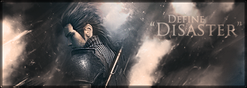
One thing is I would just use the text tool instead of trying to draw out letters since the words are sort of messy looking. And I'd try to keep all the words horizontal or keep them all vertical. In this case probably horizontal in the corners would look best.
 

Sion

Island of Horizon
Joined
Dec 9, 2006
Messages
3,020
Location
Lotus Land, BC
neon ness, your sigs always have this very nice flow that i can just never grasp :laugh:

keep up the good work. /fanboy
 

Martian

Smash Cadet
Joined
Jul 15, 2010
Messages
68
Location
Somewhere uncomfortably close to someone
PHP:
Lol I know what you mean. I usually try not to add text because I'm not good at it either.

The border looks good, it gives it a sort of professional photo shoot look. The contrast looks a lot better. Still needs more effects to me. >< Just go crazy with C4Ds and smudging and see what turns up. I think it could stand to be more complex without turning messy, but I guess it depends on if you want the simpicity look.

Worked on this one some more.

v3: Tried to add a few vector elements in addition to smudging.
[IMG]http://i228.photobucket.com/albums/ee168/BShepard/Dream-v3.png[/IMG]

v4: w/out vector rainbow
[IMG]http://i228.photobucket.com/albums/ee168/BShepard/Dream-v4.png[/IMG]

v5: Random unnecessary text!
[IMG]http://i228.photobucket.com/albums/ee168/BShepard/Dream-v5.png[/IMG]

v6: Altered colors.
[IMG]http://i228.photobucket.com/albums/ee168/BShepard/Dream-v6.png[/IMG]
Version 6 brings out the best in this signature if you want my honest opinion about the matter. The cool colors (meaning blue/violet/etc) on the outside of the "flame" (or the warm colors i.e. orange) really draw my eye to the flower on her shirt. Her bright hair make a very nice eye popper to create nice flow and a certain glow about the render.

The lighting seems to be a bit off though if I am looking at it right. There is a glare on her hair that makes it seem like light should come from above, not below. I understand though, that the light coming from her feet is very important to the flow of the piece.

Overall its pleasant to the eyes ;)

9/10


EDIT: Forgot to mention I would like some critique on my current signature, its been a while, so don't be to rough ;)
 

Neon Ness

Designated Procrastinator
Joined
Jul 10, 2008
Messages
3,631
@ Martian: You handled the text pretty well, better than I've seen someone do here in a while :laugh: I would mute the color somewhat, but the squares around the word are a pretty nice design. It could probably go further.

It looks unfinished though. Dude is just sort of cut off at the bottom/side, you need to find a more refined way to ease him into the edges, by blurring, smudging, or something. Right now it looks like it was just cropped off without any thought. The lighting looks good though, the rays coming down are nice. The background depth is also too abrupt though. There are only 2 planes of depth here, the foreground where he is and the sky. If you had some designs that were less blurry than the bg but blurrier than the guy it'd make a nice transition. Keep working on it, can't wait to see more work of yours.

@ hente: Pretty nasty tag. Only thing that might be worth fixing is his right arm looks sort of 'flat'. I think it's cuz it has a lower contrast than the rest of him.

It looks like you used just about every color in making this. Really awesome. I think you could even add some more pronounced smudging in some areas like the bottom left. I'd just add a bit more designs in front of him to avoid render plop syndrome.
 

Martian

Smash Cadet
Joined
Jul 15, 2010
Messages
68
Location
Somewhere uncomfortably close to someone
Hentekorino, the signature is very nice I like the way that the lighting is spot on and that there is a good depth. I am not sure what your getting the lighting from though, it looks like an explosion but I just cant tell. The logo is a little distracting from the render but thats not a huge deal because it isnt that pronounced. I do agree with Neon Ness when he says that arm looks flat, it does seem to have no depth. Otherwise I love the colors and lighting, all just smooth and creative.

8/10

Second tag I have done in a while.

V1


V2


V3


V4
 

Zephron

Smash Ace
Joined
Jul 26, 2008
Messages
697
Location
Among the trees in Minnesota
Woah, that's a lot of different versions.

Personally I like V1 the best because the other ones really hurt my eyes. V4 is nice too though.
I'd like Iron man to have a little more detail than the harsh silhouette, but you probably want to keep that.

I wonder if you should move the text, or make it a different font?
I don't know, I can't decide.

Otherwise there's not much else going on here, besides those flashes of red you put in, which I really like.

CnC this please.

Idk about the glossy effect. I sort of like it and then I don't.

Btw I hope this sig doesn't have render plop syndrome D:
(Terrible syndrome, hilarious name)

Glossy:


No Gloss:


It was a request from another forum. I hate adding text but he said he wanted it, so meh.
 

Neon Ness

Designated Procrastinator
Joined
Jul 10, 2008
Messages
3,631
@ Martian: v1 is best but it still has some problems like last time. There aren't enough of levels of depth for an appealing transition. It's pretty cool that you put the lighting on the other side of the render though. Your background is kind of messy looking. Did you use the smudge tool? Smudging + adjustment layers is a good way to start off getting smooth looking abtract backgrounds and a coherent color scheme.

@ Zephron: That gloss effect needs to go, sorry. It makes the sig look like a button instead of something with actual depth. Plus it's getting a bit overused lol. I think the low opacity rings need to go too, they aren't blended in any way. Great lighting near his face and I'm liking the colors. If you added flashes of light elsewhere I think it'd look cool and add something to the rest of the background. Get some more smudging/vectors going and this could be really good. The text in the corner is hrrmmm. I'm not sure how to make it better though since it's something I haven't quite figured out myself yet.
 

Martian

Smash Cadet
Joined
Jul 15, 2010
Messages
68
Location
Somewhere uncomfortably close to someone
@ Martian: v1 is best but it still has some problems like last time. There aren't enough of levels of depth for an appealing transition. It's pretty cool that you put the lighting on the other side of the render though. Your background is kind of messy looking. Did you use the smudge tool? Smudging + adjustment layers is a good way to start off getting smooth looking abtract backgrounds and a coherent color scheme.
Sorry I'm a bit rusty when it comes to these things. If you have any good tutorials on smudging and depth that would be good. Most of the ones I have looked at just dont go into enough detail. Thanks for the CnC.
 

Zephron

Smash Ace
Joined
Jul 26, 2008
Messages
697
Location
Among the trees in Minnesota
Okay... I think I improved it a little bit.
I used masks, 5 filters, some smudging, and a lot of blending effects. :O

I removed the Glossy-ness (you're totally right on that one.)
and perhaps added a minor flow effect with the stuff I added.

I didn't want to add a vector because it tends to make 2 focal points, which I really don't like.
Text does that too, but I had to add it remember :p

So I created this effect to give the background more stuff hopefully without sacrificing Sonic / Chaos emerald as the focal point.

V1


V2


V3 (A combo?)
 

Neon Ness

Designated Procrastinator
Joined
Jul 10, 2008
Messages
3,631
Sorry I'm a bit rusty when it comes to these things. If you have any good tutorials on smudging and depth that would be good. Most of the ones I have looked at just dont go into enough detail. Thanks for the CnC.
Yeah, I'll look for some tutorials. Or at least I would but, there's sort of a small problem right now :\

Also, can you turn off your sig in this thread? Only leave it on if you want CnC for it.

@ Zephron: Tough decision. v1 has a better overall look but the lighting is better looking in v3. Ehh I'll say v1 is best for now. Gettin betterrrr. That dark rift in the middle though splits the tag in 2 in a not good way. I think you need to find a way to bring the whole thing together.

Text needs to change still. To just have it sitting on top like that without any integration is underwhelming. Look at these:

- Sovereignali

-Sovereignali
Instead of just sticking the words on there, they messed with different angles, different letter sizes, and made sure the word colors matched the rest of the tag somehow. Text can look really good if you figure out how to use it.

I would try a simpler looking font. That black outline is distracting for some reason. :\
 

Zephron

Smash Ace
Joined
Jul 26, 2008
Messages
697
Location
Among the trees in Minnesota
Yeah, I'll look for some tutorials. Or at least I would but, there's sort of a small problem right now :\

Also, can you turn off your sig in this thread? Only leave it on if you want CnC for it.

@ Zephron: Tough decision. v1 has a better overall look but the lighting is better looking in v3. Ehh I'll say v1 is best for now. Gettin betterrrr. That dark rift in the middle though splits the tag in 2 in a not good way. I think you need to find a way to bring the whole thing together.

Text needs to change still. To just have it sitting on top like that without any integration is underwhelming. Look at these:


Instead of just sticking the words on there, they messed with different angles, different letter sizes, and made sure the word colors matched the rest of the tag somehow. Text can look really good if you figure out how to use it.

I would try a simpler looking font. That black outline is distracting for some reason. :\

Darnit! I was hoping you'd say v3 because I really love the lighting on Sonic, and the wave.
Those sigs have a really urban look though and I'm still somewhat clueless how I'm going to make it work, unless I make it work inside the wave somehow or something... Gah.

Thanks for the advice though. I'm trying not to use vectors but maybe I have to.

Anyone know a good site where I can get good, free stock photos or vectors?
 

Neon Ness

Designated Procrastinator
Joined
Jul 10, 2008
Messages
3,631

Darnit! I was hoping you'd say v3 because I really love the lighting on Sonic, and the wave.
Well if you really like it then you should use it. :laugh: I was just saying which one I liked best. I didn't mean to discourage you from doing something you wanted.

Why don't you want to use vectors? It might not be your 'thing' in sigmaking, which is understandable, but I still think it's important to try new stuff out on occasion. You might accidentally end up with something you think looks good.

Man, I wish I could do stuff like that. :( /jealousy.
Me too maaan. I've been working on sigs lately though since school's been out. Here's hoping we can both improve.
 

Sel

Smash Rookie
Joined
Jul 18, 2010
Messages
4
Location
Tennessee
@Zephron I personally like v1 the most, mostly because of how the light of the gem draws to the focal in a very nice way. Though the lighting effects in v3 are nice, they're a little distracting. I don't like the text in any of them though :ohwell: Try to get creative with clipping masks, blending, and most importantly, the placement of the text. Overall, they're alright :)

So here's my first shot at photoshop in 2 or 3 years. Don't spare the rod though, let me have it for this abomination -_-


Neon Ness

Designated Procrastinator
Joined
Jul 10, 2008
Messages
3,631
So here's my first shot at photoshop in 2 or 3 years. Don't spare the rod though, let me have it for this abomination -_-
Horrible, horrible sig. Quit life.

One of the few times I'm actually glad there's a border. I'm not sure why but it looks good on this one. Awesome lighting on the captain but at the same time, the background sorta kills it. It'd look waaay better in my opinion if the outer edges on the left and right were dark to offset the light in the middle, like a spotlight effect. I know having a focal squarely in the middle is a taboo sort of thing but it's just the first thing that came to mind.

The smudging looks a little bit random but it's not completely bad either. It just needs to be less abrupt in the value changes I think. The smudges you have so far look decent, they just need some direction. Maybe outward from his shoulders or something. The spiral line going around him looks tacked on. :\ Low opacity text? It should probably stand out a little more. Maybe find a way to create some depth after fixing those things.

Really though, not bad at all for having been away from PS for 3 years. Post some mooore.
 

Sel

Smash Rookie
Joined
Jul 18, 2010
Messages
4
Location
Tennessee
Thanks for the cnc Ness :D

Anyways... For this one, I told myself I was gonna commit to the tutorial I followed and this tag in general. I feel like I kind of regretted it immediately haha.


Really want to make this render work :p. This one doesn't feel done >.< But I can't think of what to add.


This one didn't turn out too terribly :)


Thought B&W looked good with this tag. Added a border and cheeky little smoke effect ^.^


Neon Ness

Designated Procrastinator
Joined
Jul 10, 2008
Messages
3,631
Yeah, following tutorials can be kind of tough... Sometimes it's hard to decide where and when you want to add your personal style to the tag and when you follow exactly what the tutorial says.

For the first one I like the colors more in v2 but v1 has depth. I think both could use some more saturated color though, even if only a little.

If you took away the quotes, upped the opacity, and made 'Define' smaller, the 'Define Disaster' would look pretty good. Maybe make the words different colors.

I think the grayscaled one looks better for the 2nd one, and the colored smoke just looks cool, pretty nice idea. The lighting is good, and even though the left side doesn't have much going on, it doesn't look bad. Sort of minimalist. I think it turned out really well.

New one:


I don't even remember what this was supposed to be when I first started it.
 

Player-4

See you in 25 years
Joined
May 16, 2009
Messages
5,582
Location
Campgrounds, TX
Gawd **** I love that sig.

The top left throws me in color, it doesn't feel like it flows with everything else. But on the note of flow I love the rest of it.

Man, I really need to get back into making sigs :ohwell:
 

Neon Ness

Designated Procrastinator
Joined
Jul 10, 2008
Messages
3,631
Gawd **** I love that sig.

The top left throws me in color, it doesn't feel like it flows with everything else. But on the note of flow I love the rest of it.

Man, I really need to get back into making sigs :ohwell:
Yes you do. :laugh: It's a fun hobby. I only get to make them during the summer since I can't exactly use them for school though.

Yeah you're right though, the color's off in the corner. :\ I tried to transition through every color--from the upper right corner to the left it goes from light green > yellow > dull orange/red > magenta. Naturally violet/blue come next, but maybe the color should be a little more saturated? I dunno.

@ Martian: The background doesn't look it matches the sprite yet. He's yelling and in a dynamic pose but there's not much going on in the surroundings, so I would say keep going with the design. Add some more vectors/smudging/or whichever direction you were thinking of.

Really liking the colors though. The burst of orange looks good. The bluish lavender area looks like it could work if there were more of it, it looks sort of out of place as is.

I can barely see the text. :\
 

L__

Smash Master
Joined
Nov 5, 2007
Messages
4,459
Location
flopmerica
Very colorful to say the least. I see no flow in a certain direction, its more of a color burst. There isn't much to say seeing as depth and lighting aren't exactly able to be criticized.

Sprite?
the square seems a bit too sharp imo, also Inuyasha seems rotated at a weird angle, was that on purpose? also, it's a bit too monochromatic and needs more depth/overall work on composition.

I'm curious as to where everyone gets their renders and what forums they go to other than this one

PLEASE AND THANK YOU :laugh:
 

Neon Ness

Designated Procrastinator
Joined
Jul 10, 2008
Messages
3,631
Unless the sig is for someone else, I just make my own renders now... too much of a hassle worrying about copyright infringement or theft. :laugh: I browse GSA on occasion. I think they were on a long hiatus and came back recently.

L, can you turn your sig off in this thread? :<
 

L__

Smash Master
Joined
Nov 5, 2007
Messages
4,459
Location
flopmerica
my bad, I forgot about that. Anyways, I don't mind being more active in this thread... [hopefully my cnc was good, it's been awhile. if it isn't, I'll just sit back and observe x_X]

also looking for an answer to my question :)

what's GSA?
 

Martian

Smash Cadet
Joined
Jul 15, 2010
Messages
68
Location
Somewhere uncomfortably close to someone
the square seems a bit too sharp imo, also Inuyasha seems rotated at a weird angle, was that on purpose? also, it's a bit too monochromatic and needs more depth/overall work on composition.

I'm curious as to where everyone gets their renders and what forums they go to other than this one

PLEASE AND THANK YOU :laugh:
I get my sprites at the spriter recourse. Renders are either made by me or planetrenders.net of course everyone knows that one.
 

Gamegenie222

Space Pheasant Dragon Tactician
Joined
Mar 18, 2008
Messages
6,758
Location
Omaha, Nebraska
NNID
Gamegenie222
3DS FC
3411-1825-3363
I get my sprites at the spriter recourse. Renders are either made by me or planetrenders.net of course everyone knows that one.
Hey can someone make a Sig with Lizardman from Soul Caliber 3 with him holding a copy of melee and brawl and planning 2 ditch one of the other from his ending thanks?
 

Sel

Smash Rookie
Joined
Jul 18, 2010
Messages
4
Location
Tennessee
Lots of signatures still on in this thread ^-^ Anyways..

L - This sig needs a lot of work :p
Nothing going on on the left side, which can be ok sometimes, but with how wide the sig is and how small the focal is, you end up looking at the blank space on the left side. I recommend a clip. Your focal could use some blending (around the waist and his left arm particularly, especially since how bright that left arm is is distracting). His midsection looks a little bright like it's been dodged and has a tint of blue to it (though it may be the c4d), which looks funny.

I like the lighting a lot, the effects are alright, and the simplicity works for this tag.

It's alright, but I suggest you get back on photoshop and make it great ^-^


Oh, and as for sitting back and watching? Forget that man lol this thread seems to have been dying. The more the merrier, and anyone who's new to sig-making shouldn't feel shy about popping in.
 

Zolga Owns

Smash Lord
Joined
Mar 16, 2008
Messages
1,888
Location
Southeast PA
The left side is boring and needs either a crop or some added effects in that area.I recommend clipping masks or c4ds that are blended well with the focal.
I like the lighting and the colors are nice.
It's not bad but it's not great either.

EDIT: ink broke when I edited my DA >.> lol
See below

First tag in awhile :<

Rip it to shreds <3
 

Neon Ness

Designated Procrastinator
Joined
Jul 10, 2008
Messages
3,631
Like them colors. The squares on the left with the separated body parts look cool.

Something about the turquoise areas looks 'pasted on' though, like it's floating instead of on her skin. Part of it is because it's so saturated and human skin is a more muted color, but you could probably fix it with dodge/burn tool by matching the highlights/shadows on her body. Good start.
 

Zolga Owns

Smash Lord
Joined
Mar 16, 2008
Messages
1,888
Location
Southeast PA
Yeah after I finished with the lightning I noticed that the sections without skin/clothes/etc were reaaaally bright. I'm going to go back right now and change the lighting.
Thanks.

How's this?


Editing this in on my DA broke the previous link so now it's hard to compare :<

EDIT: Here's what the old lighting looked like
 

Neon Ness

Designated Procrastinator
Joined
Jul 10, 2008
Messages
3,631
People use a lot of different sizes, there is no 'standard' as far as I can tell. There've been some as short as 80 pixels and others longer than 400 px. Personally I make most of mine around 375 x 125.

Lighting looks a lot better, gj Zolga.
 

ZIO

( ͡° ͜ʖ ͡°)
Joined
Sep 14, 2006
Messages
10,884
Location
FREEDOM
Ah, how disappointing. You are off now.

Well, this is what i threw together in 40 minutes.


It's to hopefully gain more attention for the Fusion Comic and hopefully more interest. Crits are welcome.

EDIT - now that I look at it, I may need some suggesting. Please help.
 

BlackKnight23

Smash Apprentice
Joined
Jun 24, 2006
Messages
160
Location
Somewhere in texas
Yeah after I finished with the lightning I noticed that the sections without skin/clothes/etc were reaaaally bright. I'm going to go back right now and change the lighting.
Thanks.

How's this?


Editing this in on my DA broke the previous link so now it's hard to compare :<

EDIT: Here's what the old lighting looked like
I actually like this alot I have never seen this type of sig before. Looks good to me

Ah, how disappointing. You are off now.

Well, this is what i threw together in 40 minutes.


It's to hopefully gain more attention for the Fusion Comic and hopefully more interest. Crits are welcome.

EDIT - now that I look at it, I may need some suggesting. Please help.

Well the text draggs the attention away from the pic since your flooding it with text lol. I would try to minimize it make it more direct to get your point across while showing off the focal point.


Alright Its been a while since I have been out of the sig making business. Forgive me I am a little rusty.


Status
Not open for further replies.
Top Bottom