• Welcome to Smashboards, the world's largest Super Smash Brothers community! Over 250,000 Smash Bros. fans from around the world have come to discuss these great games in over 19 million posts!

    You are currently viewing our boards as a visitor. Click here to sign up right now and start on your path in the Smash community!

The Sig Critique Topic

Status
Not open for further replies.

NeverKnowsBest

Monochrome Like A Panda
Joined
May 18, 2007
Messages
6,331
Location
Fort Washington, MD.
I know that my sigs aren't that good, and the quality is pretty bad, and they are pretty big, but I was wondering what I should do with my sigs to make them better.


Current sig, Werekill told me to take out the quote.


Original.


Bold font.
 

SuSa

Banned via Administration
Joined
Jul 20, 2008
Messages
11,508
Location
planking while watching anime with Fino
I see like other non-gfx sites people don't know how to tag

-shrug-

I guess I need to stop lurking more and start helping huh?


...
I'm going to be honest.

Many people on actual GFX sites don't even know how to make proper GFX, it's one of the main reasons why people join.

Out of the few (usually, larger sites have a larger amount of "few") that do, they tend to stick with GFX sites as to get less requests from random people.

Now for my crit:

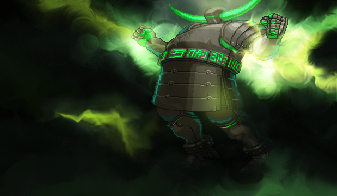
1) That is actually very nice smudging , it's a little sloppy on the blending in some parts, but better then anything I could manage with smuding.

2) There are two parts often thought of different for graphics. Both are flow, but one tends to be more common then the other. While you have proper flow to your focal point your actual "flow" in the piece is disrupted because your render makes the eye want to move opposite of the background, rather then with it. This (to many) disrupts depth and generally doesn't make for a nice signature. (It works great with larger arts though)

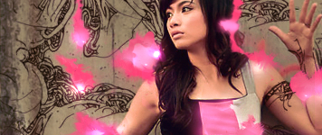
3) There isn't much I can say about this one, I dislike how a large portion of her arm is cut off. That's my only beef with it.

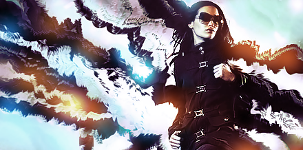
4) Flow of stock: Right
Flow of background: left
The clashing flow from the foreground and background is displeasing, but otherwise I can't say much about the actual sig. I felt you could have tried to branch off with more then just cool/warm (cyan/orange) lightings.

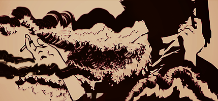
5) I honestly can't tell what it is, but it's intriguing and I like it. I'd offer a bit of critique but since I can't even identify it... I won't.

6) I'm not a fan of this type of style, so I won't comment. :/


I agree, your first was your best, and few people on a non-gfx forum will actually be good with graphics.

EDIT:
OLLLLD signature of mine


Vionce

Smash Journeyman
Joined
Oct 25, 2008
Messages
326
Location
San Diego, CA
lots of stuff. Some are very repetitive. Those first few tags are interesting. The transitions with the guy and himself mirrored could use some work. I like to use a layer mask and a large brush with 0% harding to ease the transitions. The silly black hair looks nice, but there's a lot of empty space that doesn't really help the sig look any better. For the tags with the anime girl, i don't think you should cut out the face like that. The style is interesting, but i'm not a big fan of it.
 

DFEAR

Smash Hero
Joined
Jul 10, 2008
Messages
5,582
Location
:190:
there are several pages and repetive tags mean different versions lawl xD
 

Alzi

Smash Master
Joined
Feb 8, 2008
Messages
3,450
Location
New World
The c4d stands out too much imo.
Try fiddling around more by smudging around the c4d alittle bit and giving it a overlay view or soft light.


Vionce

Smash Journeyman
Joined
Oct 25, 2008
Messages
326
Location
San Diego, CA
i think the bubble thing in the upper left and those bright blue lines intterupt the flow. And then there's the c4d in the front, on the left it's going to from right to left, even though the rest of the flow is going from left to right.

Anyway, i got something i've been working on. I think i over blended and oversharpened. I'm not very happy with the text either.


deepseadiva

Bodybuilding Magical Girl
Joined
Mar 11, 2008
Messages
8,001
Location
CO
3DS FC
1779-0766-2622
Yea Vionce, I'd change the font. Right now it says "Fight me... every Saturday morning on Kids WB!"

Which I don't think you're going for. :p

I'd suggest something more Trajany.
 

Neon Ness

Designated Procrastinator
Joined
Jul 10, 2008
Messages
3,631
@ Inyro: It's not crap...

The gradation on the jacket is the first thing I noticed... It's real nice, very warm, saturated colors. It looks like it conflicts with the background, though... The setting looks washed out and incongruous. I think it'd be nice to try increasing the saturation of the background, and then add some deep blacks in there for contrast.

It's sorta plain right now, I'd like to see what else you can do with it. Composition looks great, though, the placement of the person and text really works. It's odd that his head looks cut off, though...

@Vionce: Very sharp... hurts my eyes a little. There's not really a color scheme either, so the colors are overwhelming right now. Try starting off with just a few (maybe blue and purple) and then adding only what looks right. It looks like you have some nice designs, but they're obscured by Meta Knight. He takes up so much space that we can't really appreciate what's going on back there. Resize him and shift to one side, maybe... Or maybe you just need to find another render of Meta Knight that works better for your idea.

Text is overly fancy. Simple and streamlined is the way to go in most cases. Helvetica/Futura are some of the ones I think look good.
 

Diddyknight

Smash Lord
Joined
May 9, 2008
Messages
1,134
Location
Socal -> FL
@ophy: Crit others before you post please and as for your sig......

-.-

@Malik: I personally dont like it >.> too dark

totally diffrent style im trying out


Vionce

Smash Journeyman
Joined
Oct 25, 2008
Messages
326
Location
San Diego, CA
@malik, i think the render is a little blurry, maybe u could sharpen it up a bit? those are some interesting effects. There are also conflicting light sources. You have bright lights on the left and right, but only light is shining on the left.

@orphy if you just want ur name on a png, then i guess u did a good job (but it's a little big for only a name and some kind of logo)

@diddyknight not much depth on the face. Her hand looks like she's grabbing a 3rd breast! LOL
 

Byron 1337

Smash Journeyman
Joined
Dec 6, 2007
Messages
307
Location
Waterloo, Ontario, IGLOO-LAND Oh, and play Melee
PurDi- Pretty good for a first sig. I'd say there is too much space where nothing is there. Text could use some work, and there's not much flow. Keep working at it!

Oh man, I haven't made a sig in AGES!

Here's one from a while ago, probably my best.


And by the way, that is a GIRL. People have bugged me nonstop in the past about how she looks like a guy.. ggrrrrr

This one's prolly my second best, from a while back as well


I need better text, I didn't do anything other than slap it on
 

KawaiixxWings

Smash Cadet
Joined
Sep 8, 2009
Messages
39
@Byron: First sig feels kinda alienated, I'd consider using a different image because of it's size comparison to the sig. I also don't feel that the textures and backround don't match very well with your smudging pattern. Though your image treatment and coloring is pretty smooth.

Second sig is pretty nice. Nice border, coloring and lighting. I have no complaints. =3
 

KawaiixxWings

Smash Cadet
Joined
Sep 8, 2009
Messages
39
@L: You should work on the rendering a little, the leg especially is a little choppy. I think the sig should have some more effects as well. Like what you did with the brushing though.
 

Inyro Gatling

Smash Journeyman
Joined
Sep 1, 2008
Messages
229
Location
New York
L: very minimalistic... I'd suggest more, and work on depth, lighting, and space issues.

For depth, try using multiple layers of splatters. Also, having some splatters visibly over the focal, and some visibly under it, will work wonders for subtly adding depth. For example, this tag utilizes both ideas of adding depth:


Lighting in a splatter tag may be difficult, but this isn't solely a splatter tag. Use the c4d to your advantage. Burn the darker area on the right, dodge the left, and up the contrast. Try to distinguish where the lighting is on your focal, where the source should be located, and work from there.

For space, try filling the void with something simple, that won't draw away the viewer's eye but will still make a point. Texture is always good. Using a rust, crack, star, or grime texture here would be my personal preference, but you could use anything. Maybe try to find some kind of spider web texture? It may be a bit cliche, but it'll work. In the tag below, I used a c4d and a custom dot pattern as texture:


ANYWAY, on to my tag:
 

KawaiixxWings

Smash Cadet
Joined
Sep 8, 2009
Messages
39
@ Inryo Gatling: I REALLY like what you did with the composition and the typography, and the squiggly texture balances it out nicely. The blur on the left is nice too. Nothing really needs improvement.
 

KawaiixxWings

Smash Cadet
Joined
Sep 8, 2009
Messages
39
If anything, the stock is a little blurry/LQ to me. Though it's nothing really bothersome.

You're a pretty good sport. =]
 

aish

Smash Journeyman
Joined
Dec 13, 2008
Messages
401
Location
City of Champions(really)
There's this halo around it like it hasn't been cleaned enough and makes it look like it doesn't blend into the rest of the banner. The background of it is too blurry and empty in my opinion though some may prefer that. The choice of font is good imo too :3 it fits in pretty well, and the squiggly lines are a nice touch.
I don't know if my signature if very critiqable it's reall plainn(bad at this stuff)but why not if someone will 83 it's not very graphicsish like everyone elses "OTL
 

deepseadiva

Bodybuilding Magical Girl
Joined
Mar 11, 2008
Messages
8,001
Location
CO
3DS FC
1779-0766-2622
Inyro: I highly dislike the render. It doesn't seem to match-up with the sharp font and the clear squiggles.

Aish: I like it, very nice pixely look. Though I'd probably fix the "Best Friends Forever" a teensy bit for legibility. A light drop shadow would probably make it pop a lot too.
 

L__

Smash Master
Joined
Nov 5, 2007
Messages
4,459
Location
flopmerica
For the first one, it would be better without the lips in my opinion :\

I think the font could use a little work for the second one

The area on the left of the third looks a bit too bright, but the effect is cool nonetheless.

Ehh, I don't really like the rainbow bar effect on the bottom, but maybe that's just me. :|


You guys are really good and I was hoping some of you could point me in the direction of tutorials? :(
 

deepseadiva

Bodybuilding Magical Girl
Joined
Mar 11, 2008
Messages
8,001
Location
CO
3DS FC
1779-0766-2622
I'd choose a different font for the question mark (probably something thick and bold), and possibly change it to a darker red, or orange or black to match the circles. The lips are also... odd. :p

Otherwise it's freaky and I love it.

Really hectic - again the script font doesn't seem to fit in with the cubic and sharp elements. And what's the brown block at the left end for?

I'd really love it if the white was made transparent (so then it's a normal rectangular sig with a rainbow tab protruding from the bottom).


First time doing Black/White based >.>
and Vibrant colors ftl......
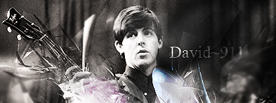
The blur effect at the end of the text I think is a bit overdone. Otheriwise, why is Cthulhu escaping from Paul's guitar? :p
 

Alzi

Smash Master
Joined
Feb 8, 2008
Messages
3,450
Location
New World

DFEAR. Best one is the first on all of them but pretty much what L said about the lips i would remove them and it would look much better.

Diddyknight:

Like that banner just remove the text on the top right corner it's just distracting to see. Otherwise love all the effects done to it and text is good too.

As for me made a new stock banner:


Looks crappy imo >_>
 

KawaiixxWings

Smash Cadet
Joined
Sep 8, 2009
Messages
39
@DFEAR:
Sig one - I really like the idea, texturizing and colors you used. The image may be a little too centered.

Sig two - The textures seem too jumbled and mix-matched. It's also oversharpened as well.

Sig three - It's really straightforward, it could use more effects.

@Diddyknight:

Sig one - The stocks look really choppy. It would help if you smoothened the C4D's out with blending.

Sig two - Lighting is pretty nice, though I think you used too many C4D's and extra stocks. Try using less and it should come out smoother. =3

@Alzi: It's pretty standard and I don't initially have any complaints. I'd suggest moving around the C4D a little though, it kind of intersects with the subject awkwardly.
 

doom dragon 105

Smash Lord
Joined
Sep 17, 2006
Messages
1,487
Location
Miami
Wow its been such a long time since I've been here

@Alzi looks too simple, just feel like all you did was trow a c4d over the stock and saved it, try and add gradient maps and play with light orbs to give your sigs an "ompth"

Man been a while since I looked at PS


Feel its just empty on the top left, but since I used a black to white gradient as my base BG C4d's won't show were it gets too light :/ anywho I think it came out nice first time using a border and clipping masks so CnC away
 

Inyro Gatling

Smash Journeyman
Joined
Sep 1, 2008
Messages
229
Location
New York
Ew on the border, and I can't make out the focal. Right now it's just an abstract tag that's so abstract, even _it_ doesn't know what it should be looking at.

Also, up the contrast a bit kthx

Bleh:
 

Diddyknight

Smash Lord
Joined
May 9, 2008
Messages
1,134
Location
Socal -> FL
lawl I think Ive seen a tut for that one somewhere in PR xD
Looks good though but a bit overdone on something which i cant place lawl xD


Too lazy to make it brigher again >..>
 

Akiak

Smash Ace
Joined
Jul 28, 2007
Messages
820
Location
In my secret laboratory.
@doom dragon: I love it! Great shading, great colors, great blending. The border fits nicely actually and I love how weird and abstract it is.

@Inyro: The colorful splashes are really cool looking and the render is nicely blended. I don't like the text at all though, first because it needs blending, and second because the font is unrelated.

@Diddyknight: I don't really like the darkness in the corner, and neither the colors or render. Good job on the blending though, but as a whole, I've seen waaaaaay better stuff from you.


Another Godot inspired sig.

 
Status
Not open for further replies.
Top Bottom