• Welcome to Smashboards, the world's largest Super Smash Brothers community! Over 250,000 Smash Bros. fans from around the world have come to discuss these great games in over 19 million posts!

    You are currently viewing our boards as a visitor. Click here to sign up right now and start on your path in the Smash community!

The Sig Critique Topic

Status
Not open for further replies.

Diddyknight

Smash Lord
Joined
May 9, 2008
Messages
1,134
Location
Socal -> FL
@Blank: Its not too bad. Just seems the light source is everywhere. find out where your light source might be at and emphasize on it. unless its a bright sig like V


or a dark sig with a obvoius light source


btw....How are those xD

d(^O^)b
 

G U R U

Smash Lord
Joined
Sep 14, 2005
Messages
1,909
Location
London, ON, Canada
Diddyknight can I use your Saber sig? My SN on another forum is Saber lol so It'd be sweet to use. I'll give you credit of course.
 

b1anK

Smash Apprentice
Joined
Apr 13, 2009
Messages
151
Location
I <33 NARNIAAA
hey thanks for pointing that out diddyknight. I went and threw in some lighting effects in the center of the sig. It makes a big difference wow haha.

That saber sig looks great. Though on the second one I can't help but get this feeling of emptiness in the upper left corner. Maybe if you moved the text more to the left, hugging the side.
 

G U R U

Smash Lord
Joined
Sep 14, 2005
Messages
1,909
Location
London, ON, Canada
Aight thx bud

The forum is Pojo.com. It's a site for Trading Card Games like Yugioh, Magic, etc. Ya I've had my Saber account on there for years haha.
 

SuSa

Banned via Administration
Joined
Jul 20, 2008
Messages
11,508
Location
planking while watching anime with Fino
@Blank: Its not too bad. Just seems the light source is everywhere. find out where your light source might be at and emphasize on it. unless its a bright sig like V


or a dark sig with a obvoius light source


btw....How are those xD

d(^O^)b
I'm going to be extremely harsh right now.

I don't understand how you can make something as epic as that Saber signature, and unless that was like.. your first sig ever, how you can make something as crappy as the second one. (I mean, the second one is horribly blended. Look at where the green light and blue horizon meet. Not even a blur to help it blend..)

I understand people have ruts, but it seems to be a trend for your sigs. "Epic sig here" "****ty sig here" "decent sig here" "epic sig here" "****ty sig here" "decent sig here" =p
 

Diddyknight

Smash Lord
Joined
May 9, 2008
Messages
1,134
Location
Socal -> FL
@Susa: Im trying out many things as you can tell. The sigs that i make usualy make well are the one that i like to make. The Saber one I enjoyed makign and the 2nd one is meh. I tend to have that trend and cannot stay consistent as it is >.<

@Inryo: No depth
 

Neon Ness

Designated Procrastinator
Joined
Jul 10, 2008
Messages
3,631
@Inryo: No depth
Best critique I've ever seen, right here...

@Inyro: Big fan of the colors (as always) and for once it looks like the drop shadows can stay. Gives it the look of layered construction paper which is something really different and interesting. I'm lookin' at version 2. I don't really like 3, the girl is just kinda blah, I guess to me. I've seen a million tags with sparkling anime girls, plus her colors don't match the background, so I think she can excuse herself from this one. Text could be amazing with version 2, though. The wordplay is too good. You've got something real good here, please please please repost after figuring out what you wanna do with the text. I want to see the end result of this.

SuSa, I think you're supposed to leave your signature off in here (unless you want advice on it), to leave more room for the images up for critique...
 

zrky

Smash Lol'd
Joined
Jun 1, 2008
Messages
3,265
Location
Nashville
New tag:

Adding space makes it funnn

Yay for spaces


=)
Haven't been here in a while....*brushes dust of brain*

I really like the colors, although on the second one it doesn't look so great because you have the flat colors, and then a bg that kinda looks like cork.

I really don't like the third tag. The colors just don't match the render, and it looks like render plop. Honestly I think this tag look great just as an abstract other than that it kinda loses it's feel.

Hope this was good:)

I feel like making a tag...maybe this weekend....
 

SuSa

Banned via Administration
Joined
Jul 20, 2008
Messages
11,508
Location
planking while watching anime with Fino
New tag:

Adding space makes it funnn

Yay for spaces


=)
Let me see version3 without the render, leave the text.

You did absolutely awesome on v3 except the render. It lacks any blending, flow, or anything with the piece of art you made behind it.

EDIT:
also leave the first blue zig zag line. lol I noticed you flipped it horizontally, then vertically.

Best critique I've ever seen, right here...

@Inyro: Big fan of the colors (as always) and for once it looks like the drop shadows can stay. Gives it the look of layered construction paper which is something really different and interesting. I'm lookin' at version 2. I don't really like 3, the girl is just kinda blah, I guess to me. I've seen a million tags with sparkling anime girls, plus her colors don't match the background, so I think she can excuse herself from this one. Text could be amazing with version 2, though. The wordplay is too good. You've got something real good here, please please please repost after figuring out what you wanna do with the text. I want to see the end result of this.

SuSa, I think you're supposed to leave your signature off in here (unless you want advice on it), to leave more room for the images up for critique...
Only if my signature has an image. No image = no image loaded = no image restriction (15 per page IIRC) applied.

Therefore, my signature doesn't matter. They assumed most people visiting this room would have an image in their signature. ;)
 

SuSa

Banned via Administration
Joined
Jul 20, 2008
Messages
11,508
Location
planking while watching anime with Fino
Lol, I see that now. xD

I was only paying attention to the font and that one line.

Anyways, can I see a version of how I asked for it? XD Unflip the sig, keep the text (you'll probably have to move it, if that looks bad then leave it flipped) but remove the render. :x
 

Inyro Gatling

Smash Journeyman
Joined
Sep 1, 2008
Messages
229
Location
New York
lol the render was so integrated into that version I don't know if I can. I know it looks plopped on top, but it's really not.
 

ndayday

stuck on a whole different plaaaanet
BRoomer
Joined
Jun 12, 2008
Messages
19,614
Location
MI
Well, right of the top of my head;

-a bigger render
-render looks plopped on
-save as a PNG next time
-smaller text, as it draws away from the already bite-size render :)
 

1UPChris

Smash Journeyman
Joined
Feb 28, 2009
Messages
408
Location
Rogueport
lol the render was so integrated into that version I don't know if I can. I know it looks plopped on top, but it's really not.
Have you ever tried burning the edges? I'm sure some people use this technique, especially me. Whenever you're working with a render, (stocks are harder to do this with) burn all the edges. I usually always like the outcome.
 

Diddyknight

Smash Lord
Joined
May 9, 2008
Messages
1,134
Location
Socal -&gt; FL
@Aqua: no depth like the few others xDD and...

-save as png
- render needs to be bigger
-text ruins it
-Rachels amazing at BB
- what he said above

EDIT:


any CnC on this one?
 

b1anK

Smash Apprentice
Joined
Apr 13, 2009
Messages
151
Location
I &lt;33 NARNIAAA
Diddyknight: the render of that character seems a little flat for that back round and play around with the text too cause it just seems like it doesn't fit well.


something new im working on ^. It's missing something I know you guys will be able to point out. I also need suggestions on text.
 

Diddyknight

Smash Lord
Joined
May 9, 2008
Messages
1,134
Location
Socal -&gt; FL
imma be a harsh critic unless SuSa or someone else better than me comes along like Black Waltz(where ever he is)......


- horrible lighting
- Render quality looks bad
- no depth again
- as for text......sci-fi theme
- as for anything else.....work on it more.....

lolol im bored again...


made this 2 nights ago....i know that the lighting in the center is too bright but not sure on how to fix it >.<
 

Alzi

Smash Master
Joined
Feb 8, 2008
Messages
3,450
Location
New World
You can use the burn tool alittle over it to darken it.

Those two lines in the bottom right corner need to go away other then that i like it i guess.
 

Vionce

Smash Journeyman
Joined
Oct 25, 2008
Messages
326
Location
San Diego, CA
I like it.

Personally i would give it no text at all.
nah it just needs better placement and fewer effects.


something new im working on ^. It's missing something I know you guys will be able to point out. I also need suggestions on text.
Perhaps sharpening up meta knight will help. Right now the hand looks like the focal point. I think something blue on the bottom right hand might be good placement for the text. Playing with the levels and curves can help with depth.
 

SuSa

Banned via Administration
Joined
Jul 20, 2008
Messages
11,508
Location
planking while watching anime with Fino
You can use the burn tool alittle over it to darken it.

Those two lines in the bottom right corner need to go away other then that i like it i guess.
Using a Soft Brush, any size (I use 300px) and brushing once over the spot you want to darken (on a new layer), then set that layer to soft light. (A few others work, but soft light normally works the best) and put that layer on 65-85% opacity.

That's how I do my lighting. (Same with white lights)

@B1ank
Your render is FAR to large. There is something called "The Golden Ratio" when it comes to visual art. The basis of this is there are 4 points that are best to have a focal point.

http://en.wikipedia.org/wiki/Golden_ratio

If you take a look at the following picture:
http://en.wikipedia.org/wiki/File:Fibonacci_spiral_34.svg

You see where it starts to get really small? (The ending), well if you keep turning that image 90 degrees counter-clockwise (or clockwise) you will find that it makes 4 points.

Those 4 points are generally the most pleasing to the eye to place a focal. (It's not quite the corners, I can make an image if you like)

Your focal (Meta Knight) is far to large, and hugely overlaps 2 of those points (but those two points are just above his left (our right) eye, and below his visor underneath that same eye. That makes it rather boring.

You have a little bit of depth, but simply not enough.

Again, I can only recommend following a few tutorials at my site ( http://tt.xpt.net ).

The point of following tutorials is to learn new techniques, not to make a nice piece of art. Learning new techniques lets you be able to do more with your signatures, and create a variety.

That, and tutorials (generally) teach you the "right" things to do, and the "wrong" things to do. (I can find tutorials that make me want to facepalm)

EDIT:
Critique this, and as a prize you are allowed to download it and look at what I did. ;)

(This is a great example of a POOR focal point. I had it centered, when I shouldn't have)
http://lighttodark.deviantart.com/art/Fear-98232404

(Turn off all layers, then turn them on one by one from the bottom, it let's you see what I did step-by-step. I also named the layers so you can get an idea of what I did)

EDIT:
I did something no artist should ever do, but it was to try and show a point.

I hope you don't mind iCe.

Adding depth using blur/sharpen and layer masks
Adding lighting and contrast using size 300px brush, white/black, 1 brush at 100% opacity, setting to soft light, and playing with the opacity:

Tell me if this is more pleasing to your eye: (I over-sharpened the render -_-)


Diddyknight

Smash Lord
Joined
May 9, 2008
Messages
1,134
Location
Socal -&gt; FL
lawl SuSa its fine. I got it darker my way lol and my good friend helped me out and its less bright than what you currently have xD once i get home ill post it once im done with my homework lawl
 

XxGGnoRExX

Smash Rookie
Joined
Aug 18, 2009
Messages
13
I see like other non-gfx sites people don't know how to tag

-shrug-

I guess I need to stop lurking more and start helping huh?


...
 

Diddyknight

Smash Lord
Joined
May 9, 2008
Messages
1,134
Location
Socal -&gt; FL
i only see 2 that are good. the 3rd to last and the the bleach one. >_>

-Horrible blending on first one
-2nd: color scheme doesnt seem to work and looks barely plotted on with hardly little blending
-3rd seems smudge and outline
as much as i suck i can tell what is good or whatnot at least unless im being arrogant lololol which true lol xD
At least try not to be arrogont/assume your better than us(even if its true) at least show it through your art and lets see what the people usually will say from that. 90% of the people here are not in art gfx forums but very little are. SuSa probably and me for all i know and some others that i dont know which might be lurking around and reading this rofl

imo your average to my eyes. To others you seem good. blargh dunno what else to do but to crit like a ***** rofl xD

only the 2 that i liked are actually good xD Im tired and felt liek being a ***** on crits rofl rofl anyway....Black Waltz where are you? T_T
 

Vionce

Smash Journeyman
Joined
Oct 25, 2008
Messages
326
Location
San Diego, CA
XxGGnoRExX, i really like the 3rd from the bottom. I like the flow and colors. You sound confident in your abilities, but none of these tags have text. I know it's not always needed, but it would show more of your abilities.
 

XxGGnoRExX

Smash Rookie
Joined
Aug 18, 2009
Messages
13
1st Tag: This one is actually the best out of the ones I posted. The smudging is of good quality while the piece has good colors and doesn't require much blending because of style done. This pieces only problem is that it's compo is boring.

2nd Tag: The colors are actually underwater colors since underwater colors are blue yellow green and white. The piece has unique lighting, good depth, good flow and decent contrast in the shades of smudging. The pieces flaw is that it needs more work done and I simply ran out of ideas.

3rd Tag: This one was made with a Photo with the girl and a plain wall without the black lines or the pink so theres alot more work then then you think.

4th Tag: This one is a bit iffy, it's another stock smudging with a bit of a unique touch on the style. The only real problem if this is that the compo is horrid.

5th Tag: Smudging on a stock with a fail attempt of adding color. Just unique but not that great.

6th Tag: The only non smudge tag out of the bunch. The tag could be better if it just had some darker shapes but it is alright.

I'm not really a elitist but I was in a iffy mood while posting them.
 

Diddyknight

Smash Lord
Joined
May 9, 2008
Messages
1,134
Location
Socal -&gt; FL
2nd Tag: The colors are actually underwater colors since underwater colors are blue yellow green and white. The piece has unique lighting, good depth, good flow and decent contrast in the shades of smudging. The pieces flaw is that it needs more work done and I simply ran out of ideas.
What depth? *points at it*

redefine to your words
 

XxGGnoRExX

Smash Rookie
Joined
Aug 18, 2009
Messages
13
Depth: Depth or Shadows repersent a image's 3d look as the eyes go from back to front or vice virsa. It is required for any piece of art to look somewhat decent.
 

XxGGnoRExX

Smash Rookie
Joined
Aug 18, 2009
Messages
13


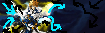
Inside the Cyan: This is the FG since it is the focal point of the piece, blending is done over the shouders and under the torso to repersent a emergence for a attack or a few other concept ideas.
Inside the Blue: This is the MG, it has the area that leads to the focal anda bit less of a detailed touch to it since it isn't the main place of focus. The flow also recycles to the left end.
To the right of the Black: This is the BG, it is the least detailed and usually the darkest of a piece. The eye makes you go return through the flow and the other two grounds.

Result: You don't know proper depth, and have now angered me when I said I wasn't going to be elitist _-


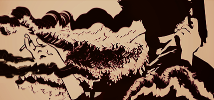
The Cyan Arrows: This is the main flow that the eye follows when looking at the tag.
The Black Arrows: This is the recycled flow that the eye will follow back to the main flow and isnt as strong.

Result: You don't understand proper flow
 
Status
Not open for further replies.
Top Bottom