• Welcome to Smashboards, the world's largest Super Smash Brothers community! Over 250,000 Smash Bros. fans from around the world have come to discuss these great games in over 19 million posts!

    You are currently viewing our boards as a visitor. Click here to sign up right now and start on your path in the Smash community!

The Sig Critique Topic

Status
Not open for further replies.

DFEAR

Smash Hero
Joined
Jul 10, 2008
Messages
5,582
Location
:190:
@neonness

in all seriousness. 30minutes

@inyro

the 1st tag is just awesome. i love the title. what a crowd, so beast man and the depth in it is amazing. that blur was a great touch.

the 2nd tag is...missing some oomph

the 3rd tag is epic. im a huge fan of this type of style and the colors u presented work very well together. the nonwhite bg is also a plus. that white better gtfo xD lol


original girl pic:
http://img11.imageshack.us/img11/1844/488796a4288b0.jpg

=D?
 

deepseadiva

Bodybuilding Magical Girl
Joined
Mar 11, 2008
Messages
8,001
Location
CO
3DS FC
1779-0766-2622
The only think I don't like is the legibility of the text - specifically the "WHAT" and "A". I didn't even know there was an "A" there before DFEAR pointed it out. :p

The concept and execution is horribly beautiful and original otherwise.

Everything else on this page is 100% perfect.
 

deepseadiva

Bodybuilding Magical Girl
Joined
Mar 11, 2008
Messages
8,001
Location
CO
3DS FC
1779-0766-2622
The depth in the text is flawless and would be murder if changed - it's just I completly missed the "A" (maybe because the "a" in "WHAT" ends in the same color as the stand-alone "A"). Maybe if the text is moved a bit to the side so the "A" is more visible? I unno.

Maybe it's just me... >__>
 

gopobox

Smash Journeyman
Joined
Jun 4, 2009
Messages
422
Location
Sydney, Australia
^ that don't make any sense to me
I think your problem was that A was fully blue and made it harder for you to read.
Well i read it fine and i think the sig is beautiful
 

SuSa

Banned via Administration
Joined
Jul 20, 2008
Messages
11,508
Location
planking while watching anime with Fino
I think the text needs work...it's just boring.. white text. :/, as long with the depth. Right now there is only really a background, and no foreground. Her left side has quite a few effects, but it's supposed to be dark. I would maybe offset her more to the left, thing's don't always have to be centered.
 

Inyro Gatling

Smash Journeyman
Joined
Sep 1, 2008
Messages
229
Location
New York
...Wow. So I can assume we like my "What a Crowd" tag? lol that's more than I expected.

Anyway, critique time for DR809:

Your focal is well defined, and the colors aren't bad, but that's about all the real good points I can find in this. There's nothing that's really bad, but nothing else that stands out as really good.
 

SuSa

Banned via Administration
Joined
Jul 20, 2008
Messages
11,508
Location
planking while watching anime with Fino
@neonness

in all seriousness. 30minutes

@inyro

the 1st tag is just awesome. i love the title. what a crowd, so beast man and the depth in it is amazing. that blur was a great touch.

the 2nd tag is...missing some oomph

the 3rd tag is epic. im a huge fan of this type of style and the colors u presented work very well together. the nonwhite bg is also a plus. that white better gtfo xD lol


original girl pic:
http://img11.imageshack.us/img11/1844/488796a4288b0.jpg

=D?
It was my fault you got skipped, so I'll bump this for you.
 

East

Crappy Imitation
Joined
Feb 11, 2008
Messages
763
Location
Doing Tricks in a Mansion Location: Tokyo, JP
I'm very impressed with the edits to the girl, the largest being the complete shirt color change, and the addition of the "tattoos" I like the color usage, as well as the juxtaposition of everything in the sig. I don't feel the fonts for the words "secret koote" were appropriate. I felt the font "Zero" was written in was much more appropriate.

This is the pinnacle of my skill right now. I'm very proud of it, because of the plethora of attention I gave the smaller details in the sig, such as lighting and how the render and the background intermingle to give a brief story.


I'm sure the last thing anyone wants to see is another anime signature, but most of the signatures I do are for websites that I rp on.
 

Neon Ness

Designated Procrastinator
Joined
Jul 10, 2008
Messages
3,631
@ DFEAR: Whoa, I just looked at the original version. You changed the girl render a lot. :laugh: That looks insanely good, though, like what you did with the sunglasses. The arm tattoos are really well done... these colors work well for some reason, the red-orange/blue combination reminds of something like a vacation or tropical setting. I like what you did with the text, using ornate font to surround the simpler font. I mean... I dunno what to say, I like almost everything about this one.

Still, though, that drooling turquoise again is :/...

@ East: First thing I notice is this enormous... chasm of negative space in the middle. Naruto on the right, text on the left... my eyes are pulled in 2 different directions. :psycho: I can't tell if there is a focal point that demands attention. Basically there's no cohesion, it feels divided.

The colors are OK, but I'd like to see what this would look like with more variation. Throw some red-oranges and yellow-oranges in the background there, maybe even a few blues. Just try different color schemes and see how it turns out. Those vertical dotted lines near his head look good, if you had a few more of those near him, I think it would add a lot. The background itself is flat looking... There's not enough variation, it's just those Wolverine claw looking designs. Eh, I don't really think those brown spheres fit in, I'm not sure why though. They just look inconcgruous for some reason.

Slanted text looks good to me. It's a little big, though.
 

Alzi

Smash Master
Joined
Feb 8, 2008
Messages
3,450
Location
New World
DFEAR all i can say is you make really well banners with humans in them. They are ment to be the hardest to do in my opinion and you do them really well.

I like your other one really much. The other girl one that has the blue and the red. Looks really good keep it up.
 

Fuelbi

Banned via Warnings
Joined
Jun 17, 2009
Messages
16,894
Location
Also PIPA and CISPA
Oh man I know this isnt much because this is my first sig and all.... and I still dont know how to use GIMP to a full extent so please dont make fun of it and be constructive.... actually Id like instructions from someone so I can make a background instead of using this gradient on my sig


Neon Ness

Designated Procrastinator
Joined
Jul 10, 2008
Messages
3,631
@ roacherman: Well, at least you're putting stuff down and getting ideas. A gradient could probably give you some ideas for what color background you want.

There's sort of a problem, though... You really should use just one subject when starting out in my opinion, to avoid a cluttered look. So get rid of either Sonic or Kirby; try to work with one focal.

We can't really tell you what background to use/make, because it depends on what you want to make. The background should probably match or otherwise relate to whichever character you're gonna use (see DFEAR's signature above). But just start using brushes, pen tool, etc. if you don't have any specific ideas and see what you get. Going crazy with a few splatter brushes always inspires me when I'm feeling blocked. If you want vectors, bust out that pen tool. If you're going with Sonic, consider yellows and maybe black/white effects... I dunno what color scheme you want. The colors in the gradient right now don't match either character.
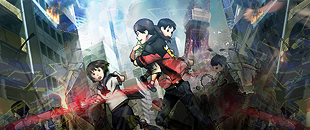
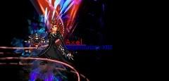
Also move whichever character you wanna use just a little closer to the middle. They're too far off to the side right now... It looks odd. But just start putting stuff down, something will come to you.

@ DFEAR: I'm always a big fan of your color coordination. Prefer version 8... depth is on point.

I enjoy seeing your stuff 'cause it's amazing, but at the same time I lament that I'm not as good. :laugh: Seriously, though, great work as usual.
 

colddegree

Smash Cadet
Joined
Apr 11, 2009
Messages
72
To DFear Man I love Your style. The colors are nice, I would love to even learn your style.
Heres My kind of style sorry taht there all brawl sigs. >_>


DFEAR

Smash Hero
Joined
Jul 10, 2008
Messages
5,582
Location
:190:
^got to work on ur coloring. the pictures do not blend well with the backgrounds, the sheik one is the best of the bunch in coloring.

just make the background more complex and do not be afraid to put stuff over the renders/pictures : >


colddegree

Smash Cadet
Joined
Apr 11, 2009
Messages
72
K alrite so work on blending the colors well with my render and dont be afraid of working on the render right?
 

Inyro Gatling

Smash Journeyman
Joined
Sep 1, 2008
Messages
229
Location
New York

and


Those are your best.

For the first, crop off part of the left side to get rid of the badly empty space, and to the right side add some effects similar to the ones you have, though maybe in another color. And less of them, just to accent.

For the second, the text isn't all that great in my opinion, and I'm not a big fan of the dominant flow you chose. I think it would've been better with the dominant flow cutting through him the other way. Crop off a bit from the left, too. =)


New:
 

O D I N

Smash Hero
Joined
Mar 13, 2005
Messages
7,408
Location
GameAngel64's house, getting my @#% handed to me.
3DS FC
4098-3123-8629
lolz at SWAT Kats. I loved that show. ^_^

Where did you end up getting topaz? Or are you not using topaz? My 'trail' ran out, so I haven't been able to use it.

As towards critique...

Last three look best. Direction really has no effect on me (towards the last two), and the font is more appealing in the 4th.

The last two on the others you posted D were my favorites. Great colors on both tags you made, I need to get my colors down. T_T


Inyro: Good smudge, but could be overdone (I can't decide just yet). Some good colors, but the background doesn't have enough 'pizaaz' in my opinion. Maybe that's why I'm so concerned with the smudge here... I dunno. The text is great is some ways, it blends well with the sig, but it's impossible for me to tell what the bottom word is supposed to say.

On second thought, the smudging is fine. I just don't like the left (my left, his right) of the tag.
 

DFEAR

Smash Hero
Joined
Jul 10, 2008
Messages
5,582
Location
:190:
@inyro the depth in ur tags is just too amazing man. the blurs are way too good. and that colorful smudge cloud is beast. lighting could be a bit better but those smudges make up for it.


illustrator+painter+ps
 

Inyro Gatling

Smash Journeyman
Joined
Sep 1, 2008
Messages
229
Location
New York

There's the best. Could use some work on the stem and lighting though. And kill the pink soft light.

Werekill: Duuuude... what happened? You're better than this. The lighting distracts me from the focal too much, there's no depth, and the checkerboard is annoying me. Work on your colors, too. Too bright and happy for a dude standing there like he could kill you if he wanted.


Tags I haven't posted here yet:
(this stock was originally grayscale, so the focal's a bit monochrome)


1UPChris

Smash Journeyman
Joined
Feb 28, 2009
Messages
408
Location
Rogueport
@DFEAR: They all look amazing. x_x I think the 3rd one looks the best. I love how you're experienced in almost every corner of GFX. The only thing you could change is the scan lines around the petals. I think it might be fine without them.

@Werekill: Since you haven't posted in awhile, this tag is pretty decent. The colors work great, but just a little washed out. o_o

Overall, it looks kinda flat. Adding some more foreground effects could help. It's actually very nice looking imo. =D

@Inyro: The first one has some great colors. The only thing I don't like are the flowers blended in around the focal. It just doesn't seem to fit with the stock (flowers and gas mask? o_o;;)

The second one isn't as good as the rest of em. Did you use a fractal? It actually looks okay in this tag. The colors are also a little too bland. I'm liking the illustrations you're using in your tags, they look sorta futuristic. =3

I think the third one is probably the best of the bunch. I like the colors, but the right side just doesn't fit with the rest of the scheme. Great smudging job btw, you seem to be good at that. =)

The last tag looks great imo. The pentooling gives the tag a nice flow, and the text finishes off the tag. Not much else I can say about it.

After a huge slump, I came up with this:


v_v
 

DFEAR

Smash Hero
Joined
Jul 10, 2008
Messages
5,582
Location
:190:
@werekill.
contrast and coloring need some fixing. too bright and soft at the same time O-o. background effects are hot. but as chris said, foreground will surely boost the tag's appearance.

@iny.
all tags are awesome. one 's coloring is cool, flowers are a good touch. the stock itself looks monotoned :\ and lighting on him could be spiced up.
2nd, if the focus is on the background u achieved it. but since its a tag with a render the goal is to make it around him and expand his awesomeness o.o otherwise bg only tags ftw ya know.
3rd is cool. i like the green u used. the right side could of been a better color such as that green.
4th. simple. the text and pentool is beast. expand on it.

@chris
background is insane. just tone down the brightness of the red a bit and organized the flow a little. the coloring should be just like the right side of her face. thats an awesome color to work with her. the red is a tad much.

and lol i suck man xD.
 

DR809

Smash Apprentice
Joined
May 26, 2008
Messages
143
Location
Brooklyn
3DS FC
3754-7546-8239
Fear-I love the 4th one fear its awesome. BTW did you see the thread shane. did on gfx. He said he didn't ask Dom yet O.o.

Inyro-Imo the last one is the best but the text kills it, it doesnt blend in well with the sig.

Made this for a battle I accepted on another site.


Edit-Oh crap I skipped Cris. Good Job I love the background and C4D ussage on it.
 

DFEAR

Smash Hero
Joined
Jul 10, 2008
Messages
5,582
Location
:190:
its k. shane is whack man xD. good thing he is not a smasher and doesnt know the mindset :p.

gotta predict what doms gonna do ya know. endure the consequences, then adapt :p
 

DR809

Smash Apprentice
Joined
May 26, 2008
Messages
143
Location
Brooklyn
3DS FC
3754-7546-8239
lol. if he were a smasher he'd flame alot.
Supposodly dom dont care.
BTW Critique >.<
 

gopobox

Smash Journeyman
Joined
Jun 4, 2009
Messages
422
Location
Sydney, Australia
Havent been in this thread in a while

^ That doesnt look too bad just that its a bit messy as some things cover the characters...

Please critique my sig...

Yeah i know its a smash sig T_T
 

Alzi

Smash Master
Joined
Feb 8, 2008
Messages
3,450
Location
New World


Werekill:
To be honest i like it alot. It has nice simple effects, Looks good for a stock image would love to see more ^_^.

gopobox:
Firstly doesn't matter what kind of sig it is, it's all about how you make it in the end that counts. There is alot of empty spaces so i would either make the width of the banner smaller and text smaller aswell to make it look better. You also need to cover up the kirby image alittle like how Werekill has done with his image. It's ok to cover up a image but you just need to be carful not to over do it. It is hard aswell trying to put some effects over it so you'll just need to practice from time to time. I haven't yet mastered this so well.

Blitz Falcon
I think i should wait for the better quality before i say anything lol.

Now can any one rate my banner in my sig :D.

Edit: You need to be on smash blue skin to see it all but if your not i'll just post it here to make it easier:

 
Status
Not open for further replies.
Top Bottom