@neonness
in all seriousness. 30minutes
@inyro
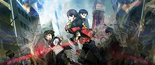
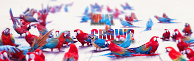
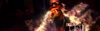
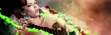
the 1st tag is just awesome. i love the title. what a crowd, so beast man and the depth in it is amazing. that blur was a great touch.
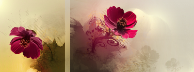
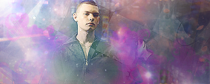
the 2nd tag is...missing some oomph
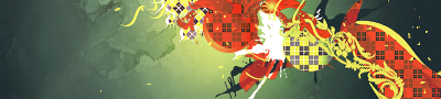
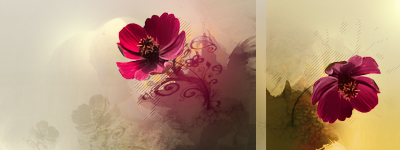
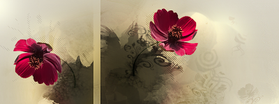
the 3rd tag is epic. im a huge fan of this type of style and the colors u presented work very well together. the nonwhite bg is also a plus. that white better gtfo xD lol

original girl pic:
http://img11.imageshack.us/img11/1844/488796a4288b0.jpg
=D?
in all seriousness. 30minutes
@inyro
the 1st tag is just awesome. i love the title. what a crowd, so beast man and the depth in it is amazing. that blur was a great touch.
the 2nd tag is...missing some oomph
the 3rd tag is epic. im a huge fan of this type of style and the colors u presented work very well together. the nonwhite bg is also a plus. that white better gtfo xD lol
original girl pic:
http://img11.imageshack.us/img11/1844/488796a4288b0.jpg
=D?


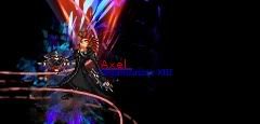
 That looks insanely good, though, like what you did with the sunglasses. The arm tattoos are really well done... these colors work well for some reason, the red-orange/blue combination reminds of something like a vacation or tropical setting. I like what you did with the text, using ornate font to surround the simpler font. I mean... I dunno what to say, I like almost everything about this one.
 I can't tell if there is a focal point that demands attention. Basically there's no cohesion, it feels divided.


")