
-
Welcome to Smashboards, the world's largest Super Smash Brothers community! Over 250,000 Smash Bros. fans from around the world have come to discuss these great games in over 19 million posts!
You are currently viewing our boards as a visitor. Click here to sign up right now and start on your path in the Smash community!
It appears that you are using ad block :'(
Hey, we get it. However this website is run by and for the community... and it needs ads in order to keep running.
Please disable your adblock on Smashboards, or go premium to hide all advertisements and this notice.
Alternatively, this ad may have just failed to load. Woops!
Please disable your adblock on Smashboards, or go premium to hide all advertisements and this notice.
Alternatively, this ad may have just failed to load. Woops!
The Sig Critique Topic
- Thread starter Livvers
- Start date
- Status
- Not open for further replies.
Inyro Gatling
Smash Journeyman
Well, I like the general concept, but (in addition to the advice Neon Ness gave), I think you should blend in the red more on the eyes. Right now it's too noticeable, and by extension unrealistic.

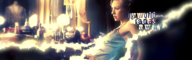
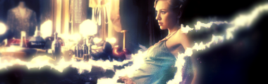
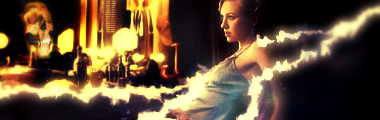
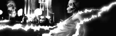
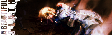
Okay, it's been a while since I stopped by here... So here's my two latest and greatest (including the 6 versions of my latest that show a good progression of what I did to it:


Neon Ness
Designated Procrastinator
- Joined
- Jul 10, 2008
- Messages
- 3,631
Looking at the second one...
Eh. I think the signature in general is more powerful when you have the lady in real life and the skull in the reflection only. When they're both skulls it's just kind of like "Oh, look. A skeleton looking at itself." :/ So I prolly prefer v3 in those regards.
The lightning doesn't seem... congruent. Like it's this somber scene of a woman looking at a rather foreboding reflection, and out of nowhere is this incredibly hype bolt of lightning. I think you can replace it with something more minimalistic, something that'll complement the tone of the scene but not get in the way.
Glad to see you got rid of the text, I think the image can (and does) speak for itself.
Good stuff, your pieces always have great colors. Composition looks good as well.
@kola, fix the monotone and u will see HUGE improvement
@DR809,
make the eyes a little more vibrant and sharpen the hair/eyelashes a little, the rest is perfect, and it be cool if ya made the tape oozing blood or is crinkled up or have tears w.e floats the boat ya know.
the 2nd sig doesnt compare to the chick sorry : <
@inyro
exactly what neon suggested about the chick sig
i really like the anime tag alot tho. only thing id change is the depth of the blurriness and sharpen some other things. and maybe flipping it horizontal might look hotter o.o
deepseadiva
Bodybuilding Magical Girl
You would suggest that.@DR809,
make the eyes a little more vibrant and sharpen the hair/eyelashes a little, the rest is perfect, and it be cool if ya made the tape oozing blood or is crinkled up or have tears w.e floats the boat ya know.


^ u and me must make a COLLAB. ur getting really good on a very fast rate.
ur text is getting better but wouldnt hurt to make it more creative (typography is a skill in itself dont u worry i suck at it hence why i never use text in mah works), the colors are beast, would love to see a pink/magneta/red version of this tag however, the lightning is beast tho. MAKE MORE
ur text is getting better but wouldnt hurt to make it more creative (typography is a skill in itself dont u worry i suck at it hence why i never use text in mah works), the colors are beast, would love to see a pink/magneta/red version of this tag however, the lightning is beast tho. MAKE MORE
We should. :D
I'm getting better because I joined a gfx site has helped me alot. I'm trying to focus on text now.
Thanks :DDDDDD. I will make more.
Edit-I look back at my old work and only find like on good one lmfao.
I'm getting better because I joined a gfx site has helped me alot. I'm trying to focus on text now.
Thanks :DDDDDD. I will make more.
Edit-I look back at my old work and only find like on good one lmfao.
Inyro Gatling
Smash Journeyman
I personally stick to GimpTalk. I normally get good advice there.
Anyway, forgot to post this one:

As for critique...
Anyway, forgot to post this one:
As for critique...
Well... I think it's a good start, but I think the c4d stands out a little too much, and there's really not much to see in the tag. Work on your text, too.
SuSa
Banned via Administration
I would like the horizontal one, but you'd need to rethink the text. I'm just not a fan of vertical signatures. :x Sorry..
To me it looks like some smudge effects, which are greatly done imo (I was never good with smudging)
I do like how you did the text though. The T is a little hard to read however. :x
Ugh... I need to get back into graphics. :/ Will all of you get on my *** about it?
Here's an old signature, experimenting with using soley C4D's for background and effects. (Sorry about the dA link... I don't have the signature saved on my cpu. I delete them every 3 months (or when I feel I've had some major improvement) unless I plan to go back to improve on them.
http://lighttodark.deviantart.com/art/Battle-72219720
EDIT:
Edited the description to prove it's mine and not some random dA accounts. XD
To me it looks like some smudge effects, which are greatly done imo (I was never good with smudging)
I do like how you did the text though. The T is a little hard to read however. :x
Ugh... I need to get back into graphics. :/ Will all of you get on my *** about it?
Here's an old signature, experimenting with using soley C4D's for background and effects. (Sorry about the dA link... I don't have the signature saved on my cpu.
I delete them every 3 months (or when I feel I've had some major improvement) unless I plan to go back to improve on them.http://lighttodark.deviantart.com/art/Battle-72219720
EDIT:
Edited the description to prove it's mine and not some random dA accounts. XD
imageshack ftw susa =O
@susa .
btw i want to see the original stock/render. but i will assume u made the bg and characters were rendered. all i can say is the tag needs moar colors =D thats all i ever suggest in sigs but thats a personal preference :3 what i do like is the realism of the tag, meaning how well u blended the stock and the effects together to create a solid piece. good **** :3
@iny. never again with vert tags, its yet to be used awesomely :\ but i will give u massive credit for attempts.
text is sort of illegible unless intended. i like the smokey ambiance of it. the only thing that bothers me in the tag is the blue of the sig seems very bland. add some flavor to the blue :3
SuSa
Banned via Administration
It's pre-rendered, however (IIRC) I did a few copies of the render for colors and such. Just slight differences.
IIRC (it's a rather old piece. XD) It's only 1 C4D, used for both the background and foreground.
It was just a test on my C4D usage. I've never really been good with using C4D's. :x
I'll try to create something more recent and post it sometime...
IIRC (it's a rather old piece. XD) It's only 1 C4D, used for both the background and foreground.
It was just a test on my C4D usage. I've never really been good with using C4D's. :x
I'll try to create something more recent and post it sometime...
Inyro Gatling
Smash Journeyman
New crappy tag:

Inyro Gatling
Smash Journeyman
lol thanks man
SuSa
Banned via Administration
I'm a fan of a 1-3px border. A tag without a border is like a picture without a frame to me... :x I feel... it should pop out more though. It's just a tad plain overall. Nothing to give it that "wow" effect.
Inyro Gatling
Smash Journeyman
SuSa: I personally hate borders, lol. But I know what you mean about lacking a "wow" factor.
DR809: It only looks low quality because I sharpened the tag after putting space stocks on, and the tiny stars give it a grainy feel. I meant to fix that, lol.
Anyway, here's a better tag:
DR809: It only looks low quality because I sharpened the tag after putting space stocks on, and the tiny stars give it a grainy feel. I meant to fix that, lol.
Anyway, here's a better tag:
SuSa
Banned via Administration
Haha, I'll have to settle my hatred of non-bordered tags when commenting on yours.... haha....
For me, it doesn't feel like enough is going on. The left side looks great, but it loses it's flow towards the right side. As well as it's "oomph". Try creating the right side, I'm thinking some neat vector effects (continue off with the idea you have on his shoulder. It looks like you were going to go vectory but decided on smudge instead)
Anyways, here is my first signature in over 6 months so be harsh:

Render used:
http://planetrenders.net/renders/displayimage.php?pos=-46535
v2"

.psd available upon request
25+ Layers
~45 minutes taken to complete
NO C4D, NO Brushes. Just render, filter, and adjustment layers. Playing around with the basics before I go more advanced.
For me, it doesn't feel like enough is going on. The left side looks great, but it loses it's flow towards the right side. As well as it's "oomph". Try creating the right side, I'm thinking some neat vector effects (continue off with the idea you have on his shoulder. It looks like you were going to go vectory but decided on smudge instead)
Anyways, here is my first signature in over 6 months so be harsh:
Render used:
http://planetrenders.net/renders/displayimage.php?pos=-46535
v2"
.psd available upon request
25+ Layers
~45 minutes taken to complete
NO C4D, NO Brushes. Just render, filter, and adjustment layers. Playing around with the basics before I go more advanced.
Very nice SuSa. I prefer the Second one then the first since it looks better smaller and the bottom left corner looks better. The dots near her hair i think might look better if they are little harder to see so make there opacity lower and it will look better imo. Once again looks very nice and why do i see eyes near the bottom left area lol. They are perving on that girl.
As for me i made this banner while trying out some smudging for the first time:

I don't know why on earth i had an urge to use that picture but squirt is way to awesome.
As for me i made this banner while trying out some smudging for the first time:
I don't know why on earth i had an urge to use that picture but squirt is way to awesome.
C.C ftw
@susa
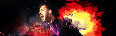
i always admire the use of defaults. just like in games knowing the fundamentals perfectly and using them well as punishes achieves flawless victory. cant know 100 hit combos if ya cant block ya know what i mean o.o. anyway regarding the tag i LOVE that tint of green, i want to see more of it. i like how u used the light green shades but lets see some dark ones too :3 looking great so far
@alzi
im a fan of sharpen/blur/lighten effects but lets go beyond that and lets do more advanced depth strategies o.o, notice how there's too much light and not enough shadows on good ol squirt. ur defying physics in this way. tho in art it shouldnt matter but realism is always something most artists try to achieve in 3d pieces o.o. the coloring is great i love that yellow u used in the corner i want to see more of that around the overall tag, his eyes are really the focus here perhaps doing something unique with them could provide the oomph factor here? text is k. squirt is too awesome. um what else? um... oh yea less white...more balance! =P
@susa
i always admire the use of defaults. just like in games knowing the fundamentals perfectly and using them well as punishes achieves flawless victory. cant know 100 hit combos if ya cant block ya know what i mean o.o. anyway regarding the tag i LOVE that tint of green, i want to see more of it. i like how u used the light green shades but lets see some dark ones too :3 looking great so far
@alzi
im a fan of sharpen/blur/lighten effects but lets go beyond that and lets do more advanced depth strategies o.o, notice how there's too much light and not enough shadows on good ol squirt. ur defying physics in this way. tho in art it shouldnt matter but realism is always something most artists try to achieve in 3d pieces o.o. the coloring is great i love that yellow u used in the corner i want to see more of that around the overall tag, his eyes are really the focus here perhaps doing something unique with them could provide the oomph factor here? text is k. squirt is too awesome. um what else? um... oh yea less white...more balance! =P
SuSa
Banned via Administration
Darken the shadows, because Squirt is drowning in light... :x Very nice effects and such. I like it.
/too bad it has no border. T_T
C.C v3:

C.C v4:

I like it. /too bad it has no border. T_T
C.C v3:
C.C v4:
Something about that border is putting me off.. maybe make it solid and thin?
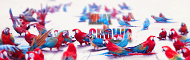
Here's a series of sigs for my crew that I've made. There still a few more to come:


Here's a series of sigs for my crew that I've made. There still a few more to come:
^wouldnt it be easier if u made a universal tag for the whole group?
alright well only thing i find iffy about the tag is the weird levels of contrast in each tag o.o, someone get me my sunglasses :\ just tone it down and its pro
alright well only thing i find iffy about the tag is the weird levels of contrast in each tag o.o, someone get me my sunglasses :\ just tone it down and its pro
=D?

deepseadiva
Bodybuilding Magical Girl
I really like the how each person has their own color motif, and they function well in a group, but individually they're kinda bland. Some of them have pretty bad render positioning - particularly the Zamus one, and the background is pretty "meh" overall.Here's a series of sigs for my crew that I've made. There still a few more to come:
I'd try working with a more dynamic background and maybe have uniform render positioning while keeping each signature original by having different fonts for each player. Just options though.
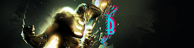
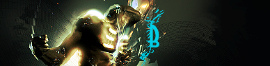
The B's funky-fresh colors are really throwing me off. I don't think they really work with the overall "brown" and "murky green" color schemes. The final one with a white B is harmonious, but I don't know why it's there.
I think I might like the empty one the best.
Also... how do you do the grid thingy in the BG...? >____>
^ crop is much needed indeed.
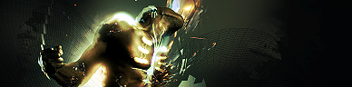
http://img12.imageshack.us/img12/8545/cellularman.png
collab between a friend and i. i did not want to create a new topic for this so ill post it here o.o
http://img12.imageshack.us/img12/8545/cellularman.png
collab between a friend and i. i did not want to create a new topic for this so ill post it here o.o
Neon Ness
Designated Procrastinator
- Joined
- Jul 10, 2008
- Messages
- 3,631
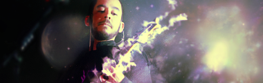
Yeah... I can't think of any better way to say it than this. Those colors look real good.Great use of Splatter and lighting is amazing. Freaking sexy x]
This reminded me, what I'm working on right now is getting that polished, "professional" look in my stuff. Guess it just takes time. A lot of time... and patience.
How long did this take?
Inyro Gatling
Smash Journeyman
I like everything in this piece... except for the composition of the splatters. Right now they look too slapped on top, too haphazard. Give them some kind of order, and I think it'll look great.
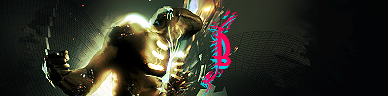
New tags:

Also, here's a little something I made, just playing around in a program called "Alchemy":

- Status
- Not open for further replies.