
-
Welcome to Smashboards, the world's largest Super Smash Brothers community! Over 250,000 Smash Bros. fans from around the world have come to discuss these great games in over 19 million posts!
You are currently viewing our boards as a visitor. Click here to sign up right now and start on your path in the Smash community!
It appears that you are using ad block :'(
Hey, we get it. However this website is run by and for the community... and it needs ads in order to keep running.
Please disable your adblock on Smashboards, or go premium to hide all advertisements and this notice.
Alternatively, this ad may have just failed to load. Woops!
Please disable your adblock on Smashboards, or go premium to hide all advertisements and this notice.
Alternatively, this ad may have just failed to load. Woops!
The Sig Critique Topic
- Thread starter Livvers
- Start date
- Status
- Not open for further replies.
Zolga Owns
Smash Lord
What happened to the old regulars? ._.
@Alzi-Multiple renders aren't good.
Its too monochromatic. The text seems to become the focal.
The large render is awkwardly placed.
New Abstract

@Alzi-Multiple renders aren't good.
Its too monochromatic. The text seems to become the focal.
The large render is awkwardly placed.
New Abstract
Conker315
Smash Lord
No one cares how many hours you put on it mojo, just saying.
Conker315
Smash Lord
Good **** overall though, but I mean I wouldn't care how long it took, but how the outcome was.
The colors are okay, I wouldn't have used the yellow you put in there, but that's an opinion. Some of the smudging you did looks good, but some of it looks sorta messy. I think it lacks a lot depth aswell. One think I like is the smudging from the top left and right corners. GL in the voting thread ^^What happened to the old regulars? ._.
@Alzi-Multiple renders aren't good.
Its too monochromatic. The text seems to become the focal.
The large render is awkwardly placed.
New Abstract
I just wanted some opinions on these tags I've made over this summer.

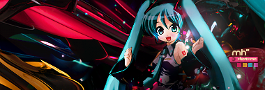

The last won me 2nd in SOTW, yet I still don't have a participant badge v_v
WOW! You have really improved from the first ones I saw from you")
They look great, but a little too cluttered, and just like in your face. If it wasn't for the fact that the renders have colors that contrast the backgrounds, they would be lost in the colors You seem to like that style of c4d, which you are managing to work well with. I love the blending, it's probably better than anything I could do (well at least right now).
That's all, I would say to try and not make them look so cluttered like you almost have to find that color or shape that doesn't match the rest of the c4ds. Otherwise looks good.
Oh, and lighting is great!
They look great, but a little too cluttered, and just like in your face. If it wasn't for the fact that the renders have colors that contrast the backgrounds, they would be lost in the colors
You seem to like that style of c4d, which you are managing to work well with. I love the blending, it's probably better than anything I could do (well at least right now).That's all, I would say to try and not make them look so cluttered like you almost have to find that color or shape that doesn't match the rest of the c4ds. Otherwise looks good.
Oh, and lighting is great!
Zolga Owns
Smash Lord
I just gave you the badge Chris ^^
Thunder Of Zeus
*Rumble Rumble*
The composition needs work. Some tags can work with a center focal, others, such as this one, can't. Keep in mind, the rule of thirds (I will be glad to explain this if you need me to).
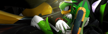
Something I did for a friend of mine.
The text stands out too much. I would recommend making it smaller, darker, and removing the white blur behind it.
The render is oversharpened.
He is holding an assault rifle. Give that man some Battle Rifle, son.
CnC on my current?
Thunder Of Zeus
*Rumble Rumble*
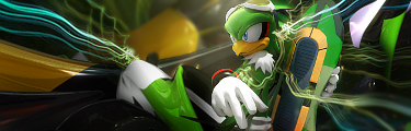
Don't forget, you're supposed to give critique before you can recieve it.lmfao. Yeah I'm reediting it. Anywho I got a new one to get critiqued for a SOTW on another forum.

The text should match the color of her hair, in my opinion. If you were to recolor it that blonde and do a hair texture overlay, I think it would look really nice.
I don't particularly like the yellow smudging you did below the text, either.
The light on the cant is pretty distracting from what I'm pretty sure is supposed to be the focal above it.
I love what you've done with the tag overall, though.
NeverKnowsBest
Monochrome Like A Panda

SuSa recently complimented on my sig and it made me feel super happy and I wanted to know what others though of it. I was never too confident it till the lovely comment from SuSa =3
Note: I made this sig like a year ago and I finally decided to start on a new one. Except I'm worried becasue it's kinda depressing (if you have seen End of Evangelion think about the elevator scene and that is essential my new sig being made.)
Thunder Of Zeus
*Rumble Rumble*
In my humble opinion:
SuSa recently complimented on my sig and it made me feel super happy and I wanted to know what others though of it. I was never too confident it till the lovely comment from SuSa =3
Note: I made this sig like a year ago and I finally decided to start on a new one. Except I'm worried becasue it's kinda depressing (if you have seen End of Evangelion think about the elevator scene and that is essential my new sig being made.)
The borders are overkill.
The text is rotten and too "in my face."
I like the silhouette idea, but not the execution. I see random orange in there.
I don't really see how the image and video fit, but that's a personal problem.
Horizon lines on the middle of the canvas are a no-no.
Please follow the rules and critique before requesting critique.
Thunder Of Zeus
*Rumble Rumble*
Good job on:Overall text could use some work. The border is kinda messes up the whole sig.

C4d's
Render choice
Work on:
Smudging (work on that a lot)
Text (boring, it could use some texture)
Composition (still not following that rule of thirds)
Border (it really isn't necessary)
Size (it's massive)
Thunder Of Zeus
*Rumble Rumble*
http://en.wikipedia.org/wiki/Rule_of_thirdsWhat are these rules you speak of?
NeverKnowsBest
Monochrome Like A Panda
Thank you so much for the critique. I actually appreciate it a lot! Could you describe how the borders are overkill? I used em to separate the gif from the sig. I am also confused on what you meant by horizon lines in the middle? Yeah I thought the text was pretty bad. Lol but I couldn't find one I liked.In my humble opinion:
The borders are overkill.
The text is rotten and too "in my face."
I like the silhouette idea, but not the execution. I see random orange in there.
I don't really see how the image and video fit, but that's a personal problem.
Horizon lines on the middle of the canvas are a no-no.
Please follow the rules and critique before requesting critique.
Thunder Of Zeus
*Rumble Rumble*
The borders could be a simple black and much more thin; in other words, they stand out far too much and distract from the actual art.Thank you so much for the critique. I actually appreciate it a lot! Could you describe how the borders are overkill? I used em to separate the gif from the sig. I am also confused on what you meant by horizon lines in the middle? Yeah I thought the text was pretty bad. Lol but I couldn't find one I liked.
The horizon line is found in your background. Good composition has horizon lines at either third of the canvas.
Another thing that I noticed is that your signature looks very grainy. Here is my recommendation: Seperate the video and the image beside into two different files. Keep whatever borders you would like. Save the image as a .png and put it next to the video in your signature for better quality.
Please turn your signature off here.
NeverKnowsBest
Monochrome Like A Panda
O crap I am so sorry!!! Was that why you told me to follow the rules last post?The borders could be a simple black and much more thin; in other words, they stand out far too much and distract from the actual art.
The horizon line is found in your background. Good composition has horizon lines at either third of the canvas.
Another thing that I noticed is that your signature looks very grainy. Here is my recommendation: Seperate the video and the image beside into two different files. Keep whatever borders you would like. Save the image as a .png and put it next to the video in your signature for better quality.
Please turn your signature off here.
I well take your advice about the png thing. It always bothered me that the sig grainy look but I wanted to keep the sig and gif in the same area.
Thunder Of Zeus
*Rumble Rumble*
There are three rules I have mentioned recently, all three of which apply to you.O crap I am so sorry!!! Was that why you told me to follow the rules last post?
I well take your advice about the png thing. It always bothered me that the sig grainy look but I wanted to keep the sig and gif in the same area.
Rule of thirds (see the aforementioned link.)
Signature rule (your signature should be set to OFF. The pages become quite lengthy as it is; signatures add to that considerable stretch.)
CnC rules of courtesy (you should critique someone else before requesting critique.)
Don't sweat it.
NeverKnowsBest
Monochrome Like A Panda
Lol o goodness I feel like such a scrub. I would love to critique a sig but I don't feel I have the expertise to decide what is good or not, seeing how I don't really understand the rules.There are three rules I have mentioned recently, all three of which apply to you.
Rule of thirds (see the aforementioned link.)
Signature rule (your signature should be set to OFF. The pages become quite lengthy as it is; signatures add to that considerable stretch.)
CnC rules of courtesy (you should critique someone else before requesting critique.)
Don't sweat it.
Thunder Of Zeus
*Rumble Rumble*
Don't worry about rules too much. Just say what you like and don't like about signatures.Lol o goodness I feel like such a scrub. I would love to critique a sig but I don't feel I have the expertise to decide what is good or not, seeing how I don't really understand the rules.
Enough about rules and such. There's critiquing to be done.
Conker315
Smash Lord
lulz
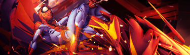
sexy abstract zolg, sorry I didn't mention it on last page
sexy abstract zolg, sorry I didn't mention it on last page
it needs moar s.e.x. for my eyes.Overall text could use some work. The border is kinda messes up the whole sig.
dont get me wrong. it looks spicy. its just, for me, the "vibrant" colors make my eyes have orgasms, what im saying is. the colors are a tad dull and should be spiced up more a notch o.o BAM ya know?
c4d is placed well, fix the quality of the stock/render/spideyman :3 (makes sigs look that much more sexier), add some "flare" effects to that smoke/smog or perhaps some mini lights, just BLING it

Thunder Of Zeus
*Rumble Rumble*
Someone's horny for aesthetics.it needs moar s.e.x. for my eyes.
dont get me wrong. it looks spicy. its just, for me, the "vibrant" colors make my eyes have orgasms, what im saying is. the colors are a tad dull and should be spiced up more a notch o.o BAM ya know?
c4d is placed well, fix the quality of the stock/render/spideyman :3 (makes sigs look that much more sexier), add some "flare" effects to that smoke/smog or perhaps some mini lights, just BLING it
lmfao. I'll BLING it just for you xD.it needs moar s.e.x. for my eyes.
dont get me wrong. it looks spicy. its just, for me, the "vibrant" colors make my eyes have orgasms, what im saying is. the colors are a tad dull and should be spiced up more a notch o.o BAM ya know?
c4d is placed well, fix the quality of the stock/render/spideyman :3 (makes sigs look that much more sexier), add some "flare" effects to that smoke/smog or perhaps some mini lights, just BLING it
The lq render makes the tag look bleh. Try to add more colors, as Fear mentioned, to give the tag a nice appeal. The clipping masks are random, and the smudging you did looks like a mess. :/ Try to keep it simple and detailed. Use a different color for your text, one that is easier to read. White is usually the best solution, or a lighter shade of the red you already have.Overall text could use some work. The border is kinda messes up the whole sig.
Any ideas before I apply it?
Llumys
Smash Champion
Here's my new signature. It was made in Photoshop CS2 9.0.

I like what you were heading towards. I think the background has a little too much greay in it. The slanted text is great imo. I guess the border can be added, but again I hate em.Here's my new signature. It was made in Photoshop CS2 9.0.
Richard7
Smash Ace
Hey everyone.
I reackon the people who make signatures and stuff like that are really talented. A friend of mine made my signature.
Tell me what you think of my sig. Its even cooler if you've seen the show.
I reackon the people who make signatures and stuff like that are really talented. A friend of mine made my signature.
Tell me what you think of my sig. Its even cooler if you've seen the show.
- Status
- Not open for further replies.