• Welcome to Smashboards, the world's largest Super Smash Brothers community! Over 250,000 Smash Bros. fans from around the world have come to discuss these great games in over 19 million posts!

    You are currently viewing our boards as a visitor. Click here to sign up right now and start on your path in the Smash community!

The Sig Critique Topic

Status
Not open for further replies.

Thunder Of Zeus

*Rumble Rumble*
Joined
Jan 3, 2009
Messages
4,128
Location
Mt. Olympus
I've never used C4Ds before, and this my first go. ( I don't smudge well either...)


Thanks in advance. I'm as scrubby as it can get. Sadly. I'm sorry for being a scrub .
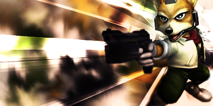
This siggy could look quote night with the c4ds on the left recolored to red (like the right side). You should also work on the composition. Move the render to the right and put the text (if you must keep it, which I wouldn't reccomend) in a more hidden place; it is quite distracting. The flow is off and I don't know how I feel about the render contrast... it seems a little bit overdone.

CnC on my current? It's been a while.
 

GreyClover

Smash Apprentice
Joined
Jul 23, 2009
Messages
89
Location
Dallas, Texas
@emergency: Your's is too messy and as SG16 would say, don't save your signatures as jpg since it loses it's quality. The render and C4D placement isn't too great neither.

I think the signature would be a little better if it was smaller.

@Zeus: Your's is too plain, not enough to critique on. Looks like you just took a background, punched in a render, and mixed up the lighting contrast. Brushes, C4Ds, anything would be A LOT better.
 

DFEAR

Smash Hero
Joined
Jul 10, 2008
Messages
5,582
Location
:190:
@emergency: Your's is too messy and as SG16 would say, don't save your signatures as jpg since it loses it's quality. The render and C4D placement isn't too great neither.

I think the signature would be a little better if it was smaller.

@Zeus: Your's is too plain, not enough to critique on. Looks like you just took a background, punched in a render, and mixed up the lighting contrast. Brushes, C4Ds, anything would be A LOT better.
hmm simplicity is also a style.

@ emergency. all i have to say is NEVER EVER GOD **** NEVER put ANY stock/picture/render in the middle of a sig. it ruins the focus and depth by the thousands. otherwise just put less patterns and make it more high quality, looks a bit too sandy ya know. i want sex for my eyes pls :3 but its great no doubt keep working at it.

@zeus...simplicity is a style and i appreciate it alot! but what i could suggest is work with the coloring a bit more. it looks slightly off to me. make it more realistic, the lighting that is.
 

doom dragon 105

Smash Lord
Joined
Sep 17, 2006
Messages
1,487
Location
Miami
I've never used C4Ds before, and this my first go. ( I don't smudge well either...)


Thanks in advance. I'm as scrubby as it can get. Sadly. I'm sorry for being a scrub .
that sig beats out alot of the noobie seniors here that over effect it has looks a bit grainy, take it off and repost for a real CnC

hmm simplicity is also a style.

@ emergency. all i have to say is NEVER EVER GOD **** NEVER put ANY stock/picture/render in the middle of a sig. it ruins the focus and depth by the thousands. otherwise just put less patterns and make it more high quality, looks a bit too sandy ya know. i want sex for my eyes pls :3 but its great no doubt keep working at it.
What? I can find plenty of well made sigs that have a center focus, its just a bit harder to get make the sig, but it doesn't ruin it at at

and Zeus, I think by now ou should be alot better than you are. Its basically a render placed over a stock with some gradients or something of that nature. That looks like it would be your first sig honestly
 

Thunder Of Zeus

*Rumble Rumble*
Joined
Jan 3, 2009
Messages
4,128
Location
Mt. Olympus
that sig beats out alot of the noobie seniors here that over effect it has looks a bit grainy, take it off and repost for a real CnC


What? I can find plenty of well made sigs that have a center focus, its just a bit harder to get make the sig, but it doesn't ruin it at at

and Zeus, I think by now ou should be alot better than you are. Its basically a render placed over a stock with some gradients or something of that nature. That looks like it would be your first sig honestly
I make about one sig every two months. You really haven't given any suggestions. If I practiced and put time into this like I used to maybe I would be better. I'm not much of a digital artist these days.
 

DFEAR

Smash Hero
Joined
Jul 10, 2008
Messages
5,582
Location
:190:
What? I can find plenty of well made sigs that have a center focus, its just a bit harder to get make the sig, but it doesn't ruin it at at
never said it "ruins" a sig in general, just cripples its potential in depth mostly and yes i agree it makes it more difficult to achieve what is desired from the sig. its just, having a center focus is sometimes considered very cliche, abundant in the industry. having an off center focal point can create a unique atmosphere to the design and create a different creative side of the art in general.

tho yea i did exaggerate the usages of center focus but hell if u want to work with it why not. it is just cnc after all.

@zeus. apply urself. :3
 

DFEAR

Smash Hero
Joined
Jul 10, 2008
Messages
5,582
Location
:190:
use ur free time wisely xD? i know its in ya man =D, everyone is a prodigy.
 

DFEAR

Smash Hero
Joined
Jul 10, 2008
Messages
5,582
Location
:190:
i like it. would love to see different color variations such as maybe a red one, pink (magenta of course), cyan, green. would look mad hot in cyan and magenta for sure.

hmm. the stock itself is a wonderful choice. it is blended well and placed perfectly. only thing that bothers me is that when i look at it i dont feel anything coming from it. dunno i might be high looking at this O.o. anyway i suggest perhaps adding more depth to the stock with more "effects", something creative of course. maybe streams of letters? shapes with gradients (i love using radial circles :3), or some smudged c4d if needed.

needs more light contrast, but only slightly. i likes me to see somes vibrant stuff, ya know =P

do not take it wrong of course. as it looks now, the sig is beast, i just want to see u do more to it. the talent is clearly shown. ur choice in coloring is great, focal judgement is superb and the creativity is there.

=D
 

DR809

Smash Apprentice
Joined
May 26, 2008
Messages
143
Location
Brooklyn
3DS FC
3754-7546-8239
So Im making a sig for some who requested it but I feel as if somethings off

Original


Revised

i dont know I just might make a whole new one using that same render. He asked for a icy feeling. I think its just the depth thats bothing me or just the whole thing in general.
 

Neon Ness

Designated Procrastinator
Joined
Jul 10, 2008
Messages
3,631
@HybridTheory: Yeah, this is a really unique composition. The effects are relatively straightforward for the most part, but the little details like those aerial figures (are those birds or planes?) and the contour of the right most shape really stand out. Nice. Love the lighting as well, subtle but accurate. Colors seem fine, I think anything more saturated might be too loud for the focal.

Not sure how I feel about those letters. There's something nice about their, uh... ambiguity, but it's also bothersome that I can't tell what it says. *shrug*

@DR809: Yeah, drop shadows destroy depth because they make everything beneath them appear as a flat surface. D: That cross is sort of distracting anyhow, it looks like the Ice Climbers are the intended focal. I think it needs more colors, it's sorta strictly turquoise right now. I think some violet overtones would help in creating a sort of aurora atmosphere in there, try some more color schemes out. It's also really bright, I think some darks would do the overall contrast some good.

Any thoughts on this latest one? I thought it looked alright while I was working on it, but I always end up hating a piece once it's finished. :/


Uh, sorry. It's kind of huge.
 

DR809

Smash Apprentice
Joined
May 26, 2008
Messages
143
Location
Brooklyn
3DS FC
3754-7546-8239
Yeah imma end up remaking it. Yeah I gotta play with it more.

Overall it looks great. The coloring works nicely. How the lighting works in the sig is amazing.
 

DFEAR

Smash Hero
Joined
Jul 10, 2008
Messages
5,582
Location
:190:
T_T is it my monitor or something. or is everything to me low in contrast. i wants that vibrancy in that sig neon!

its an awesome creative sig dood. only thing i suggest is do something with the black. either with soft brushes set to lighten/screen/linear dodge or add more splooges of different color.

great tag either way. i r proud =D
 

Neon Ness

Designated Procrastinator
Joined
Jul 10, 2008
Messages
3,631
Oh yeah, I guess the contrast is sort of lacking. I think you have a point about the black, too, I left it solid black because I thought it looked comic book...esque, but I should definitely try some different colors/light settings to see how it turns out.

Thanks for the replies, guys. :D
 

DFEAR

Smash Hero
Joined
Jul 10, 2008
Messages
5,582
Location
:190:
Oh yeah, I guess the contrast is sort of lacking. I think you have a point about the black, too, I left it solid black because I thought it looked comic book...esque, but I should definitely try some different colors/light settings to see how it turns out.

Thanks for the replies, guys. :D
always. always make at least 3-5 versions of a single tag. see what works and what doesnt and build upon it :3. then make 3 versions of that fav tag in different colors =3
 

DR809

Smash Apprentice
Joined
May 26, 2008
Messages
143
Location
Brooklyn
3DS FC
3754-7546-8239


So I whipped this up critiques? The font kinda bothers me suggestions?
 

DFEAR

Smash Hero
Joined
Jul 10, 2008
Messages
5,582
Location
:190:
^ fix the font. too plain. :p would be nice to see with color tho.

hmm as for blending its cool. hehe get it? =P

anyway so much blue going on, i would love to see more of that pink/purple i see there.

=D
 

DR809

Smash Apprentice
Joined
May 26, 2008
Messages
143
Location
Brooklyn
3DS FC
3754-7546-8239
lmfao wow. I tried to avoid the whole blue thing pink might help it out more.
 

DR809

Smash Apprentice
Joined
May 26, 2008
Messages
143
Location
Brooklyn
3DS FC
3754-7546-8239


I added more color and changed up the font. I also made the contrast a bit better.
 

DFEAR

Smash Hero
Joined
Jul 10, 2008
Messages
5,582
Location
:190:
seems perfect. only thing i would change is fix the pixelation of their eyes. its really bothersome o.o its all i keep looking at xD
 

DR809

Smash Apprentice
Joined
May 26, 2008
Messages
143
Location
Brooklyn
3DS FC
3754-7546-8239
Thanks :D. I don't know what to do about the eyes though
 

DFEAR

Smash Hero
Joined
Jul 10, 2008
Messages
5,582
Location
:190:
Thanks :D. I don't know what to do about the eyes though
d00d, u hurt me when i read that : [

just blur it slightly or recreate it manually. it is just a gradient after all with some white :3
 

DR809

Smash Apprentice
Joined
May 26, 2008
Messages
143
Location
Brooklyn
3DS FC
3754-7546-8239
d00d, u hurt me when i read that : [

just blur it slightly or recreate it manually. it is just a gradient after all with some white :3
wow really well I'm sorry :p.
It just might be that I'm lacking sleep. lol
 

DFEAR

Smash Hero
Joined
Jul 10, 2008
Messages
5,582
Location
:190:
aw, was hoping ud do something vectorish and cartoonish to blend with the pic : <
 

DR809

Smash Apprentice
Joined
May 26, 2008
Messages
143
Location
Brooklyn
3DS FC
3754-7546-8239
lmfao. Thanks for the idea could do something like that with one of my next works.
 

DFEAR

Smash Hero
Joined
Jul 10, 2008
Messages
5,582
Location
:190:
that c4d looks so familiar to me for some reason o.o but ill assume u made it. only thing id change is just to blend the stock really. make the red in that weird blue color or vise versa and that red on his jacket could be used as a compliment for the rest of sig whether that color is used in text or extra effects. etc, etc. :3

good sig tho.
 

L__

Smash Master
Joined
Nov 5, 2007
Messages
4,459
Location
flopmerica


I added more color and changed up the font. I also made the contrast a bit better.
IMHO the font could use a lot of work. It attracts too much attention from the focal, which should be the Ice Climbers.

experiment with the vector idea^


a request from another forum D:
I don't like the font, the C4Ds are too distracting, IMHO and the random line that shoots through the font isn't needed.


MojoMan

Smash Ace
Joined
Jun 1, 2008
Messages
975
Location
Brooklyn
@lthe tag is way too big, zero belnding, colors are muddy, depth is off and effects are way too blurry. no good.
@DR clipping maksa don't fit, and the shape is rather stuppid. text is really bad and choppy ,\\, and the lighing is off. background is also just c4d spam.


100% vector and manip, with over 5 hrs of work. bow to me
 

DR809

Smash Apprentice
Joined
May 26, 2008
Messages
143
Location
Brooklyn
3DS FC
3754-7546-8239
lol the background is a stock image (I'll post it when I'm my comp) and I only used 3 C4D's in total. I fixed the font I figured out it was just the settings I had for it.
 

MojoMan

Smash Ace
Joined
Jun 1, 2008
Messages
975
Location
Brooklyn
well the font is out of place and sucks anway, and the background looks like c4d spam. it's all about appearance.
 

DFEAR

Smash Hero
Joined
Jul 10, 2008
Messages
5,582
Location
:190:
@DR809. the effects done below the text is amazing. spread that everywhere =D but organized of course =P

@L. i would love to see more colors than the default colors of fox. perhaps adding a few hues of red and green to spice things up. the "spread blast" effect is pulled off quite well but do not know why u chose that style for the character? perhaps an anime entrancing effect?

@mojo. good ****. now do the rest of it =P then ill give u the real cnc.

@alzi. too light. meaning kinda unbalanced between the lighting and the overall depth of the tag. the choice of color is perfect. just utilize it more and expand the other colors that are presented to u, such as that red i see there o.o
 
Status
Not open for further replies.
Top Bottom