SuSa
Banned via Administration
Wellllll, I have no idea what you are talking about. So I'll keep it simple:
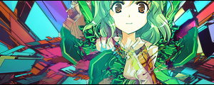
No real depth, nothing really "wows" me, but that is a nice vector background. :3
No real depth, nothing really "wows" me, but that is a nice vector background. :3

")