The Kitten Burglar
Smash Cadet
- Joined
- Nov 6, 2009
- Messages
- 39
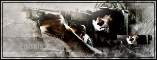
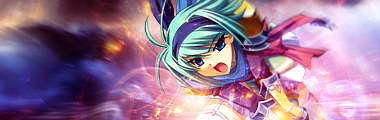
First person I showed it to (the first version) thought it was too dark, haha.
'preciate it.
'preciate it.

Welcome to Smashboards, the world's largest Super Smash Brothers community! Over 250,000 Smash Bros. fans from around the world have come to discuss these great games in over 19 million posts!
You are currently viewing our boards as a visitor. Click here to sign up right now and start on your path in the Smash community!
No problem. I don't think so really...the sig is fairly symmetric on the basis of the lighting actually. : )First person I showed it to (the first version) thought it was too dark, haha.
'preciate it.
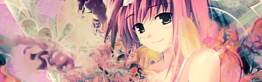
Ah um...thank you I wasn't asking for one but it always helps. As for the boarder, I always use this kind, because it implies the image stops there. The light coming out of Ness' hand is more prominent but you're right, I should tone down the left side of the sig a little.People can't take negative critique unless you are on a real art site, so lets see...
So Yink; not a lot that I don't like, but there isn't much I care for either. Nice use of contrast with the red and greyscale. Losing the border will help a lot. I like some of the smudging, but feel there is a bit too much on the right. The lighting looks like it is coming from two different sources as well.
Hey Tanner....
Hey dere.Hey Tanner....

")
Yes. It's my fault, I apologize. I won't do it again.Didn't we have a rule about turning your signatures off?
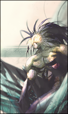
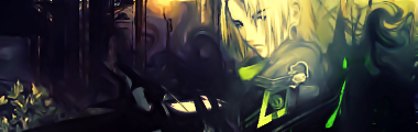
Original stock must see.-Looks good, creeps the shxt out of me. If you added the cracks/thing from the girl's mouth then that's a +. More contrast = sxc BnW tag-
Edit: Fak really good job with making it look creepy, nice manip.
Gogo.
(yes I am Demon Kirby, hi)
Hehe woops. I also mispelled the name of the club wrong as well. Something I overlooked accidentally. Thanks for the positive reviewI like it. I tend to like simple sig banners. However, you spelled Magikarp wrong, and the Comic Sans font might not always be the best one to put on a banner. I really like the simple water texture, though. The Magikarp fits well with it.
Yes. It's my fault, I apologize. I won't do it again.
Lol. Mistakes happen. And you're welcome, no problem. ;pHehe woops. I also mispelled the name of the club wrong as well. Something I overlooked accidentally. Thanks for the positive review
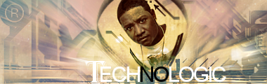
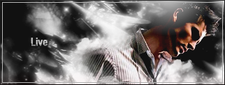
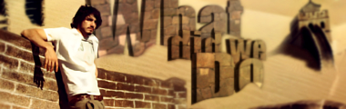
 It looks like a good cell phone background.
Thanks much, I just wanted to see what it looked like.The render?
it's really big, but here it is:
http://images1.wikia.nocookie.net/marvelvscapcom/images/c/c6/Mvc2-blackheart.jpg
EDIT: I'll just link it instead.


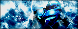
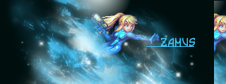
sorta kindaFor starters Malik, I love your real ava and sig because I LOVE that artist's work.
Second, your new sig.
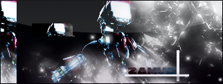
I like the effects, but you might want to darken the left side, because the streak of white going from the left edge of the sig up onto the top left corner is very distracting. You want to keep a lot of the focus on Samus herself.
Secondly...that text is bad. I'm sorry I'm not trying to sound mean but text in sigs is usually bad even if pros do it sometimes. I'd remove it or find another way to make it more visable and flow with the sig.
EDIT: About C4Ds, it's actually simple once you get used to it. I'd go to deviantART and search for "C4D render pack". When you find one that looks interesting, click on "download" on the left. Basically, C4Ds are used to create depth and effects. When you open a C4D, if you use Photoshop it should just open like a normal file. You can then DRAG the C4D into your sig/ava/whatever! Resize it and rotate it as you wish.
Did that help?

What's the difference...? Both statements reference an appreciation for something beautiful or creative. People normally say OMGthatsamazing at something aesthetically appealing...I was aiming for aesthetic appeal, not OMG-that's-the-most-amazing-thing-I've-ever-seen appeal. ^.^
My god i'm really loving this one, good job. :D