Here's where I come out on things. I see that it ended up kinda lengthy.
Characters like Steve are why I buy the pass piecemeal, and not as a whole. I don't know if I'm going to want every character in the pass. There aren't too many I inherently don't want. I really can only think of two I wouldn't buy (Steve and Cinderace). Though I wouldn't have bought the plant either, but it was free.
Now the reason I don't want Steve isn't because I don't like Minecraft. I haven't played Minecraft, and really have little sentiment on it either way. It's not because I think he's "undeserving". Minecraft is huge and he was popular, especially with kids and probably casuals. I'm sure he'll sell well. It's not because I thought they couldn't make a moveset for him. I was arguing they could way back in the Banjo thread.
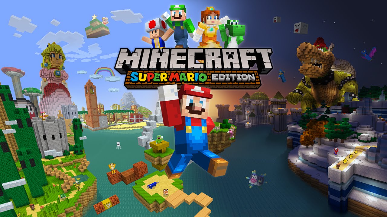
It's just because I think he's got a really really unappealing, incongruous design. When I pictured him in the game, it was always quite jarring, both in his appearance, and how it meshed with the other characters. But, even when I pictured him, his design had been Smash-ified somewhat. You know, his look was smoothed over and he had slightly more articulation, so as to achieve the consistent aesthetic within the game. Something like this.
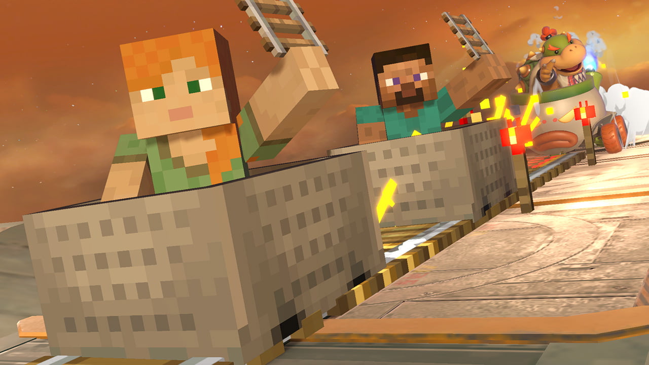
Now, the Steve we got is basically a transplant from Minecraft. And I'll give them points for faithfulness. Between the look and the movements, it's very faithful. But I actually find it
more jarring than what I envisioned, due to the retention of an aesthetic from a game with a drastically different art direction. I think there's a big reason characters embrace Smash's design sensibilities when in Smash. Artistic cohesion is a large reason the group of so many disparate characters from disparate art styles doesn't seem to clash. A bright, clean character from Smash 4 would look very strange in Brawl, right?
I mean, I'd like to see Travis in the game, but it'd be really weird if he showed up all cel-shaded, I want him to blend visually with the cast. Bayonetta with her original giraffe proportions in Smash would look very odd, and there's a reason they changed her for the game.
So all of this is to say, Steve actually came in below what I was expecting for the character, and I already thought he'd be a strained fit. To me, he seems a very awkward implementation, and one that doesn't mix particularly well. I mean, his art isn't exactly kinetic, like the others, and his presence on the mural could pass for photoshop, imho. I feel like they could've done much more to mix the two aesthetics.
Though I'm sure his moveset will be fine, it seems quite inventive... but I just don't really want a character that I feel is so out of place on my roster. If you like him, and I'm sure many of you do, and I'm sure many more of you will now that he's there... great. I'm not here to say he's a "bad" choice. I don't particularly like him but I made peace with his ample merit a long time ago.
I know this opinion I hold used to be quite prevalent, but I expect now with his inclusion, it will suspiciously dissipate over the coming weeks, as criticism becomes antagonized. Even though this isn't criticism, it's just how I feel about the character and their inclusion. And I don't expect to waver much.
But for me, he's now the second member of the "I'll pass" club, after Corrin in Smash 4.


