
-
Welcome to Smashboards, the world's largest Super Smash Brothers community! Over 250,000 Smash Bros. fans from around the world have come to discuss these great games in over 19 million posts!
You are currently viewing our boards as a visitor. Click here to sign up right now and start on your path in the Smash community!
It appears that you are using ad block :'(
Hey, we get it. However this website is run by and for the community... and it needs ads in order to keep running.
Please disable your adblock on Smashboards, or go premium to hide all advertisements and this notice.
Alternatively, this ad may have just failed to load. Woops!
Please disable your adblock on Smashboards, or go premium to hide all advertisements and this notice.
Alternatively, this ad may have just failed to load. Woops!
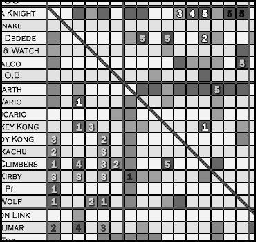
Character Board Specific Matchup Chart Project (Last Update: 12/21)- Not a tier list!
- Thread starter DanGR
- Start date
Sonic The Hedgedawg
Smash Hero
okay... so yeah... what looks best?
I say it's those high contrast white leters with black outlines in the top right... not just because I suggested them... I honestly do
Mmac
Smash Lord
I think the Pure White is the best
Though transparent is good too
Though transparent is good too
zamz
Smash Journeyman
- Joined
- Apr 30, 2008
- Messages
- 291
Alright, I added one final color scheme. Black lettering with a white outline. I've emailed all the potential variations to Dan, so he can choose which one he likes best based off your guys's opinion.

Sorry for spamming this topic with so many images.
Sorry for spamming this topic with so many images.
itsthebigfoot
Smash Lord
can we get a different jiggs thread? yours is never really updated and is off on a few matchups
MK26
Smash Master
High-contrast white looks good in both black-and-white and colour charts
itsthebigfoot
Smash Lord
also, dk - zelda is in agreement, and dk fox is close enough (6-4 dk and 7-3 dk)
PKNintendo
Smash Master
- Joined
- Aug 9, 2008
- Messages
- 3,679
Freakin lol! HAHA!Mario should have and advantage over Ness, Ness's Dash atk and Fair are the only things that I can think of that Ness really has against Mario. Ness has kill power but his only reliable ones are Bthrow and Fsmash. Mario can gimp Ness very easily and Mario is better at pressuring Ness than vice-versa. Mario's juggles are also near combos that can quickly rack up dmg on Ness. Fireballs are great for approaching Ness since Ness's PK Magnet is a free Dsmash and Ness's bat has too much startup lag most of the time. Also, any of Ness's moves that have priority are susceptable to FIHL. And Ness's PK Flash and PK Thunder are also too dangerous to use against Mario since FLUDD can grant free KOs from them most of time. PK Fire can be caped easily even while caught inside it. Mario's Fsmash has a lot more reach than Ness's and kills early.
Ness Fsmash reliable (HAHAHAH!) it's decent. Ness PKT2 is more reliable. Ness aerials eat Mario for breakfast, and your logic is really really stupid.
PK Magnet is a free Dsmash and Ness's bat has too much startup lag most of the time
It's PSI MAGNET! PSI!
And what if I don't use it smart alec. And Ness Fsmash has more range than Mario's Fsmash.
To much bull**** in that post to process. OVERLOAD!
Oh and, Im waiting for you Matador. And I have my red cape ready for you.

Adapt
Smash Lord
I have a suggestion as to the chart with numbers...Alright, I added one final color scheme. Black lettering with a white outline. I've emailed all the potential variations to Dan, so he can choose which one he likes best based off your guys's opinion.
<image removed>
Sorry for spamming this topic with so many images.
(instructions for PS:CS2
Try making a layer with black numbers, change blending options to overlay and create an inner shadow (size 1, distance 1)
you get something like this: (numbers I changed circled in red)


Alternately: Use a white layer and set it to overlay, and use a drop shadow (size 1, distance 1)
These create good looking effects that are also pretty easy to read
Also, you never changed the Link vs ZSS match Dan... despite both me and bouse posting it.
Morrigan
/!\<br>\¡/
- Joined
- Mar 10, 2006
- Messages
- 18,681
I actually like that.
The best options so far are this ^ and the transparent white with the drop shadow. The solid white+outline is too "strong".
Actually, the actual chart would look really nice if you included what Adapt did once it's done.
The best options so far are this ^ and the transparent white with the drop shadow. The solid white+outline is too "strong".
Actually, the actual chart would look really nice if you included what Adapt did once it's done.
Mmac
Smash Lord
Adapt's is sexy. the engravement is just awesomeness
MK26
Smash Master
+1 post count vote for adapt's way if it looks good in black and white
+200 post count
+200 post count
zamz
Smash Journeyman
- Joined
- Apr 30, 2008
- Messages
- 291
Of course, there's thousands of ways we could do this. I figure if we're making a color-blind version of this chart, the best idea is to stay away from black, eh? I don't want it one huge mesh of differing shades of dark-gray. You know? Hence why we were using white as a sharp contrast from the already gray chart. The numbers aren't there to be asthetically pleasing, but to be easily readable and accessable...
You do have a point though, I did make an attempt using overlay but to be perfectly honest, I didn't like the outcome. If everyone else likes, it though, Dan could certainly use it. =)
You do have a point though, I did make an attempt using overlay but to be perfectly honest, I didn't like the outcome. If everyone else likes, it though, Dan could certainly use it. =)
- Joined
- Apr 10, 2008
- Messages
- 6,860
sure thing. I've already got one in mind. I was waiting to see if it'd last. It has.can we get a different jiggs thread? yours is never really updated and is off on a few matchups
I hope you guys know that colorblind doesn't mean color... blind...+1post countvote for adapt's way if it looks good in black and white
+200 post count
My thoughts...Of course, there's thousands of ways we could do this. I figure if we're making a color-blind version of this chart, the best idea is to stay away from black, eh? I don't want it one huge mesh of differing shades of dark-gray. You know? Hence why we were using white as a sharp contrast from the already gray chart. The numbers aren't there to be asthetically pleasing, but to be easily readable and accessable...
You do have a point though, I did make an attempt using overlay but to be perfectly honest, I didn't like the outcome. If everyone else likes, it though, Dan could certainly use it. =)
-no black, sorry.
-pure white is alright I guess. It's stressful on the eyes (mine at least)- which brings me to my next bullet
-the bold part=truth
-I agree with latter half of the second to last sentence.
-w/e y'all want though
-llamas = win
-MK will be banned by Thanksgiving if the current conditions don't improve.
")
-llamas = win
Zamz, I guess I'll just wait until we get a concensus on which to use. We've got 4-5 different versions floating around.
Adapt
Smash Lord
No colorblind does not mean black/white, but why not just make the colorblind chart as light gray squares with black numbers? (maybe 2 shades of gray so you can differentiate rows easier) It's perfectly readable. You only have to link it in the first post, not display it for everyone to see.I hope you guys know that colorblind doesn't mean color... blind...
My thoughts...
-no black, sorry.
-pure white is alright I guess. It's stressful on the eyes (mine at least)-
Zamz, I guess I'll just wait until we get a concensus on which to use. We've got 4-5 different versions floating around.
Thanks for the votes, Mmac, Dekuu, XienZo, and MK26. I also think it would look good on the main chart being displayed, but its a fair bit of extra work that it not really necessary.
itsthebigfoot
Smash Lord
lol wut?
its not april 1st already is it?
its not april 1st already is it?
and this is why pt gets no respect.
http://www.smashboards.com/showthread.php?t=198012
it's also one of the hardest match ups for pt, if not the hardest. 4:6 disadvantage sounds pretty **** good.
http://www.smashboards.com/showthread.php?t=198012
it's also one of the hardest match ups for pt, if not the hardest. 4:6 disadvantage sounds pretty **** good.
- Joined
- Apr 10, 2008
- Messages
- 6,860
Well... actually, I'm still waiting on a conclusion about the numbers. Zamz sent me his versions, but not Adapt's. You guys seem to like his better.
*doesn't know what to do*
Also, I think the numbers should go onto the noncolor-blind chart. Not two separate from each other.
Edit: april 1st? where'd you get that bigfoot?
*doesn't know what to do*
Also, I think the numbers should go onto the noncolor-blind chart. Not two separate from each other.
Edit: april 1st? where'd you get that bigfoot?
MK26
Smash Master
And if my dog wants to read the chart?I hope you guys know that colorblind doesn't mean color... blind...
Adapt
Smash Lord
Does Zamz send you a .psd file? If so, you could forward it to me, and I could create all of the layers that you would need to update the chart.Well... actually, I'm still waiting on a conclusion about the numbers. Zamz sent me his versions, but not Adapt's. You guys seem to like his better.
*doesn't know what to do*
Also, I think the numbers should go onto the noncolor-blind chart. Not two separate from each other.
PK-ow!
Smash Lord
I have thought about this, and I must say that the thought seizes me that not all dittos are equal.
Some, for example, may amplify the difference in skill level between the players, so that a slight privilege of skill and practice in one will make that game decidedly easier on that player. Conversely, the ditto may ease out disparities, so that it remains much more up in the air, a "neutral match." (still 55:45 for the actual better player, or so).
This is because the way that a character, interacts with that same character, is still different, depending on the character. Luigi's weaknesses are still Luigi's weaknesses, and it matters how well your own character can attack those weaknesses. If your character is Luigi, it's gonna matter what Luigi's physics allow him to do to the sort of character that Luigi is.
Yes, the opponent has the same option; but it's about how easily a weakness can be broken open, and what that weakness means when a character gets rolling on it.
An easy example would be a character who has an infinite against himself, compared with a character whose best strategy is to turtle, against himself. The character who has an infinite in the ditto, in high level play, will be hyper focused on that infinite. All else being equal, this will intensify the ability of a player to earn that one frame advantage that eventually cascades into connecting with the first move of the infinite. In the other case, every advantage is lost to the extremity of time that passes before either one KOs the other. The mistakes become small compared to the size of all choices made in a stock.
Inasmuch as matchup charts are an attempt to quantify upsets, these data seem relevant.
So I was wondering if these matchup charts, and future Smash meta developers, would look into annotating ditto matchups with any sort of information, beyond the current "auto-slash" we see running across the chart on post 1 here.
- Joined
- Apr 10, 2008
- Messages
- 6,860
Sorry. That blows my mind^. It's 1:46 in the morning and I couldn't respond logically to that seemingly incredibly deep post* if you were to pay me to. (I tried, but I laughed at what I was typing, haha)
When I wake up tomorrow, (or later today I guess) I may think that post was dumb. lolz
*head explodes*
When I wake up tomorrow, (or later today I guess) I may think that post was dumb. lolz
*head explodes*
Lmao, I knew the Wolf and Fox boards would end up going at it. Your Matchup was bound to come around.I'd just like to add, that the "new fox match-up thread" and it's ludicrous numbers (they have 5:5 vs MK and 7:3 advantage vs Snake!) make a completion of this chart impossible
Unfortunately notomg^, that's ridiculous. Is there a different thread I could use?
@matador
uhm...I've no clue what ur trying to say...I'm a bit hazy atm
Ussi
Smash Legend
For this thread, I will refuse to help concerning Ike, I hope other Ike's follow my example so we don't have to deal with everyone claiming their character 7-3's Ike since he's slow. If every character 7-3'd Ike then he's be bottom. (Only some boards actually don't do this, but 80% of the boards have Ike 7-3 or 65/35 that I'm sick of it)
So don't bother going to the Ike boards. You'll get ALOT of disagrement with the match ups. We don't care what others think of our match up so you don't have to include our thoughts.
So don't bother going to the Ike boards. You'll get ALOT of disagrement with the match ups. We don't care what others think of our match up so you don't have to include our thoughts.
sandwhale
Smash Journeyman
yeah i've been lurking around the fox boards these past weeks and it's pretty muched turned into a "we will resurect the fox god by unleashing his true potential as best character in the game!" sect and their motto is like "in the right hands fox is unbeatable and those who dare contradict us will be immediatly trashed!"...
Ussi
Smash Legend
well, its something to exploit on Wolf, but everyone works to cover their character's weakness, that's a given. I always thought at least people gave Wolf credit for his good ground game.
But wolf's recovery = fail on lylat, I just laugh since Lylat counters all 3 of the characters it shares its game with.
But wolf's recovery = fail on lylat, I just laugh since Lylat counters all 3 of the characters it shares its game with.