Sorry for the delay, guys. Spire's been super busy with work, to the extent that he hasn't had time to do
recently, even for himself. We've got the scores for you though, and I have my write-ups, although Spire wasn't able to write his own.
Sir Bedevere
Bug/Poison
From this sprite, it’s immediately evident that it is bug-type, and through design and the tail, as well as natural accompaniment, poison makes sense as well. Overall, the sprite is extremely well-designed – in fact, my only complaint is that it’s almost too well-designed in that it’s somewhat difficult to tell that it used to be Charizard. Aside from that, though, you did excellent work on this sprite.
Firus: 9/10
Spire: 9/10
FINAL: 9/10
Chibo
Dark/Fire
While this sprite is well-executed, the actual retyping isn’t quite as obvious. The black and the dark aura certainly give off a feeling of “Dark”, but I can’t help but feel you could’ve done something to represent that better. Furthermore, the dark aura also brings to mind the gas surrounding Gastly, which makes it hard to discern whether it should be dark or ghost.
Firus: 5/10
Spire: 2/10
FINAL: 3.5/10
Riddle
Rock/Grass
The Rock/Grass typing is almost immediately evident here. You did a very good job portraying the rock-typing especially – through the coloring and the cracks in Charizard, I immediately think of rock. The grass is pretty evident too, although I think it would’ve worked better if you’d incorporated it into Charizard’s style of wings more rather than making it so akin to Tropius. The tail is a nice touch as well, although it does look a little rough and almost more like crystals than leaves.
Firus: 8/10
Spire: 7/10
FINAL: 7.5/10
Fuelbi
Ghost/Fire (?)
(You didn’t specify a type, so I’m just assuming you were going for ghost/fire.)
Your concept with this sprite was good, and the ghost is pretty evident, but the fire is a little iffy; a blue flame is usually a good go-to color for a ghastly fire, whereas black isn’t a typical color for fire. In making your ghost-tail, I would’ve thinned out Charizard a little more, because the belly dropping into the tail as it does is a little awkward. The ghost aura is also a little rough; the jagged edges are difficult to look at. You should always make sure your edges are smooth – generally, just by looking at them you can tell if they’re too jagged or not.
Firus: 5/10
Spire: 3/10
FINAL: 4/10
Charmander
Ghost/Water
Honestly, I would have a very difficult time telling the type of this sprite had you not put it down. The Gyarados tail more-or-less gives the water part, but that’s really the only thing that gives that indication, and with the lack of eyes, stone-color and torn-up wings it gives more of a rock-type vibe than ghost. The blood would have been a nice touch, except I don’t necessarily associate blood with ghosts – I associate blood with dark-type, since not all ghosts are malevolent. Overall, there’s just a lot going on in this sprite and it’s difficult to tell much of what’s happening. The Gyarados tail looks kind of choppy in the way it was attached, in my opinion; had you tried shortening the tail and maybe attached it to the back instead of the bottom, it may have looked better.
Firus: 4/10
Spire: 3/10
FINAL: 3.5/10
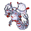
rPSI
Poison
Simple and to-the-point – the pronged tail, coloring, and fangs make it pretty evident that you were going for poison. The ridges on the tail are a nice touch too, giving a snake-like look and adding to the poison. I’m not entirely sure what you were going for with the yellow part from the nose, though…my initial thought is some sort of poisonous snot bubble? Maybe poisonous gas? That’s a little unclear, and it distracts me from the rest of the sprite a little bit; but you accomplished your mission.
Firus: 8/10
Spire: 9/10
FINAL: 8.5/10
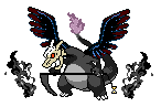
Meta-Kirby
Dark/Poison
I really like the way you approached this sprite. The “corruption” with the poison veins gets across the poison and dark at the same time, and the small addition of bat-like ears and a toothy grin give off extra indication of dark-type. The one thing about the sprite that throws me off is the tail; while you didn’t do anything wrong in theory, keeping the tail as it was, the light color of the tail in combination with where the largest part of it is confused me until I realized what it was. For a second, it seemed that you had forgotten to make part of the background transparent. Just to eliminate confusion, I might’ve made the coloring a little darker or repositioned the tail.
Firus: 9/10
Spire: 7/10
FINAL: 8/10
canvasch
Dark/Ghost
I look at this sprite, and the concept was good, and when I look at each part individually it’s actually pretty good, but together the pieces clash. The skull is good, and I like the whole grim reaper concept, but the light blue in the wings clashes with the black/red scheme and makes it look very unfinished; the skull is well made, but better shading would make it seem less out-of-place; and the scythe could use some more shading as well. Also, while the grim reaper concept gives some essence of ghost and dark, it lends itself more to being the grim reaper itself than to any particular Pokémon type.
Firus: 3/10
Spire: 5/10
FINAL: 4/10
Pachirisu
Bug/Electric
While this sprite looks good and it gives off a fairly clear vibe of Bug/Electric typing, I have trouble fully accepting this as a retype. It’s a well-executed fusion, but in a retype, even if you borrow from other Pokémon, you should do more to the sprite than merely borrow from other Pokémon for the purpose of retyping. In the future, I’d recommend borrowing ideas – like insect eyes, wings, and tails with lights at the end, and adding them on in your own way rather than ripping them straight from the Pokémon from which the ideas came.
Firus: 5/10
Spire: 6/10
FINAL: 5.5/10
UltiMario
Ice/Electric
The Ice/Electric typing is immediately evident here, between the icy body and the sparks branching off of Charizard’s body. The transition of body to neck/head, as well as body to arms, is a little awkward, but overall you accomplished the icy effect well. I’m still not entirely sure what the top-like things are supposed to be; I assume they have something to do with the levitate you gave the Charizard, but they’re a little odd nevertheless. There are some awkward spots, but overall you did a good job conveying the Ice/Electric retype.
Firus: 7/10
Spire: 8/10
FINAL: 7.5/10
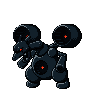
Neon Ness
Steel/Dark
This sprite is amazingly well-done. You immediately see that it’s mechanical – and therefore probably Steel-type – but the dark coloring and red lights on it also give off an evil vibe, accomplishing the retype well. Charizard looks as if it were turned into a robot, not only with mechanical joints and parts, but its wings have even been replaced by engines. Excellently done.
Firus: 10/10
Spire: 9/10
FINAL: 9.5/10
Wave⁂
Grass/Flying
Simple, but pretty well-done sprite. The wings and tail are somewhat reminiscent of plants, so I can definitely see the grass there, and the green coloring also gives off the grass vibe, and the fact that you have wings make the flying part evident as well. However, the darkest green on Charizard’s body seems to be a slightly different hue of green from the lighter color, which makes it clash somewhat; when darkening a color, try to only change the light/darkness of it. In addition, I would color the wings the same color as the main body (i.e. not the stomach area) so they blend together better.
Firus: 7/10
Spire: 8/10
FINAL: 7.5/10