
-
Welcome to Smashboards, the world's largest Super Smash Brothers community! Over 250,000 Smash Bros. fans from around the world have come to discuss these great games in over 19 million posts!
You are currently viewing our boards as a visitor. Click here to sign up right now and start on your path in the Smash community!
It appears that you are using ad block :'(
Hey, we get it. However this website is run by and for the community... and it needs ads in order to keep running.
Please disable your adblock on Smashboards, or go premium to hide all advertisements and this notice.
Alternatively, this ad may have just failed to load. Woops!
Please disable your adblock on Smashboards, or go premium to hide all advertisements and this notice.
Alternatively, this ad may have just failed to load. Woops!
The Sig Critique Topic
- Thread starter Livvers
- Start date
- Status
- Not open for further replies.
Diddyknight
Smash Lord
CnC?
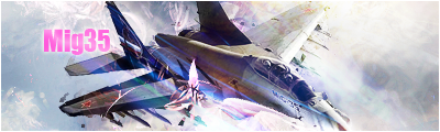
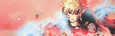
and DroMac: I cant see it due to school comp so ill edit this on the drive to R3
Wow...
CnC?
and DroMac: I cant see it due to school comp so ill edit this on the drive to R3
No one has called me that before...
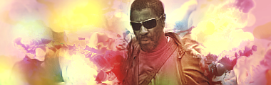
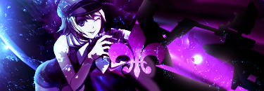
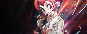
First off, the text is large and distracting. It's placed badly as well. This could use better text. There is a lot going on with the right wing of the plane, such as the C4D's and effects; it could use better composition. Lastly, the borders completely kills it. The sig does not need borders. This has some potential though.
I'm not a sprite sig expert Doromac but the dark part underneath the text doesn't look too good.
Diddyknight i like the sig just on the right wing there i alot happening just make a tadd softer around there. The text is ok i guess i would just make it smaller if it's still going to placed in that area. Make it the same length as that small back wing so it matches up. Thats why it looks alittle odd there since it's size isn't the same as that back wing.
I made a new banner so if anyone wants to comment on how i can improve they can.
stunimpact
Smash Rookie
- Joined
- Dec 22, 2009
- Messages
- 1
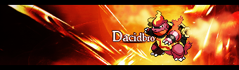
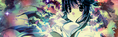
One is my current sig and the other was pretty good or so they told me at gfxfreaks.com
cnc
cnc
Grim Tuesday
Smash Legend


I'm always making them, but they don't fit in the sig thing.
Black Waltz
Smash Champion
- Joined
- Jan 27, 2007
- Messages
- 2,243
Read the rules people:
And try to give other people some helpful comments before demanding feedback. If you genuinely can't think of something to say, fine. Don't stretch yourself. But at least try.
gopobox
Smash Journeyman
I'll still give a few comments.....
@stunimpact
I like your first sig.. the difference in brightness from one end of the sig to the other. I also like the random blue lines that you used in the middle there.
I hate sprite sigs for some reason so i wont comment.
@grimtuesday
All those sigs look the same. A random background with outerglow put onto your renders. It looks pretty ugly and bland. Also the renders that you used a pretty ugly. You could go search for some tutorials on how to make sigs or something.... The font used doesnt help the sigs either. Also make the size of the sigs smaller, they are way too big and also if you make it smaller. It could fit when youre using htem.
I'll make a sig later and post it up later if i can be bothered...
Diddyknight
Smash Lord
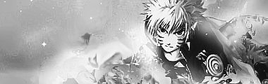
@grim: no
@stun: i like the top one a lot. The 2nd one: Border can be removed and its chaotic. Try to calm it down a bit.
@doro: lol but anyway the text you should work on a lot more. Its..awkward. I also am not a sprite person >.> Border is also not needed.
@gopo: *waits*
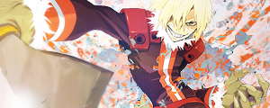
made this during R3 lol. I was missing material T_T but anyway CnC
EDIT: one more xD
http://hentaiking4ever.deviantart.com/art/Signature-148279686
made this at 2:36 AM Pacific lol <3
@stun: i like the top one a lot. The 2nd one: Border can be removed and its chaotic. Try to calm it down a bit.
@doro: lol but anyway the text you should work on a lot more. Its..awkward. I also am not a sprite person >.> Border is also not needed.
@gopo: *waits*
made this during R3 lol. I was missing material T_T but anyway CnC
EDIT: one more xD
http://hentaiking4ever.deviantart.com/art/Signature-148279686
made this at 2:36 AM Pacific lol <3
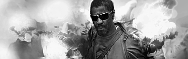
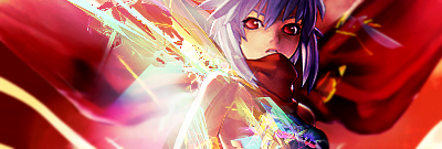
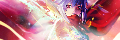
DiddyKnight: On the first one, the text placement is awkward, and the text choice is bad. The lighting is ok. I don't like the compo too much as well. It might be because of the BG. The second one has a lot of empty space, bad smudging, color choice, and text placement/choice.
-----------------------------------------------

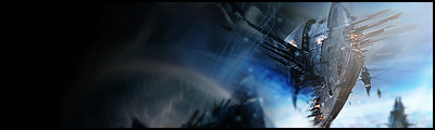
I was told this is probably the best sig I've ever made.
-----------------------------------------------
I was told this is probably the best sig I've ever made.
gopobox
Smash Journeyman
@diddyknight
I think the first sig is pretty nice with the c4d blending in with the render. Don't see why doromac hated the background. But i like it. I have huge troubles with creating backgrounds so mine usually look crap T_T. The text doesn't really match the sig that great. You could find a better one that that. Won't say much about lighting because i have troubles with that **** myself.
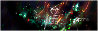
The second one is pretty unclean and its really empty. I do like the motion blur coz like she's on a bike but the c4d coming out of her *** is a no go. It like is a little disturbing and doesn't look good anyhow. But hentaiking4ever, I guess its ok.
@Doromac
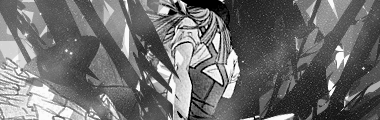
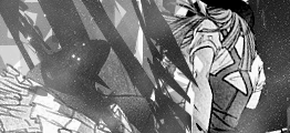
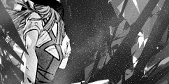
I really like the depth in your sig. It's pretty nice to look at. The random squares on the right hand side is a really nice way of adding something to what would be blank space. Really creative i must say. My only problem would be the colours. To me blue, yellow and orange looks weird all together.
Both of you guys do nice work.

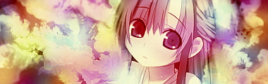
If you've watched clannad before than you should somewhat understand what i put in this..
I think the first sig is pretty nice with the c4d blending in with the render. Don't see why doromac hated the background. But i like it. I have huge troubles with creating backgrounds so mine usually look crap T_T. The text doesn't really match the sig that great. You could find a better one that that. Won't say much about lighting because i have troubles with that **** myself.
The second one is pretty unclean and its really empty. I do like the motion blur coz like she's on a bike but the c4d coming out of her *** is a no go. It like is a little disturbing and doesn't look good anyhow. But hentaiking4ever, I guess its ok.
@Doromac
I really like the depth in your sig. It's pretty nice to look at. The random squares on the right hand side is a really nice way of adding something to what would be blank space. Really creative i must say. My only problem would be the colours. To me blue, yellow and orange looks weird all together.
Both of you guys do nice work.
If you've watched clannad before than you should somewhat understand what i put in this..
Inyro Gatling
Smash Journeyman
Gopo: Not bad in terms of composition, but there's just sooo much pink that I almost can't see anything else in the tag. Not your fault, just maybe next time more color diversity.
Few new ones:

We'll leave it at this for now. ^.^
Few new ones:
We'll leave it at this for now. ^.^
Player-4
See you in 25 years
Really good smudging Inyro (I wish I could smudge that good). I like the color versions better than the BW ones too. I like the first sig probably the best, the dept on it is really good. ")
Beam Kirby

Mirror Kirby

Beam Kirby
Mirror Kirby
Neon Ness
Designated Procrastinator
- Joined
- Jul 10, 2008
- Messages
- 3,631
@ Doromac: Great composition. It looks like you put a lot of thought into the colors, too-- they look good together. The clipping mask rectangles are a really good idea, but I dunno about those drop shadows behind them. They sort of destroy the otherwise good depth by making the background underneath them appear flat. Something's odd about the person's face too, but I can't quite tell. Some parts may need more blurring... I dunno, that might just be me. It's good, though.
@ Gopobox: Great idea, I think it could even be worked on more. Make it look more like she's leaning/lying down on something. Her position is sort of awkward/uncomfortable looking... And add some effects in front of her as well as behind her so she's more integrated into the tag.
@ Player 4: It just needs more. Add effects that somehow relate to Beam/Mirror Kirby besides the generic stuff around the borders. The colors are pretty good--they match the render. And if you want to smudge well, you just gotta practice! That goes for most things in Photoshop/GIMP. Just force yourself to try it out often and you'll figure out the best way to use it.
You've just given me an amazing idea. Thanks for the CnC.@ Doromac: Great composition. It looks like you put a lot of thought into the colors, too-- they look good together. The clipping mask rectangles are a really good idea, but I dunno about those drop shadows behind them. They sort of destroy the otherwise good depth by making the background underneath them appear flat. Something's odd about the person's face too, but I can't quite tell. Some parts may need more blurring... I dunno, that might just be me. It's good, though.
Zolga Owns
Smash Lord
I don't want to make this a spam post but I couldn't seem to find a social thread.
Didn't there used to be one?
Hey guys, remember me?
Didn't there used to be one?
Hey guys, remember me?
Hentekorino
Smash Journeyman
^Do you still GFX? o_o
Zolga Owns
Smash Lord
Mhm.
10mhms
10mhms
Inyro Gatling
Smash Journeyman
Maybe I'll get something more this time:
The colors are too overwhelming. The contrast is too great. The smudge BG is boring and the lighting is bad. The only decent one is the Avatar one. The lighting effect is OK.
I got too much love for this. I drew it with mah tablet.
I got too much love for this. I drew it with mah tablet.
I love the 4th Dep, but the rest are really bright/generic/boring. Their colors are bad as well.
Doro, the depth is kinda funky.
New tag, cnc please.
Doro, the depth is kinda funky.
New tag, cnc please.
Neon Ness
Designated Procrastinator
- Joined
- Jul 10, 2008
- Messages
- 3,631
@ Werekill: The right side looks more worked on than the left. Really, I like those light streaks in that area, they're well done. But there are some lighting issues. Look at her hand and shoulder; see how the shadows are on their right sides? That means the light source should be coming from the left of her body (and slightly above her actually). But most of your lights are on the right. That's the only thing that bothers me, but I think that should be easily fixable. Once that's fixed I might even consider darkening the shadows for higher contrast. Other than that just fill in the lower left side some more. Just break out the pen tool and go crazy or something.
That's a pretty cool render. Mind if I ask where you found it?
That's a pretty cool render. Mind if I ask where you found it?
Yink
The Robo-PSIentist
@Inyro: The sigs...are all the same. I'm sorry, they just all have the same feel to them and it's very boring. The first two are very similar in colors and backround and they just don't work well. Color wise it's not terrible but, depth wise it's nothing special
Third sig's depth is actually very nice, same style, not many effects.
Fourth sig is alright, maybe a tad over-sharpened (not by much though).
@Doro: Cool concept and drawing, not the best colors and there's some funky depth going on.
@Were: As Neon already stated most of it...he's right. Your left side looks almost untouched. Add something that will attract the eyes up to your render and fill up some negative space. Blend your render a little more too and the sig will really look great.
Hentekorino
Smash Journeyman
@Zolga: New tags, I wanna see 'em.
@Doro: Liking the shapes/colors, it just looks... "soft," dunno how to explain it. >_<; Needs to be sharpened I guess?
@Were: Right side - messy, messymessymessy, negative space on the left would look fine if the right side would've been cleaner, too much of an imbalance as it is.
Don't need crit, just need to know which one looks better.
Inyro Gatling
Smash Journeyman
Hente, first tag looks better. I'm not completely liking the sparkles in the second, for some reason it just doesn't seem to fit (but v2 of that tag, if anything).
Okay, since my other tags are crap:


Okay, since my other tags are crap:
Diddyknight
Smash Lord
@hente: first one best
@inyro: nice use of smudging on the first one. 3rd looks better of out the 3 versions you put up. lighting seems to work well with it but the problem is, there seems to be no flow from 2nd -4. First one <3
@inyro: nice use of smudging on the first one. 3rd looks better of out the 3 versions you put up. lighting seems to work well with it but the problem is, there seems to be no flow from 2nd -4. First one <3
Hente: first one
Dep: They all have MAJOR floating head syndrome.
Fixed up the last one, any cnc?
Dep: They all have MAJOR floating head syndrome.
Fixed up the last one, any cnc?
Neon Ness
Designated Procrastinator
- Joined
- Jul 10, 2008
- Messages
- 3,631
@Inyro: v1. That text doesn't blend well at all with the rest of the composition. In this case I think it would have been best to go with a more subtle typeface since the effects are so... in your face. It'd probably make for a nice contrast. I guess I just don't understand why you chose that specific font. The last 2 are technically well lit, but just far too bright and washed out looking.
Well done with the depth. Those red and purple tones tie in nicely together, and the blue-green's a nice contrast. The effects on the right shoulder (his[her?] right) are a bit too sharp.
@ Werekill: The lighting's still incorrect, it looks like... It's not quite coming from the right direction. The light effects are flowing even better than before, though. The left side is looking plain...
It's gettin' there.
Gypsy Lee
Smash Champion
My fav of the four.Maybe I'll get something more this time:
The smudging is great, though you should try to make it less obvious in places (i.e. wherever there's little half-circles floating around). You should look into other forms of effects: C4Ds, splatter brushes, or even copy&pasting a cloud image then Sharpen + Filter.
The 2nd and 3rd pieces' stocks are too off-centered, and you abused the soft brush lighting effects. 4th one would be great with more work put into it (looks half-finished now, but a half-finished great tag).
Is the best. Try making the lighting less harsh, sharpening the girl and bluring the empty background (a lot), and adding a little contrast. It'll bring out the girl and look tons better, mhm. I think some really heavy gradient work would be great for this particular piece, too.
Same advice as above: Nice use of C4Ds, but try to use other types of effects. Oh, and keep in mind that you want to use the C4Ds to compliment your subject by adding depth and flow to your tag, and it shouldn't be obvious that you used one to an untrained eye. 'Eraser' is your friend!!
Hope that helps. D'unno you guys too well so I apologize in advance for any misunderstandings.
Red the Ghost
Smash Ace
@ Inryo: I love the effects of the first sig, and the first of the other ones looks the best. Fourth one would look best if the color seemed less washed-out and it was a slightly less bright. Bring out the render like Gypsy Lee said as well.

This part also seems to interrupt the flow a bit, though it may just be me.
That text in the second version is scary.
Hente, definitely the first, the other (both versions) seems a bit messy.
I made this as a request with help of a tutorial, but I'd still like to see what others think about it overall, to learn what I should and should not take from it. There is still some original work in it, though. xD
I really have problems working on signatures from scratch; perhaps it's a lack of knowledge or experience, but any advice here would be great.
Octave
Smash Ace

Whipped this up in about 30 minutes last night. I'm a scrub at photoshop but I have fun with it. Not too experienced with lighting or really any effects.
Inyro Gatling
Smash Journeyman
Gypsy: Thanks for the crit, I'll definitely look into those areas.
Red: When you want to make a tag from scratch, always try to have an idea of what you _want_ it to look like in your head, even before you start. This way, you can better work toward getting your tags to come together. Believe me, it helps a lot.
As for this tag here, I'd say the two biggest things to work on is blending the focal and creating depth. When you're blending the focals in, you don't necessarily need to blur or smudge the render. Instead, try doing something like putting effects over the focal. For instance, in the tag I'm asking for critique for in this post, I blended the focal in by having a few shapes over the focal's arm. You can develop depth partially in the same way, and also by working with your lights and darks in the tag.
Keep working at it. =)
Octave: Next time, try posting a little critique of the tag above you when you want critique yourself. Anyway, art is all about having fun doing it - so you're off to a great start here. Maybe in your next tag, try experimenting with different ways to make a background. You can get some pretty impressive stuff just using basic filters and tools (gradients, smudges, sharpen, pentool...).
Here's my newest tag:
And two crops to help the flow:
Octave
Smash Ace
@ Inryo: Ah, sorry about that. I'll make sure I do that next time.
Hmm.. looking at your new tag I feel like the left side of it is kinda empty despite being filled with the shapes. I think its because of the pink-colored star near the bottom. It looks out of place on the blue and white area unless you stare straight at the character in the center. I think maybe a little more color around it would make it fit in, but that's just me.
Hmm.. looking at your new tag I feel like the left side of it is kinda empty despite being filled with the shapes. I think its because of the pink-colored star near the bottom. It looks out of place on the blue and white area unless you stare straight at the character in the center. I think maybe a little more color around it would make it fit in, but that's just me.
L__
Smash Master
You need to work on your general composition, your sig looks very flat.Gypsy: Thanks for the crit, I'll definitely look into those areas.
Red: When you want to make a tag from scratch, always try to have an idea of what you _want_ it to look like in your head, even before you start. This way, you can better work toward getting your tags to come together. Believe me, it helps a lot.
As for this tag here, I'd say the two biggest things to work on is blending the focal and creating depth. When you're blending the focals in, you don't necessarily need to blur or smudge the render. Instead, try doing something like putting effects over the focal. For instance, in the tag I'm asking for critique for in this post, I blended the focal in by having a few shapes over the focal's arm. You can develop depth partially in the same way, and also by working with your lights and darks in the tag.
Keep working at it. =)
Octave: Next time, try posting a little critique of the tag above you when you want critique yourself. Anyway, art is all about having fun doing it - so you're off to a great start here. Maybe in your next tag, try experimenting with different ways to make a background. You can get some pretty impressive stuff just using basic filters and tools (gradients, smudges, sharpen, pentool...).
Here's my newest tag:
And two crops to help the flow:
Also, the text does not blend well with the image, and it seems to centered IMO.
I wonder if anyone here remembers me
here goes nothing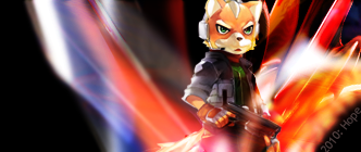
Inyro Gatling
Smash Journeyman
Flat, really? Hm...
As for your tag, there needs to be more. Just more. Background, depth, and effects are all pretty lacking.
And now:
As for your tag, there needs to be more. Just more. Background, depth, and effects are all pretty lacking.
And now:
Neon Ness
Designated Procrastinator
- Joined
- Jul 10, 2008
- Messages
- 3,631
@ Inyro: Your designs seem to be getting more and more complex... Great color scheme. The guy is too faded looking, or something... No, not faded, but sort of blurry. I can appreciate a 'subtle' look but to me he doesn't stand out enough. It makes the sig appear very flat. Again, the effects are really good. The lighting and colors are most interesting on the far right.
Black and white tags need a lot of depth and a lot of contrast to be interesting, I think. This one doesn't really work well in grayscale.
@L: That lighting is O_O. Did you do it yourself? It's... well... it's really good. A bit too much negative space. I see what you were going for making the bottom corners triangular areas of black, but it's a little choppy. The right bottom corner looks plainly eraser tooled. I wish it was smoother.
Low opacity text... eh. Also, I think you should just put 'Hope'. I wish the font were more square/the same case so that all of the letters were the same height. It's sort of throwing me off with H towering above the rest of the letters. The text could go closer to Fox; not sure, though. Just try placing it in different areas and see what works.
Red the Ghost
Smash Ace
That was the first thing I thought as well.Also, I think you should just put 'Hope'.
Player-4
See you in 25 years

Thoughts?
It was a request, and I liked the outcome enough to post it here and get some CnC
New tag, cnc please.
Dep: Seems flat and uninteresting. Try creating some more depth with the burn/blur tools. The render seems LQ as well.
Neon Ness
Designated Procrastinator
- Joined
- Jul 10, 2008
- Messages
- 3,631
@ Werekill: I think the 'camera' angle is the best part, it's really dynamic and nice to look at. Great depth (especially with the blade on the left in front of him) as well. The background is too uniform to me, though. If it had more variation it would add some different areas of interest. It has good colors but it's a little flat as is. It has a lot of movement.
@ Player 4: Don't forget to critique someone else's first before asking for advice...
I just want to see more contrast. It's almost overpowered by white-- white corners, white lighting on Lucario, white in the center of the Aura Sphere. Add some dark tones to balance that out. Darken the shadows with blues/violets, for instance. You could even add some lighter tone blues to the lighting on the front of Lucario.
The lighting is... strange. There's a shadow on his right/back side, but there's also an area of white on the right that looks like a light source, which is paradoxical. The right side should probably have darker tones. I'm a big fan of the fractal lines. They look sharp. Give them some more direction if possible, though; they look sort of randomly placed in some areas.
- Status
- Not open for further replies.