• Welcome to Smashboards, the world's largest Super Smash Brothers community! Over 250,000 Smash Bros. fans from around the world have come to discuss these great games in over 19 million posts!

    You are currently viewing our boards as a visitor. Click here to sign up right now and start on your path in the Smash community!

The Sig Critique Topic

Status
Not open for further replies.

Diddyknight

Smash Lord
Joined
May 9, 2008
Messages
1,134
Location
Socal -> FL
@Player 4: no depth again....
@werekill: seen better of your artwork =\ sword looks blurred + random splatter it looks like...
@Inryo: color scheme looks good but some parts it looked like you over did the soft bursh =/


CnC? I wasn't sure where to put this....

Edit: lightings funny lol
 

Inyro Gatling

Smash Journeyman
Joined
Sep 1, 2008
Messages
229
Location
New York
Player: Work on giving the tag more substance. All you really have right now is the render, the background, and some drop-on effects. Try doing something more.

Were: Your focal's flow and the effects' flow contradict, which is about the only thing keeping me from loving this.

DK: Make the planet more distinctly the focal, and get rid of the white stuff coming off the planet, and I think you'll be set.


Finally back onto my Alienware, so expect more better quality tags like this one. ^.^
 

Ori_bro

ignite the fire
Joined
Mar 6, 2008
Messages
9,343
Location
Michigan
dude this thread looks awesome ill have to start putting my stuff here so i can get some good feedback expect a banner soon :)

on topic
@Inyro those Talims are very nice i really like the 2nd one :)
 

Inyro Gatling

Smash Journeyman
Joined
Sep 1, 2008
Messages
229
Location
New York
lol waiting anxiously, ORI

New tag:
-
-


Okay, so I made this tag (against what it may look like) with just an anime stock and an anime render. No c4ds or anything else.
 

Diddyknight

Smash Lord
Joined
May 9, 2008
Messages
1,134
Location
Socal -> FL
@gatling: no flow =[ the 2 red things destroyed the flow. you should've taken out one of them then built it from there. Random render in the back =\ It'll probably be better if you take off the red thing near her head. Nice color mix but blending could've been better. I see 3 flows potentials >.>

lulz. It looks like I put giberish. ^
 

Yink

The Robo-PSIentist
Joined
Oct 6, 2009
Messages
7,419
Location
Osaka, Japan
NNID
SSBYink
@Inyro: This is a very nice revision, it's got great colors, powerful lighting and interesting effects visually. The only thing is, the blur in the front of your sig looks very weird compared to there being not as much in the back. I bet that sounds weird but what I'm saying is maybe blur a little of the guy in the back, nothing crazy. It also really fixes your eyes on your focal and light.

Also, I saw your other Black and White sigs and I do agree, they were very flat so this one feels great compared to those. Be careful with BaW sigs...they're good from time to time but sometimes they hide mistakes. (Not saying you made one or anything, just stating a fact)
 

Dr_Twist

Smash Lord
Joined
Oct 6, 2006
Messages
1,110
Location
Iowa-gimme some brawl challengers yo!
=D not sure if anyone remembers me but IM back! after 3 years lol.
ive gotten a new computer and another photoshop trial so i have 30days to get back into it and hopefully more if i get the actual thing.

now i will CnC and post some sigs but i havent been doing this for 3 yrs soo bare with me =).

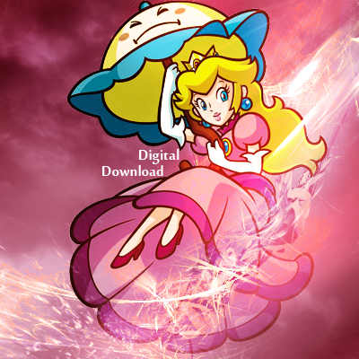
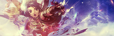
Inyro-i like the effects for the most part the shine on her arm is a bit much just unbrighten it just a tad. and the thing above her head that sticks out like a sore thumb against that blurred background. (back when i was here we did a 1-10 scale =P) so 7/10


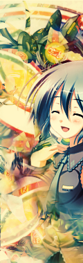
anyway i havent been makin this stuff for three yrs so im a bit rusty =P if only i could find my own artwork from back then =( my last few were rly pretty good but heres my first two i've made since the first two days ive had photoshop back. CnC and plz offer some advice and some tools cause ive been gone to long. ty
(also an avatar made with each just using the sig but cropped rly ;P whatta nub right lol)


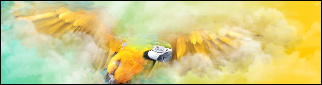
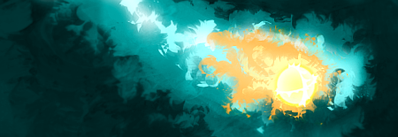
(for the fox one? are the stars too much? cause i couldnt take them out cause it made it too bland)
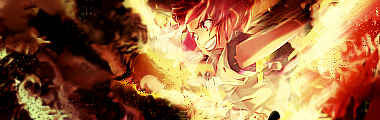
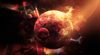
(i also thought i blended him pretty well into the back ground in this one)?


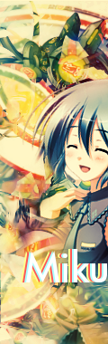
EDIT: HEY! i Found one of the last things i made ( i consider one of my best)
this is from 3 yrs ago i was tiny little kid then but i thought this was major awesomo(if you would like the tut to make a sig like this PM me, i found that too)
 

Black Waltz

Smash Champion
Joined
Jan 27, 2007
Messages
2,243
@Twist: "rly pretty good" I respectfully and thoroughly disagree, little one.

Like, OW OW OW OW. My eyes are burning from the overcontrast. In your Mass Effect tag, the effects are too random and scattered. Work on making the effects compliment Shepard rather than having them off to the sides. The Fox one just looks really shoddy. Why did you use a spray paint effect?? It doesn't help at all and makes it look really low quality. And your so-called "blending" is counteracted by the massive amounts of overcontrasting. Since you're obviously new at making tags, stay away from text since it's really hard to make it work well.

Your last tag looks like a huge mess. the effects are just everywhere. The sprite is so tiny that I have to squint to see it. The funny thing is that you took the time to make a tutorial for a such a sub-par tag too, lol.

Look at these: http://www.smashboards.com/showthread.php?t=175790
and compare them to your own. Do you see differences? How do they make the effects blend well?
 

Dr_Twist

Smash Lord
Joined
Oct 6, 2006
Messages
1,110
Location
Iowa-gimme some brawl challengers yo!
*takes punch to face* *goes back to making fail sigs*
..anyway new one


( i rly liked the fox text but meh )
id also like some tips instead of total pick apart and bash. not just hey thats messy maybe a tool or effect thatll help unmessy it. (people so much nicer when i was younger :p )
 

★Malik★™

Smash Ace
Joined
Jul 13, 2009
Messages
627
Location
FL
if only i knew how to go back to a saved sig.

Malik-nice, just teach me how to do that so Waltz wont have to punch me so hard. lol
how you make them come out of the water and the reflections just great 10/10
I cut them in half. D:
 

Diddyknight

Smash Lord
Joined
May 9, 2008
Messages
1,134
Location
Socal -> FL


meh I was bored. CnC?
@Malik: I dont know sprites so....=\
@twist: way to chaotic for that last one...random burshes lul

E1: the render choice was a bad one. =/
 

Neon Ness

Designated Procrastinator
Joined
Jul 10, 2008
Messages
3,631
What does Digital Download have to do with Peach? That's the first thing that comes to mind... The font is sort of uninteresting, though. Make it glassy looking, or tilted, or a different color, or something. There's a lot that could be done to the text. Most times simplicity for text is better, but I'm just throwing out ideas.

The wind effects are pretty nice, and it's fitting since she's floating with an umbrella.

You chose a good render in my opinion. To go along with what the text says it would have been cool to have Photoshopped Peach to look like an android/machine of some sort. It wouldn't really even be too difficult, either. Keep going.
 

Neon Ness

Designated Procrastinator
Joined
Jul 10, 2008
Messages
3,631
Uhm... oh.

Oh well, I tried.

@ Dr_Twist: I just wish there was a focal here. No part really stands out much more than any other. That can work for abstract pieces I think, but in this case he should be the clear main focus of the tag. This could be done by blurring some areas of the background, or even making the colors on him more saturated/making the background less saturated.

The color flow in the background is well done. The red-blue gradient is a good match to the render. But overall, it just feels very far away and... underwhelming.
 

Roller

Smash Legend
Joined
Mar 21, 2008
Messages
13,137
Location
Just follow the grime...
*takes punch to face* *goes back to making fail sigs*
Ok. THIS is the mentality that will lead you no where. Don't just listen to his criticism, then brush it off and move on to another sig. Before going on to another sig, which you will inevitably use a similar level of skill to complete, FIRST take the advice he gave you. Work on the things he said needed work. Then resubmit the sig for critique. Keep doing this over and over until he says its at least decent. THEN you can choose to move on. Don't settle for making a ****-ton of crappy sigs. If you honestly want to get any good at all at this try to improve the problems in your sigs before moving on. It's how you get better.
 

Alzi

Smash Master
Joined
Feb 8, 2008
Messages
3,450
Location
New World
Malik i really like the way you did the sprites in the water with the reflections. It's just a nice idea overall.

Diddyknight nice thing you did with the peach although i do agree that the render was kinda a bad choice since of the cartoon look peach has me thinks.

I mad a signature yesterday testing out somthing new that i learnt and i am happy with the result it's not perfect or extremly good but hope someone can comment about it and say what i did wrong or right.
 

★Malik★™

Smash Ace
Joined
Jul 13, 2009
Messages
627
Location
FL
^ Its good, I think you should've moved him a little bit towards the middle, that way the text don't have to try and take up the space on the left. Oh, and text. Its okay, I would've moved it closer to his arm and made it parallel to it.

8/10
 

Roller

Smash Legend
Joined
Mar 21, 2008
Messages
13,137
Location
Just follow the grime...
I havent seen you in a while RollerKing =D

Took a break from the forums, now I'm back... in black.

lol srry rollerking just a joke D=

I understand the reference to the next sigs you will be making being crappy was in jest. It was the fact that you were moving on to a new sig at all that I was commenting on.

And I apologize for being a little harsh there.

The render looks a tad large for the sig.
 

Yink

The Robo-PSIentist
Joined
Oct 6, 2009
Messages
7,419
Location
Osaka, Japan
NNID
SSBYink
I'm not sure if Rollerking is posting their sig to be critiqued so...


Gosh I'm rusty but I'd LOVE come CnC be as harsh as possible. It's the only way to get better.

(if you want me to critique you Rollerking just tell me, I apologize)
 

Doromac

Smash Journeyman
Joined
Aug 31, 2009
Messages
260
Location
Nashville
Not liking the border much, but this is very nice. More of the body needs to show. The lighting is superb.
 

Dr_Twist

Smash Lord
Joined
Oct 6, 2006
Messages
1,110
Location
Iowa-gimme some brawl challengers yo!
saying i should not make sigs anymore? i realize what Black Waltz said and sadly i agree with another of his post i read on another thread, that im that kind of the "public" that says hey shiny! im trying to improve just need some time rly dont have enough experience and resources yet. but unless im reading your message wrong id prefer some help over telling me to quit. (blow to my ego eh? =P)

anyway

InYro-the color and flow are good and go well with the pic. theres no transition from light to dark really but i cant tell if that bad unless i see another version. my problem is the the little bits scattered around the effect by the pic. seems rough when the rest is smooth. and rough with smooth isnt always a bad thing but it doesnt work in this one. good job tho. --8/10--

Edit: also im wondering where can i post wallpapers and other forms of art from photoshop? for critique or something?
 

Alzi

Smash Master
Joined
Feb 8, 2008
Messages
3,450
Location
New World
Yink i love the sig but not the border it currently has. Other then that everything else looks good to me.

Inyro i like all the effects on the banner. Just i think the render might of been covered up alittle too much since i can't picture what it's body is ment to look like.
 

Black Waltz

Smash Champion
Joined
Jan 27, 2007
Messages
2,243
saying i should not make sigs anymore? i realize what Black Waltz said and sadly i agree with another of his post i read on another thread, that im that kind of the "public" that says hey shiny! im trying to improve just need some time rly dont have enough experience and resources yet. but unless im reading your message wrong id prefer some help over telling me to quit. (blow to my ego eh? =P)

anyway

InYro-the color and flow are good and go well with the pic. theres no transition from light to dark really but i cant tell if that bad unless i see another version. my problem is the the little bits scattered around the effect by the pic. seems rough when the rest is smooth. and rough with smooth isnt always a bad thing but it doesnt work in this one. good job tho. --8/10--

Edit: also im wondering where can i post wallpapers and other forms of art from photoshop? for critique or something?
Don't be discouraged. Keep making tags but realize that self-critique is the most important way to improvement. Once you can point out the flaws in your own tags you'll become exponentially better. If you need tips and advice on effects, etc. just PM me.
 

Diddyknight

Smash Lord
Joined
May 9, 2008
Messages
1,134
Location
Socal -> FL
@Twist: *insert Black Waltz Quots* : Keep trying. It takes a while to get "good" or even decent level. Even though I still suck rofl.
 

Neon Ness

Designated Procrastinator
Joined
Jul 10, 2008
Messages
3,631
Edit: also im wondering where can i post wallpapers and other forms of art from photoshop? for critique or something?
Right cheah. http://www.smashboards.com/showthread.php?t=235725 For anything that's not a signature.

@ Yink: It's got that professional look to it. It has a lot of good motion around her, and the lighting is incredible. I actually wouldn't mind the border if it was either A) thicker, or B) thin but went along the sides as well. Right now it's sort of straddling the fence and looks incomplete.
 

Yink

The Robo-PSIentist
Joined
Oct 6, 2009
Messages
7,419
Location
Osaka, Japan
NNID
SSBYink
:o Oh wow...I didn't think it was that good. Thanks a lot, I'll get to changing that boarder.

@Inyro: Actually...I don't know what it is but I don't like this tag all that much. The colors are alright but the render is really covered up. It has some weird depth too and color placement. I don't know man, just not one of my favorites from you. The smudging is still as good as ever though.
 

Dr_Twist

Smash Lord
Joined
Oct 6, 2006
Messages
1,110
Location
Iowa-gimme some brawl challengers yo!
holy crap is that smudging still? insane look dude but the render is WAY to small the focus seems to me on the fireball unless that the point. but it looks amazing you need a tut on how to smudge that good or w/e it is. but even if the fireball is your focus you need to be able to notice its target that it seems to have. either way make the pic bigger while keeping him blended well and itll look tight

Edit: just finished a new one CnC

i have two versions--tell me which you prefer then critique on rest of the sig

V1

V2


edit: so i just got back from school and thought id put a border on it. so..

V3 (its V1 with border)

not sure if i like it or not. btw if theres any tips on borders like a tool to help them look better would apprieciate
 

★Malik★™

Smash Ace
Joined
Jul 13, 2009
Messages
627
Location
FL
holy crap is that smudging still? insane look dude but the render is WAY to small the focus seems to me on the fireball unless that the point. but it looks amazing you need a tut on how to smudge that good or w/e it is. but even if the fireball is your focus you need to be able to notice its target that it seems to have. either way make the pic bigger while keeping him blended well and itll look tight

Edit: just finished a new one CnC

i have two versions--tell me which you prefer then critique on rest of the sig

V1

V2


edit: so i just got back from school and thought id put a border on it. so..

V3 (its V1 with border)

not sure if i like it or not. btw if theres any tips on borders like a tool to help them look better would apprieciate
What made these look bad is the render quality. That line or whatever it is, is sorta leading me away from the focal to text that.... seems to be good. But if you're planning on putting text in a sig, make sure its near the focal, that way it doesn't distract the viewer. Also, I can barely see his sword, his sword is one thing that must be seen since its his weapon.

7.7/10
 

Dr_Twist

Smash Lord
Joined
Oct 6, 2006
Messages
1,110
Location
Iowa-gimme some brawl challengers yo!
totally agree lol only one i could find untill today i just came across a better one i might try to go back a touch it up ty.

i made a new one for my brother he likes it but im not in love

im pretty sure i did the same thing with the text but thats b4 i read comment. would it look better with "Frdge" up by "Link" and then "link" pushed closer toward the pic or the two pieces of text on the shields two connecting sides(the top part).


Edit: I revised the Afro Samuri sig have 3 versions ( 2 have text and one doesnt)

V1


V2


V3
 
Status
Not open for further replies.
Top Bottom