• Welcome to Smashboards, the world's largest Super Smash Brothers community! Over 250,000 Smash Bros. fans from around the world have come to discuss these great games in over 19 million posts!

    You are currently viewing our boards as a visitor. Click here to sign up right now and start on your path in the Smash community!

The Sig Critique Topic

Status
Not open for further replies.

Inyro Gatling

Smash Journeyman
Joined
Sep 1, 2008
Messages
229
Location
New York
Chris: Right side's quite good, but I don't like the large canvas size or the obnoxious wireframe on the left.
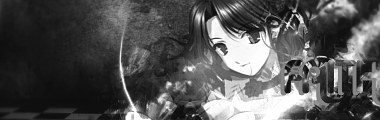
Mojo: Circle takes away from the focal in my opinion, and I'm not a fan of the left side in general...
Hente: I like the 4th from the bottom on the right side, but some of them (like the House one) just don't appeal to me.


lordunicorn3

Smash Journeyman
Joined
Mar 1, 2008
Messages
472
Location
Paris
Inyro, first one for sure, maybe dull the colors a little though, i really really like that tag actually, make the text a little more distingushable though

so i decided to start over my tag making (new everything, stocks, c4d's etc. (new pb too, mines full of junk) so this is my 'first' tag since then, there was a sprite in it, but i took it out, did not match

oh, and thats my user name on a diff forum, anyone know if you can get name changes here?
 

lordunicorn3

Smash Journeyman
Joined
Mar 1, 2008
Messages
472
Location
Paris
Thank you for that BW, i did not rly get what he said >.<
Anyway, I know its pretty messy, not much i can do to it now, i was supposed to be one big band across the screen, but that did not really work :/
working on a newer better sig now though
 

Shadow Moth

Up in the clouds
Joined
Oct 28, 2008
Messages
6,672
Location
Hyrule
Well by wispy I sorta mean smokey. I know I should lower the opacity and I can draw smoke but I was wondering what to do to the edges really.

I guess if I had to give an example I'd say ghostly since that's really what I'm aiming for.

I just figured wispy would give a clearer idea of what I wanted but nobody knows what it means.

> lol dictionary please >
 

lordunicorn3

Smash Journeyman
Joined
Mar 1, 2008
Messages
472
Location
Paris
Ok, nothing on this page to c+c, ive done plenty in the past though
so, this is the other version of the sig i posted on the last page, better, or worse?

here is a new sig i made, i tried text, but it failed >.< so i took it out


so far im pretty happy with my re-start to sig making, (if you think im doing better or worse, tell me)
 

O D I N

Smash Hero
Joined
Mar 13, 2005
Messages
7,408
Location
GameAngel64's house, getting my @#% handed to me.
3DS FC
4098-3123-8629
@Unicorn: The sprite sig is still too messy. It clutters up with too much in the middle, and you can't even tell what your focal is supposed to be. Plus, I'm guessing that it's a sprite. O_o Some effects look good, but don't look good stacked on each other. I prefer looking at the sides on that sig, then the middle. :(

Second is good. I like the pentool, but the background seems a little cluttered. Good colors though; they work well with what you're doing. Blend your stock a little better. Seems very cut and paste-ish.

No lighting either; some sigs need it, some don't. I can't decide on this one. :-/
 

Demon Kirby

Smash Champion
Joined
Sep 18, 2007
Messages
2,081
Location
Back from the dead
I'm not too fond of the colors on the second one; they seem overly contrasted. Pentool seems random. Seems bland and messy at the same time.

The first one is also overly contrasted and altogether too random.

also, 1Up, image used in that last tag you posted please?
 

doom dragon 105

Smash Lord
Joined
Sep 17, 2006
Messages
1,487
Location
Miami
Yo ODIN good seeing you again

Everyone seemed covered so...

I dug this up xD Its just my first abstract don't think I ever posted it


Inyro Gatling

Smash Journeyman
Joined
Sep 1, 2008
Messages
229
Location
New York
Conflicting flows ftl. Work on that, and maybe some different colors. I dunno, these just don't do it for me. D=


doom dragon 105

Smash Lord
Joined
Sep 17, 2006
Messages
1,487
Location
Miami
I think you used this for a background on a sprite tag.
>_> I think so, I know the tag itself sucked *** I liked the BG though though I would have it CnCed as an Abstract since I liked it alot

So for my CnC 1st is better than the 2nd imo, The first is fine from a gfx stantpoint I guess, I don't like the BG alot, but thats my personal taste as for the 2nd idk what to say its really kinda plain :/

Well here is a new one, yes I love Shawn Jonhson and I haven't made a tag in ages lol I make one then never make one for a while xP rinse and repeat


and matching avi


Thunder Of Zeus

*Rumble Rumble*
Joined
Jan 3, 2009
Messages
4,128
Location
Mt. Olympus
>_> I think so, I know the tag itself sucked *** I liked the BG though though I would have it CnCed as an Abstract since I liked it alot

So for my CnC 1st is better than the 2nd imo, The first is fine from a gfx stantpoint I guess, I don't like the BG alot, but thats my personal taste as for the 2nd idk what to say its really kinda plain :/

Well here is a new one, yes I love Shawn Jonhson and I haven't made a tag in ages lol I make one then never make one for a while xP rinse and repeat


and matching avi

Where do I start...? Oh yes, my favorite thing to say, of course. "Center focals are generally fail." This center focal, in my opinion, is not well done. The render is overcontrasted. The transluscent boxes do not add to the sig at all, they just make it look sloppy and screw up the flow. There isn't much going on. They lack a unifying color-scheme. The background does not make sense with the render.
 

zrky

Smash Lol'd
Joined
Jun 1, 2008
Messages
3,265
Location
Nashville
Well here is a new one, yes I love Shawn Jonhson and I haven't made a tag in ages lol I make one then never make one for a while xP rinse and repeat


and matching avi

Aww come on she can't even reach the floor if she is sitting on a chair :p

anyway, I don't really like the effects that you used, they kind of make the tag look messy. If you used effects that were more solid and not so dispersed it might look better. I like the feel it has though. Also like zeus pointed out the render is oversharpened. I like the avi better, I think it has more to do with the fact that the tag looks like it has negative space on the right:ohwell:
 

doom dragon 105

Smash Lord
Joined
Sep 17, 2006
Messages
1,487
Location
Miami
Aww come on she can't even reach the floor if she is sitting on a chair :p

anyway, I don't really like the effects that you used, they kind of make the tag look messy. If you used effects that were more solid and not so dispersed it might look better. I like the feel it has though. Also like zeus pointed out the render is oversharpened. I like the avi better, I think it has more to do with the fact that the tag looks like it has negative space on the right:ohwell:
-_- shes perfect leave her height out of this!

To be honest I made the avi first and like it so I dragged it into a sig and centered it

I'll try to clean it up a bit and I just noticed the boxes o_O

Is BW or ODIN is there any expert advice?
 

O D I N

Smash Hero
Joined
Mar 13, 2005
Messages
7,408
Location
GameAngel64's house, getting my @#% handed to me.
3DS FC
4098-3123-8629
>_> I think so, I know the tag itself sucked *** I liked the BG though though I would have it CnCed as an Abstract since I liked it alot

So for my CnC 1st is better than the 2nd imo, The first is fine from a gfx stantpoint I guess, I don't like the BG alot, but thats my personal taste as for the 2nd idk what to say its really kinda plain :/

Well here is a new one, yes I love Shawn Jonhson and I haven't made a tag in ages lol I make one then never make one for a while xP rinse and repeat


and matching avi

The avi seems better, because it's a smaller space, and thus the collection of colors there looks more... Bountiful? :-/ (just got out of work, bad headache) The smudging looks decent from what I can tell, but it just seems REALLY dark. Try some brighter colors for your main background, because now the girl (whomever she is) is too bright compared to the background. I believe in flow, and I think flow is complimented by colors, the focal, and it's contrast to the background. Sorry for rambling.:urg:
 

Demon Kirby

Smash Champion
Joined
Sep 18, 2007
Messages
2,081
Location
Back from the dead
I wish to add that the render being centered simply does not work here and ****s up the composition pretty badly. The whole tag seems a bit choppy and jaged.

Try moving the render elsewhere and softening the whole thing a tad, erase some of the useless white specks to the left, and working on the contrast, as Odin said.
 

MojoMan

Smash Ace
Joined
Jun 1, 2008
Messages
975
Location
Brooklyn
hey gujys, here's a tag


vectired the hand and maniped the waterfall and added the texture and did a ****load mroe that I don't have time to explain.
 

Neon Ness

Designated Procrastinator
Joined
Jul 10, 2008
Messages
3,631
@ Smash G 0 D: Whoa, wha...? I see a lot of themes here... a Mario hat, Aqua Teen Hunger Force, and... is that Samus? I'd recommend trying to stick with one theme, just to avoid confusion. It makes it easier to create a cohesive design.

The subject on the right is... uh, unintelligible. Might just be me, though. Also looks like you used a Photoshop filter. Some of 'em are a'ight on occasion (very rare occasions), but to be honest it's kind of lazy to use them, when something made by you would end up looking a lot better.

Oh yeah, I like the font; it's simple, although sort of small. A lot of times people overdo text with crazy effects. But only use 1 area of text, I think more than that is messy looking.

Black borders look unnecessary, but I don't normally use them so I couldn't tell you how to make them better.

Colors are bleh. I see hints of brown in the background but the subject is strictly grayscaled. Pick one scheme or the other.

@ Mojo: That's really well done. The old-timey painting feel is definitely there... I can see where the arm is cut off on the left, but other than that I'm a big fan of the vectorwork. The dust and speckles are a really nice touch.
 

integrebel

Smash Rookie
Joined
Jul 4, 2009
Messages
24
My spidy senses tingling =)
well i think its pretty cool love the details in it =)

But i like your smiling blue digglett thingy avatar more though its just pwnage
 

The Dinkoman

Smash Lord
Joined
Apr 13, 2008
Messages
1,277
Location
Back!
My spidy senses tingling =)
well i think its pretty cool love the details in it =)
Ok, here in the Sig Critique topic we only give detailed, harsh, and possibly give the person a lower self-of-steam critiques.
You have no sig, means no ratey. D:
Spam.
you too lolz
Also spam. And turn your signature off.

@1UPChris: There's a ton of things going on, unless its because I'm farsighted but I see no focal. The colors are OK, but the render is kind of bad imo.
 

Zolga Owns

Smash Lord
Joined
Mar 16, 2008
Messages
1,888
Location
Southeast PA
I'M BAAAAACCCCCKKKK.

@Inyro- I don't like the first one to be honest.
I like your color usage though.
I feel that if you would have done the lighting differently and cleaned it up a bit, it would be a good tag.
Also the text is huge and ugly :/

The second one, all I see is fractal on the left side(Which in this case works). There is a low opacity fuzzy black box that annoys me. it detracts from your left side.
The thing under "Mike" draws my eyes away from his face and the beautiful smudge work you did. The colors on the right side are sexy, but the left could be a little more vibrant.


This is the first tag I've made in like...4 months.

No Border


Border
 

DarkAura

Smash Lord
Joined
Apr 24, 2009
Messages
1,197
Location
The Cold


just made all these today cause i was bored >.>

Radimux is my Gamer tag so thats why it's in all of them

say your worst comments xD i couldn't care less i made these in like 5 minutes
 
Status
Not open for further replies.
Top Bottom