• Welcome to Smashboards, the world's largest Super Smash Brothers community! Over 250,000 Smash Bros. fans from around the world have come to discuss these great games in over 19 million posts!

    You are currently viewing our boards as a visitor. Click here to sign up right now and start on your path in the Smash community!

The Sig Critique Topic

Status
Not open for further replies.

Demon Kirby

Smash Champion
Joined
Sep 18, 2007
Messages
2,081
Location
Back from the dead
Great tag that I had to stop and look at while I was on PR. :D

I don't have anything to add that you haven't already probably heard (BG color, "nice colors", blah blah).
 

Sinz

The only true DR vet.
Premium
Joined
Aug 31, 2005
Messages
8,189


First tag in a while.

@dinkoman: *insert what everyone else said about cluttering, placement, etc.* Colors also need some work, imo.

edit: switched tags.
I don't see any color blending what so ever. One thing you can do to help out your signature(this is just a little basic thing for EVERYONE. Is start off with a black layer. Put your Render on it, and just smudge it a bit. Then duplicate the smudged layer, and do a spatter (10 radius, 5 smoothness) and use the blur tool for spots that are too sharp. It helps to make a blended background that has the same colors as your render.

Anyone up to review my current?
 

Sinz

The only true DR vet.
Premium
Joined
Aug 31, 2005
Messages
8,189
For starting, its not a necessity, however it is a good way to start a signature. The real problem that I was addressing was the lack of color matching, the coloring in the signature that I was critiquing didn't have any well, matches I guess? I can't find the word for it right now, so I was giving something easy to do to help solve that problem for that person to start.

You have to start somewhere, and it is nice when people give you a hand.

The little tid bit about everyone, is because i see a lot of signatures that are lacking the background that is a quality background. While, C4d background isn't horrible, it isn't that awesome either. But, there are always different ways, you just have to develop your own style, and figure it out from there. I am just giving a tid bit of advice that helped me when I started.
 

Sinz

The only true DR vet.
Premium
Joined
Aug 31, 2005
Messages
8,189
Im stuck...
One of the things that you will find is that with a larger canvas, you get stuck a lot more. I recommend a simple size for 350 by 125. Or 360 by 120. Both sizes look nice.

Hmmm... I am going to go find my old tutorial, maybe you should try something with that.
 

Conker315

Smash Lord
Joined
Jun 20, 2008
Messages
1,138
Location
Houston, TX
I alredy now that, but im trying on larger work now.Keeping to a definite size actually tends to not get that part of the picture you enjoy looking at, and thats whats happening here, and nty on the tut part.I dont really need it.Also, the stock looked nasty shrunk.
 

zrky

Smash Lol'd
Joined
Jun 1, 2008
Messages
3,265
Location
Nashville
smash64, this isn't really the place for that, but it could only be done if you gave someone the .xcf (GIMP) or .psd (Photoshop).
 

smash64

Smash Champion
Joined
Aug 11, 2006
Messages
2,363
Location
Cincinnati, Ohio
could i you give me a link plz to a place where some one edit this sig for me also im not really good with codes and stuff lol
 

Sinz

The only true DR vet.
Premium
Joined
Aug 31, 2005
Messages
8,189
I alredy now that, but im trying on larger work now.Keeping to a definite size actually tends to not get that part of the picture you enjoy looking at, and thats whats happening here, and nty on the tut part.I dont really need it.Also, the stock looked nasty shrunk.
Well, other than the size. Somethings that are standing out to me as bad, are the random red dots on the girl(the ones set to like, Lighten or screen or something like that.).

They are distracting from the picture. Also, the overall tag seems a bit bright to me. Maybe you could try a b&w gradient map, and set it to darken/multiply(find a comfortable opacity). T

hen make a new layer, apply the image and set a layer mask to it. (set to hide all.)(also, unchain the picture) Then make some lines(Fill in the bars with White) that follow the flow of the picture(like bars), and drag the picture til you find an effect that looks nice.
 

zrky

Smash Lol'd
Joined
Jun 1, 2008
Messages
3,265
Location
Nashville
could i you give me a link plz to a place where some one edit this sig for me also im not really good with codes and stuff lol
sorry I didn't get that?

What I mean by .xcf and .psd is the file type you save in.
 

Thunder Of Zeus

*Rumble Rumble*
Joined
Jan 3, 2009
Messages
4,128
Location
Mt. Olympus
@Conk, I don't like how massive that eye is and the red is a bit distracting... like they said, a large canvas is tough.

First sig and a very long time. I know it's fail, but I hope you guys and help me make it better =D


Inyro Gatling

Smash Journeyman
Joined
Sep 1, 2008
Messages
229
Location
New York
How to make it better: Change the background. Add foreground effects. Use flow off the sword. Make canvas longer.

Newest thing is a little photo manip. Do we liek?:


If you can't tell which is the maniped version... you fail. =3
 

Sinz

The only true DR vet.
Premium
Joined
Aug 31, 2005
Messages
8,189
@Conk, I don't like how massive that eye is and the red is a bit distracting... like they said, a large canvas is tough.

First sig and a very long time. I know it's fail, but I hope you guys and help me make it better =D

Its a bit sharp, there isn't a border. The render isn't blended with the background. The flow is kind of screwy. I recommend trying to find some tutorials and start from there. It helps.


How to make it better: Change the background. Add foreground effects. Use flow off the sword. Make canvas longer.

Newest thing is a little photo manip. Do we liek?:


If you can't tell which is the maniped version... you fail. =3
Another thing you can do is use a photo filter, set it to deep blue, and just blackout the background and just effect the car only. So that the car gets a cold effect.
 

gopobox

Smash Journeyman
Joined
Jun 4, 2009
Messages
422
Location
Sydney, Australia
^The C4D's look pretty cool.

BTW someone please judge the sig that im using. Some quick thing i made. Looks pretty **** basic when comparing it to other peoples sigs.
 

Sinz

The only true DR vet.
Premium
Joined
Aug 31, 2005
Messages
8,189
Don't use borders.
Why not?
Because it cleans up the signature? Makes a sealed effect? It makes it look cleaner, and better overall. You just have to find the right kind of border. For example, on my current I have a top and bottom border, but not a left or right.

@Inyro one problem I am having instantly is not knowing being able to tell what that render is. Avoid chopped head syndrome, its ok to a point(which is a small point.) Also, in your tag there is a white lighting that doesn't go with the render. The render has the light coming from the top left, while you have it coming from the bottom left.

Anyone mind critiquing my current?
 
Joined
Jul 10, 2008
Messages
1,166
Location
I cant help it if I think your funny when your mad
Why not?
Because it cleans up the signature? Makes a sealed effect? It makes it look cleaner, and better overall. You just have to find the right kind of border. For example, on my current I have a top and bottom border, but not a left or right.

@Inyro one problem I am having instantly is not knowing being able to tell what that render is. Avoid chopped head syndrome, its ok to a point(which is a small point.) Also, in your tag there is a white lighting that doesn't go with the render. The render has the light coming from the top left, while you have it coming from the bottom left.

Anyone mind critiquing my current?
Lighting is great, I love the smokey feeling it has to it. The text is horrendous and needs to be trashed. The border is to large and distracting, make it smaller or trash it. I would say that it is an ok sig.

Can anyone critique my tag, first in a while.
vv
 

Demon Kirby

Smash Champion
Joined
Sep 18, 2007
Messages
2,081
Location
Back from the dead
Quickies for all!

Don't do popouts, first of all. :s Second, try making your text simpler instead of just doing what you think looks cool.

@Inyro: the contrast from one side to the toher (blue to green) seems awkward to me and really upsets the balance in the tag. Lighting and compo need work. For your manip, try working on the contrast a bit

@Zeus: fractals are usually pretty **** ugly and should not b used. Sprite does not blend well at all.

@conker: very plain, but you said it was a WIP so... meh. Dunno what to tell you since it's not really my style. Perhaps wireframes? Meh... I would have gone with a very different style for that render in the first place.

Also, if you're going to try for larger canvases, try vertical tags.

"Because it cleans up the signature? Makes a sealed effect? It makes it look cleaner, and better overall."

People often misuse them and they generally look fugly.
 

zrky

Smash Lol'd
Joined
Jun 1, 2008
Messages
3,265
Location
Nashville
Seriously guys? Was that really what Demon said it was? ...stupid

Anyone have something new? to posibly get on topic?
 

PaperstSoapCo

Smash Lord
Joined
Nov 16, 2007
Messages
1,237
Location
537 Paper Street - Bradford - 19808

Tons and tons of smudging...
I like the text you decided to use in this sig.

A lot of the sigs I've seen look great but for some reason the poster always starts with "I know this is the worst thing I've made in my life but...". You guys beat yourselves up too much.


I found some cool brushes online. Found a site for the text that I just PrtSc after the rendering was done. I don't remember where the brushes came from exactly I just googled "Bloody brushes". The text was from some website I found googling "grafftext". I should note where I find certain things more clearly but if you are interested in getting some of those brushes I'd recommend it. I only used three out of a **** load that came in the DL.

Anyways just wanted to share that and if anyone would like to reccomend the brushes they use I'd definitely would be for checking them out.
 

Black Waltz

Smash Champion
Joined
Jan 27, 2007
Messages
2,243
WOW, haven't posted in here in a while, new AE tripped me up a bit.

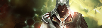
@sinz: lulz, wait till you see the render I used. The whole is oversharpened; in some areas it looks ok but in others (particularly near the text and clipping masks), it's noisy and grainy. Text could be more refined, as it's also oversharpened and it's 'menace' quality sort of diminishes. I would also get rid of the large clipping mask on the top left, it's just very...awkward for some reason and makes me wonder why it's there to begin with.

@inryo: overcontrasted, IMO. The text is decent, but I don't really like how it looks 3D, makes it look cheesy. Otherwise, looks pretty good.

@Paperst: Good start, I suppose. I'm usually very blunt and offensive in my critiques so I'm not good at starting people off. Just go on various GFX sites and check out their resources and tutorials.

Nothing from me in the past few months so trying to get back in (plus I owe a gift to a friend so I want it good >.>)


EDIT: and to answer 1UP's question about the SOTW, I will not start it up again since I'll be out of the country for most of the summer and will have limited internet access, etc. Also because I don't like the new AE.
 

Marthmaster92

Smash Champion
Joined
Jun 29, 2006
Messages
2,564
Location
Stuck between a parallel dimension of code and you
Went through the past couple of pages, and came upon this post.

Are you saying that's always a necessity, or no? Because it's not, and most tags aren't made that way.
I agree. I've never used that method before. o.O Albeit that's a good way to do it in theory, there are many other practical ways to have the correct colors and such.


@Black Waltz: Loving the clean look to it, but I feel like it's missing something. Maybe use some more of them snazzy dna-looking-strand-effects you have in the background on the front? Try an outer glow of about 3.0-5.0, make 'em pop. Just a thought. All in all not bad. KIU.


...thoughts?

BTW, just noticed, i've been on this forum 3 years this month. Man, where has the time gone?


EDIT: I'll throw in my opinion on the SOTW here as well. NO. We had too much trouble with noob voting, people just voting on what had pretty colors or a cool quote, and not what sig was actually better. In my honest opinion, it shouldn't be revived.
 

MojoMan

Smash Ace
Joined
Jun 1, 2008
Messages
975
Location
Brooklyn
cobra, that's meh. the splatters dont really fit and the lighting is off.


2 and 3 are manips.
 

The Dinkoman

Smash Lord
Joined
Apr 13, 2008
Messages
1,277
Location
Back!
Hello :)

this is my first /real/ signature I've made.

C&C, please?

GIMP or Photoshop? Cause thats real good for a first sig. >_> :)

And I think it Might be a little big... Usually I use 380(w) by 127-130(h) But every person is different...

The text needs work, and yes most people on smashboards can read 12 font ;)

And I'm not sure if grunge sigs are still instyle but, its a real good start. :D
 

doom dragon 105

Smash Lord
Joined
Sep 17, 2006
Messages
1,487
Location
Miami
I haven't touched PS in months

Seems everyone is CnC covered

Well It's not finished yet, but can I have some advice on how to fix it and how to finish it **looks a bit brighter in PS which looks better imo :/

 
Status
Not open for further replies.
Top Bottom