• Welcome to Smashboards, the world's largest Super Smash Brothers community! Over 250,000 Smash Bros. fans from around the world have come to discuss these great games in over 19 million posts!

    You are currently viewing our boards as a visitor. Click here to sign up right now and start on your path in the Smash community!

The Sig Critique Topic

Status
Not open for further replies.

Player-4

See you in 25 years
Joined
May 16, 2009
Messages
5,582
Location
Campgrounds, TX
at first i thought it was just a picture... then i saw the c4ds in the back.... the only thing that distracts my eye is the c4d in the front on her shirt and arm. for some reason when i look at the piece my eye is drawn into and focused on that green c4d in the front.. other than that gj.


do you guys think its to choatic? i was playing around with alot more c4ds this time around. im trying to stay away from brushwork.
It's OK. It needs depth, because right now it looks like you just pasted the Climbers over a BG you made.
 

Neon Ness

Designated Procrastinator
Joined
Jul 10, 2008
Messages
3,631
O>O Never seen the Sig Shoppe so dead. Maybe people will come back soon...

thirdkoopa, the best thing about yours is the colors. You've got reddish violets and bluish violets which is a really nice mix, especially where they fade into one another. Some element of randomness is good but I personally think there should be some planning. There's not much variation to look at to keep the attention.

There's a whole lot of negative space on the left. That can be fixed by either moving Koopa left (which I recommend) or just cropping some off. Remember the Rule of Thirds! Plan out what else you'd like to make of this tag and see it through. A sense of direction will really help avoid too much randomness.

This one is old but, eh. Looking back I know the composition leaves much to be desired.


MojoMan

Smash Ace
Joined
Jun 1, 2008
Messages
975
Location
Brooklyn
that actually isn't that bad. THe text is pretty bad though. You need more blending, and the render is too centered.


my latest stuff.
 

Neon Ness

Designated Procrastinator
Joined
Jul 10, 2008
Messages
3,631
@ MojoMan: First tag, really good contrast. The black and white look is overall good, but the girl being inverted looks sort of... not good. I'm not sure why, but it doesn't seem to fit. I think a version with a normal version of her would look nice. The composition's odd in some areas, that white line on the left divides it into 2 separate frames. I don't understand the text placement or size. I get BW for black/white but copying it and reversing it seems sort of odd. Why so huge? Try some smaller/less fancy fonts.

2nd one's my favorite of the 3. Good vectorwork on the faces, but they look a little low quality, could just be my computer screen... I can appreciate the simplicity. I'm not sure if it even really needs much else. Maybe something to flesh out the background? I like how it looks as is.

3rd is a good start but for me, since sprites are so small, I feel like background and special effects have to be really prominent to make up for it. This one's getting there, the lightning creates a good focus. There could be more variation in other places, though, to keep the attention. Great colors. Like outer space or something.
 

doom dragon 105

Smash Lord
Joined
Sep 17, 2006
Messages
1,487
Location
Miami
Oh man haven't posted in probably a year lol

I was messing with CS5 and made this


I don't think it came out too great, however I would love some CnC on it.

I have another sig very similar to it using the same line effects and C4D's, I just wanted to update it with more effects and a prettier girl lol

EDIT:

Messed with it a bit ... I was feeling colorful ..... lol to me it looks messy and her face doesn't have the right color. I've really lost an eye for color and art -_-


Another edit because this thread is dead


Neon Ness

Designated Procrastinator
Joined
Jul 10, 2008
Messages
3,631
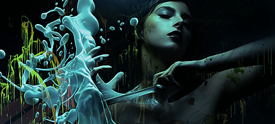
doom, I think the colors work best in v3. She has sort of a sickly skin tone in v2 rofl. Really though, the lighting and effects are well done, there's a lot of color harmony, and I really like the integration of the white lines in v3. My only gripe is she's stuck square in the middle of the composition.

And yeah this thread is sort of dead nowadays. :< I remember when this place always had people posting.

The Sig Shoppe is in a little bit of a drought I guess. We have this thread and several closed shops and that's pretty much it. I was thinking of some way to get some life and activity to the place, and I think Sig of the Week was a good idea when we had it. But I keep running into the same problems.

1. How to decide who gets to be a judge. I would start it myself but I'm not anywhere near an expert sigmaker. :laugh: So I don't think really good people would want to me to be a judge, I dunno. Then it becomes a whole big thing about who's good enough/has the right to judge.

2. Prizes/Incentive. In order to get official prizes like colored names/special titles you have to talk to the staff. And since the AE moderators are already busy with Art With Your Power I'm not sure if they'd have enough time in their schedules to judge an entirely different contest altogether. I guess someone could always just make like a small banner or something for the winners to put in their sigs.

But yeah. My 2 cents of late night rambling. I'm probably overthinking it lol.
 

Neon Ness

Designated Procrastinator
Joined
Jul 10, 2008
Messages
3,631
Yeah, I hate to say it but I don't really know what to say about those. Whatever program you used makes low resolution images, though. :/

Did you cut fox out of a picture? There's a weird blue outline around him, not sure if it's supposed to look like that.
 

Alzi

Smash Master
Joined
Feb 8, 2008
Messages
3,450
Location
New World
Somtimes being harsh is a good thing.

Anything can be a Sig btw.

Seems like the other banners have been rated.

Someone rate my super mario galaxy 2 banner in my sig and tell me what can be improved. I did it awhile ago.
 

Player-4

See you in 25 years
Joined
May 16, 2009
Messages
5,582
Location
Campgrounds, TX
I like it, Alzi, but the lighting is throwing me.

I don't like the green hue either, it makes it look weird.

Mario's focal quality is lacking too.
 

Black Waltz

Smash Champion
Joined
Jan 27, 2007
Messages
2,243
That's really not called for. You could just kindly tell him that this is really not a sig. Don't be an *** about it. You don't want to discourage him from actually learning how to make sigs.
You'd think that a normal human being would try to find some good examples of what a tag actually LOOKS like. Also, you should be used to my method of critique:
1. Make person feel like ****
2. Person begs for advice
3. I give advice
4. ????
5. Profit

Hey guy who needed critique; look at this, study it, analyze it, have eye sex with it and then make another tag.

http://www.globalsigalliance.com/forums/showthread.php?t=9889&page=63
 

Neon Ness

Designated Procrastinator
Joined
Jul 10, 2008
Messages
3,631
Also, you should be used to my method of critique:
1. Make person feel like ****
2. Person begs for advice
3. I give advice
4. ????
5. Profit

Hey guy who needed critique; look at this, study it, analyze it, have eye sex with it and then make another tag.
Crude but effective. Can't argue with the man's logic.

I've actually never visited globalsigalliance yet but I think I'll be browsing there pretty soon.
 

Black Waltz

Smash Champion
Joined
Jan 27, 2007
Messages
2,243
Crude but effective. Can't argue with the man's logic.

I've actually never visited globalsigalliance yet but I think I'll be browsing there pretty soon.
You should, GSA just came back from a two year hiatus.
 

Wschl

Smash Apprentice
Joined
Dec 18, 2008
Messages
167
Location
Germany, Bochum
Black waltz about ur Lulu sig :
U should use some other lightning settings, she looks very unreal at some places , except the Face.
ALso the right Side could use some filling. I would suggest some bg fractal brushin or smth fitting the theme.
One question i came up with: which font did u use for "Final Fantasy" and which did u use for the vertical text at the right side? i like especially the last. Even if Final Fantasy is some standart Font, i would guess Arial/TNR but just in case im wrong.
 

Alzi

Smash Master
Joined
Feb 8, 2008
Messages
3,450
Location
New World
Lets just hope that WB40 comes back and post.

It somtimes depends on your age how good you can be generally the younger you are the more less experience you have and the older you are the more experience you have with graphics.

Black Waltz maybe cropping that sig and taking away most of the right will fix up that mistake of having it too empty. But the problem i see with that is that it would be too akward as it will be placed weirdly.
 

O D I N

Smash Hero
Joined
Mar 13, 2005
Messages
7,408
Location
GameAngel64's house, getting my @#% handed to me.
3DS FC
4098-3123-8629
You'd think that a normal human being would try to find some good examples of what a tag actually LOOKS like. Also, you should be used to my method of critique:
1. Make person feel like ****
2. Person begs for advice
3. I give advice
4. ????
5. Profit

Hey guy who needed critique; look at this, study it, analyze it, have eye sex with it and then make another tag.


http://www.globalsigalliance.com/forums/showthread.php?t=9889&page=63

Yup. I don't remember the last time I was here, but that's BW all right.

So how ya doin' BW?

Rest o' the Sig critique board?
 

Black Waltz

Smash Champion
Joined
Jan 27, 2007
Messages
2,243
Yup. I don't remember the last time I was here, but that's BW all right.

So how ya doin' BW?

Rest o' the Sig critique board?
Ohai O D I N, long time no see :)

Haven't done any tagging in a long time, so hopefully I can get started back up.
 

Charmander

Smash Champion
Joined
Jan 4, 2010
Messages
2,015
Location
The Middle Pokeball
NNID
JoeThorpedo
The tiny blue outline around fox, Maybe we could make it so he looks like hes glowing blue? i dunno.

My sig is for my fangame Pokemon Gypsum, Made totally from scratch.
 

Neon Ness

Designated Procrastinator
Joined
Jul 10, 2008
Messages
3,631
Haven't done any tagging in a long time, so hopefully I can get started back up.
Yeee I feel the same way. After this last week of summer school I'm gonna try to start making some better tags. Like way better.

@ charmander: If it's like an advertisement or something then it needs to pique our interest somehow. Just looking at that doesn't let me know it's a fangame, I wouldn't have known what that was if you hadn't said.

There's just not much going on. A Pokemon (I don't recognize that one, actually) on the left, some huge text on the right, and a pixelated background. Even if it is Pokemon related I think it might be better to choose another (simpler) typeface and use it for both words for consistency. The words are also blurry. Did you save as a .jpeg? Sometimes that causes the image to lose quality, try to always save as a .png.

The way that... thing's head is showing and the rest of it's cut off is also weird in terms of composition. At least creating some darker areas or blur to hide where it's cut off would look a little more "worked on", but to just chop it off right there so abruptly makes it look unfinished.

I dunno what the game's about but maybe that banner could tell us a little more with visuals.
 

O D I N

Smash Hero
Joined
Mar 13, 2005
Messages
7,408
Location
GameAngel64's house, getting my @#% handed to me.
3DS FC
4098-3123-8629
@ charmander: If it's like an advertisement or something then it needs to pique our interest somehow. Just looking at that doesn't let me know it's a fangame, I wouldn't have known what that was if you hadn't said.

There's just not much going on. A Pokemon (I don't recognize that one, actually) on the left, some huge text on the right, and a pixelated background. Even if it is Pokemon related I think it might be better to choose another (simpler) typeface and use it for both words for consistency. The words are also blurry. Did you save as a .jpeg? Sometimes that causes the image to lose quality, try to always save as a .png.

The way that... thing's head is showing and the rest of it's cut off is also weird in terms of composition. At least creating some darker areas or blur to hide where it's cut off would look a little more "worked on", but to just chop it off right there so abruptly makes it look unfinished.

I dunno what the game's about but maybe that banner could tell us a little more with visuals.
This. There really isn't much else to say. The words are dark too. Sorry to piggyback, but he summed it up.


First in a long time. I really like it. Glad I didn't scrap it after the first half hour of staring at it. O_O
 

Gypsy Lee

Smash Champion
Joined
Apr 24, 2007
Messages
2,331
Location
Bethany, West Virginia


First in a long time. I really like it. Glad I didn't scrap it after the first half hour of staring at it. O_O
Bring her right arm back, her left arm forward, add lighting under her left arm, sharpen that soft brush lighting and reduce the fill. Hmm... add some greens or blues then filter the piss out of it to make the colors more vibrant. My two cents. :lick:
 

A_man13

Smash Master
Joined
Apr 6, 2008
Messages
3,535
Location
Auburn, Al
This. There really isn't much else to say. The words are dark too. Sorry to piggyback, but he summed it up.


First in a long time. I really like it. Glad I didn't scrap it after the first half hour of staring at it. O_O
First off, great signature. Sure is a lot better then the crap I've been pulling out lately. Take note of this signature for those who are just starting out sig making.

First off, As Gypsy pointed out you might want to send the right arm to the back (darken it a bit) and the left arm to the front (slightly blur it). Not only does this bring out the focal, it will add to the flow of the signature and really make it pop.

I can't help but feel that the effects and the render don't match color wise. It looks great, mind you, but adding some effects that better match the colors would really make the signature stand out.

--

Wow, Gypsy Lee, O D I N, and myself. Is it just me or are old faces re-surging?
 

Alzi

Smash Master
Joined
Feb 8, 2008
Messages
3,450
Location
New World
Nice banner Odin. I'd just add some filters to it like Gypsy Lee said to make it all good.

Made a new banner for skyward sword.

Need suggestions on how to improve it if possible.
 

Marthmaster92

Smash Champion
Joined
Jun 29, 2006
Messages
2,564
Location
Stuck between a parallel dimension of code and you
Ridley is makin a comeback... >.>

Thanks for the CnC guys. I'll give it a try. :D
You still get props for making a Cammy sig. SSF4 FTW, man.


CnC. Older one, haven't done anything in a long time. Might get back into GFX when I get my new Computer Tower in.


Effects are done by me, btw. Wanted a cleaner look for it.

----------


Speaking of old vets coming back, what's up y'all.
 

A_man13

Smash Master
Joined
Apr 6, 2008
Messages
3,535
Location
Auburn, Al
Holy cow, vets ARE coming back! Long time, no see.

The effects on that are great, Marthmaster. The only issue I see is that the effects don't lend itself to a particular flow. Try and make the flow a bit more clear. Otherwise, all I can say is wow.
 

Marthmaster92

Smash Champion
Joined
Jun 29, 2006
Messages
2,564
Location
Stuck between a parallel dimension of code and you
Hahahhhh, I see smashboards hasn't changed a bit. XD


I've done a lot of GFX work since I left the forums, and I've long abandoned the sense of "flow", no offense. I look at the piece as a whole, anymore. I work with what colors go with what, the contrast, placement, , depth, *sometimes* and the overall look of it. </mini rant>


Not upset or anything, just feels good to be back. In a way. lol. And if you like that one, you should see some of the other ones I've done. :chuckle:
 

A_man13

Smash Master
Joined
Apr 6, 2008
Messages
3,535
Location
Auburn, Al
I really like that signature even if the effects are random. The flow would be nice, but it's not always a necessity. Besides, a lot of advance signatures abandon it nearly entirely.

I'd show off some of my work, but my new stuff is crap. Even "crap" is being generous.
 

Marthmaster92

Smash Champion
Joined
Jun 29, 2006
Messages
2,564
Location
Stuck between a parallel dimension of code and you
I really like that signature even if the effects are random. The flow would be nice, but it's not always a necessity. Besides, a lot of advance signatures abandon it nearly entirely.

I'd show off some of my work, but my new stuff is crap. Even "crap" is being generous.
Random is good sometimes. lol.


And hey, throw it out there. That's how you get better, getting critiques and experience.
 

A_man13

Smash Master
Joined
Apr 6, 2008
Messages
3,535
Location
Auburn, Al
Even if my signatures were amazing, I haven't made anything in a while. Even my current signature is at least 3 moths old. I haven't made anything in a long time nor do I really even plan to. Even my Pokesplicing has gone downhill because of my break (and that is hard to screw up).
 
Status
Not open for further replies.
Top Bottom