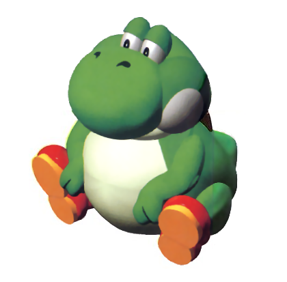
- 10/10. One of my favorites. The way it is positioned makes it look cool, and that's how DS should be.

- 10/10. Love the stance. Sword and shield well positioned and overall demonstrates who he is well.

- 9/10. Looks like he got out of bed, but the pose fits him.

- 10/10. The way the sword and Ike are positioned makes this render a good one.

- 9/10. I like that they are all doing something - attacking as a team. One fault is that it makes the individual Pokemon's renders look out of place.

- 10/10. This is
@Diddy Kong. Fun and sporty.

- 8/10. The addition of the snake is perplexing and it makes the stance jarring.

-10/10. Not much of a Sonic guy but this one captures the cocky attitude he has whilst showing some action.

- 10/10. Simple, but effective.

- 7/10. It does show you that Olimar uses Pikmin, but it's doesn't really work as a render.

- 8/10. It's alright, but the Smash 4 render is better. I think the pose there shows his character more.

- 10/10. It shows ROB as a sentient being rather than a mere robot like Smash 4 and especially Brawl.

- 9/10. Looks too angry for Toon Link but I dig it. The way the sword is positioned makes the render tick for me.

- 9/10. Beastly, but the position of his head makes it look small kind of?

- 10/10. His Smash 4 one was good, this one improves it. The addition of the net and the stance are definite improvements.

- 10/10. The pose and the addition of him doing an action makes it another improvement on the previous one.

- 9/10. Definitely in character and looks more natural than Smash 4's which was a bit awkward.

- 10/10. Luma and Rosalina are positioned much better here than in Sm4sh. It shows more that they are a team.

- 10/10. A fan of the boxing stance he has. The Smash 4 render was jarring a bit.

- 10/10. Didn't re-use the Pokemon artwork. Shows more life the way he is now.

- 10/10. They show more life.

- 10/10. Wow she's actually doing something in the render. The way everything is angled is perfect.

- 10/10. Another Smash 4 newcomer with a better render. Like the rest, they simply show more life.
:ultrobin- 10/10. This one actually makes him look like a fighter rather than a librarian.

- 10/10. One of my favs. The way he positions the Monado and his stance are baller.

- 9/10. Showcases his personality better, but I find the render somewhat awkward due to him jumping out of the kart ever so slightly.

- 6/10. Not a fan of this one. The stance is awkward and the angle is off-putting with the rest of the cast. Smash 4's was much better.

- 10/10. This one shows he means business better than the previous installment. Everything about it is perfect.

- 10/10. Better than Sm4sh's for the pose alone. Love that the sword is more in focus with Cloud.

- 9/10. Slightly better than Smash 4's, but roughly the same quality really. Female Corrin's was nerfed hard, though.

- 10/10. The direction for this one is much better. Shows the sass AND class of Bayonetta exceptionally well.

- 9/10. It's what you'd expect from the Inklings.

- 10/10. I enjoy how menacing he looks. The mouth is key for this render.

- 9/10. Not much to say here.

- 10/10. The pose is slightly better than Simon's for me.

- 9/10. The details on his scales pop here and I enjoy sassy Rool, but he's missing a goofy element.
Alright that's done jeeeeez. Has a Direct been confirmed since lol.
...


