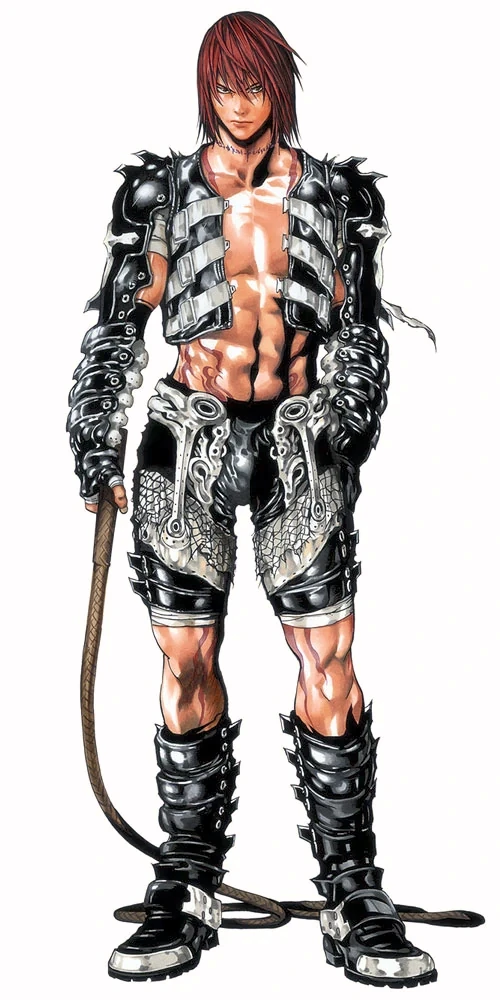
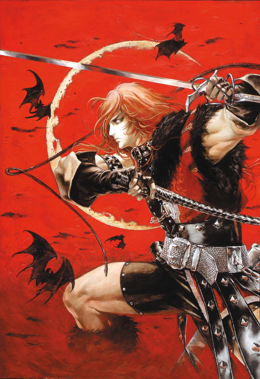
If Simon were to make it, I hope we get Simon's Castlevania Chronicles look.
I know it's not everyone's favorite look for him, but I kinda dig the gothic asthetic he has going. Better than his horrendous Judgement design.
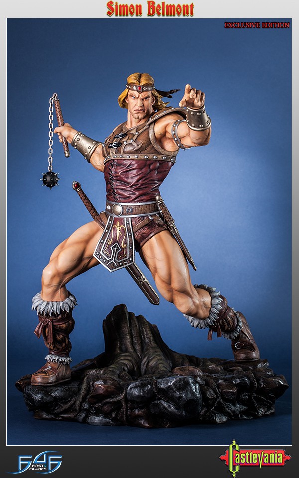
Meh, no thanks, i want the old school barbarian Simon Belmont:
The one you see here is specifically the one based on the Neca Figures design, which takes heavy inspiration from
the Cover art of Castlevania 1 (which is drastically different from
the instruction manual artwork, altough it is MUCH better i might add)
It helps that most Konami games of recent age have actually been pushing for this design such as
Super Bomberman R and
Grimoire of Souls.
It's interesing in the case of Grimoire of Souls because the artist for that game is Ayami Kojima, the same one behind the Chronicles design. It seems now they are pushing this deisng as the default appereance of Simon Belmont and is possible the Netflix series might use this one too if they want to keep consistency for the designs of the characters (which would be a monumental feat for the Castlevania series) regardless of artist.
and im honestly glad that they are fading Chronicles Simon away from the public, since i never liked it at all and the only reason i tolerate it and people (myself included) know about it is because they were heavily pushing it back in the 2000's (when Ayami Kojima was the ilustrator of almost every Castlevania game with a few exceptions here and there) and not to mention not a lot of people in particular care about Chronicles (really the only thing most people would know about is Simon Belmont's design) it's not that i dislike Ayami's artwork in gneneral, i love most of her artwork (and i would have prefered Trevor's design over to one we got for the Netflix show, but if i complained about the Netflix show i would be doing it all day) but Simon's design clearly looks like as if she tried to keep the barbaric style (because Simon is still a long-haired, tall muscular man with a sword on his belt just like the Classic Simon deisgn) and at the same time add gothic and bishonen (a common trope that she uses for almost every male protagonist the she designs to the point it gets tiresome) aesthetics on top of it, and it just looks wrong.
Hell i actually like Ayami's interpretation of the Classic Barbaric Simon design better than the Neca figures one, which makes me wonder why she even bothered to do this unnecessary Chronicles redesign when she was perfectly capable of drawing the former.
Although i do prefer
his design from Castlevania for the Sharp X68000, which is my favorite by far, but i know the Neca figures-cover art inspired Simon Belmont is the most likely if we go by Simon's recent portrayals (and im not that bothered because both of them are similar)
Also, anything is better than Judgement's character designs. You have to go out of your way to make something worse than Judgement.


