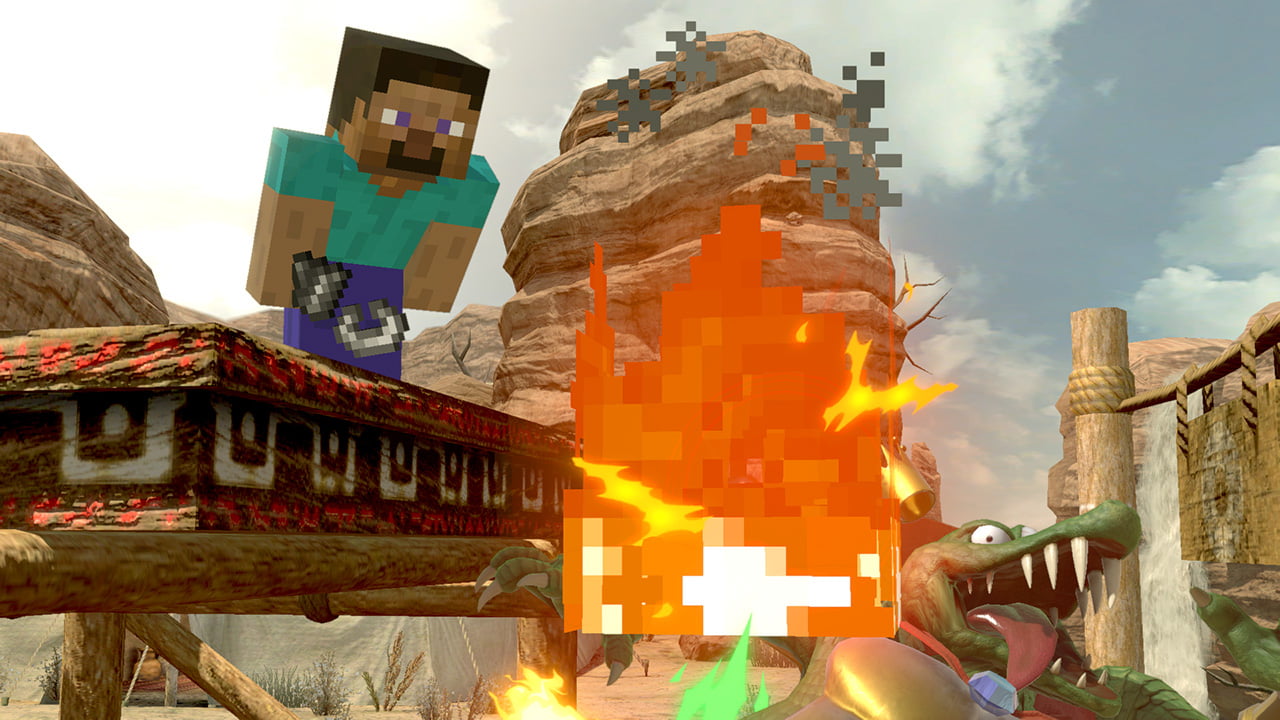
Honestly, how would they make Steve fit in Ultimate's style though? Someone suggested the promotional art, but honestly, I can see people still complaining over that. I think Sakurai made the best decision on what to go with Steve.
This wasn't even a question before yesterday. Now Steve gets in bringing his own aesthetic with him and people can't fathom how it'd be different.
Like I said, there are other mockups out there, created for the purpose of emulating Smash style, that the fans have previously expressed positivity for.
And yes, people would still complain about it (I believe there would be fewer, as being in-line with the Smash aesthetic is the norm, but sure - there'd be complaints). But it's Steve, people are going to complain regardless. Scratch that, it's a new Smash character. Complaints come with the territory.
Also Steve being different and blocky compared to the others is quite charming in a way. If everything has to be "Smashified", do you want Mr. Game and Watch to have eyes and ears now?
Mr. Game & Watch has been Smashified as much as he can be without a drastic redesign. In his case, it's getting an outline around him so he doesn't clash with the stage. He's an outline, a shadow. There's only so much he can be altered. And even then he's been redesigned over time to reduce his bulkiness.
Steve is a character that has a z-axis, a colour palette, and multiple official renditions. It's not like he's without room for variation.


