• Welcome to Smashboards, the world's largest Super Smash Brothers community! Over 250,000 Smash Bros. fans from around the world have come to discuss these great games in over 19 million posts!

    You are currently viewing our boards as a visitor. Click here to sign up right now and start on your path in the Smash community!

Full-Roster Character Select Screen

hotdogturtle

Smash Master
Joined
Feb 15, 2007
Messages
3,503
Random on the bottom is a bit awkward, yes, but with the layout that we're discussing, there's no room for it in the actual cluster with the characters.
 

Jyro

Smash Cadet
Joined
Apr 12, 2008
Messages
58
Location
NJ
NNID
TheChooseGoose
guess i'll take a shot

-manly characters on sides facing inwards
-swordsmen ... in the shape of a sword
-gliders in same general area
-samus/zss -- zelda/shiek (transformers kinda)
-cartoony characters on left, more realistic humanoid characters on right
-dk-peach
-falco evolves into DDD
bottom row may need most change for random/additional characters
 

MaxThunder

PM Support
Joined
May 27, 2008
Messages
1,962
Location
Norway=)...
Everyone go home.

I've perfected it.

i'd want this ^^ or this vv if mother and fire emblem switched places...

It doesn't look as good with the single random slot, but here is a take with that in consideration.
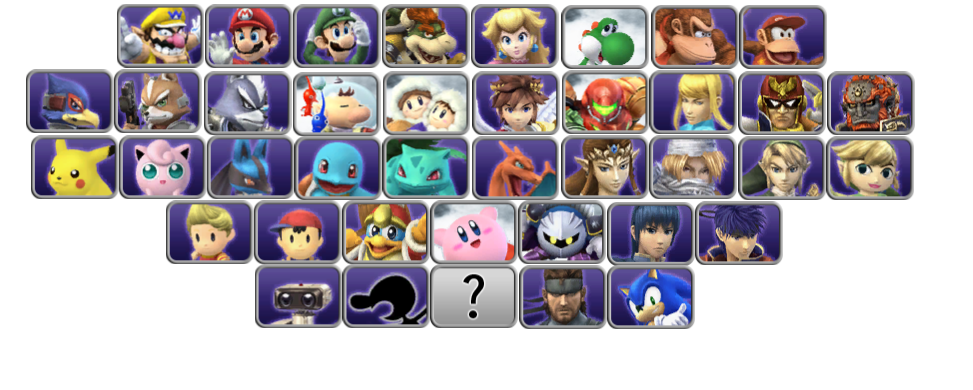
wait... did mother and fire emblem just switch places in there ^^ or is it just me?..
if it's just me then that one was the best all along...
 

9bit

BRoomer
BRoomer
Joined
Jun 28, 2005
Messages
2,740
Location
Illinois
*Heave* Let me just dig this up for a second.

OK so check this out. Clone engine is a real thing. Roy is gonna be in the game. And probably Mewtwo.

With those two additions in mind I made a new one of these based off the Melee character select screen. It keeps most characters in very similar spots but unfortunately has a hole in it. Not a problem if we get a third new character, but the whole thing falls apart if we get more than that.

So here it is:


Here is the Melee CSS for comparison:


Similarities to note:
  • Mario cast on top in the same order, but Wario replaces Dr. Mario.
  • Captain Falcon and Ganondorf in same spots
  • Star Fox cast in the same location, + Wolf
  • Ness is still next to Fox and Ice Climbers
  • Ice Climbers are one space to the left of Kirby still, who is near the middle
  • Zelda cast is on the right side with Toon Link replacing Young Link and Zelda/Sheik set up as "clones"
  • Fire Emblem cast below that with Roy still in clone spot
  • Pokemon on the bottom in the same order except Pichu is replaced by Lucario
  • Game and Watch is one slot to the right of Mewtwo and is next to a Fire Emblem character
The only real problems are the gap and the Samus / Donkey Kong thing. Overall not bad I'd say. Both of them can be set up in clone formation as you can see, but doing that moves one or the other out of Melee positioning. No other characters are clone-like enough to fill that bottom left position, though.

Anyway I'm pretty happy with it.

Finally, here's one that removes the gap but loses a little Melee-likeness in the process:


smashbro29

Smash Champion
Joined
Oct 9, 2007
Messages
2,470
Location
Brooklyn,NY,USA
NNID
Smashbro29
3DS FC
2724-0750-5127
Yoshi and Wario aren't Mario characters, Gotta take that into account with these things.
 

Phaiyte

Smash Ace
Joined
Jul 6, 2010
Messages
932
Yoshi and Wario aren't Mario characters, Gotta take that into account with these things.
In all fairness, his first appearance ever was in a Mario game.

But this CSS would look sick with Mewtwo filling in for the symmetry on the bottom
 

smashbro29

Smash Champion
Joined
Oct 9, 2007
Messages
2,470
Location
Brooklyn,NY,USA
NNID
Smashbro29
3DS FC
2724-0750-5127
In all fairness, his first appearance ever was in a Mario game.

But this CSS would look sick with Mewtwo filling in for the symmetry on the bottom

Oh not to discount any of the stuff here, it's really nice just in this game they aren't Mario characters. Wario and Yoshi have their own logo. Gotta follow those logos.
 

Pwnz0rz Man

Smash Lord
Joined
Mar 30, 2008
Messages
1,862
Location
Nowhere, Kansas
3DS FC
1950-9089-5761
These look pretty good, the only question I have is why Wario takes the left corner instead of Mario. He isn't representing the Mario franchise in Smash, and Mario is Mr. Nintendo, you'd think Mario would push his chubbier rival over near Yoshi.
 

Comeback Kid

Smash Champion
Joined
Dec 25, 2009
Messages
2,431
Location
Parts Unknown
With those two additions in mind I made a new one of these based off the Melee character select screen. It keeps most characters in very similar spots but unfortunately has a hole in it. Not a problem if we get a third new character, but the whole thing falls apart if we get more than that.
9 Bit, why not experiment with removing the central question mark random select icon and instead fill it's slot and that missing slot with characters, add random select question marks on both sides at the bottom. Keeps things totally even while giving you more slots to play with.
 

Comeback Kid

Smash Champion
Joined
Dec 25, 2009
Messages
2,431
Location
Parts Unknown
How I would change the older CSS 9 Bit made assuming two clone characters. He was nice enough to make it for me so here it is.


For reference, this is what that looks like all put together:

- Luigi to Mario's left (blasphemy I know, but he is the only clone now that Dr. M is gone, put him where he belongs I say!)

- Wario goes after Yoshi but before DK

- Kirby centered by moving Meta Knight where Kirby currently is and vice versa.

- Olimar to the left of C. Falcon (after the dead Pikmin in SSE, they have a grudge)

- Pit in Olimar's place, along with G & W below him so the 4 classic characters are all together in a square.

- Snake and Sonic obviously both move one to the right.
 

Little Nemo

The Dream Master
Joined
Oct 18, 2012
Messages
357
Location
Moses Lake, WA
NNID
LockableFaceman
Oh not to discount any of the stuff here, it's really nice just in this game they aren't Mario characters. Wario and Yoshi have their own logo. Gotta follow those logos.
Okay well Wario is his own thing placed before the Mario characters and Yoshi is his own thing placed after the Mario characters.
Problem solved.
 

9bit

BRoomer
BRoomer
Joined
Jun 28, 2005
Messages
2,740
Location
Illinois
Edit: One of my last posts in this thread I promise lol. How I would change this current CSS 9 Bit made assuming two clone characters.


- Luigi to Mario's left (blasphemy I know, but he is the only clone now that Dr. M is gone, put him where he belongs I say!)

- Wario goes after Yoshi but before DK

- Kirby centered by moving Meta Knight where Kirby currently is and vice versa.

- Olimar to the left of C. Falcon (after the dead Pikmin in SSE, they have a grudge)

- Pit in Olimar's place, along with G & W below him so the 4 classic characters are all together in a square.

- Snake and Sonic obviously both move one to the right.
For reference, this is what that looks like all put together:


9bit

BRoomer
BRoomer
Joined
Jun 28, 2005
Messages
2,740
Location
Illinois
Another attempt, this time adding one more character to the roster to even things out and make it look real nice.


As you can see I added Shadow, but not for any reason other than he's like a "clone" type of Sonic, so he fits the pattern. It could be anybody. But you can see what I'm going for.

Also, it's more Melee-like than the previous ones because it puts Kirby dead center and keeps DK and Samus pretty close to their Melee positions.

Ice Climbers, Pit, ROB, G&W, Olimar, and Snake can of course all be moved around within their positions, it doesn't really matter where they are. And Sonic would be moved if Shadow were not added, obviously. The side slot would be reserved for a character that has a clone-like counterpart.
 

schavira

Smash Journeyman
Joined
Jun 17, 2013
Messages
210
Location
NYC


with removed Melee characters (minus Dr. Mario)

Clone teams of three bookend the Star Fox/Zelda row.

The third and fourth rows are interchangeable. It actually makes more sense to have the third row on the bottom because of the series diversity, but I kept Pokémon/Fire Emblem below to emulate Melee. Snake was moved to the top row to solve a spacing problem. It places the three muscular male characters next to each other. Sonic is in the middle to emphasize importance of inclusion.
 

Chzrm3

Smash Ace
Joined
Feb 4, 2008
Messages
625
3DS FC
3926-5442-3703
Seeing all those Pokemon on the bottom row is seriously a beautiful sight. :D
 

schavira

Smash Journeyman
Joined
Jun 17, 2013
Messages
210
Location
NYC


This is my new guess. It would make a lot of sense to switch the positions of the Star Fox and Legend of Zelda characters at this point, now that things are not exactly like Melee anymore. But the competitive players would probably throw a fit. It would make a lot of sense to have Mario, Link, Pikachu and Kirby (the four "Smash Bros." in the Brawl E3 trailer) on the column furthest to the left., switching Star Fox/Zelda and Fire Emblem/Kirby, and adding two more characters to make it rectangular (Pichu? Young Link?).
 

schavira

Smash Journeyman
Joined
Jun 17, 2013
Messages
210
Location
NYC


This could be a nice redesign.

Things to note:

First column are the starting characters in the E3 Brawl trailer
Second column characters are clones (approximately)
First row is Mario/spinoffs/class of '86 (also the two non-Meta Knight characters introduced in the E3 trailer, next to each other)
Second row is Zelda/non-Metroid space explorers
Second row is bookended by two sets of three clones with a near-identical moveset
Third row includes nearly all of the custom characters (save Young Link) and Nintendo's two biggest traditional RPG franchises
Fourth row features all of the oval-eyed characters
Fourth row is Kirby/Mother/classic/third-party
All "clones" are next to one another
 

splat

Smash Lord
Joined
Oct 28, 2006
Messages
1,169
Location
The Netherlands

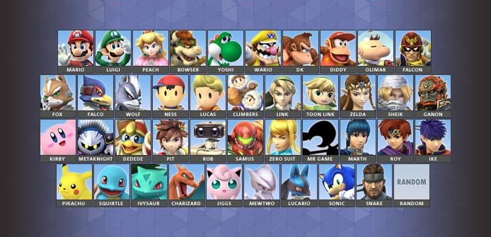
I did one as well, tried to keep the Melee roster somewhat intact. Settled on a 10-11-11-10 roster; I thought it looked the nicest.

Top row is still Mario and his comrades - included Wario and Diddy - and Captain Falcon. Put in Captain Olimar as well: OIimar was based on Mario, so it makes some sense to me, and now the two Captains are next to each other as well. Falcon is the last one in the row so that he still connects with Ganondorf.

Second row is more or less Melee's - but extended with the new characters: Wolf, Lucas, Toon Link and Sheik. Also hauled Ganondorf's ass down a row so that all the Zelda characters are on the same row; it's OCD or something.

There's two series that did not make the second row because of the new characters:
Kirby and Metroid move down one row. Pit is closer to the Kirby characters because they're all multi-jumpers (with Charizard and Jigglypuff somewhat connected below as well). ROB is there because I needed to fit him in somewhere, might be better if he'd be after Metroid, but I liked this one better from an aesthetic view. Mr. Game and Watch and Fire Emblem moved up one row, and they're still next to each other like in Melee.

Finally, the row of Pokemon - bottom row, like in Melee. Pikachu first, being the face of the series, then the rest of the first generation and finally Lucario, who is connected to Mewtwo.

Guest characters (aka third parties) are last, I only thought it'd make sense. Random button is bottom right because Melee (somewhat) and Brawl had it there.

All 'clone'-ish characters are connected one way or another to their respective base.
 

HMWii22

BRoomer
BRoomer
Joined
Sep 28, 2005
Messages
860
Location
Toronto
Those last two look really spiffy but can the actual look and feel of the CSS be changed like that? Or only the positioning
 

Comeback Kid

Smash Champion
Joined
Dec 25, 2009
Messages
2,431
Location
Parts Unknown
In the original post it says there is only room for 10 boxes per row. So it probably means 5 rows is necessary, though either 11 boxes per row or 5 rows total will look cramped.
 

AnOkayDM

Smash Champion
Joined
Mar 10, 2010
Messages
2,235
Location
Shoreline, WA
NNID
EvanescentHero
Those last two look really spiffy but can the actual look and feel of the CSS be changed like that? Or only the positioning
The look can be changed, I'm pretty sure.

Comeback Kid is right though, the maximum we can have is fifty slots, with five rows of ten. The absolute maximum is ten per row (unless the PMBR wizards can magic that away too).
 

9bit

BRoomer
BRoomer
Joined
Jun 28, 2005
Messages
2,740
Location
Illinois
I'm going to have to update the OP. But I am currently too lazy to log out of this account and in to that one, and also to actually do the updating... but I will do it.
 

9bit

BRoomer
BRoomer
Joined
Jun 28, 2005
Messages
2,740
Location
Illinois
Alright here is a version that goes 9 10 9 10 9 in rows.


It takes into account a total of 47 characters plus one random slot. According to some people, 7 is the max number of characters that are able to be implemented using the Clone Engine. We already know that Roy and Mewtwo will be in the game, so that leaves 5 slots that I've numbered, shockingly, 1 through 5. These are placeholders until more characters are announced.

This is very close to Melee's CSS with the notable exception of Kirby. The "Brawl Newcommers" Olimar, Pit, Snake, Sonic, and ROB can of course be switched around with the 1 through 5 placeholders if need be.

Again, here is the Melee CSS for comparison:


The thing is, regardless of the specific positions of each character, with 47 total slots to be represented, I think a 9 10 9 10 9 layout is the best choice. It allows for the Random icon to be directly in the middle, which people seem to really want, and it's the only way to evenly distribute the entire cast.
 

ChronoBound

Smash Hero
Joined
Sep 20, 2006
Messages
8,998
That arrangement is perfect (9 10 9 10 9)

Here is how I would do the "feng shui" to "complete" Project M roster (adding the possible newcomers of Ridley, Isaac, Dixie Kong, Lyn, and Sami/Andy).

I would have the first row be entirely Mario "universe" characters (main Mario series, Yoshi, Wario, and DK characters). Basically, leave this row the same as it is you have, only adding Dixie Kong to the right of Diddy Kong.

Second row would be the one with Nintendo's "fantasy"/"anime" series (Zelda, Fire Emblem, Kid Icarus), those series with basically sword/blade wielding protagonists and an overall "anime" aesthetic". It would begin with the Fire Emblem characters, with the first starting at the furthest left being Roy (since he is derived from Marth), followed by Marth, Ike, and Lyn. Next would be Pit to separate the FE and Zelda series. The last Zelda character in this (the furthest right), would be Ganondorf.

The third row would consist of Nintendo's "space" series (Metroid, Star Fox, F-Zero, Pikmin). The furthest left character of this row is Falco (due to being derived from Fox). After Falco, there is Fox, Wolf, and Olimar. The next icon is the Random Icon (which I think is for the best for it to be smack right down in the middle of the selection screen). After the Random icon, you have Samus, Zero Suit Samus, and Ridley. Last you will have Captain Falcon (hence, Captain Falcon and Ganondorf will still be adjacent to one another).

The fourth row consists of series in which HAL Laboratories helped develop (Kirby and Mother), the Retro trinity, and the two guests. The row begins with Lucas (again due to being derived from Ness), followed by Ness. After that, you have Kirby, Meta Knight, and King Dedede. Next is the three retro characters (Ice Climbers, Mr. Game & Watch, and ROB). Finally, the row is concluded with the two guests, Snake and Sonic.

The last row (bottom most) consists of Nintendo's primary handheld franchises (franchises that are mostly handheld, or rather have nearly all of their most famous installments on handhelds only). This row can begin with the seven Pokemon characters. After Mewtwo or Lucario, the row is concluded with the new handheld series newcomers (Golden Sun and Advance Wars), with Isaac and Sami/Andy.

I think that would be a pretty spiffy character selection screen.
 

splat

Smash Lord
Joined
Oct 28, 2006
Messages
1,169
Location
The Netherlands
Here is how I would do the "feng shui" to "complete" Project M roster (adding the possible newcomers of Ridley, Isaac, Dixie Kong, Lyn, and Sami/Andy).

[...]

I think that would be a pretty spiffy character selection screen.
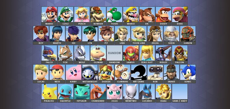
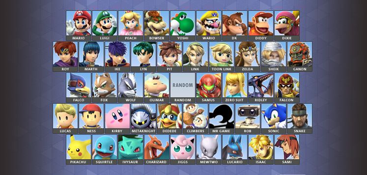
For those who prefer a visual interpretation as opposed to a written one:


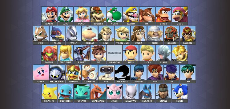
Also, did a version of my own preferred full roster layout, using most of Chrono's suggestions but replacing Sami / Andy with Claus:


splat

Smash Lord
Joined
Oct 28, 2006
Messages
1,169
Location
The Netherlands
Thank you very much. I deeply appreciate your efforts. Could you make one with Sami next to Isaac? Thanks a lot again.
No problem. Just left home though, and I won't be back for the next six hours or so.

Also, do you know of any 3D models of Sami, or do I really have to combat my OCD and put in a drawn piece of artwork?
 

ChronoBound

Smash Hero
Joined
Sep 20, 2006
Messages
8,998
No problem. Just left home though, and I won't be back for the next six hours or so.

Also, do you know of any 3D models of Sami, or do I really have to combat my OCD and put in a drawn piece of artwork?
Another change would be to make Snake the furthest right on the row above the Pokemon/GBA row since Sami/Andy and Snake would be clones (kind of like how Falcon and Ganondorf are sorta of adjacent).

However, unfortunately, I don't think there is any 3D artwork of of those two Advance Wars characters (or any for that matter).

Thanks again for taking the time to make of an image of what I talked about. You didn't have to.
 

Friesnchip

Smash Journeyman
Joined
Sep 25, 2013
Messages
324
Location
United States
I'd personally prefer to have the order as:

Marth - Roy - Ike

Fox - Falco - Wolf

Ness - Lucas

I'm not big on copying Melee's clone characters on the outer edge layout, at least on the left side. But otherwise, the 9-10-9-10-9 layout looks fantastic, the organization of the characters is perfect, and I'm fine with the clone engine character choices (not that this is set in stone or anything).
 

ChronoBound

Smash Hero
Joined
Sep 20, 2006
Messages
8,998
I'd personally prefer to have the order as:

Marth - Roy - Ike

Fox - Falco - Wolf

Ness - Lucas

I'm not big on copying Melee's clone characters on the outer edge layout, at least on the left side. But otherwise, the 9-10-9-10-9 layout looks fantastic, the organization of the characters is perfect, and I'm fine with the clone engine character choices (not that this is set in stone or anything).
Yeah. I am having so second thoughts on that. However, I still would want Ganondorf/Falcon and Snake/Sami to be the furthest right of their respective rows.
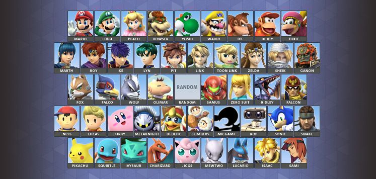
Once again, great job splat. It just looks great and looks like a real roster screen would be arranged.
 
Top Bottom