-
Welcome to Smashboards, the world's largest Super Smash Brothers community! Over 250,000 Smash Bros. fans from around the world have come to discuss these great games in over 19 million posts!
You are currently viewing our boards as a visitor. Click here to sign up right now and start on your path in the Smash community!
It appears that you are using ad block :'(
Hey, we get it. However this website is run by and for the community... and it needs ads in order to keep running.
Please disable your adblock on Smashboards, or go premium to hide all advertisements and this notice.
Alternatively, this ad may have just failed to load. Woops!
Please disable your adblock on Smashboards, or go premium to hide all advertisements and this notice.
Alternatively, this ad may have just failed to load. Woops!
Full-Roster Character Select Screen
- Thread starter 9bit_alt
- Start date
Kor of Memory
Smash Rookie
- Joined
- Nov 21, 2013
- Messages
- 13
I there any reason we can't do a more vertical menu? Putting the player boxes in each corner while all the character take up the center of the screen from top to bottom?
I there any reason we can't do a more vertical menu? Putting the player boxes in each corner while all the character take up the center of the screen from top to bottom?
It could certainly work, and someone tried it earlier in the thread, but that would be a huge break from Smash tradition, especially for a mod attempting to live up to the organizational standard set by Melee. It might scare off newcomers.
splat
Smash Lord
I think most games use horizontal tile roster (or a vertical, scrolling one). At least, I expect one when I boot up a game with a fairly large roster.I there any reason we can't do a more vertical menu? Putting the player boxes in each corner while all the character take up the center of the screen from top to bottom?
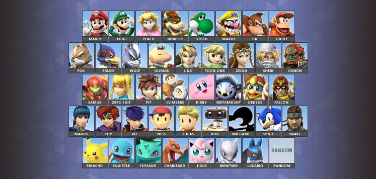
I noticed people still post rosters; I still prefer an 8-9-8-9-8 kind of roster as opposed to the 9-9-9-9-6 we have now:

Kor of Memory
Smash Rookie
- Joined
- Nov 21, 2013
- Messages
- 13
That looks gorgeous. Do you have that pac file available?
I think I would change that up ever so slightly.
Probably move the Zelda character all the way to the left, withe Capt. Falcon next to Ganondorf and then the Spacies. Then move Olimar down there next to Dedede.
I think I would change that up ever so slightly.
Probably move the Zelda character all the way to the left, withe Capt. Falcon next to Ganondorf and then the Spacies. Then move Olimar down there next to Dedede.
splat
Smash Lord
There's no .PAC file for it, it's a mock-up I made. If I knew how to hack the character selection screen, I might've tried to make something similar, but I'll just keep stage hacking for now.
Is it possible to hack the CSS? Because your menu and the menu on the OP look MUCH better than all the box-shaped ones we currently have...There's no .PAC file for it, it's a mock-up I made. If I knew how to hack the character selection screen, I might've tried to make something similar, but I'll just keep stage hacking for now.
Kor of Memory
Smash Rookie
- Joined
- Nov 21, 2013
- Messages
- 13
Is it possible to hack the CSS? Because your menu and the menu on the OP look MUCH better than all the box-shaped ones we currently have...
I know it's possible, I was screwing around with it the other day before 3.0 came out, but I didn't know enough of what I was doing to complete it.
Something like a program called Brawlbox to extract the file out, and then a CSS organizer to manipulate it.
Kor of Memory
Smash Rookie
- Joined
- Nov 21, 2013
- Messages
- 13
I did this before 3.0 came out, but I couldn't get it to actually work in game


I will definitely look into it :3 Thanks~I know it's possible, I was screwing around with it the other day before 3.0 came out, but I didn't know enough of what I was doing to complete it.
Something like a program called Brawlbox to extract the file out, and then a CSS organizer to manipulate it.
While we're at it, can we banish all box-shaped menus forever? They're all incredibly dull...

Mockup of what we are looking at with Waluigi (this is assuming Waluigi is not included as part of the Mario team and is either of the Wario universe or receives his own designation)
I switched up the Zelda characters a bit, mainly so Zelda/Sheik are above Samus/Zero Suit Samus. Fox has also been moved to make the placement below the Mario characters less awkward. Ice Climbers were moved to the bottom row with the other 'classic' characters (R.O.B./G&W were swapped so the NES characters would fit together).
And, just for fun, this is my updated ideal:

...or if Ridley actually does make it in to SSB4:

If Knuckles makes it in to SSB4 too I have no clue what to say lol
Last edited:


