• Welcome to Smashboards, the world's largest Super Smash Brothers community! Over 250,000 Smash Bros. fans from around the world have come to discuss these great games in over 19 million posts!

    You are currently viewing our boards as a visitor. Click here to sign up right now and start on your path in the Smash community!

Draw With Your Power!! Currently going through a transition. HINT FOR WEEK 12!!

handsockpuppet

Smash Lord
Joined
Nov 1, 2007
Messages
1,438
are you still allowed to post? if so...


for teh lulz

Oh how I love Bioshock

digital

EDIT: it probably is, but for some reason the title still says Ivysaur
 

ndayday

stuck on a whole different plaaaanet
BRoomer
Joined
Jun 12, 2008
Messages
19,614
Location
MI
Toondiddy probably has a pet fox he's going to dress up.
 

Bomber7

Smash Hero
Joined
Jun 30, 2007
Messages
5,766
Location
Louisiana
I'm gona have trouble with fox. But I'll try. I dont have much time this week either. I think I will have to do it on Friday, hopefully nothing will go wrong so I can get it done.
 

Ange

Smash Lord
Joined
Dec 3, 2008
Messages
1,179
Location
Sweden
Also Zook, you could change the 'Bowser; Overall' to me, as the votes has been double checked.
 

deepseadiva

Bodybuilding Magical Girl
Joined
Mar 11, 2008
Messages
8,001
Location
CO
3DS FC
1779-0766-2622
I made you guys a sig if you wanted. ^^


It refreshes the artwork every time the page loads and links to the OP. I shant be using it (I <3 my blooper), but you all can haz.
 

Barge

All I want is a custom title
Joined
Aug 9, 2008
Messages
7,542
Location
San Diego
I still think you should get the links for the rest of the winners, otherwise the last 6 weeks are pointless.
 

Mit

Smash Ace
Joined
Oct 20, 2008
Messages
947
Location
Southeast Michigan
No, I know that. But we can't see the winners without traveling through billions of pages, we neeeed the links D:
I'm with you on that. What you're looking for is here though:

http://www.smashboards.com/showthread.php?t=219822

Zylar has a User Blog with a complete archive of every entry in the contest so far, all in one place.

I really think you should link to it in the first post Zook :\ As I said in the group forum, this would make it MUCH easier for more people to vote who don't want to keep up with every page of this thread. Heck, I'm going to be participating, but I didn't even vote before because I wasn't aware of that Archive with all the pictures in one place (would've been much easier).


Oh and Zylar, you might want to start making new User Blog entries for every single week. Eventually, that single blog is going to be MASSIVE, and when we're at like, Week 20, it'll take AGES to load. Something to consider in the future also would be saving and hosting the pictures on sites like ImageShack, so that if they're hosted on sites like Photobucket, they don't exceed bandwidth or get deleted by the photobucket user or something.
 

Zylar

Smash Ace
Joined
Sep 21, 2008
Messages
688
Location
In your homez, playing your Wiiz.
Mit, I've already addressed that issue. Notice that on the second page of the archive is the reserved space for furture archiving. Hopefully, more people will post there so that I can do the same for future pages. And if all else fails, I'll do Zook's original suggestion, which is to change to showing the link instead of the pics, or at least for all entries except winners. That way there won't be 38 or something archive links. D:

Thank you for your comments, though!! :)

Edit : Wait, that "Might get deleted" thing is a thought I haven't thought. Thnx!
 

deepseadiva

Bodybuilding Magical Girl
Joined
Mar 11, 2008
Messages
8,001
Location
CO
3DS FC
1779-0766-2622
*Tries out new sig!!!* Edit : D: :( for realizing it isn't showing! D:D:D:
Yea... there's four variations of it, one of them is kinda stupid and won't show up sometimes. :ohwell:

I've also decided to use it for awhile. xD

I'll add variations of it as more characters are done.
 

ook

Smash Lord
Joined
Feb 18, 2008
Messages
1,635
Location
Vernon Hills, Illinois
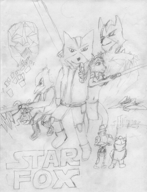
My masterpiece.... :chuckle:


Hand-drawn with a pencil


lol.... maybe I'll color/shade it later (and put my name on it... until then, nobody steal it! :mad: lol)
 

matt4300

Smash Ace
Joined
Dec 23, 2007
Messages
821
Location
USA-AL
Resized for a better fit on the screen... still just a sketch... no color v_v'


EDIT:
NOTHER FOX PIC: WUUUACHAAA!!!!

url=http://imageshack.us]
[/url]
 

:034:

Smash Hero
Joined
Jun 9, 2007
Messages
7,562
Location
Netherlands
Matt, even though your picture is great I think you should make the arms a bit furrier. I mean - they are a bit hairy, but not filled with hair. Fox is still a fox and I just thought you grabbed a random body and put Fox's head on it.

Good picture, though, even if the legs are a bit close to each other... Not much of an action pose now. XD
 

mzink*

Smash Ace
Joined
Mar 23, 2008
Messages
984
Location
MI
Wow I really like the second one, great job! I like the way you portray him in that one. The first one is cool too, but it kind of makes him look a bit too female-ish. It kind of reminds me of Michael Jackson lol. But they are both really great.

Also, "ook" yours is cute :)
 

matt4300

Smash Ace
Joined
Dec 23, 2007
Messages
821
Location
USA-AL
Matt, even though your picture is great I think you should make the arms a bit furrier. I mean - they are a bit hairy, but not filled with hair. Fox is still a fox and I just thought you grabbed a random body and put Fox's head on it.

Good picture, though, even if the legs are a bit close to each other... Not much of an action pose now. XD
Well you know the furry code right? To show there is furr on the body you put little pieces of it on the shoulder and elbow. I dont know why, its just in most anthropamorphic pics I have seen. No lol I dident use some random body its all custom thought up and drawn (though I did use bruce lees stance. So thats why the legs are so close together)

Also keep in mind they are scetches as you can see they were done quick without much attention to detail.
 

:034:

Smash Hero
Joined
Jun 9, 2007
Messages
7,562
Location
Netherlands
Well you know the furry code right? To show there is furr on the body you put little pieces of it on the shoulder and elbow. I dont know why, its just in most anthropamorphic pics I have seen. No lol I dident use some random body its all custom thought up and drawn (though I did use bruce lees stance. So thats why the legs are so close together)

Also keep in mind there scetches as you can see they were done quick without much attention to detail.
Hmm, really? Never heard of that rule before o-O

I'm all fired up now... Maybe I'll be doing another epic Brawl+Gurren Lagann crossover.
 

Bomber7

Smash Hero
Joined
Jun 30, 2007
Messages
5,766
Location
Louisiana
I thinkMatt is so gona win this in hand drawn and overall. I'm still gona do mine, but right now I dont have alot of time today so I'm gona have to do it like at school tomorow during one of my classes where I do nothing at the end.
 

Bitter Romantic

Smash Journeyman
Joined
Dec 17, 2008
Messages
217
Location
Southern California [Anaheim/Fullerton, San Diego]
matt4300: I'm going to have to agree with Flying Dutchman on this one for the legs :O
close together, but also that the feet are pointing in the same direction, when the legs from the waist indicate a more perpendicular split? or am I imagining things? :O
his arms also look REALLY skinny to me , but that could just be the head/body proportion for the character


and I have an idea now :D
in keeping with my 'humor/gag' style, of course :3
*hopes that nobody steals this one too D:
 

matt4300

Smash Ace
Joined
Dec 23, 2007
Messages
821
Location
USA-AL
matt4300: I'm going to have to agree with Flying Dutchman on this one for the legs :O
close together, but also that the feet are pointing in the same direction, when the legs from the waist indicate a more perpendicular split? or am I imagining things? :O
his arms also look REALLY skinny to me , but that could just be the head/body proportion for the character


and I have an idea now :D
in keeping with my 'humor/gag' style, of course :3
*hopes that nobody steals this one too D:

Its a style, The style I chose. Human-esque body big cartoony fox head. This isne't brawl style fox thats very short, stocky and super deformed.(did nobody see that awsome super anime lucas that was sitting on the pole with the electricity in his hand that was a style. ^_^) I see what you mean on the foot that was a stupid mistake I usually dont make... but no johns lol. Yes I made his legs close together on purpose that is the stance... can people not put there legs close together?:confused:

oh yeh dude with the electrode avatar. its digital both are.

OH and dude
 

ndayday

stuck on a whole different plaaaanet
BRoomer
Joined
Jun 12, 2008
Messages
19,614
Location
MI
I think that looks fine Matt, just the left leg is a bit wierd which has been mentioned.

I know what I'm doing, and I think I may just try a tablet this time around...I hope it'll be as good as it looks in my head.
 

St. Viers

Smash Champion
Joined
May 15, 2006
Messages
2,409
Location
Boston MA
Matt--the first one looks amazing!!!

Your second one (with the extra large head) doesn't look so hot--you can call it style, but generally when people have exaggerated features, they do it in such a way as to make it clear it isn't a mistake, by exaggerating other things to make it look "right" when viewers parse it (think really good chibis, for example--none of them are a perfectly proportioned body plus blown up head) As it is your's doesn't seem to mesh the head and body properly.

Sorry to sound critical, but just throwing my opinion out here, as a former art developer/ and current art critique-er =P Nice work overall though!
 

Bomber7

Smash Hero
Joined
Jun 30, 2007
Messages
5,766
Location
Louisiana
wait till i get my toony fox, it'l be a challange but I'll pull it off. I hope oyu guys like it. It'l be a little twist.
 

Moozle

Smash Champion
Joined
Mar 1, 2009
Messages
2,594
Location
Madison, WI
I thought Matt's second one was the best. I didn't even notice the legs until I went back and looked :laugh: The only thing that looks a bit weird to me is the skinny arms, but it's still wayyyy better than mine!:p
 

matt4300

Smash Ace
Joined
Dec 23, 2007
Messages
821
Location
USA-AL
XD holy crap, I can't belive how much I'm getting critiqued compared to any other drawing that has been put on here thus far lol... guess I have to do crap now... expect a few bandaid changes to the second.

BEHOLD THE POWA OF THE LASSO TOOL!!!! DUN DUN DUNNNNnnnn anything eles???

Edit: Yeh, I know what you were talking about but didn't and wasn't going to fix it. Then I found out I have nothing to do while I eat dinner(**** bleach isen't out). SHAZAM lasso tool...

 
Top Bottom