omg what skins folder???? im lost at that part!!
EDIT: please somebody i wanna get this done before i get to bed!!!!!
First you have to have a skin.
A skin is a folder w/ any name.
Inside are two things:
-'back' a JPEG format picture 250x90
-'Custom' a txt file w/ the coordinates for time/date
inside the custom txt file shoud look like this:
Arial
10
0 0 0
79 76
121 76
169 76
210 76
type/copy/paste them in. this determines the txt, txt size, and placement of the Days/Hours/Mins/Secs
So have 1 folder with those 2 things inside.
Next you have to put that skin folder into the Phantim3 skins folder:
Go to:
My Computer
->Local Disk
-->Program Folders
--->Phantim3
---->
Skins
^thats where the skins have to be in order to use them.
Are you using the downloaded skins? You just have to put them in that Phantim3 "Skins" folder.
Do you have trouble opening the WinRAR?
Do you have WinRAR? its a simple must have program that just about everyone uses. You need it to unzip files:
http://www.winrar-download.info/
After you install it, Right Click, Extract Here then put it in that phantim3 skin folder
the end. Hope that answered your problem.
To Hitaku: I can reupload the skins/change the text folders easily, just open them all up at once and replace each one by one. Its better that I fix it then everyone else who wants to use them. I just have to make sure what txt coordinates you want:
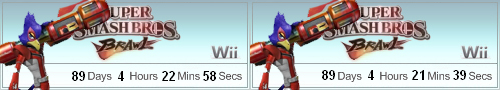
(1st one) This is the current txt file used.
Arial
10
0 0 0
79 76
121 76
169 76
210 76
(2nd one) the one you posted
Arial
10
0 0 0
79 75
121 75
169 75
210 75
In my opinion, the first (current) one is good already. doesnt the 2nd seem a lil high?
(1st one) current one in download section
Arial
10
255 255 255
79 76
121 76
169 76
210 76
(2nd one) the one u posted earlier.
Arial
10
225 225 225
79 75
121 75
169 75
210 75
IMO, the first one looks better. my only complaint is that the Secs is kind of close
Just make sure you give me the coordinates you want.
Edit:
Just so no one asks/ is confused. The txt file coordinates of Hitaku's new Bowser Jr., Falco, and Wolf additions are messed up a bit. The skins in the Download Section are the same (messed up). After Hitaku tells me the coordinates he wants, I'll reupload them.