• Welcome to Smashboards, the world's largest Super Smash Brothers community! Over 250,000 Smash Bros. fans from around the world have come to discuss these great games in over 19 million posts!

    You are currently viewing our boards as a visitor. Click here to sign up right now and start on your path in the Smash community!

The Smash Grand Festival Spriting Contest (Closed)

Status
Not open for further replies.

CT Chia

Smash Obsessed
Joined
Sep 4, 2007
Messages
24,416
Location
Philadelphia
This prompt is the freggin national of spriting contests lol

I've never seen competition like this
 

Charmander

Smash Champion
Joined
Jan 4, 2010
Messages
2,015
Location
The Middle Pokeball
NNID
JoeThorpedo
Looking at the competition, there is no way my sprite will win v.v
Oh well, Im liking these other sprites anyway, they deserve the icon ^^
 

Sir Bedevere

Smash Lord
Joined
Jan 31, 2008
Messages
1,476
Location
doop doop
Wanted to clean up some things in my sprite, but I came home too late. >_<

Omfg, it's the Cave of Wonders dipped in chemical waste and turned into a hot rod.

And it makes no sense at all, but I ****ing love it.
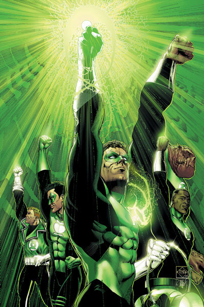
Hahaha, you've got the general gist of what I was going for. I just think of it as a Mutant Candle Monster (that Poliwrath jumped into to become the Green Lantern >.>).

That Poliwrath is amazing it's giving you the middle finger!!! :laugh: :laugh: :laugh:
Ack, I didn't even realize that. D: I was trying to emulate the pose the Green Lantern does with his ring:

And thank you everyone for all the nice compliments. :D Good luck to all the other contestants!
 

Spire

III
BRoomer
Joined
Apr 13, 2008
Messages
15,079
Location
Texas
Update: Firus fell asleep so expect everything tomorrow. I'm going to go ahead and finish my half up so all the weight is on him :troll:
 

Spire

III
BRoomer
Joined
Apr 13, 2008
Messages
15,079
Location
Texas
Week 2 Scores! (Firus will add his comments tomorrow)

BLM (black mage):

Firus: 1/10
Spire: 5/10
"You successfully merged a basic and second stage Pokémon and recolored them green. I appreciate that neither one of the base Pokémon were green to begin with, but the creature in whole fails to captivate or convince me of legitimacy. It feels anatomically imbalanced almost solely because its arms are made of stone, but also because their coloring does not match that of the body and legs. While the colors are consistent, the shading and source of light is not."
Final: 3/10

Charmander:

Firus: 8/10
Spire: 6/10
"I really want to like this, but I keep reading this, "not convincing enough to be a Pokémon" feel from it. My gut feeling says your choice of dark olive green renders it lesser. Don't get me wrong, it looks fantastic, but not for a Pokémon. I suppose this is because Pokémon generally have a more saturated and lighter pallet; i.e. why not one Pokémon sprite has true black in it. This creature (which if realistically rendered could be an awesome Final Fantasy enemy) needs just a pallet adjustment. I think the form is fantastic; the underbody being white perfectly balances it; tying the purple fin-tail with the olive green and of course, this could not have been done without the orange details. It's all so great, but just not quite a Pokémon. In summation, the issue is: too dark."
Final: 7/10

Riddle:

Firus: 5/10
Spire: 9/10
"I would sacrifice the whole Porygon and Magnemite lines so this could exist. The coloring is absolutely fantastic; it is toy-like, and yet it resembles a mallard just ever so slightly. Its foreside would be entirely convincing if not for the antennae not having some sort of distinctive outline at its base, though only on the shaded side. Also because of the angle, the magnet-arm in the background should be moved up a few pixels to truly convince me of its balanced anatomy. Nearly perfect."
Final: 7/10

Fuelbi:

Firus: 7/10
Spire: 5/10
"I suppose this creature actually looks more naturally fitting than the official Politoed as it resembles Poliwag far more. However, you did not actually recolor anything green."
Final: 6/10

rPSI:

Firus: 7/10
Spire: 4/10
"It feels weightless. You met the criteria, but your color choice and shading detract from the whole. I can identify your process, but the color selection is truly a detriment and remember - what colors you choose will either properly or improperly render the creature. Furthermore, I think I am targeting this issue almost solely because I have a mental clash of ice cream and flames tied together by vines, yet all are the same color. It just feels wholly bizarre."
Final: 5.5/10

Chibo:

Firus: 9/10
Spire: 8/10
"Very minimalistic, but very effective. You identified Otamaro's tadpole tale and realized it was similar to Porygon Z's limbs and thus created your little specimen. The green you chose compliments the dark grey of Otamaro and naturally fitting, the cream-colored face brings it all full circle. Having three balanced colors is a force to be reckoned with. However, I would have liked to see you experiment with your own color choices beyond the sole green."
Final: 8.5/10

Meta-Kirby:

Firus: 9/10
Spire: 7/10
"I really like it, and yet it feels so lacking. If the Turtwig and Dokkora lines didn't exist, this would feel right at home in the Pokédex. I love that you retextured the concrete columns to be logs - absolutely love that motif. However, while you cleverly worked in Turtwig's pallet to encompass the whole of the Pokémon, it wouldn't have hurt to at least use a different hue of green to differentiate it just that much. All in all, I just see Turtwig's head on Roobushin's body, and recolored to match the former. A proper fusion is to try and match each Pokémon 50/50, and texture ≠ form. Each should be treated as individual obstacles. Overall it's an extremely balanced sprite, but I suppose that is because most of it is unaltered in terms of form."
Final: 8/10

Neon Ness:

Firus: 7/10
Spire: 6/10
"What catches my eye first is the mishapen twirled antenna thing. I know Budew has it, but this is too long, too rigid, and misangled. The whole sprite is very directional, pointing down-left-forwards. However, the thing on its head does not abide by this direction whatsoever. It's just there. I really like that you removed the arms because by doing so, you attribute Budew's inclusion even more as it has a spherical and generally vestigial-less shape."
Final: 6.5/10

TAL:

Firus: 6/10
Spire: 9/10
"This is as hilarious as it is fantastic. Congratulations, you merged a caterpillar with the Incredible Hulk! I don't have much more to say other than it has this lingering smell of "mix and match". It's vague, but ever-present. Perhaps it is because Caterpie's parts retain all of its original colors, no?"
Final: 7.5/10

Sir Bedevere:

Firus: 10/10
Spire: 10/10
"Just going to say that the dripping candle wax completes this. It adds your own personal touch. With the cold mouth, a potentially radioactive ooze body, and blue flames emiting from its exhaust tubes, this creature nearly makes no sense, and yet it all works together. It's like a chemical waste nightmare. Biologically unstable enough to not be able to uphold a definite form, yet all the while trying to with its erect candles. You've disguised Exploud incredibly and Hitomoshi even better. These two Pokémon have yielded a truly unique creation."
Final: 10/10

canvasch:

Firus: 2/10
Spire: 2/10
"Honestly, it just looks like Roobushin recolored green and blue with Gastly's head. There is no transition or unification with Gastly. Gastly's key feature is the gas that surrounds it, and yet I see not a hint of it. A proper fusion would accomodate every feature possible of both Pokémon, especially that which provides a basis for their names. Perhaps you could have completely reworked the concrete columns into handheld gas lamps."
Final: 2/10

Congratulations to Sir Bedevere for winning the second Smash Grand Festival Spriting Contest!

Also:

Current Prompt

Retype Charizard. Plain and simple, change Charizard's typing. You may change Fire, Flying, or both. However, you cannot change Fire to Flying and vice versa. You must choose any other type(s). Also, do not double-type Charizard as no Pokémon are double-typed (i.e. Ice/Ice). Lastly, you may drop a type so Charizard may end up either single or dual typed.

The deadline is Wednesday, January 10th at 11:59 PM.
 

Mic_128

Wake up...
Administrator
BRoomer
Joined
Jun 19, 2002
Messages
46,180
Location
Steam
Premiere ball away!

TAL, I hope you don't mind me using yours? I just find it hilariously awesome. :bee:
 

Neon Ness

Designated Procrastinator
Joined
Jul 10, 2008
Messages
3,631
Awesome job to everyone! Kudos to Spire/Firus as well for looking through all of those entries lol.

Guess I have some more things to learn about this Pokefusion business. I just hope all of the future competitions have this many incredible entries.
 

Wave⁂

Smash Legend
Joined
Feb 16, 2006
Messages
11,870
What really caught me with Sir Bedevere's entry was that it wasn't just a cut / paste / recolor job, it look like he just took Exploud's head and did the rest from scratch. Congrats!
 

Terywj [태리]

Charismatic Maknae~
Joined
Aug 23, 2007
Messages
30,536
Location
香港 & 서울
Nicely done, Sir Bedevere! I really should take a shot at learning how to sprite. I could at least beat Canvasch lol. This is much more entertaining.

Good luck to those participating in Round 3!
 

Circa

Smash Champion
Joined
Feb 6, 2009
Messages
2,874
Location
Three Rivers, MI
NNID
timssu
3DS FC
1891-2120-4792
So I'm guessing this means we can't drop a type either? You know, so long as we actually put in the effort. I wouldn't be expecting you to accept a wingless Charizard as a pure Fire-type entry or anything. I don't know if I'm going to enter yet or not, but if I do that's definitely a path I'll consider taking if you guys allow it.
 

Wave⁂

Smash Legend
Joined
Feb 16, 2006
Messages
11,870
I think it's pretty obvious that the end product must be dual-typed.
 

M.K

Level 55
Joined
Jul 10, 2007
Messages
6,033
Location
North Carolina
I don't think so. If you can change both types, than it can be assumed you can make him mono-type by changing the second type to "nothing".
 

rPSIvysaur

[ɑɹsaɪ]
Joined
Jun 7, 2009
Messages
16,415
I assumed that "Also, do not double-type Charizard as no Pokémon are double-typed (i.e. Ice/Ice)." means that you can't do it as nothing...

Thanks for the comments Spire! I hope it helps me improve.
 

Spire

III
BRoomer
Joined
Apr 13, 2008
Messages
15,079
Location
Texas
Yes, keep Charizard dual-typed. I will update that in the prompt.

I am amending this once and for all: Charizard can end up as single or dual typed.
 

Firus

You know what? I am good.
BRoomer
Joined
Apr 7, 2008
Messages
7,681
Location
Virginia
NNID
OctagonalWalnut
3DS FC
0619-4291-4974
Hey guys, sorry for the holdup on my comments -- I finished my judging last night but didn't want to post anything up without having Spire's scores first. Anyway, here are my comments from Round 1 and Round 2. I might've gone a little overboard on the commentary, but I was trying to be as thorough and explanatory as possible.

Round 1 Comments said:
Are-Sigh

Followed the prompt, but somewhat of an awkward fusion overall. Cyndaquil’s skinny physique doesn’t work so well merged with Jigglypuff’s round body, and the arms should probably be placed higher up so it looks more natural. There’s no outline around the body where it overlaps with fire, and Jigglypuff’s curl-thing from its forehead would look better on Cyndaquil if smaller, due to the size difference in the heads.

Fuelbi

Followed the prompt. However, with the coloring – while it was creative to use blue to complement the purple, between the multiple shades of blue, shades of purple, and a shade of pink, the colors clash a little bit and take away from the overall visual appeal of the sprite. The arm on the right is awkwardly positioned and the outlining should be modified to match the general lighting of Pokémon sprites – usually, the light source is from the upper-left. The outline of the arm on the left could also use some modifications. Overall, however, the sprite is well-constructed.

Chibo

Followed the prompt. Some outline issues; namely, there are a few spots where the outline is dark blue when it should be black (on the right side, on the bottom) The foot on the right is a little awkwardly positioned, and would probably look better if positioned more vertically. The eyebrows are slightly misshapen; perhaps it would’ve looked better to merely go with a single forehead swirl, akin to Wigglytuff’s? Finally, I think the sprite would’ve benefitted from the use of a more light, natural blue than the one you have.

Meta-Kirby

Followed the prompt. A little simple of a sprite, but solid nevertheless. Granbull’s head blends well with Magmortar’s, and the collar of Granbull works well. The blue and black also complement each other nicely. The one issue I have is that there are some bits of purple left uncolored, which are unnoticeable for the most part, but should have been recolored nevertheless.

Neon Ness

Followed the prompt. Pretty simple sprite; save for the color, the beak, and the head feathers, I don’t see any changes from Ho-Oh. However, you did fairly well with what you did. The beak is a solid modification from Ho-Oh to resemble Chatot’s, and I must say I love the way you colored the tail/head feathers. However, the darkest shade on the top wing is purple; a darker blue would have fit as the darkest color better. Also, it seems you were trying to emulate Chatot’s music-note head in altering Ho-Oh’s head feather’s shape, but rather than merely chopping part of it out, it would’ve looked better had you modified it in a more complicated way.
Round 2 Comments said:
BLM (black mage)

1/10

Overall, this sprite leaves a lot to be desired. It follows the prompt, but even in recoloring the sprite green some gray from Geodude was left uncolored. The shading is much more akin to second gen than fourth/fifth, being flat in most places. Remember that the light source in Pokémon sprites is almost always at the top-left, and shades should go from one to another gradually – i.e., the lightest color and darkest color should be separated by a middle shade or two. There’s also much unnecessary black in the sprite, including a stray speck by the arm on the left.

Charmander

8/10

Follows the prompt. Very solid sprite, with good attention paid to shading on the head and feet; however, the forehead could benefit from a little more light, pushing the darker shade back a little. The line on the side of the mouth is a little awkward-looking. It also might’ve been interesting if the mouth had taken on the zigzag of Trapinch’s mouth. There is some remnant gold-brown on the left side of the face that you seem to have missed recoloring. As for the legs, I like how you adapted Trapinch’s shell-like body, but think it would’ve been better if you made the transition rigid and put a black line outlining the connection to the body instead of having the deep green blend straight into white.

Riddle

5/10

Follows the prompt. Overall a cleverly planned-out sprite, but unfortunately, due to Porygon’s odd angling, it’s hard to blend Magnezone with it without doing some scratching / major editing. The magnet legs are slightly angled the wrong way, which makes them look funny. The antenna on the head should have a dark gray/black line on the bottom so the yellow and green aren’t directly blending into each other. The tail is also missing a bit o outline. Again, I do like the concept you were going for here, but it’s difficult to manage without major edits.

Fuelbi

7/10

Follows the prompt. Solid fusion of the two Pokémon, but the result of combining Politoed’s full-length limbs with Poliwag’s small body is a little awkward. In addition, the leg on the right doesn’t blend into the body at all. Pieces of the outline are also still blue and clash with the overall green body. I do like how you handled the spiral and overall you fused the Pokémon well, but I think the sprite could’ve benefitted from shorter limbs.

rPSI

7/10

Follows the prompt. The shading on the main body could use some improvement; though Vanipeti lacks much shading at all on its main body, it doesn’t work as well when it isn’t white. What you have is a good start, but some dark green added toward the bottom could’ve helped. I do like that you added check marks to the bottom of Shandera to make it resemble an ice cream cone – it’s a subtle, but cool (no pun intended) touch.

Chibo

9/10

Follows the prompt. The two Pokémon were blended pretty well, and I think the shade of green you chose for the…limbs, I suppose you’d call them, really matches Otamaro’s other colors well. I like what you’ve done with the sprite, but it’s fairly simple; perhaps you could have made what you have levitating over Porygon-Z’s lower half, perhaps minus the bottom limb (or tail, whatever that is exactly) from the top half and keeping it on the lower half, or doing something with Porygon-Z’s body pattern on Otamaro. There isn’t a whole lot to work with given the two Pokémon, but a little more would have benefitted the sprite in my opinion.

Meta-Kirby

9/10

Follows the prompt. You did a very good job blending Turtwig into the body, making it fit naturally, even making for a grass/wood theme – I love how you changed the blocks of stone into wood. My one complaint is that you kept the darkest brown from Roopushin, and it’s a little more red than the tame browns of Turtwig, and it clashes a little bit with the otherwise tame and faded colors.

Neon Ness

7/10

Follows the prompt. You did a pretty good job blending the two Pokémon; I like how you shaded the tips hanging off of Dusknoir’s face, and I like how you changed the face on his body to be less creepy. I do feel that Budew’s face is a little awkward merely placed on Dusknoir’s head, though, and honestly I feel the vine would’ve looked better if you had removed Dusknoir’s ghost-like bottom and put the vine there instead, making it more plant-like and removing the top accessory altogether.

TAL

6/10

Follows the prompt. You did a good job blending Caterpie into Machamp; the replacement of Caterpie’s antenna with Machamp’s “hair” is flawless to the extent that I almost didn’t notice you had changed it. Caterpie’s underside blends fairly well with Machamp, but I think it would look better if you blended Caterpie’s underside straight with Machamp’s body instead. I also think Caterpie’s head looks awkward just sitting there; instead, I’d have blended it with a neck like Machamp has.

Sir Bedevere

10/10

Follows the prompt. While the neon green you used is a little bright, this sprite is very, very good. Not only does the basic shape effectively imitate Hitmoshi being a candle, but you altered Exploud’s windpipes to be candles as well – not only being on fire, but dripping like candles as well. For that matter, Exploshi is dripping like he’s made of wax all over the place, and it looks completely natural. Honestly the best combination I could imagine coming out of these two Pokémon – you did an excellent job.

canvasch

2/10

Follows the prompt. While there’s nothing all that bad about this sprite, there’s nothing all that good either; the Gastly head simply placed over Roopushin’s looks awkward, and aside from the green/blue recoloring, you made no other modifications. At the least, you might’ve added Gastly’s foggy aura around the sprite to add something more to it than simply a head.
 

CT Chia

Smash Obsessed
Joined
Sep 4, 2007
Messages
24,416
Location
Philadelphia
kind of wish the charizard didnt have to be dual typed. i didnt have any ideas yet, but its another restriction :/
id love to see an ice zard but i wouldnt know how to make it
 

Neon Ness

Designated Procrastinator
Joined
Jul 10, 2008
Messages
3,631
Actually had a question about the deadline, it says it's due Wed. January 10th. But isn't next Wednesday the 12th?

I'm wondering if this is due Monday or Wednesday.
 

canvasch

Smash Rookie
Joined
Dec 29, 2010
Messages
20
This prompt is actually pretty awesome. Ive done some work that will hopefully at least get me past last place.
 

Spire

III
BRoomer
Joined
Apr 13, 2008
Messages
15,079
Location
Texas
Actually had a question about the deadline, it says it's due Wed. January 10th. But isn't next Wednesday the 12th?

I'm wondering if this is due Monday or Wednesday.
My bad. It's Wednesday the 12th. That's what happens when you update at a million-o-clock in the morning. I'll change it right now.

To avoid confusion, I am officially amending the prompt for the last time so that Charizard may be either single or dual typed.

Current Prompt

Retype Charizard. Plain and simple, change Charizard's typing. You may change Fire, Flying, or both. However, you cannot change Fire to Flying and vice versa. You must choose any other type(s). Also, do not double-type Charizard as no Pokémon are double-typed (i.e. Ice/Ice). Lastly, you may drop a type so Charizard may end up either single or dual typed.

The deadline is Wednesday, January 12th at 11:59 PM.
 

Wave⁂

Smash Legend
Joined
Feb 16, 2006
Messages
11,870
Sorry for being a possible pain in the ***... but...

"You cannot change Fire to Flying and vice versa" means I can't do pure Fire or pure Flying, right? And it means nothing more than that?
 

Sir Bedevere

Smash Lord
Joined
Jan 31, 2008
Messages
1,476
Location
doop doop
Woo! <3 My ball. Thanks mods!

What really caught me with Sir Bedevere's entry was that it wasn't just a cut / paste / recolor job, it look like he just took Exploud's head and did the rest from scratch. Congrats!
Fun fact: the only thing I copied directly from Hitomoshi's sprite was his eye (and even then I edited it to make it more proportional lol).

I was kinda worried I'd lose points for not having Hitomoshi represented as much as he was supposed to be, but I guess it was enough. I'm really glad Firus picked up on the body being the general shape of Hitomoshi.

---

Just curious: did anyone see the fire lit inside Exploshi's mouth/body, or was that just too obvious to mention?

Also, not sure if this was asked before, but if someone were to achieve the "Sprite Master" rank, would they still be allowed to continue submitting sprites and get critiqued? If I (or anyone else, really) were to get to that point and wanted to continue entering, I wouldn't want the Sprite Master to take away chances from other people to get/upgrade postbits.

Got something for the new prompt, should get it up within a few days.
 

canvasch

Smash Rookie
Joined
Dec 29, 2010
Messages
20
Heres a dark(ghost?)/flying version I made. >9000 hours in ms paint.


Any suggestions? I tried to add a semi transparent cloak but nothing seemed to look good. I still think its missing something.

Its based on the grim reaper in case the scythe didn't give it away.
 

Fuelbi

Banned via Warnings
Joined
Jun 17, 2009
Messages
16,894
Location
Also PIPA and CISPA
Heres a dark(ghost?)/flying version I made. >9000 hours in ms paint.


Any suggestions? I tried to add a semi transparent cloak but nothing seemed to look good. I still think its missing something.

Its based on the grim reaper in case the scythe didn't give it away.
Damn, and that just gave me my idea for my sprite thanks :bee:

Btw, can I leave one of the types the same while I retype the other?
 

Neon Ness

Designated Procrastinator
Joined
Jul 10, 2008
Messages
3,631
The skeleton look is the best part imo. I think his torso, wings, and arms should look like bones to match

The skull might need some shading as well, it's sort of a flat white.

I like what you did with the wings though... I dunno if they would actually look better as bones lol, but it's just a suggestion if you wanted a complete skeleton look.
 

canvasch

Smash Rookie
Joined
Dec 29, 2010
Messages
20
The skeleton look is the best part imo. I think his torso, wings, and arms should look like bones to match

The skull might need some shading as well, it's sort of a flat white.

I like what you did with the wings though... I dunno if they would actually look better as bones lol, but it's just a suggestion if you wanted a complete skeleton look.
Full skelly look would be sweet, the only problem is that the skull alone took an inordinate amount of time.

But then again, I have a week and borderline ∞ free time.
 

Wave⁂

Smash Legend
Joined
Feb 16, 2006
Messages
11,870
Man, separating the wings from the rest of the body is a giant pain in the ***.
 

ndayday

stuck on a whole different plaaaanet
BRoomer
Joined
Jun 12, 2008
Messages
19,614
Location
MI
I'd change the wings up a bit. Personally, I'd think a Zekrom-esque black would be nice if you were to keep it, but a skeletal wing structure would be awesome like MK said. Also I'd take a look at the plain black/white skull and recolor it to be more skull-like. Maybe you can look off of Duskull for inspiration as far as that goes?

Cool concept, but polish it as much as you can. And take everyone else's advice too imo. :0
 

CT Chia

Smash Obsessed
Joined
Sep 4, 2007
Messages
24,416
Location
Philadelphia
Here's what I currently have, a Bug Dragon Charizard. Still going to need some work though. I need to tweak the wings, I used Beedrill and Venomoth for inspiration but something doesn't look right.


Fuelbi

Banned via Warnings
Joined
Jun 17, 2009
Messages
16,894
Location
Also PIPA and CISPA


Ok, so so far I have this. I WANT to add more to it because it's WAAAAAY too simple, but I have no idea what I could possibly add to it, which is why I post it here to get some help with spriters block or w/e

And if I can't then I'll be replacing this sprite with another one so this isn't final
 

Wave⁂

Smash Legend
Joined
Feb 16, 2006
Messages
11,870
General spriting question, I don't really want to necro a thread that is old as ****. When is it a good idea to use dithering?
 
Status
Not open for further replies.
Top Bottom