• Welcome to Smashboards, the world's largest Super Smash Brothers community! Over 250,000 Smash Bros. fans from around the world have come to discuss these great games in over 19 million posts!

    You are currently viewing our boards as a visitor. Click here to sign up right now and start on your path in the Smash community!

The Sig Critique Topic

Status
Not open for further replies.

Neon Ness

Designated Procrastinator
Joined
Jul 10, 2008
Messages
3,631
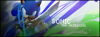
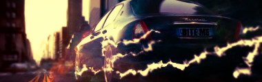
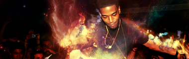
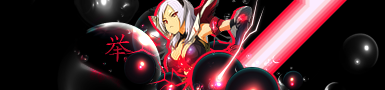
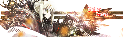
Great colors, they've been blended really well. Some of the lighting doesn't make sense, though; there's a bright area behind her, yet she has shadows on her back. Make sure your lighting is accurate.

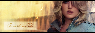
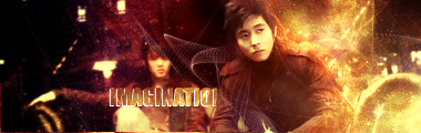
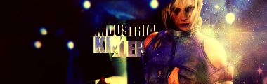
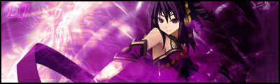
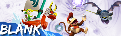
It's a good start. Do more stuff, though, it hasn't reached that "Wow, look at that!" level quite yet. I think the background would look good with some heavy darks, to up the contrast and match Dixie... Also really like these flame..esque effects, so try some more variations of that (as well as different effects so it doesn't like so monotonous).

Text is sorta myeh. It's just there, plain old horizontal text. It should be a darker color I think, the pink doesn't fit as is. Try some different angles, too, a normal horizontal layout is sort of uninteristing here. The underline is unnecessary... and I would try a more compact font, then move it closer to Dixie.

I can't get over those background effects, though, they look so nice. Tone down the brightness a little.
 

Conker315

Smash Lord
Joined
Jun 20, 2008
Messages
1,138
Location
Houston, TX
@Blitz:You got something really good coming along but your sprite is to small.try and enlarge it a tad bit to see who he is, or just make your canvas a bit wider for more working space.I understand what you tried to do, by making your negative small, but really you could do better the way your going with this.Be a bit more creative and add some smudging in there with some nifty effects.
 

Alzi

Smash Master
Joined
Feb 8, 2008
Messages
3,450
Location
New World
Thanks for the tips Neon Ness. I am actually agreeing with what you said there it makes so much more sense. I will edit it and do more to it and change the text and re-post it here once i have the time.
 

Conker315

Smash Lord
Joined
Jun 20, 2008
Messages
1,138
Location
Houston, TX
@DBR:First one is a total mess imo, try adding more than just a overly smudged background to your tag, and if so then make the smudging look better.Your text is awful and basicly stands out entirely, so look up some text tutorials.Also, I wouldn't recommend using those type of renders, but then again I've never used those types.Either way stick to some simple stuff and progress up.

2nd is alright, but with the sense I have, I would think theres a bit more light than shadow out there atm.Your adjustments towards the bottom was a bit too much, so next time dont go that deep with it.But I get your idea of the focal, good idea but wrong way to achieve it with your dark areas.All that you did was adjustments I believe, unless you did 3 copy's of the air balloon and did some depth.

Last one is to bright and not much effort was put on the background or effects.Dont add much light to many areas unless your crazy.One must focus on one thing, and that is the part you want it to be but still having more than one focal is bad.

I was bored...and maybe ill get back into making tags.


EDIT:Did it for fun
 

Conker315

Smash Lord
Joined
Jun 20, 2008
Messages
1,138
Location
Houston, TX
Hmm well still try to inprove in the reality it should have.That could have been a great adjustment if you had more experience.
 

lordunicorn3

Smash Journeyman
Joined
Mar 1, 2008
Messages
472
Location
Paris
Wow, its really been a while since ive been here, but since i went without internet for a while (stupid french internet companies >.<) i got back into tag making
for critique
DFEAR, i really like both of them, only problem with them is on both the splotches in the background, they seem a little overused, other than that, both great, love the second one.

here they are


and a random smudge abstract i did, not great, but :/


i have more, but those are my favorites, maybe ill post some others later if i feel like it
 

DR809

Smash Apprentice
Joined
May 26, 2008
Messages
143
Location
Brooklyn
3DS FC
3754-7546-8239
The first one is the best. The white behind the text is distracting and would look better with out it.


Opinions?
 

Conker315

Smash Lord
Joined
Jun 20, 2008
Messages
1,138
Location
Houston, TX
More please??


@Dfear:1st ag is awesome but really not breath taking.It kinda looks like its undone and I hope it is because it's looking great.Maybe add more things to it.
Second tag is just sexy m8...kiu.

@Dbr:Maybe try using a stock for the bg instead of a playing red one.Good animation though.
 

DR809

Smash Apprentice
Joined
May 26, 2008
Messages
143
Location
Brooklyn
3DS FC
3754-7546-8239
Thanks. It was originally a stock till I motion blured it and changed the hue and sat lol.
 

Inyro Gatling

Smash Journeyman
Joined
Sep 1, 2008
Messages
229
Location
New York
Conky: First one needs work, the focal is currently the c4d in the foreground. Blur that a bit. And I'm not a big fan of the compo of the second... too plain, and the shapes look too big and chunky.


Newww:


Let's edit in one more!
 

DR809

Smash Apprentice
Joined
May 26, 2008
Messages
143
Location
Brooklyn
3DS FC
3754-7546-8239
um its too simple imo and so much more can be done with it. Text doesn't go with the sig either. Hit up some tuts and hopefully you'll get better
 

KoSa!

Smash Journeyman
Joined
Oct 2, 2008
Messages
481
Location
NJ
Everyone seems to do tag without the border, and without text. I always thought the border cleaned things up and the text would help against people who like to rip it, and it helps to get a point across that someone wouldn't notice by the image alone.

Inyro that tag is sweet.

But w/e my tag


SuSa

Banned via Administration
Joined
Jul 20, 2008
Messages
11,508
Location
planking while watching anime with Fino
Conky: First one needs work, the focal is currently the c4d in the foreground. Blur that a bit. And I'm not a big fan of the compo of the second... too plain, and the shapes look too big and chunky.


Newww:


Let's edit in one more!
I think if you sharpened the focal point on the car a bit more, it'd be a lot better. Right now it's just overly blurred and the red near the front left tire bothers me... :x

I really enjoy this signature, but it has one flaw. The flow is completely opposite that of the stock.Your stock would appear to be having a more left and up flow, but the focal isn't his body. It's the face, and where he is looking. Your flow should start going up and left, but curve over. To not disrupt what is already there. The only flow that really "ruins" the already created flow is the wireframe on his right (our left). Simply removing that bit by his shoulder would do wonders.

I LOL'd. Even if I don't get it. (userbar)

That is a ****ing sweet tag effect wise (I'm assuming you smudged.. something I can't do well :/). my only issue with it is that one bar-like thing on his left (our right) that disrupts the flow and feels out of place.The negative space on the left may need to be filled up a bit. Not entirely sure how I feel on it.

Everyone seems to do tag without the border, and without text. I always thought the border cleaned things up and the text would help against people who like to rip it, and it helps to get a point across that someone wouldn't notice by the image alone.

Inyro that tag is sweet.

But w/e my tag

For some reason people dislike borders. To me it's a picture without a frame.

Text is for multitudes of things, and can clean up dead space. I generally avoid putting my name into a piece of work, I waterprint it ever so slightly instead.

Now onto your signature:
It is far to green. There is no real flow to the piece, and my eye doesn't know where to focus. Your main focal point, I would assume, is the girl - but you have her have faded out, as if erasing her from existence. I really do mean no offense, but it's like you had a ton of random ideas and threw them all into one. :/ I'd suggest following some tutorials as they will help you get an idea of what does what. And don't follow them EXACTLY, experiment a little.
 

KoSa!

Smash Journeyman
Joined
Oct 2, 2008
Messages
481
Location
NJ

For some reason people dislike borders. To me it's a picture without a frame.

Text is for multitudes of things, and can clean up dead space. I generally avoid putting my name into a piece of work, I waterprint it ever so slightly instead.

Now onto your signature:
It is far to green. There is no real flow to the piece, and my eye doesn't know where to focus. Your main focal point, I would assume, is the girl - but you have her have faded out, as if erasing her from existence. I really do mean no offense, but it's like you had a ton of random ideas and threw them all into one. :/ I'd suggest following some tutorials as they will help you get an idea of what does what. And don't follow them EXACTLY, experiment a little.
Noted , I don't mind if your harsh with something , I do. I think I learn better if its an exact answer and not a beat around the bushy answer. I'm going to attempt touching it up right now.
 

SuSa

Banned via Administration
Joined
Jul 20, 2008
Messages
11,508
Location
planking while watching anime with Fino
I would say the first one, the effects don't really go. It all looks to messy, the render is not blended into the background at all, and... well it's just a mess. :/ sorry.

The second is much better, but has far to much negative space on the left. Also nothing about the signature makes me go "wow", and again. The render lacks real blending into the background (which also doesn't quite fit the render in my eyes...)

Also the contrast is a bit too much.


I'd give suggestions for improvements, but I'm far to tired right now :/ sorry.
 

SuSa

Banned via Administration
Joined
Jul 20, 2008
Messages
11,508
Location
planking while watching anime with Fino
Unless it is different versions of the same tag, if you want more C&C from more people, I'd advise only posting one signature at a time. :x

I don't particulary enjoy the first, not to say it isn't interesting or well done, but nothing makes me go "wow" at it.

The 3rd version of the 2nd signature is the best IMO. The random orange block on the first killed it for me, and the left side seemed like too much.

the 2nd version has to much negative space that contrats, and a lack of things going on.

The 3rd is a fine balance, and while nothing (again) makes me go "wow", it is still interesting and pleasing to the eye. I like the effects done, and it catches my interest. Also the bubble like things that aren't in V2 are in V3, filling up a lot of the negative space.

I don't really like the 4th. It looked like you were expereimenting a lot with wireframes, the pen tool, and bits and pieces of C4's. I'd say remove the person, take off the larger effects, and do things similiar to the white line wrapped around the 2 purple ones. Give it that space abstract feeling. (Just an idea of something to try)
 

T-major

Smash Champion
Joined
Oct 19, 2006
Messages
2,167
Location
Windsor, Ontario, Canada
Diddyknight: the blending on the second last sig looks great. the Saber image and effects go together well, and you combined them almost seamlessly. The last one is, overall, good. however, I find the large amount of white space is what keeps it from being "great".


First one of these I've made in a while. golly :D


SuSa

Banned via Administration
Joined
Jul 20, 2008
Messages
11,508
Location
planking while watching anime with Fino
Text in corner = bad. That's my only real problem with it.

Made as a request of Prawn's in my blog:


Let it be noted, I suck with requests. And any GFX I try to force... I let it come to me. >.<
 

b1anK

Smash Apprentice
Joined
Apr 13, 2009
Messages
151
Location
I &lt;33 NARNIAAA
Susa: I think it may be a little too bright which is taking away the cute detail from the IC's fur. Idk that's just my personal taste tho. other wise I think that's great.


I need advice on what to do to make this better ^. This is my first real sig btw. Any advice or tips will help.
 

SuSa

Banned via Administration
Joined
Jul 20, 2008
Messages
11,508
Location
planking while watching anime with Fino
I make my signatures on a bright BG in Photoshop, unless you are using like.. the one bright skin on SWF, it's going to look brighter then it really is because of the contrats... :x

I'm confused because I thought your name was B1anK D= not BLANK....

Text should never (if possible) be in the corner. There are a few scenarios where it will look good, but those are far and few. With that said, swirls don't tend to make a good flow. Neither does having 3 focal points (in this case, TL, Diddy, and MK) It lacks depth (BG, renders slapped over, text).

I'll leave it at that.

And my personal thing of "it lacks a border".

It's your first signature, and you are doing something most everyone does for their first few signatures, so don't worry. Keep practicing and you'll get better. :)
 

Akiak

Smash Ace
Joined
Jul 28, 2007
Messages
820
Location
In my secret laboratory.
Hi, I was an active sig maker about a year ago in the old critique topic.

@Susa: The lighting on the characters gives the sig a very realistic feeling, especially on the hammer. I like how Popo's hammer fades in the background. The right side is the only complaint. That ice part is too blurry and I think it would have been more fit if you could actually see the lines and borders of that part, if you get what I mean. Text is a bit too jittery, maybe a wider font would have worked better. Overall, not bad.

Here's my try at putting phrases in the sig.


Cnc? (Do people still use that term now? :laugh:)
 

b1anK

Smash Apprentice
Joined
Apr 13, 2009
Messages
151
Location
I &lt;33 NARNIAAA
Uber Mage: I really like that :D. This thread is making me jealous of your guys skills. I feel so amateur. Idk maybe you could play around with the colors of the backround a little to match her outfit. Like add some pink maybe.

Akiak: Again really great job. There's nothing I have to say about it really problem wise other than maybe move the text around a little. It seems to be in a weird position.


^ this is my second try at a sig. I feel it's missing something still.
 

Diddyknight

Smash Lord
Joined
May 9, 2008
Messages
1,134
Location
Socal -&gt; FL
@Blank: Your 2nd one is much better than your first at least XD Seems like the focus is the text instead of Tink. >_>


screwed aroiund in class for 10 min lololl
 

Akiak

Smash Ace
Joined
Jul 28, 2007
Messages
820
Location
In my secret laboratory.
Thanks b1ank, yea the text was the only big problem in making it was "where should I put the text?"
Anyway that sig of yours is waaaay better than the last one. I believe you've got an eye for what fits and what doesn't. I love the render you put. It's nicely placed and very colorful. As for the text I would have put something more sea-ish, like fat round bubble letters.

@Diddyknight: Out of all your sigs, that first metaknight one was phenomenal. This one ain't half bad either. I love the text, and the brushes and colors are also very fitting. Oh and did you cut the point of the sword? :ohwell:

More comments on mine?
 

b1anK

Smash Apprentice
Joined
Apr 13, 2009
Messages
151
Location
I &lt;33 NARNIAAA
diddyknight: wow for something that took you that quick that came out really great. I'm with Akiak on that one tho I'm kinda wondering about the tip of the sword. And thanks for the critique :)

Thanks to all you guys who critiqued me. I appreciate it a lot and it helped me make a great sig for myself. I like this thread a great deal :). Here's my final product. You don't have to critique I just wanted to show how much you guys helped.

VV
 
Status
Not open for further replies.
Top Bottom