• Welcome to Smashboards, the world's largest Super Smash Brothers community! Over 250,000 Smash Bros. fans from around the world have come to discuss these great games in over 19 million posts!

    You are currently viewing our boards as a visitor. Click here to sign up right now and start on your path in the Smash community!

The Sig Critique Topic

Status
Not open for further replies.

Fire!

Smash Champion
Joined
May 4, 2008
Messages
2,049
Location
Seattle
NNID
Fire149
3DS FC
2809-9924-8928
How is mine? It's kind of old and I've been using it for a while. Should I change it up?


Thunder Of Zeus

*Rumble Rumble*
Joined
Jan 3, 2009
Messages
4,128
Location
Mt. Olympus
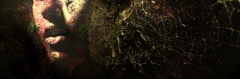
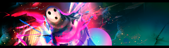
Hmm... I like it, especially the text, but the colors/lighting need a little tweaking, imo. Not much though.

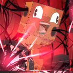
Lol worthy tag, was bored and wanted to try something new.
I actually love this signature.

You did a fantastic job defining the focal(s). The lighting is good and the flow works nicely.

That being said:
The left side is a bit bland, the lit area doesn't transition well in-between colors and, lastly, I do not like the red light you threw in there.
 

Smash G 0 D

Leave Luck to Heaven
BRoomer
Joined
Oct 5, 2005
Messages
3,571
Location
Charlottesville, VA
This is part of a series I made for sigs for members in my crew, but I took out the name of our crew for the purpose of critiquing the sig on its own.


Neon Ness

Designated Procrastinator
Joined
Jul 10, 2008
Messages
3,631
@ Smash G 0 D: The render is more visible, but it still suffers from a lot of the problems of the other. :ohwell: 
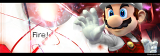
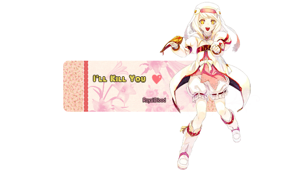
No color coordination, lack of variation in effects and disorganization are still hurting it... Interesting concept on the M on Mario's hat though. o.o

@ Llumys: Whoa, huge text. Matching Noel...esque colors look a'ight but the text takes up so much room it distracts from Noel herself. Smaller? Like 10 or 12. And maybe just one brief phrase or word. The font is over the top. Why so fancy? Try a sans serif font, maybe. The background has almost too many colors, though. Try sticking to mainly a few... I think that will add cohesiveness.

@ DFEAR: Third signature is nasteee. Actually all of these are great. There's a bit too much pink in the Arakune one, it looks a little bubblegummy (or was that your intent?), but other than that I can't see much wrong. Rachel and Ara look a little oversharpened, but I'm a big fan of your lighting and color coordination in all of those.

Oh yeah, I liked your Ragna template a lot... I think you also posted it in the BB Social Group as well.
 

DFEAR

Smash Hero
Joined
Jul 10, 2008
Messages
5,582
Location
:190:
:3 ty NN, i love mixing colors. i HATE monotoned stuff :\

and the pink wasnt supposed to be intentional. it was originally green. but the shade i used didnt match the bg and made the lighting way too contrasted. then switchd to red, lookd better but didnt have that "kick", changd to pink and was satisfied since it kind of created a decent focal point tho i really wished i could of used green :\.

tomorrow hopefully my group of friends will goto this one store that can create the templates i made onto wood/metal and then we can modify our sticks ill take pics of the final product later :3

ty again :3
 

Demon Kirby

Smash Champion
Joined
Sep 18, 2007
Messages
2,081
Location
Back from the dead
Dfear, you're probably the best person to come into the gfx area as of late. I really like the third one.

I'd also enjoy knowing where you got those BB sprites (?).
 

DFEAR

Smash Hero
Joined
Jul 10, 2008
Messages
5,582
Location
:190:
=3 google does wonders bro. seriously page 3 is top tier xD.

and thanks :3 im all up for helping people out in gfx making.
 

The Dinkoman

Smash Lord
Joined
Apr 13, 2008
Messages
1,277
Location
Back!
5 sigs with not much change
Ok, first of all they're waaaaaaaaaaaaaaaaaaaaaaaaaaaaaaaaay x infinite to big.

Personally I don't really like the transparent parts, it just doesn't fit. Full sigs work better IMO. Not really any flow, Border is kind of bad, text is bad, no lighting, no focal.

If you do anything, don't do transparent please.
 

RoyalBlood

Smash Ace
Joined
May 4, 2008
Messages
764
Location
Mexico
Any suggestions to make it better?

Thanks for the feedback.

o__o I was reading the thread & ........... are you experienced at this?

I'd really love to hear an "expert" or at least someone with good eye (that easily recognizes faults & pros) XD

I don't mind harsh critiques but I must be sure they know what they're doing, not just "I don't like this".

To critique you also have to give suggestions to make it better.

Thank you.

PS:: You need focal for a transparency o__o

Flow it's alright but focal o_o

Don't worry, I like my signatures so I'll use them but you shouldn't say things like "don't do ---------"

There's always time to get better n_n

EDIT:: Now my post looks bad with the edit below >: (

Oh well :3
 

Thunder Of Zeus

*Rumble Rumble*
Joined
Jan 3, 2009
Messages
4,128
Location
Mt. Olympus
Any suggestions to make it better?

Thanks for the feedback.

o__o I was reading the thread & ........... are you experienced at this?

I'd really love to hear an "expert" or at least someone with good eye (that easily recognizes faults & pros) XD

I don't mind harsh critiques but I must be sure they know what they're doing, not just "I don't like this".

To critique you also have to give suggestions to make it better.

Thank you.

PS:: You need focal for a transparency o__o

Flow it's alright but focal o_o

Don't worry, I like my signatures so I'll use them but you shouldn't say things like "don't do ---------"

There's always time to get better n_n

EDIT:: Now my post looks bad with the edit below >: (

Oh well :3
While "reading the thread" perhaps you should have read the rules. You're lucky to have recieved any critique at all; in order to recieve critique, you must first give it.

EDIT: Dinko knows, pretty well, what he's doing.
DOUBLEEDIT: We simply tell you what we think is wrong with the signature, leaving it up to you to decide how to go about fixing the issues.
 

RoyalBlood

Smash Ace
Joined
May 4, 2008
Messages
764
Location
Mexico
Sorry but I'm not fit to give critique, I appreciate his critique but it should have been constructive criticism as stated in the rules.

I'm asking for ways to improve.

Thanks again.
 

Thunder Of Zeus

*Rumble Rumble*
Joined
Jan 3, 2009
Messages
4,128
Location
Mt. Olympus
Sorry but I'm not fit to give critique, I appreciate his critique but it should have been constructive criticism as stated in the rules.

I'm asking for ways to improve.

Thanks again.
PM me if you want to discuss this further, but here's my last bit on the issue:

It was constructive. He pointed out specific aspects that needed work and tweeking. If you would like to know how to do things to fix it, then you should go to the tutorials thread.
 

DFEAR

Smash Hero
Joined
Jul 10, 2008
Messages
5,582
Location
:190:
well to answer ur question Royal, regarding which one is good. the first one is to me.

why? its just simply better!

things u can do to make the signature/tag better:

create a definite FOCAL POINT(being light source or anything that forces the eye to look at it first before anything else but a light source is teh easy way =P)

more DEPTH (depth is a concept really to me. make it have feeling, make it "awe" worthy, create a realism feel to it whether it be lighting/shading w.e that adds that "oomph" for that "depth")

COLOR can be tweaked a bit better (the color choice u have used does "blend" but doesnt necessarily mean u couldnt have used a different color combination ya know, i make sure i add some ambience to each sig by having AT LEAST 2-3 colors. It makes it unique and have a vibrant feel in a way.)

PATTERNS are sometimes straining to the eyes (patterns are awesome, dont get me wrong but sometimes the eyes want some simple flavors for its delicious appetite we call sight o.o)

too me whether the signature is transparent based or not its how u utilize the capabilities of the said technique and used it in a fashion where its effective as a both a piece of art and a useful tech.

i support the transparencies...but lets not complicate ourselves and get to the point. it was not needed.
 

MojoMan

Smash Ace
Joined
Jun 1, 2008
Messages
975
Location
Brooklyn


hey guys guess who's ba-ack? im just gonna post these two again, cuz i wantzez more. btw number 2 is all vector, manip and textures.
 

RoyalBlood

Smash Ace
Joined
May 4, 2008
Messages
764
Location
Mexico
well to answer ur question Royal, regarding which one is good. the first one is to me.

why? its just simply better!

things u can do to make the signature/tag better:

create a definite FOCAL POINT(being light source or anything that forces the eye to look at it first before anything else but a light source is teh easy way =P)

more DEPTH (depth is a concept really to me. make it have feeling, make it "awe" worthy, create a realism feel to it whether it be lighting/shading w.e that adds that "oomph" for that "depth")

COLOR can be tweaked a bit better (the color choice u have used does "blend" but doesnt necessarily mean u couldnt have used a different color combination ya know, i make sure i add some ambience to each sig by having AT LEAST 2-3 colors. It makes it unique and have a vibrant feel in a way.)

PATTERNS are sometimes straining to the eyes (patterns are awesome, dont get me wrong but sometimes the eyes want some simple flavors for its delicious appetite we call sight o.o)

too me whether the signature is transparent based or not its how u utilize the capabilities of the said technique and used it in a fashion where its effective as a both a piece of art and a useful tech.

i support the transparencies...but lets not complicate ourselves and get to the point. it was not needed.

Thanks a lot ^_^

I appreciate your advice, will work on it.
 

DFEAR

Smash Hero
Joined
Jul 10, 2008
Messages
5,582
Location
:190:
change that water to sand and its top tier :3 then just smooth it out and perhaps add more details to give it some S tier qualities :p
 

The Dinkoman

Smash Lord
Joined
Apr 13, 2008
Messages
1,277
Location
Back!
That is just beautiful
Turn of your sig.
Sorry Stink its rules.

I think mostly every body is covered buuttt

Mojo: #1 Sig: It has great atmosphere but the colors are blarg. I like the cracked glass effect looks good.


Ehh? I thought it was way to much stuff going on, but it could just be me.
 

DFEAR

Smash Hero
Joined
Jul 10, 2008
Messages
5,582
Location
:190:
i think that sig would look better without the stock/render/dood. some bg's are too epic to have some dood blocking the awesomness.

only reason im saying that is cuz the dood doesnt seem well blended in, it really looks like u just faded/feathered/deleted the sides of him and just put him there with a random blue circle set to lighten? dunno its not working.

you got a great idea working there just go through it all the way. change the dark blue of the right side of the sig to that nice smooth turquoise/cyan color of the left.

the sharpen near the blue circle towards the eyes is really bothering me, its almost the main focal point, though i know u tried making the white the main focus. fix that and its good.

um im seeing a nice touch of magneta/red color balance would do this sig some good :3

over all i like it. just needs some spices and condiments.
 

DFEAR

Smash Hero
Joined
Jul 10, 2008
Messages
5,582
Location
:190:
im gonna assume its a forum trick to show a persons username regardless whos viewing it o.o...ugh the mindgames
 

MojoMan

Smash Ace
Joined
Jun 1, 2008
Messages
975
Location
Brooklyn
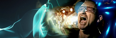
There's too much water. How could anyone fit that much water in one hand? It had to have been poured; had the water been poured, there would be splash. I like the work you've done, but this was just too distracting for me.
you clearly aren't getting the concept. he's not pouring it, it's suppose to be a waterfall.
 

DFEAR

Smash Hero
Joined
Jul 10, 2008
Messages
5,582
Location
:190:
@mojo. one person's opinion shouldnt matter to u. it should matter to the artist.

if zues here doesnt get the concept then he clearly doesnt get it. in that respect, the artist FAILED to achieve that through zues here. in which as a good response, the artist should fix the mistake and add the suggested "improvements" for version 2 if he so chooses o.o.

though who am i to say that my opinion matters xD
 

emergency

Smash Journeyman
Joined
Dec 7, 2008
Messages
251
Location
Junahu's Box
I've never used C4Ds before, and this my first go. ( I don't smudge well either...)


Thanks in advance. I'm as scrubby as it can get. Sadly. I'm sorry for being a scrub .
 
Status
Not open for further replies.
Top Bottom