• Welcome to Smashboards, the world's largest Super Smash Brothers community! Over 250,000 Smash Bros. fans from around the world have come to discuss these great games in over 19 million posts!

    You are currently viewing our boards as a visitor. Click here to sign up right now and start on your path in the Smash community!

The Sig Critique Topic

Status
Not open for further replies.

Inyro Gatling

Smash Journeyman
Joined
Sep 1, 2008
Messages
229
Location
New York
Well, Evil Guy, I really can't say I'm a bit fan of that first style (never have been). The lighting isn't bad here, but could definitely look a bit more realistic. Right now it looks a little too much like soft brushing. And then, I really don't like the clipping mask on the left.

As for the second tag, I like the concept, colors and lighting. I just don't care for the motion blur and the overall sharpness of everything.

Two new smudge tags from me:


Evil-Guy

Smash Journeyman
Joined
Mar 2, 2009
Messages
416
Location
Cats Eye Nebula Constellation: Draco
weeee you like smudging, the colors in those are marvelous, but stay away from gray and black they make the colors of the sig very murky sometimes :s also be careful with the quality of certain parts but otherwise its good :)
 

Inyro Gatling

Smash Journeyman
Joined
Sep 1, 2008
Messages
229
Location
New York
weeee you like smudging, the colors in those are marvelous, but stay away from gray and black they make the colors of the sig very murky sometimes :s also be careful with the quality of certain parts but otherwise its good :)
In Color Storm, I was actually going for murky colors in parts (it's supposed to be a not-so-friendly storm lol).

And yeah, some parts are a tad oversharpened...


Anyway, new tag since there's nothing to critique:
 

Dan Goodine

Smash Rookie
Joined
Feb 13, 2010
Messages
13
Location
Cleveland Ohio
Hey guys, I have always wanted to make a signature for my self for this forum, and I thought that I would just boost on ahead and make myself one. It might not be this best, but I take great pride in it. Could you guys critique it please? Made in Photoshop 8
 

Dan Goodine

Smash Rookie
Joined
Feb 13, 2010
Messages
13
Location
Cleveland Ohio
Oops, I forgot about that, I found the most recent one to critique.

Im not exactly the best judge of things, since I find it hard to find anything bad about something unless its painstakingly obvious, but I must say I like this one, It kinda has a dark feeling to it, and I have anything bad to say about this one.
 

Conker315

Smash Lord
Joined
Jun 20, 2008
Messages
1,138
Location
Houston, TX
Gosh its been a while, and wow Inyro you've gotten really good. Dont know if you remember me but keep up the good work. Love the blending and your smudging.
 

lordunicorn3

Smash Journeyman
Joined
Mar 1, 2008
Messages
472
Location
Paris
well, seems this has gone a bit dead, ill bring it back :)
inryo, since yours was last, i like it, bit plain/dark, but its good
i managed to get PS, and wow.. its much better than gimp, at least for someone of my skill 'level' (low lol)
first sig in ps :)
 

Neon Ness

Designated Procrastinator
Joined
Jul 10, 2008
Messages
3,631
That there is a very nice blue. The way you added a reflective mirror property to his mask is really good, actually o.o Impressive.

The space is somewhat confusing. On the right side of the sig, it looks like we're looking down at the Shy Guy from an angle. But then that white line that's going straight down on the left half... I can't even tell where it's supposed to be, spatially, in relation to the Shy Guy. I can't figure where the vanishing point in this sig is supposed to be.

I would mess around with the colors some more so they just flow. From left to right it goes dark turquoise, white, lighter turquoise, darker turquoise again pretty sharply. The shifts should be more gradual. Also try to add some hints of blue violet/greener blues for color varaiation.
 

lordunicorn3

Smash Journeyman
Joined
Mar 1, 2008
Messages
472
Location
Paris
Thanks neon :)
yeah, I was just trying the line as I had seen it in a tut, and wanted to test it out.
sig number 2 :) (v1, this is an earlier version, but any opinion on the lines?)

v2 (final, just wanted to see what people think of the lines)

imo this is one of, if not my best tags
and a bigger piece I did, idk why, its not great :p

(Would this be better with a transparent bg?)
 

Conker315

Smash Lord
Joined
Jun 20, 2008
Messages
1,138
Location
Houston, TX
I like V1. better because it has no borders, but you could work on more things. I dont like the wisps over the text like that, it kinda distracts me from the focal. The smudging could be improved and have more of a flow to it. The text on the second version could be put on v1 to not catch so much attention to it. V1 is all bold but for v2 its like not getting that same attention to me as the first tag. Looks simple and can be improved so KIU and ill try to give better critique next time :x
 

Neon Ness

Designated Procrastinator
Joined
Jul 10, 2008
Messages
3,631
Hey, you should use this random old thing I found.


All my other recent sigs have other people's names on them lol :( Sorry I don't have any worthwhile ones to give out right now.

@Evil-Guy: Try to challenge yourself by doing something that's vastly different from what you're used to. Like making a tag without any c4ds or something. That normally helps me out when I'm stuck.

They're still good on their own though. Your lighting and fx are well placed, and you really paid attention to the colors.
 

lordunicorn3

Smash Journeyman
Joined
Mar 1, 2008
Messages
472
Location
Paris
Had no internet for a bit, so what did I do? sig making (and school work, but w/e)
(nothing to critique above me, well, ness thats really cool actually, cant think of anything negative to say)
this one i think is decent

this one is realllly mehh
 

Neon Ness

Designated Procrastinator
Joined
Jul 10, 2008
Messages
3,631
Outer glow text aaagghhh

It just makes it harder to read really.

Besides that though 1st one is good. It's nice how the effects/bg sort of burst outward from the biker. The color scheme is really nice and warm too. But you need more contrast. A lot of it is more or less the same value so hardly anything stands out as a main focal point. It's a really good start though. Why have the same word twice?

Nothing really spectacular about the 2nd one. Outer glow text again :mad: Weird camera angle but it works, oddly. It's different than what you normally see. I don't understand the lighting though... There are bright streaks on the right but the sig gets darker there for a really weird effect. Gives it a sort of hazy/dreamlike feel, but if that's what you wanted then... good? The lighting just technically doesn't make sense in some areas lol.
 

lordunicorn3

Smash Journeyman
Joined
Mar 1, 2008
Messages
472
Location
Paris
Hehe, thanks, :)
I was trying something new with the outer glow text, I'm pretty new to PS, and I saw it in a tut, figured I would try it.
but yeah, im gonna spend a bit more time on the first one, i was quite happy with how it turned out
 

Neon Ness

Designated Procrastinator
Joined
Jul 10, 2008
Messages
3,631
Usually helps if you comment on others' first.

Big red letters, first page.

The render is a nice idea, but eh. He has a sort of "Eureka" look on his face, but the effects around him aren't... spectacular enough. The contrast is overall really good. But I think it'd look better if there was more of an outward bursting thing happening with the effects. Just because of how he's looking up, lit from above, his palms spread open like that.

There's something strang over his left hand. What is that?

Also, I think the more prismatic colors look better than the faded ones closer to the outer edges of the sig. The dark halo around his body looks odd since it doesn't really match the lighting.
 

Neon Ness

Designated Procrastinator
Joined
Jul 10, 2008
Messages
3,631
Lol, you are too kind. :embarrass

I wish though. So busy these days, I miss sigmaking sometimes.
 

Shök

Smash Champion
Joined
Jun 24, 2007
Messages
2,251
Ha ha. I'm pretty sure some other people would like to see some of your work as well. ;D
 

E123Omega

Smash Lord
Joined
Sep 16, 2006
Messages
1,880
Location
ニューヨーク
Usually helps if you comment on others' first.

Big red letters, first page.

The render is a nice idea, but eh. He has a sort of "Eureka" look on his face, but the effects around him aren't... spectacular enough. The contrast is overall really good. But I think it'd look better if there was more of an outward bursting thing happening with the effects. Just because of how he's looking up, lit from above, his palms spread open like that.

There's something strang over his left hand. What is that?

Also, I think the more prismatic colors look better than the faded ones closer to the outer edges of the sig. The dark halo around his body looks odd since it doesn't really match the lighting.
Thanks for the critique. When I make my own sigs, I never really know what I want. I was halfway following a tutorial halfway doing my own thing, playing around with an orange C4D that now looks like a kind of flame in the picture.

I'm not gonna explain everything I did so I'll leave it at that heh..

I have another one that I really like, a request actually.


I disagree with the border but I like what I did with everything else. The blue things surrounding Marth are most likely going to show up in more of my sigs since they are actually part of another picture that I erased and I can make cool focals with.

The background is actually a distortion with various filters added on top of layer after layer after layer blended together. Why parts of it are blacked out, I really don't know but I think it may be an effect of the filter lol.


EDIT 10/10/10: A day later. Oh wow, this topic is booming! -_-
I have another sig that I made just now that I'd like to be critiqued


I kinda hate making sigs for myself cause I never really know what I want. I made this because I loved the original pic of Brian Dunesing so much. it spoke absolute volumes to me, so I'm like "I gotta make a sig of this!". And so these are my attempts. One is greyscale and regular. Tell me what you guys think of both and the Marth sig!

10/15/10 2nd EDIT: Sheesh, its as if nobody WANTS to critique. Oh well, I made another sig:


Tons of experimentation with this one, think I like it lots! Eventhough its prolly cluttered as hell >_>
 

Neon Ness

Designated Procrastinator
Joined
Jul 10, 2008
Messages
3,631
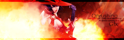
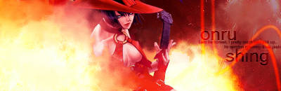
1st tag: I'm not a fan of borders, mostly since I can never get them to look right. :embarrass: The border on this one's not horrible, but it could probably be thinner. I always saw borders best as being 1 px wide... 2 maybe.

That liquid effect around Marth is good. Looks like the liquify tool, I'm guessing? You can do some pretty crazy stuff with that thing (see Inyro Gatling's tags lol), so keep experimenting and improving. The bg on the left seems to not match the liquid motif though, or the colors on the right side. I would try to mess with the liquify tool there as well for consistency's sake. Marth's face is a little pixel-y around certain areas, you can blur those a bit to hide any 'low-quality' looking places. This is a good color scheme so far, try to throw a few more in there to see how they work out.

I guess filters can do some interesting things sometimes, but mostly I would suggest avoiding them. The effects they make you can really do yourself, but better. I hate saying that because it sounds snobby, but I feel like you'll benefit from tryna make visuals without using them as a 'crutch'.

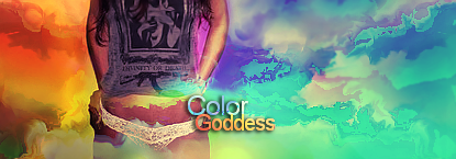
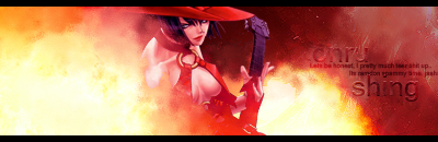
2nd tag: Grayscale is awesooome, great contrast on that one. It's really minimal feeling.

Background I'm on the fence about. I sorta liked it at first, but when I realized it was just an enlargement of his eye it just kinda killed it for me. I have no idea why but using a copy of the render in some way to make the background has always bothered me. It just doesn't look right for some reason. Also since it's a bright spot it detracts from his face as a focal point. Bg should probably be darkened (and not be a copy of his eye) so the only bright area is the area we should care about looking at (face). Right side near his shoulder has great fx, text should probably go though. Or at least, be rotated or something so that it fits with the fx. They sorta bump into each other as is if you know what I mean. I don't really like the repeated lines in the background, they don't particularly add anything appealing.

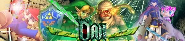
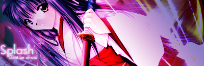
3rd tag: Really good also. I actually don't find it cluttered at all, and you managed to make a centered focal look good which is not easy at all. Like the wings you added there.

Some parts have really great color, like that area near his left shoulder. Other parts just look random and noisy, so pay careful attention to which places you want to emphasize with color.

It's almost there. Make sure you really define a light source. Judging by his face I'd say it's somewhere centered above him, so try to emphasize this by making areas near him and far from him lighter or darker. I don't care for serif fonts in sigs really but the text is fine. I don't think it needs to glow though, if you want to emphasize it, there are probably better ways like making it bold, all caps, a certain hue, certain font, etc.
 

SuSa

Banned via Administration
Joined
Jul 20, 2008
Messages
11,508
Location
planking while watching anime with Fino
I'm one of those "if I don't see you round this neck of the woods every other day at the least, I get suspicious" types... so I went ahead and namesearched you for this forum. I like the style you use on a lot of your tags, and I'm glad I'm suspicious as hell. Got to see some nice tags (didn't save any to show you which ones I liked, sorry. :x)

Anyways... I'd love to see a tutorial on pretty much any of your tags; if you don't mind spending the time to make one. <3 style is great.

As for your C&C:

Unlike neon - I despise a tag without a border. It looks like an unframed picture, one not ready to be displayed on a wall. It's just a personal issue with it, but I wouldn't go so far as to say it looks "bad" without a border. (aka: I wanna see a bordered version, just 2px white or black. BAAAWWW)

As for the concept behind it, the.. black shadowy stuff? is to contrasted on the right side of the picture and REALLY stands out, especially against that orange light. The left side looks more like shadows while the right side is just black blobs. Also that lighting seems really faint and far away, but it's a really strong red on the renders hair. It makes the lighting look artificial and not natural to have it as such. Tone down the bit on her hair/neck a bit.

The render (stock?) also looks a little out of focus, it focuses on her breasts (it's really sharp there) but her face is somewhat blurred. Might want to flip that around as it creates a confusing focal point.


Lastly, there is nothing that makes me go "wow" at this signature. It's not bad, but it's not that great either. Nothing jaw-dropping about it. It's just as it is. It's nice. Not much else to say about it.

:nifty::leek:
 

Black Waltz

Smash Champion
Joined
Jan 27, 2007
Messages
2,243
A tad oversharpened and you could a little more with the negative space on the left side. That's a nice render, btw, do you mind if I borrow it?
 

lordunicorn3

Smash Journeyman
Joined
Mar 1, 2008
Messages
472
Location
Paris
:(
sad to see its been almost a month since the last post,
but ive been doing a bit lately, and so.. here is one of them
this is just an edit on an old tag i did, ill put some others up later (in .psd, and im too lazy to open up ps lol)
 

Neon Ness

Designated Procrastinator
Joined
Jul 10, 2008
Messages
3,631
The text and border look good. The border's got a nice high contrast look that works well with the central area's more muted look. The words are a nice font but their placement seems like it could be better, some of it almost falls off of the right side.

The left side's just way too bright though. It could have some sense of contrast, or depth, or something but right now it's just a bright spot that doesn't add much in terms of interest. I-No also looks sort of flat, as a focal point she doesn't stand out very much. The designs on the right half look fine.
 

E123Omega

Smash Lord
Joined
Sep 16, 2006
Messages
1,880
Location
ニューヨーク
I like the smudging but at the same time I don't. :/

Watcha guys think of this avatar I made?


I like the way I made it "come out" but I don't think its very remarkable cause it took me roughly 5-10 minutes.
 
Status
Not open for further replies.
Top Bottom