• Welcome to Smashboards, the world's largest Super Smash Brothers community! Over 250,000 Smash Bros. fans from around the world have come to discuss these great games in over 19 million posts!

    You are currently viewing our boards as a visitor. Click here to sign up right now and start on your path in the Smash community!

The Sig Critique Topic

Status
Not open for further replies.

Neon Ness

Designated Procrastinator
Joined
Jul 10, 2008
Messages
3,631
...Oh.

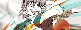
Well, I'm not sure how to crit this since I know it's taken from work that someone else made. :p

But I will say it's important to mess around with tools in Photoshop to learn how to use them. With the smudge tool (I assume? That's what it looks like you used) you can get a lot of different effects just by changing the brush tools/settings. Personally I think smudging with the default leaf/grass brushes makes a really nice effect. Smudging on duplicate adjustment layers also yields some pretty crazy results.

So yeah, just keep experimenting. But, probably on stuff you made on your own lol.
 

O D I N

Smash Hero
Joined
Mar 13, 2005
Messages
7,408
Location
GameAngel64's house, getting my @#% handed to me.
3DS FC
4098-3123-8629
You mean like this?

Kinda sorta. Smudge benefits from other brushes; Splatter brushes and such. Not just your circle brushes.

There's lots of good brushes over at deviantart.

Here's a few examples:


More smudge than anything else. Think I used a 'charcoal' brush, one of the defaults.


More splatter brush.


Splatter brush with clipping mask.


Good example of C4D use, as well as lighting.
 

t3h Icy

Smash Master
Joined
Jun 12, 2009
Messages
4,917
They're okay, I like the top one, but you should really use the Smudge Tool more.
 

Charz

Smash Cadet
Joined
Jan 15, 2011
Messages
25
Location
Germany
i am pretty bad at criticizing but their does not seem to be much happening in the background, maybe try smudging some of the render with the background. Here is a sig i made, some criticism would be nice.


Snuc

Smash Apprentice
Joined
Mar 21, 2011
Messages
79
Location
Omaha, NE
@Charz: It is hard to see whats going on, you also overdid the smudging and it isn't bright enough. The colors fit well, but you need more going on, there is way to much negative space.


CnC??
 

Charz

Smash Cadet
Joined
Jan 15, 2011
Messages
25
Location
Germany
thanks for the criticism. I did not notice the text that well in the sig, maybe try bring it closer to your render. The flow of the whole sig is also kinda wierd. On the left hand side the flow seems to go into the render, but on the right there does seem to be any flow so yeah maybe bring the flow. Just my two cents hopefully it helps you.
 

O D I N

Smash Hero
Joined
Mar 13, 2005
Messages
7,408
Location
GameAngel64's house, getting my @#% handed to me.
3DS FC
4098-3123-8629
thanks for the criticism. I did not notice the text that well in the sig, maybe try bring it closer to your render. The flow of the whole sig is also kinda wierd. On the left hand side the flow seems to go into the render, but on the right there does seem to be any flow so yeah maybe bring the flow. Just my two cents hopefully it helps you.
Didn't notice the text until it was pointed out. O_o

Charz hit the nail on the head for yours, Snuc. I'm not a big fan of 'pixelated' smudging, but that's just me. For text, I'm a big fan of 'clipping mask' text, or changing it to overlay of some sort. I'll turn my sig on as an example, since I did it for mine. It looks like you used a smudge/grunge/splatter brush for your smudging, but something happened on the ends. I personally don't care for it. :-/

Also, Charz, sorry I didn't leave more feedback for you. It's very possible my monitor/screen isn't showing me everything. Like I said, all I see is brown, with a hint of some guy in the middle.

... Okay, that sounded REALLY bad...
 

Flutter NiTE

Smash Lord
Joined
Oct 3, 2010
Messages
1,634
Location
PA, USA


This is my first sig I made in like... 2 hours on and off... Obviously it doesnt compete to ANYTHING else posted here, but just curious on how it is as far as starting off... self taught
 

Neon Ness

Designated Procrastinator
Joined
Jul 10, 2008
Messages
3,631
Welcome to the Art Shoppe! Glad to see a new face interested in making sigs.

For people just starting off, I always recommend looking through this thread: http://www.smashboards.com/showthread.php?t=175790 In order to make good sigs I think it helps to look at some examples from more experienced people, so you at least have something to work toward and draw inspiration from.

I think working with sigs for the first time, it helps to work with a smaller canvas. The main thing I notice is there's a lot of empty space where the background is. Simpler fonts are normally better since they're less distracting, and having one picture is easier to work with for simplicity's sake. Also, make sure whatever picture you use isn't cut off around the edges and looks natural in the sig.

I know that's a lot of vague stuff, but I hope it helps. Feel free to post more stuff so we can see how you improve, or ask any questions you have. Really I'd just say that looking at other people's work for inspiration is just as important as practicing on your own.
 

Nesu

Smash Rookie
Joined
Apr 3, 2011
Messages
8


..CnC? It's a smudge sig I did on Gimp. I 've been told before once that I should take the text off.
 

Neon Ness

Designated Procrastinator
Joined
Jul 10, 2008
Messages
3,631
I like those smudges a lot actually. That Shaymin(?) already looks like a painting so everything really goes together. I would just try to figure out what to add besides smudges, but it looks good right now. Awesome colors.

Only thing about the text is it's a little bright, it looks brighter than the green on Shaymin. I would also make it smaller (it is slightly distracting from the visuals) and not stuffed away in the corner.
 

t3h Icy

Smash Master
Joined
Jun 12, 2009
Messages
4,917
Hey Xenon Mess, what do you think? I didn't even use the smudge tool:


You can save your time telling me how awesome it is since I already know, just tell me what's wrong with it and what could be better (besides lack of smudge tool).
 

Neon Ness

Designated Procrastinator
Joined
Jul 10, 2008
Messages
3,631
New faces! :D This thread died for a while.

@ M4RTYR: The colors and affects are great, no complaints there. My only comment is it's very bright; some darker shadows would balance out the contrast. Adding some more depth could help since everything appears to be on the same plane. High quality work though, hope you'll post some more.

@ Cinatoast: 1st seems unfocused. I can't tell where the central point of 'interest' should be since everything is sort of fuzzy. I think if the character was sharpened it would jump out and the background would recede more, but the whole things looks flattened.

2nd one has a great sense of depth and contrast. The colors are unusual but they work lol. I don't actually have any complaints with this one, probably my favorite of the 3.

3rd one is very bright without a lot of shadows to balance it out. The colors look good on the right half but the left is a little blander. I also wish there was some negative space above her head, it's awkward how the top is cut off like that.
 

Neon Ness

Designated Procrastinator
Joined
Jul 10, 2008
Messages
3,631
I just meant I wish there was more empty background space above her head, so it doesn't get cut off.
 

ZIO

( ͡° ͜ʖ ͡°)
Joined
Sep 14, 2006
Messages
10,884
Location
FREEDOM
Well now that the contest is over. What could I do to improve this?


I think I spent a tad too much time drawing the characters and what have you, and not enough time thinking of the composition of the piece.

I also have little experience making signatures because I hate using them. Anyway - fire away. :bee:
 

deepseadiva

Bodybuilding Magical Girl
Joined
Mar 11, 2008
Messages
8,001
Location
CO
3DS FC
1779-0766-2622
I loved the concept. Gonna steal~

Minor things I would have changed would have been the comic sans font (never) and having the main figure kept inside the box, at least except for the hair (I always find blunt cuts like that jarring).

I also don't know if I would have gone for that odd cloud shape in the bottom right. It's lost under the boxes, and the transparencies give the scenes weird incomprehensible shadows, like the bottom most one.

My favorite box is the Vespa box. Very cinemagraphic.
 

SupaSairentoZ7℠

Smash Hero
Joined
Nov 27, 2010
Messages
7,555
Location
Norfolk, Virginia
Kula Diamond my favorite KOF. Lovely signature. =)

Anyone know a good link for really good abstracts and virtual Bgs? I tried google, deviantart, imageshack, and photobucket but I none of them had what I wanted...

:phone:
 

Neon Ness

Designated Procrastinator
Joined
Jul 10, 2008
Messages
3,631
@ Ankoku: Yeah, sometimes text is unnecessary. The main thing that catches my eye is that it's not a strict rectangle, very original. Everything is cut very nicely.

@SSZ7: A lot of people use c4ds for sig backgrounds, I thought dA would have some under their resources section. In terms of actual environment background art that's not a photo... I'm not sure where you'd find those without having to steal something. o-o Might be best to just try painting/vectoring the bg yourself. Sorry I couldn't be of more help there...
 

ZIO

( ͡° ͜ʖ ͡°)
Joined
Sep 14, 2006
Messages
10,884
Location
FREEDOM
Thanks for the compliment, Meno. My goal was to get across the style of a comic. I could have put more thought into the composition. Thanks for the help, though.


And Ankoku, I find the far top-left of the image a tad distracting as it seems too bright to me. Other than that, it seems fine to me. You might not need to add text, unless you feel like it. besides, if you consider the avatar and the sig as two parts to one whole, you could possibly fit the name in the avatar.
 

SupaSairentoZ7℠

Smash Hero
Joined
Nov 27, 2010
Messages
7,555
Location
Norfolk, Virginia
SSZ7: A lot of people use c4ds for sig backgrounds, I thought dA would have some under their resources section. In terms of actual environment background art that's not a photo... I'm not sure where you'd find those without having to steal something. o-o Might be best to just try painting/vectoring the bg yourself. Sorry I couldn't be of more help there...
You'll have to excuse me on this. I don't know what "c4ds" is. /= I'm still experimenting around and I don't know much about the more advance options and such but I do thank you for the response.

:phone:
 

Zankoku

Never Knows Best
Administrator
BRoomer
Joined
Nov 8, 2006
Messages
22,906
Location
Milpitas, CA
NNID
SSBM_PLAYER
Cinema 4D is what's commonly used for backgrounds, foreground effects, etc. to emulate a 3D effect through a pre-rendered abstract image. You can find a lot of them simply by searching "c4d" in Google Image Search.
 

SupaSairentoZ7℠

Smash Hero
Joined
Nov 27, 2010
Messages
7,555
Location
Norfolk, Virginia
Cinema 4D is what's commonly used for backgrounds, foreground effects, etc. to emulate a 3D effect through a pre-rendered abstract image. You can find a lot of them simply by searching "c4d" in Google Image Search.
Thanks for explaining it to me. All I typed up as far as image search was just "abstracts" along with a color I was interested with. When I get home I will do a search on that instead. Thanks! =)

:phone:
 

Starphoenix

How Long Have I Been Asleep?
Joined
Oct 10, 2007
Messages
8,993
Location
Cyberspace
NNID
GalaxyPhoenix
3DS FC
2122-6914-9465
What do you guys think of this sig?


I'm thinking my neon lightning over to the left is crowding it up too much? Thoughts?

@SupaSairentoZ7: If you need a visual example of C4D's, look at my signature above. It is a perfect example of the type of results you can achieve when you use them. My background utilizes them and most of my stroke effects were created by blending them over my King Slime render.
 

t3h Icy

Smash Master
Joined
Jun 12, 2009
Messages
4,917
I felt he looked a little visually impaired, so I fixed that for you. I also made him a little more cheerful looking and improved the background. I'd suggest using the Smudge Tool often, but you're really talented already!


Starphoenix

How Long Have I Been Asleep?
Joined
Oct 10, 2007
Messages
8,993
Location
Cyberspace
NNID
GalaxyPhoenix
3DS FC
2122-6914-9465
I felt he looked a little visually impaired, so I fixed that for you. I also made him a little more cheerful looking and improved the background. I'd suggest using the Smudge Tool often, but you're really talented already!

What the heck did you do to him...?
 

Victum

Smash Rookie
Joined
Sep 3, 2011
Messages
2
So I recently quit going to the website I used to use for all my graphics critique.
I remember SWF had a pretty good graphics forum back in the day so I came here.

Rules are the same right? I still have to CnC the last post before I can ask for some? k.

@Nesu
The Shaymin sig on the last page, I really like the smudgework. Can you tell me what brush/settings you used?


@Starphoenix
The C4d on the left is cool, but there's absolutely no reason to have that... I'm guessing stock image on the right. It also has no flow, some things go left some go right, some go down, some go up. I think it's kinda a bad render choice since the render has no direction, neither can the sig. The lighting on it really isn't bad. The text draws way too much attention from the render. Find a font that fits better. Get rid of the white bar on top.... those changes I think will make it look much better.

Now... can I get some CnC on these?


Status
Not open for further replies.
Top Bottom